Footnotes & Flashbacks: State of Yields 4-14-24
A bad week for duration yet again after CPI, but the weekend events could start a new game clock on risk pricing and inflation handicapping.
"January 1991 Desert Storm." Not looking for a replay...
The macro release flow has not been friendly to UST bulls and got hostile again this past week with CPI setting off anxiety in the equity markets ahead of what will be a fresh reassessment this week after Iran-Israel events raised the stakes.
The weekly deltas were mostly influenced by the 1-day move on “CPI day” while inflation expectations ticked higher in the U Michigan Consumer Sentiment update.
This week we get Retail Sales and Industrial Production for more flavor along with more housing stats, but we expect oil and missiles will be the dominant focal point.
The above chart updates the UST migration since the 10-19-23 peak on the UST 10Y. We also update the YTD deltas as the UST curve is closer to the highs than where the year started.
The above chart updates the migration of the UST curve across the tightening cycle. We include a memory box for the tightening history from March 2022 to July 2023. We see the brief retracement of the UST in March 2023 from year end 2022 after the regional bank mini-crisis that the Fed addressed very quickly and successfully.
After the big moves in 2022 on the rapid series of hikes into 2023, the UST inversion “hang time” has been breaking records an adding “protracted” to “inverted” in the attempts to capture how unusual the shapeshifting period has been in just the third major inflation-fighting cycle since the early 1970s. One could easily argue it has been only two inflation fights and that the 1970s version did not end until after Volcker in the early 1980s. In other words, there is not an excess of macro examples to look to for guidance.
The most interesting aspect of the above chart was the convergence of the 12-31-22 UST curve and the 12-31-23 UST curve further out the maturity spectrum despite the 100 bps differential in the fed funds upper bound noted on the chart. That relationship can be sobering on the duration call if you still see room for 2 fed funds cuts this year. Where the curve will migrate in longer dated maturities with so much supply to fund deficits and interest costs makes a downshift in the long end hardly a layup even with FOMC cuts on the front end.
The weekly UST deltas above show double-digit moves from 2Y to 10Y after a bigger move than that just on CPI day (see CPI March 2024: The Steeplechase Effect 4-10-24). As we covered in our parallel Footnotes publication on returns (see Footnotes & Flashbacks: Asset Returns 4-14-24), the UST setback continues a bad streak for the 6 bond ETFs that we routinely track in our weeklies.
The updated migration from 10-19-23 (UST 10Y peak date) through Friday close is a reminder of the UST curve rally from the peak levels in the fall in what was a distinctive bull flattener even with fed funds frozen in place relative to expectations. In contrast, the YTD trends posted in the next chart have not been kind to the UST bulls.
The YTD period has seen an upward shift that has hurt the reallocation benefits to bonds that many expected. Pension funds and retail savers had been taking steps to shore up their longer-term exposure to bonds in this post-ZIRP period with lower inflation expected to translate into favorable UST shapeshifting under the consensus to start the year. The call for lower fed funds and a downward shift has not played out and may need to be a 2H24 event.
The debate around easing has been tough enough to see kick in to this point in 2024, but the fear of too much UST supply needed to refi and fund deficits out the UST curve is not easy to dispel. A full downward shift all along the curve back to flat has been a hard case to make unless the “flat” is just about the front end narrowing the inversion.
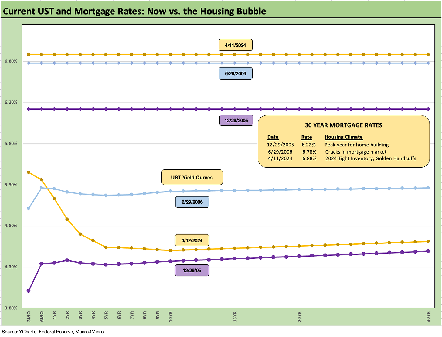
The above chart updates the weekly historical lookback we do in mortgages. We frame the current mortgage rate and UST curve vs. those rates during the housing bubble. We use year end 2005 to mark the peak year in homebuilding and then mid-2006 for the time when the subprime RMBS issues were creeping into the picture.
Today’s UST curve is above Dec 2005 and well below June 2006, but mortgage rates remain higher today. Demand for mortgages and new and used homes had skyrocketed in 2005-2006. Today, the combination of mortgage rates and high home prices in a market with so many low existing mortgage rates (approx. 60% below 4%) has reduced available inventory and slammed existing home sales (see Existing Home Sales Feb 2024: Surrendering to Mortgage Market Reality 3-21-24).
The sticker shock has been an impediment to potential sellers with “golden handcuff” effects. That has been easing somewhat of late, but has turned the marketing advantage over to homebuilders (see New Home Sales Feb 2024: Hope Spring Eternal, but Demand Seasonally 3-25-24, Housing Starts Feb 2024: Rites of Spring on the Doorstep 3-19-24).
Homebuilders have been great equity performers despite the mortgage increases since demographic demand is very favorable, and the builders have more tools at their disposal to drive volumes. We cover those topics in our housing commentary and single name work.
The above chart updates the time series for IG Corporate and HY bond all-in yields. The timeline is interesting given so many years of ZIRP and QE and “barely normalizing” activity by the Fed in the window from Dec 2015 to Dec 2018 as the Fed headed into easing mode in 2019 on signs of cyclical weakness. Of course, then March 2020 brought COVID and a return to ZIRP until the March 2022 tightening cycle.
The relevant yield comparisons for today are the pre-crisis medians which show median HY at 9.3% and median IG at 6.1%. We are now operating in a post-ZIRP world after 14 years of minimal UST rates from late 2008 into the series of rapid 2022 hikes (ZIRP to +450 bps upper range by year end) and the last 100 bps in Feb 2023 to July 2023. The hiking cycle has shifted a lot of the focus to all-in yields and not relative view of spreads in historical context.
With credit spreads tight and UST views bullish, the focus has been on duration on the way into 2024. So far, that has been a struggle with net negative return generation from the UST side of the trade as we cover in our asset return Footnotes.
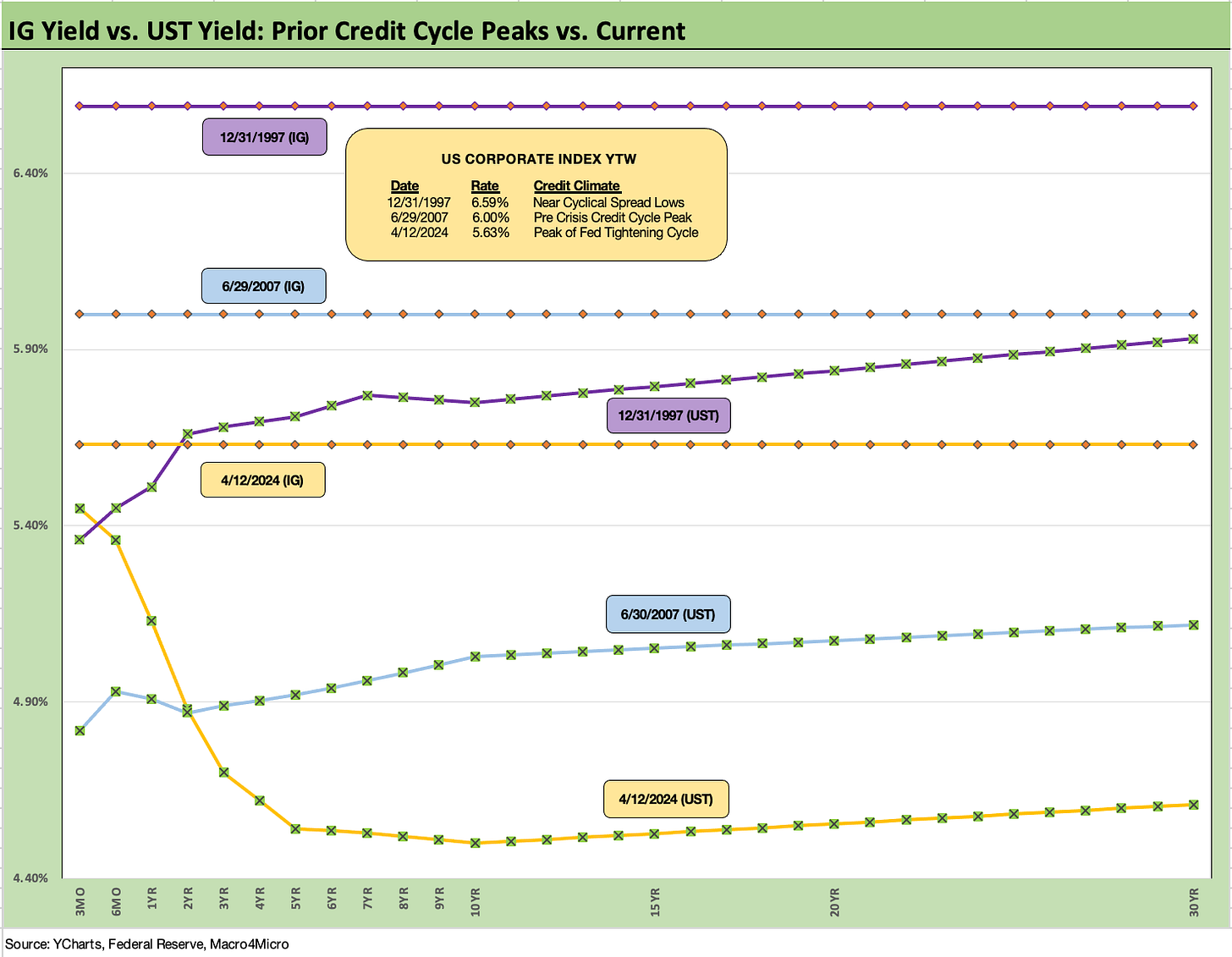
The above chart on the IG Corporate bond market does a similar version of an historical lookback like we did with mortgages except we use the credit cycle peaks in late 1997 and midyear 2007. We plot the UST curve for 12-31-97 and 6-30-07, as well as the IG index yields for the ICE IG index on the horizontal line.
The UST yields are lower today than 1997 and 2007, and the IG index yield is now also below Dec 1997 and June 2007. For this past week, there was minimal action in IG spreads. As a frame of reference, the Friday close on the IG index spreads at +92 bps (4-12-24) are inside those seen at the end of June 2007.
The current IG OAS is just below the +93 bps average of 1H04 to 1H07. The 1H07 period alone averaged +86 bps. The all-time low for IG was +53 bps in Oct 1997 before reaching +70 bps at the end of 1997 and averaging +95 bps for 1997-1998. Current IG spreads are quite tight right now even if well above the 1997 lows. Those timelines of tight spreads speak to how spreads can remain compressed for a long stretch absent a major catalyst to rattle them.
The above chart does the same exercise as IG but for the HY index. The 8.14% HY index yield seems like manna from heaven after so many years of financial repression and reaching for HY index yields in BB and B tier names that were below the current 3M UST of 5.3% (even some CCC deals printed below that level).
The 1997 HY index yields of 8.6% is above the Friday close of 8.1% but June 2007 closed out at just under 8%. The yields are thus right there around some peak HY markets where HY OAS was tighter at the lows of those bygone years (sub-250 bps for the low index tick in the months of Oct 1997 and June 2007). For the past week, HY OAS widened slightly by 7 bps to +325 bps for ICE HY.
The above chart updates the 3M to 10Y UST slope. The inversion of -95 bps pales in comparison to the -189 bps peak inversion during May and June of 2023. As detailed in the long-term UST slope median box, the post-1984 median slope for 3M to 10Y UST is +162 bps. That is a long walk from here.
The above chart shortens up the timeline (from Jan 2021) for the same 3M to 10Y UST slope trends. We see a peak of +227 bps in May 2022 finally crossing into inverted (and staying inverted) late in 2022 after returning to a mini-peak of +62 bps in late Sept 2022. The median for that Jan 2021 to current period was +25 bps.
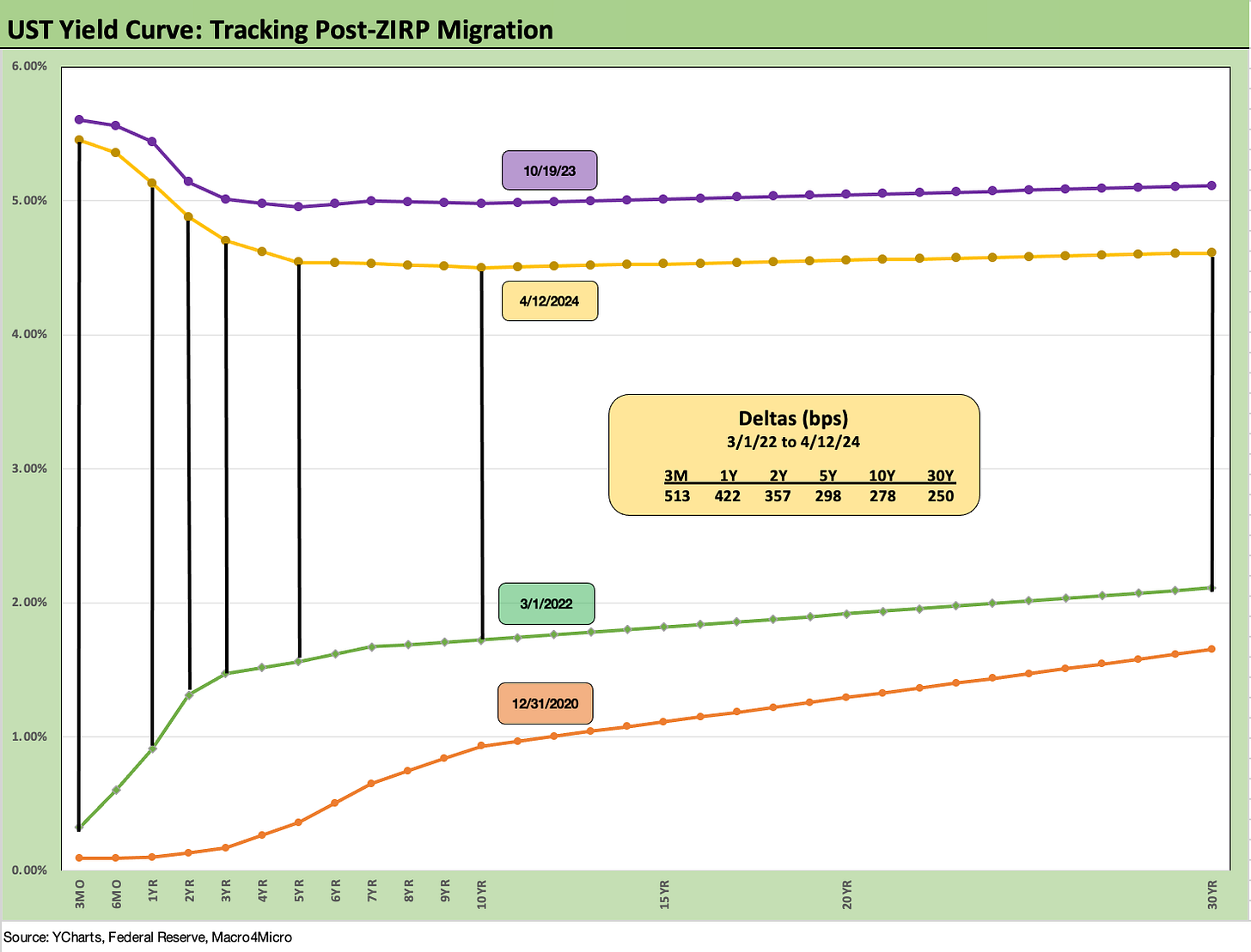
We wrap with our usual UST migration period that tracks the running UST deltas from the beginning of March 2022 (the month ZIRP ended effective 3-17-22). We break out the deltas in the box and drop in the 10-19-23 peak UST (peak 10Y UST) and a 12-31-20 UST curve for frames of reference.
The market open and overnight chatter from abroad will be very interesting. Oil vs. risk aversion is a tricky one for the UST curve. We would expect the US consumer will not get swept up in the hatred and threats unless it flows into his gasoline tab or auto finance and/or mortgage rates. The “hate factor” allocation is oversubscribed at this point in the US. It is hard to avoid that oil impact if Israel-Iran escalates and supply is disrupted in the Gulf.
See also:
Footnotes & Flashbacks: Asset Returns 4-14-24
Consumer Sentiment: Do You Think Scary Thoughts 4-12-24
CPI March 2024: The Steeplechase Effect 4-10-24
Credit Markets Across the Decades 4-8-24
Credit Cycles: Historical Lightning Round 4-8-24
PCE Prices, Personal Income & Outlays: Sideways Tone 3-29-24
4Q23: Final Cut, Moving Parts 3-28-23
New Home Sales Feb 2024: Hope Spring Eternal, but Demand Seasonally 3-25-24
Pension Profiles: Benefit Drain Rates and Returns 3-22-24
Existing Home Sales Feb 2024: Surrendering to Mortgage Market Reality 3-21-24
FOMC: Hail Powell the Consistent 3-20-24
Housing Starts Feb 2024: Rites of Spring on the Doorstep 3-19-24


