Footnotes & Flashbacks: State of Yields 6-25-23
We look at the action in yields over the past week and update income levels and the UST migration and shapeshifting.
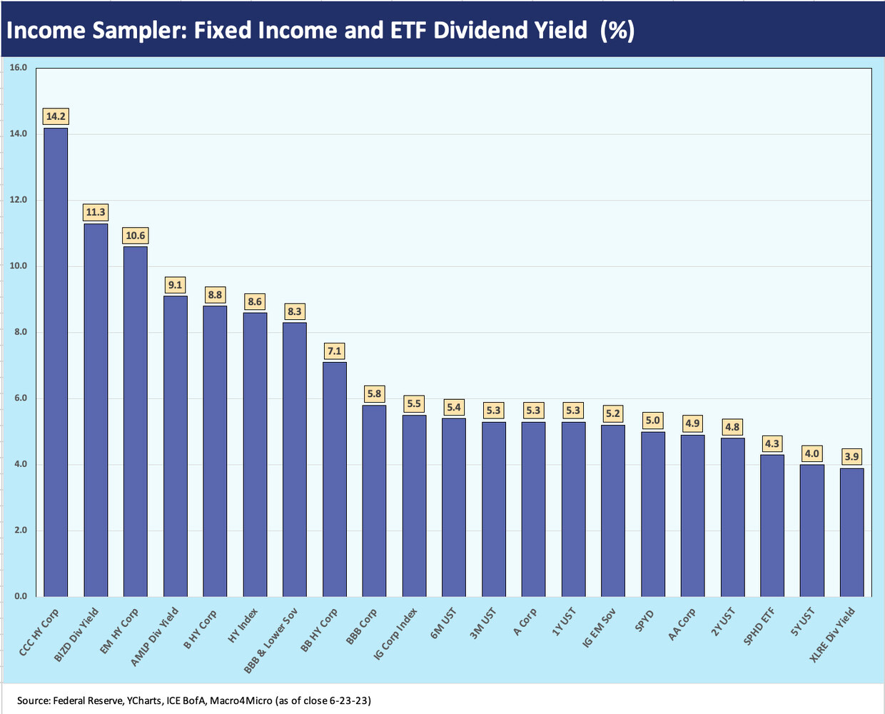
We look at a cross-section of “income samplers” for where UST, credit, and select ETF dividend yields frame up.
The UST migration and shapeshifting offer a reminder that the world has changed while the menu has expanded for those thinking through their mix of total returns via some combination of income and price returns.
The post-FOMC action saw some modest upward migration on the short end, but curve inversions remain the order of the day as we update 2Y to 30Y slope, 2Y to 10Y, 2Y to 5Y, and 5Y to 10Y.
The above chart plots the highest to lowest yields across a range of asset subsectors from UST to corporate bonds (IG and HY) to a few equity categories using ETF dividend yields for income proxies in the broad industry groups. We frame a range of maturities (and thus duration exposure) and a full spectrum of credit.
One asterisk in the credit yields is that the indexes carry a dollar discount with par weighted coupons well below quoted yields. That gets back to the question of cash income vs. cash income + accretion in the longer-term return picture. For example, in US IG, the index yield of 5.5% gets framed against par weighted coupons below 4% (3.9%) and a 10-point discount to par. That mix should be adapted to the specific portfolio needs and parameters, especially when 5% handles can be found in short UST securities.
The battle of yield is clear enough depending on where you want to be on the curve and how much risk the investor wants to take in the underlying assets. The CCC tier and an ETF for Business Development Companies (BIZD) sit on the far left with EM HY Corp and a Midstream ETF and B tier HY rounding out the Top 5 of highest yields. Interestingly, the Real Estate ETF (XLRE), which is REIT-intensive, sits over on the far right with some higher income equity ETFs a bit to the left including S&P 500 high dividend payer baskets such as SPHD and SPYD.
With the 3M UST and 6M UST sitting in the middle at a 5% handle, we would highlight that the lowest risk asset group to the left of short UST is the IG Corp and BBB index. Beyond that, we see HY credit, EM credit and riskier ETFs such as BIZD and AMLP. That means more credit risk, more duration risk, or more price risk to move to the left of short UST.
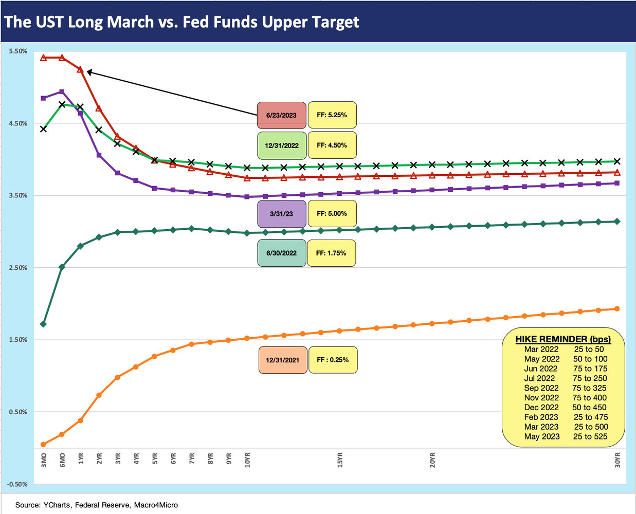
The above chart updates the latest picture of the yield curve migration from the end of 2021 across a few select timelines of 2022 and into 2023 as the Fed kept hiking and the curve went from steep to flat to inverted on its journey. We include a “reminder” box on the Fed hikes. The highs on the short end could still go higher as we covered after the recent FOMC “hawkish pause” (see FOMC: Hit Squad or Suicide Squad 6-14-23).
As we detail further below, the inversions are always cited as the precursor to a recession, but the value of the UST curve should be more like a game clock than an actuarial metric for mortality. Of course, we will have a recession someday. How much lead time does an inversion get before it is a coincidence?
The UST curve inversion and aggressive Fed response has unfolded in a period with an inflation spike that has not been seen for over four decades after a stretch of time with extended periods of ZIRP and QE. The recent timeline does not fit so neatly into models with a handful of cycles to look at.
There are a lot of cyclical debates going on around how sustainable the consumer sector strength can be and when the manufacturing sector might falter after waffling around reasonably healthy levels lately (see Industrial Production in May: Holding, Waiting 6-15-23). Housing also continues its recovery (see Housing Starts: Slow and Steady Sequential Moves 6-20-23).
The argument tends to go quiet after each positive employment report whether JOLTs (see JOLTs: Debt Ceiling Threat Did Not Derail Postings 5-31-23) or the monthly job adds (see May Employment: Payroll Records Continue 6-2-23). For now, the reality of today’s numbers is still trumping the theories around tomorrow’s direction.
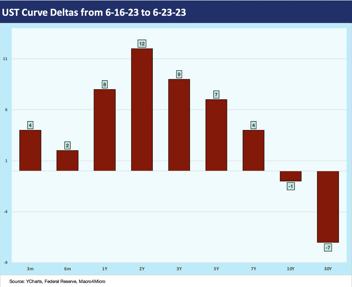
The above chart updates the UST curve deltas for the past week. We see some more upward moves in the 1Y to 5Y segment of the yield curve with some variation at the fringes in recent weeks. The 30Y is down slightly again this week. The wrestling match over whether the bear steepening will try to close the gap with the short end is not going away. The same is true with those making the case that the cycle is vulnerable and the inversion will be the right call ahead of late 2023 weakness and potential 2024 recession.
We pushed back on recession chatter in the fall when too many were saying the recession had already arrived (see Unemployment, Recessions, and the Potter Stewart Rule 10-7-22), but we still expected a fade in later 2023. That is a harder case to make now than in the winter. Contraction is hard to find in corporate guidance, employment, housing, construction (see Construction Spending: Demystifying Nonresidential Mix 5-9-23), and mega-project investment (see Signals and Soundbites: Ashtead 4Q23/FY 2023 6-14-23, United Rentals: Investor Day Backs Up Bulls 6-11-23). We ducked the debt ceiling and Congressional crazies crushing the cycle. Next, we have a government shutdown risk on the budget fights, which is not a major systemic issue at all. The consumer is the key (employment under that category) and Fed aggression on its hawkish pause timing.
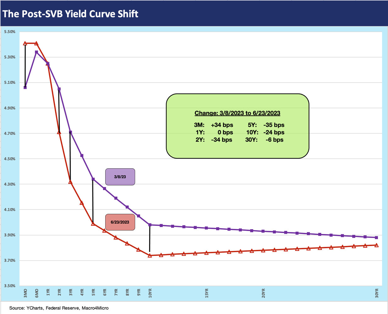
The above chart updates where the UST curve deltas are since the Silicon Valley Bank collapse and ensuing panic. The fear of tightening credit conditions went into the “recession risk factors” column and the rising short rates will continue to cast some gloom on bank earnings via interest margin pressure. Loan loss positioning is likely to add to the earnings pressure for banks and promote defensiveness around risk appetites. With bank earnings season a few weeks away, bank analysts will be on alert.
The above chart just gives a different visual for post-SVB yield curve shifts as the inversion got more pronounced from 3M to 10Y. The potential for more Fed hikes ahead is not going to make life easier for bank deposit costs or deposit retention.
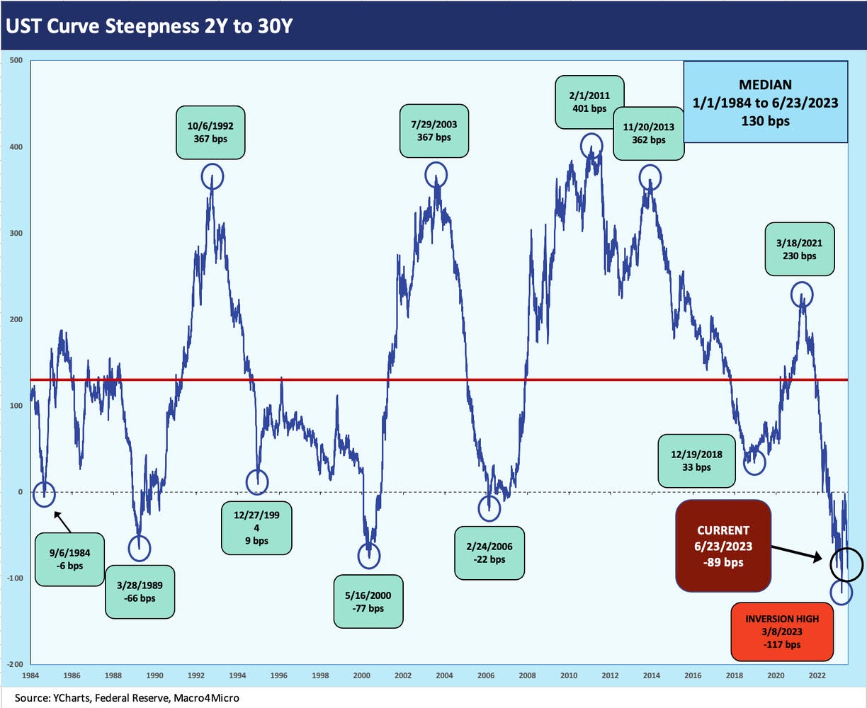
The above chart frames the UST slope history from 1984 for the 2Y to 30Y curve shape. We update these from time to time, and we see the peak inversion on 3-8-23 just ahead of the regional bank chaos. The current -89 bps presents a more pronounced inversion than any prior cycle shown in the chart with the closest being the -77 bps of May 2000 when the budget was balanced and the supply of UST well below where we are today. The end of the 2000 inversion was the TMT bubble implosion but set against a very mild economic contraction in 2001 (see Greenspan’s Last Hurrah: His Wild Finish Before the Crisis 10-30-22).
The above chart looks at the 2Y to 10Y UST slope, which is arguably the most watched given how it covers the sweet spot of both US HY and US IG corporate bonds. The 10Y UST is also the key driver of 30Y mortgage rates. The current -97 bps is down only modestly from the peak inversion of -107 bps in that critical 3-8-23 date ahead of SVB and regional bank mini-contagion.
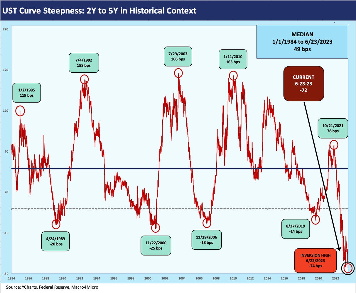
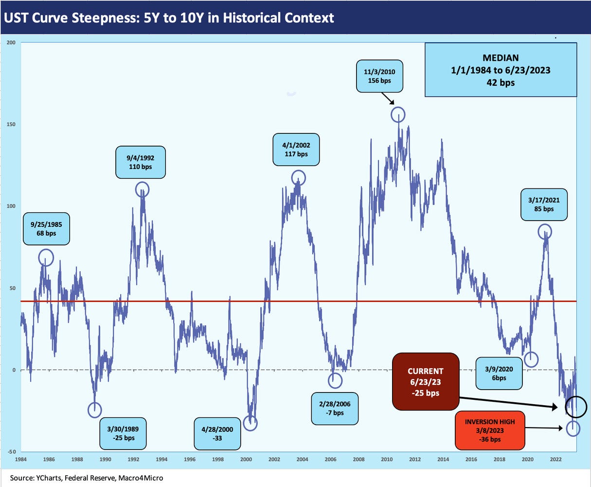
As an exercise, the next two charts break the 2Y to 10Y into two pieces: the 2Y to 5Y and the 5Y to 10Y. The above chart shows a peak inversion over the past week for this segment of the UST curve at -74 bps. There is nothing close in the prior cycles shown in the chart. The 2Y UST has become the new gambling den of UST rates, inflation, and Fed policy. The 2Y UST was especially volatile in March as the market grasped for a handle on where the UST curve would find a range with Fed policy uncertain.
The 5Y to 10Y has a somewhat more normalized inversion at this point vs. past cyclical peak periods such as spring 1989 and spring 2000 and even early 2006. All of those inversions saw ugly endings in the cycles whether the credit cycle after 1989 and 2000 or the systemic crash after 2006.
The 2006 inversions were pretty minimal. There were systemic nightmares soon to unfold in mortgages and counterparty domino risk, but the inversion was not telling much after a few years of tightening and a flat curve after so much mortgage and structured credit excess.
The correlation vs. causation debates eat up a lot of talking clock on those topics, but the problems in 1989 and 2000 only required you look out the window (or at the line items in your portfolio). The inversions were hardly predictive since the trouble had already arrived. We have covered those cycles ad nauseum in other commentaries, and the NBER dating of recessions are not the main event (see Business Cycles: The Recession Dating Game 10-10-22). By 1989 the credit cycle was in disarray and some of the securities shops and S&Ls were a trainwreck (bridge loans, etc.). Legislation to restructure banks and regulatory oversight were put on the books in 1989 (FIRREA) to solve some problems. By 2000, the default cycle was already underway.
The above chart wraps up our yield curve collection for the week with an update of the running migration from March 2022 after ZIRP ended and the Fed started its quite belated tightening cycle to deal with soaring inflation. The box in the chart details the cumulative running deltas through Friday.


