
Footnotes & Flashbacks: State of Yields 1-7-24
We update the state of yields as the first week of 2024 backpedals a bit on UST, credit, and equities.


We update the last round of yield curve shapeshifting as the first week of 2024 starts off with a retreat.
The upward shift in UST mixes constructive fundamentals (notably jobs) with the usual “morning after” reactions to a dazzling rally in Nov-Dec that is more about forecasts than current run rates.
Credit spreads widened during the week to push HY back above 8% with a more material move in HY OAS that includes some mix changes in the CCC tier and quality spreads widening from the bottom up.
We did a thorough review of the 2023 yield curve trends in our recap this past week (see Footnotes & Flashbacks: State of Yields 1-1-24) and the first week showed more action in UST moves than many might have expected as stocks sold off. The UST curve combined an upward shift with a steepening beyond 1Y UST as we detail below in the curve delta charts.
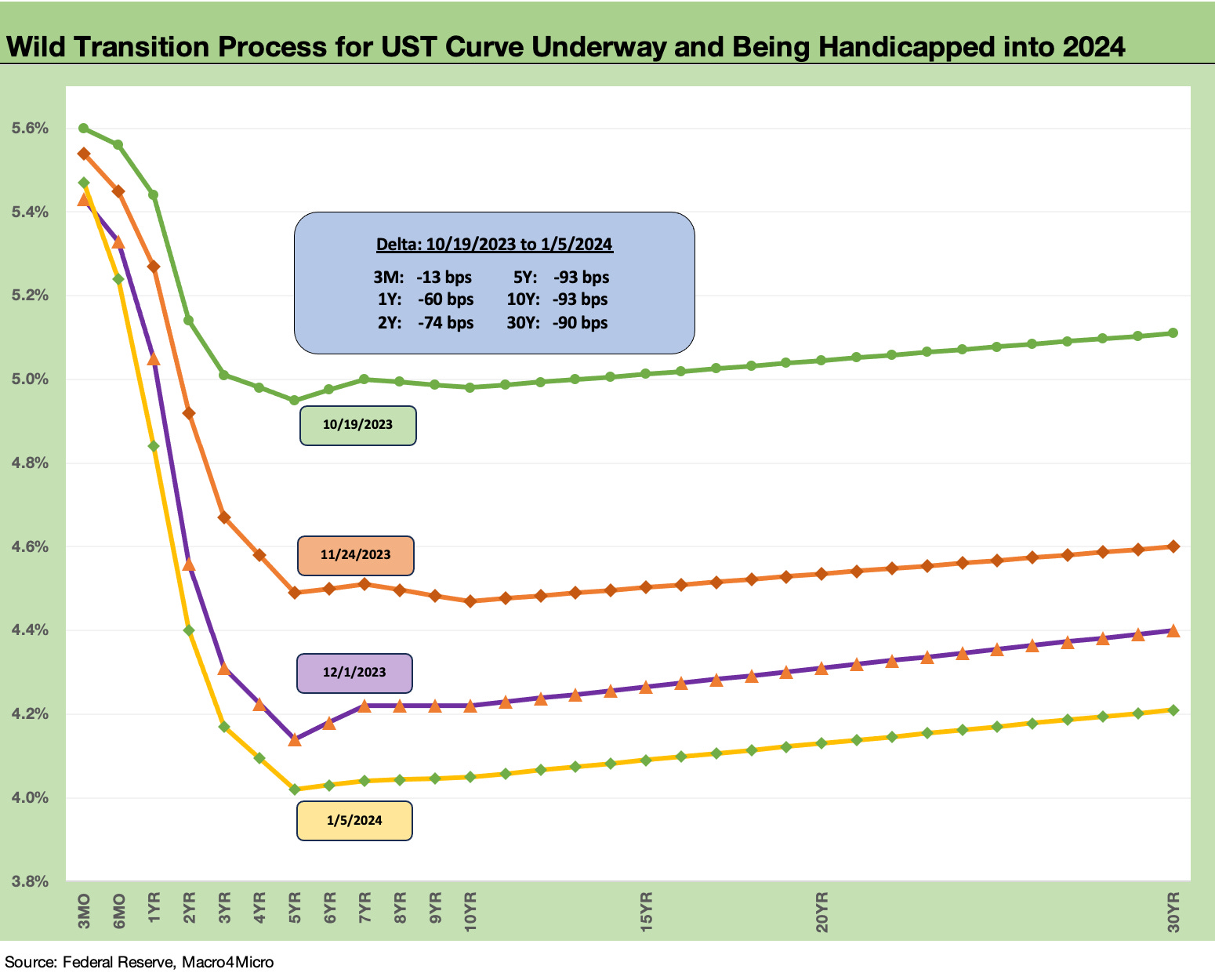
The above chart plots various stages of the downward shift in the UST curve since late October from the dates around when the UST 10Y kept flirting with the 5.0% line on a few different trading days. We include the UST curve deltas over that time period in the box within the chart.
The path from the late Oct 2023 peak to current UST curve shows a “bull inversion.” You don’t see that every day with a dramatic, protracted inversion running alongside strong economic growth and a banner year for equities across a wide range of benchmarks and equity subsectors (see Footnotes & Flashbacks: Asset Returns 1-1-24).
The rarity of the UST behavior comes with the qualification that we have not had an inflation spike and aggressive inflation fight tightening cycle since Volcker. The brief 1994 Greenspan aggression was an anomaly (see Bear Flattener: Today vs. 1994 and Aftermath 10-18-22), but that was more about an ugly bear flattening on fears of inflation that might come and not an inflation spike that had arrived as we saw in 2022-2023.
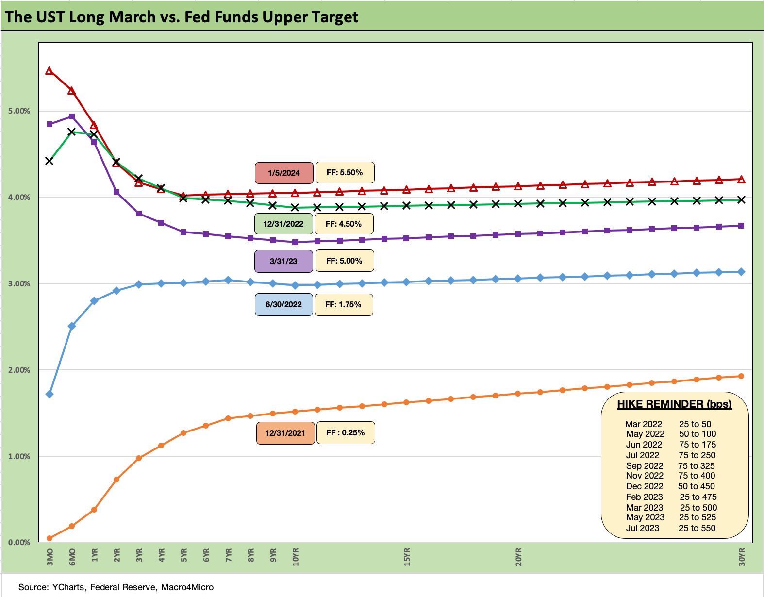
The above chart frames the migration pattern from the end of 2021 as ZIRP came to an end in March 2022 and the duration pain kicked into gear out along the UST curve. We include a memory jogger box in the charts on the Fed hikes along the way.
The UST curve had earlier shifted since Oct down to being on top of the year end 2022 curve, and then this past week sent the UST curve back into a steepening move as seen in the chart. We remain materially above the 1Q23 UST curve after the early 2023 UST rally was in part driven by the regional bank mess.
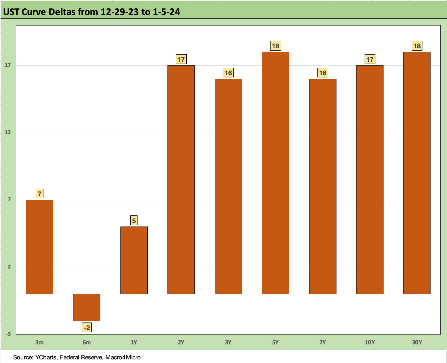
The above chart shows the UST deltas over the past week that brought the 5Y to 10Y UST back above the 4.0% line. As we frame in the next chart, that is still a material move lower from as recently as Oct 2023.
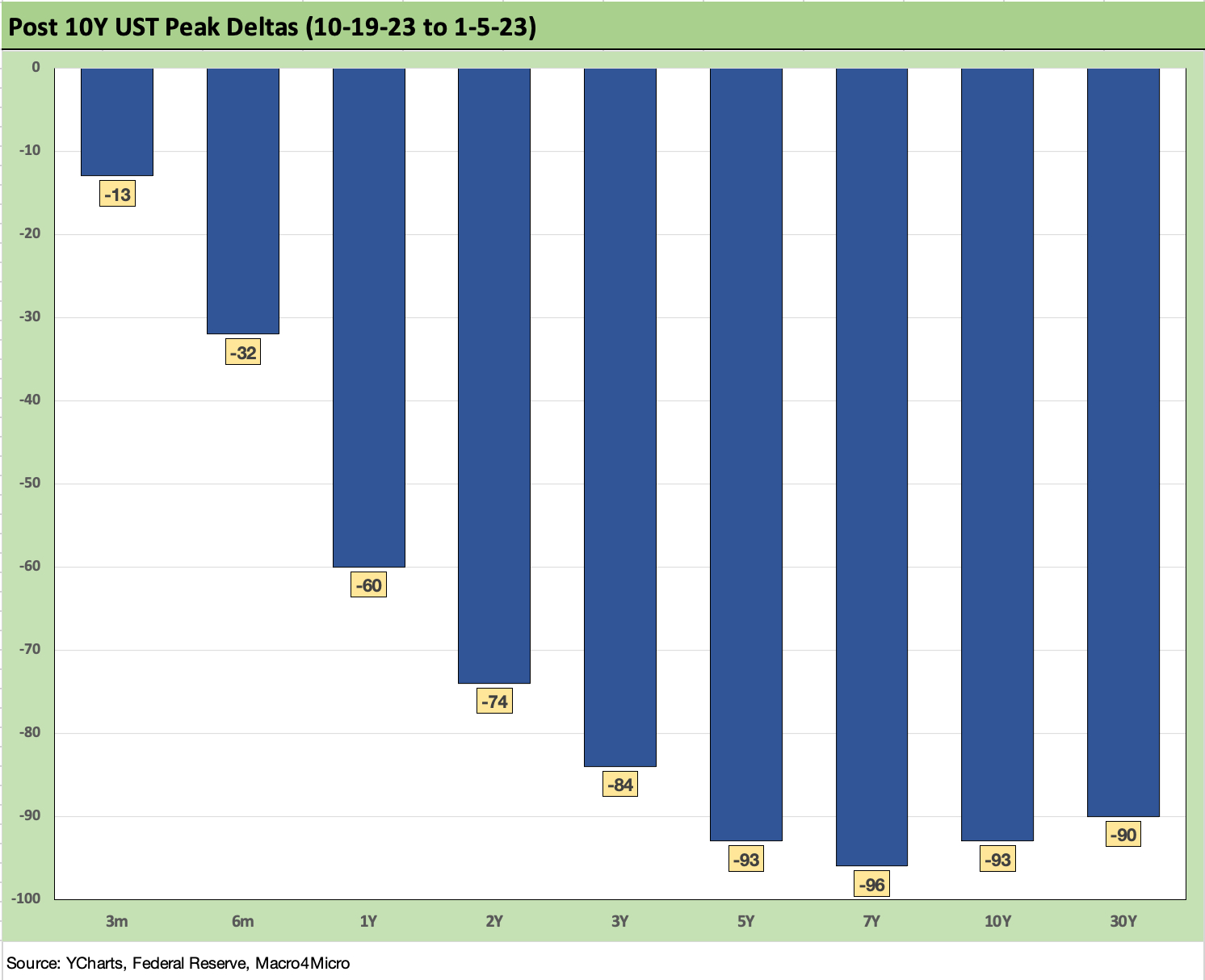
The above chart gives a clear visual on what had unfolded since late Oct with a -90-handle bps decline in yields from 5Y to 30Y UST. That was good news for duration but is building in a lot of assumptions on how the UST curve can get back to a remotely normal shape with positive term premiums for taking duration risk and how that flows into the term structure of corporate credit sector all-in yields for taking longer term duration risk and longer term credit risk.
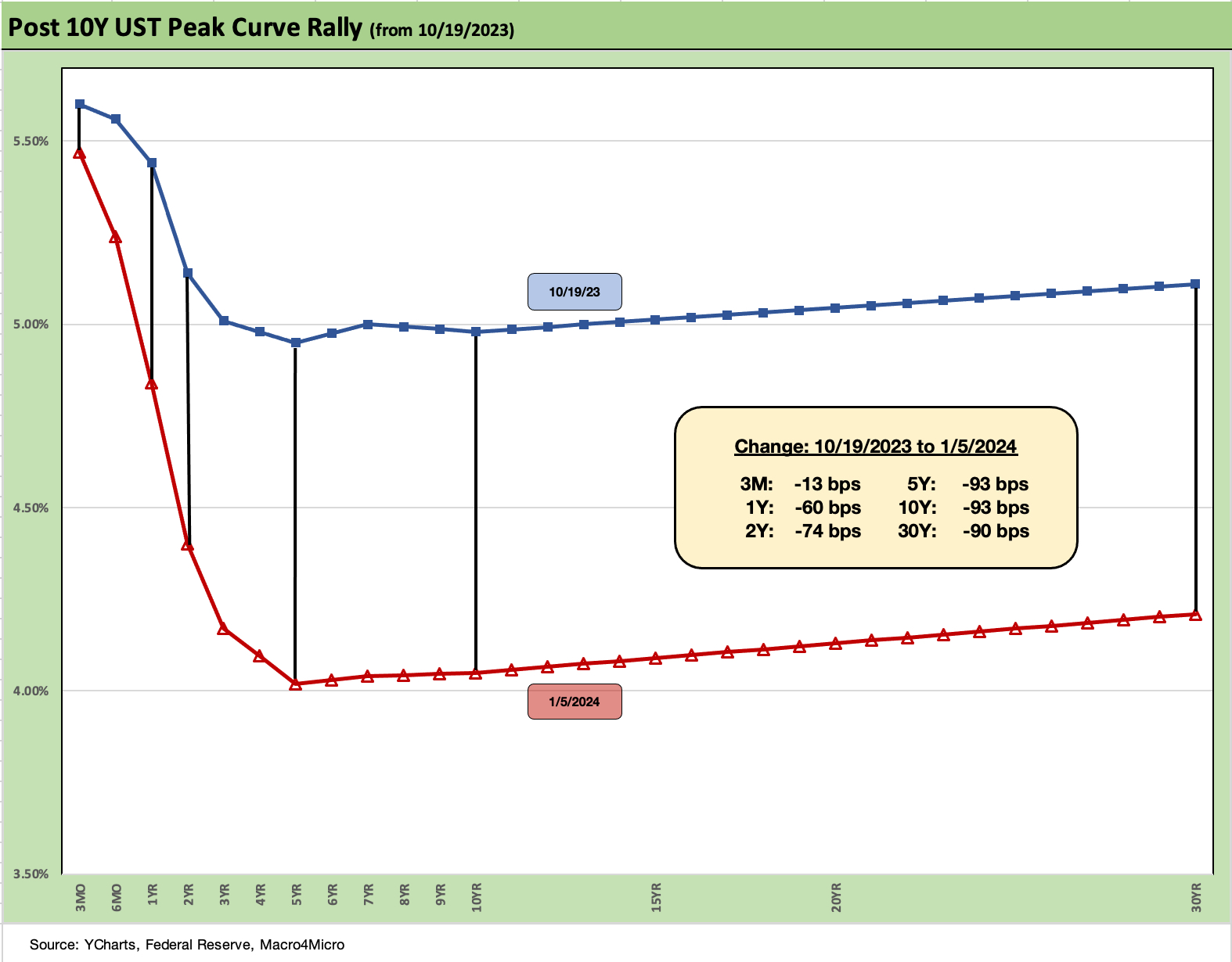
The above chart just takes the UST curve deltas from the prior charts and maps it into a yield curve format. The curve is materially lower now but upward sloping beyond 5Y. If you believe the front end moves lower on rising contraction risk, Fed easing, and lower inflation…that is one set of assumptions.
The other set of assumptions is you assume the Fed, which controls the short end, will declare the inflation war as “mission accomplished” or the enemy is in a clear enough retreat that FOMC policy can turn into a mop-up action with gradual cuts.
The next set of moves is where the level of positive real fed funds rate gets a test on FOMC confidence on what is the right relationship between fed funds and PCE inflation (see Fed Funds vs. PCE Price Index: What is Normal? 10-31-22). The Volcker game plan was for protracted, higher real fed funds well into the expansion.
The real fed funds forecast gets into framing what the FOMC is thinking (how high on real fed funds and for how long) but also implies gauging a confidence level on where inflation will level out in 2024.
Oil is a question mark that has impacts within core inflation as well in energy. Jobs are also a big wildcard. In other key areas, spending levels have remained solid. In addition, geopolitics can be a double-edged sword on the Goldilocks checklist with Mideast stress plus a Taiwan election.
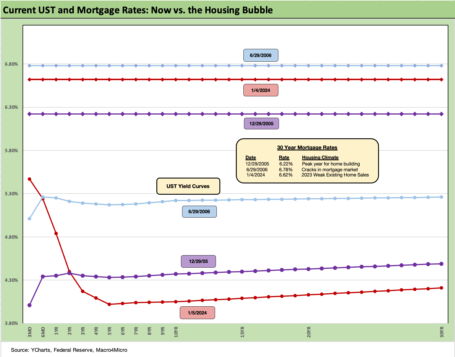
The above chart frames the current mortgage rate and UST curve for the past week (using the Freddie Mac benchmark for 30Y that gets released once a week). We already have written a lot on this topic in prior pieces, but the main point is to consider where mortgage rates are now vs. the housing boom/bubble when demand was obviously very high at 6% handle mortgage rates.
Right now, the rates are between the 30Y mortgage rates seen in 2005 (peak homebuilding year) and 2006 (when subprime RMBS was just starting to show cracks to those who were staring at them). Higher mortgage rates and higher home prices mean materially higher monthly payments for the same profile of house.
From here, the question will be whether the home prices need to adjust to shake out more existing home sales since even a 6.0% rate would be ugly for monthly payments for a homeowner with a 3% handle mortgage rate (the golden handcuffs thing, etc.).
In contrast, the homebuilders continue to have a lot of room to maneuver by having available homes that are profitable at a target price range and can be supported by incentives on the mortgage side (rates and fees).
The spring and summer selling seasons seem a long way off for Fed watching and UST curve handicapping, but the residential real estate brokers have a lot of hopes and dreams similar to the bond managers positioned for steep Fed easing and material UST downshifts.
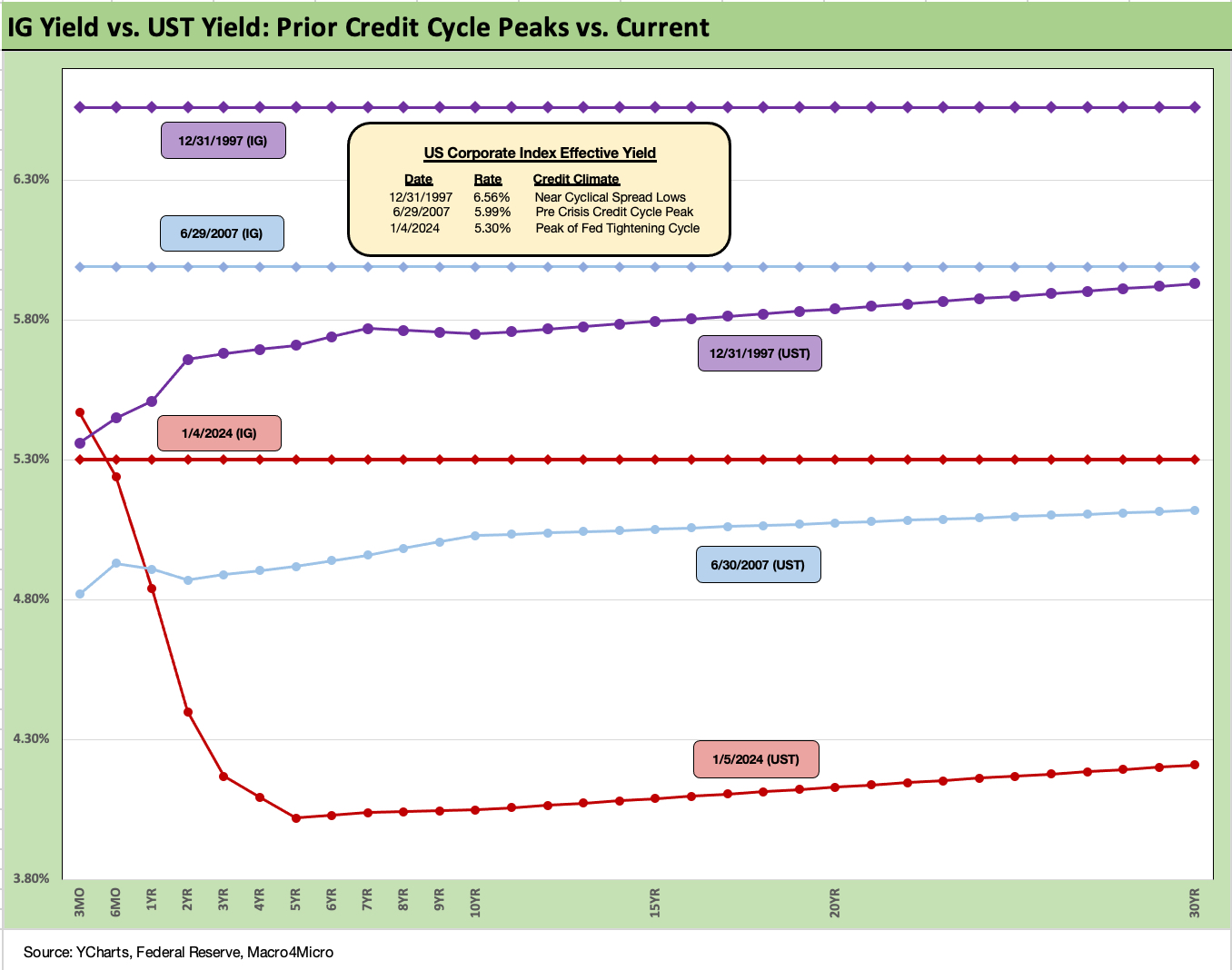
The above chart on IG credit takes a similar approach to what we looked at for mortgages in looking at past peaks, but we use Dec 1997 and June 2007 as useful comps. We have looked in more detail at these earlier credit spread peaks, so feel free to peruse the Jan 1, 2024 recap for those discussions (see Footnotes & Flashbacks: State of Yields 1-1-24). The same is true for the HY yield charts below.
The UST curve is lower and inverted, so that is a material contrast from 1997 and 2007. Spreads are also wider today than 1997 and 2007. IG OAS averaged +95 bps for 1997-1998 vs. the Friday (1-5-24) close of +109 bps.
Oct 1997 did see a frothy low of +53 bps for IG. IG was at +100 bps on 6-30-07 but was running at a lower average of around +93 bps from 1H04 to 1H07. That was indeed a protracted and very tight spread backdrop, so these things have certainly shown they can last when demand is high and asset allocation friendly.
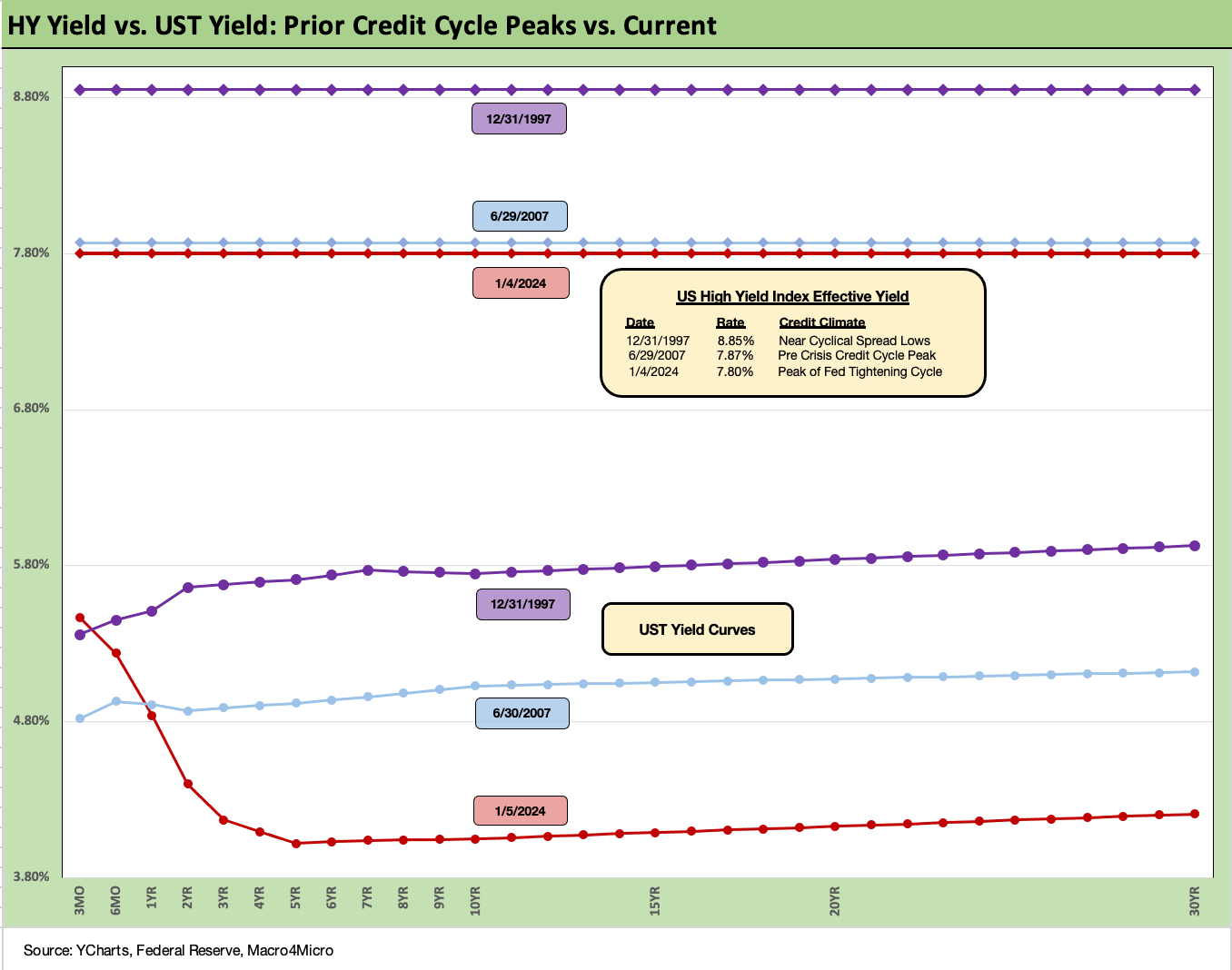
The above chart for HY does the same drill as the prior IG chart. The past week ending 1-5-24 ended at a HY OAS (ICE) of +368 bps as spreads started a broader backpedal and some adverse issuer mix “drop-ins” (Carvana and Office Properties) pushed CCC tier OAS much wider. Those CCC tier index quirks are routine and just part of the drill as companies get downgraded or get added to the issuer mix. Those two names, among some other adds, caused more than +50 bps widening in CCCs on mix.
We saw HY OAS at +296 bps to end 1997. The HY market had seen sub-300 bps OAS for averages in 1H97, 2H97, and 1H98 before the late summer/early fall of pain in 1998 (Russia, LTCM, Lehman) that pushed the Fed to ease briefly and round up street players for an LTCM bailout. June 2007 was the ultimate bubble on the way to the 2008 crisis with HY OAS moving under+250 bps to start the month of June and averaging +270 bps in 1H07.
The current HY market was able to cross below the June 2014 lows (+335 bps on 6-23-14) just ahead of year end (see Footnotes & Flashbacks: State of Yields 1-1-24). The late 2023 rally was threatening a run at the Oct 2018 lows of +316 bps on 10-3-18, but the market backed off this past week with its +34 bps widening overall with quality spread differential across the tiers moving wider (+23 bps BB, +31 bps B, and the distorted +103 bps CCC widening).
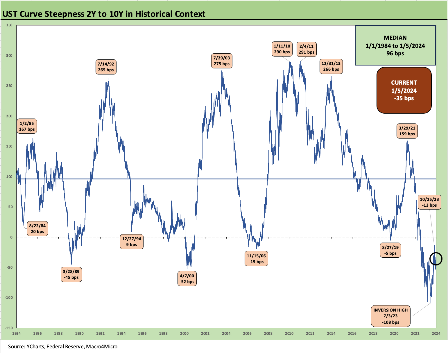
The above chart updates the long-term timeline for the 2Y to 10Y UST slope. The -35 bps inversion is well off the -108 bps inversion of July 2023 and is closer to such earlier “flashing red” inversions as March 1989, April 2000 and Nov 2006.
It is worth highlighting that March 1989, April 2000, and Nov 2006 were not in the middle of an inflation food fight. We look at those periods in other histories we have published, but the 1989 period had a laundry list of problems including a thrift crisis, a case study in LBO excess, the back end of an oil patch crisis crushing some regional economies, and a ticking clock on bridge loans as the year wore on. That is just the short list.
April 2000 had all kinds of structural nuances beyond the TMT bubble ready to pop as the UST market was feeling a shortage of UST supply as Washington actually balanced the budget, and there was less need for the UST to borrow (Imagine that?!). Credit quality and counterparty excess was lurking, but it was a very different set of circumstances including the convergence of the banks and brokers as Glass-Steagall was phased out and ended. As far as 2006 goes, that was late in a cycle of credit excess and really was not much of an inversion.
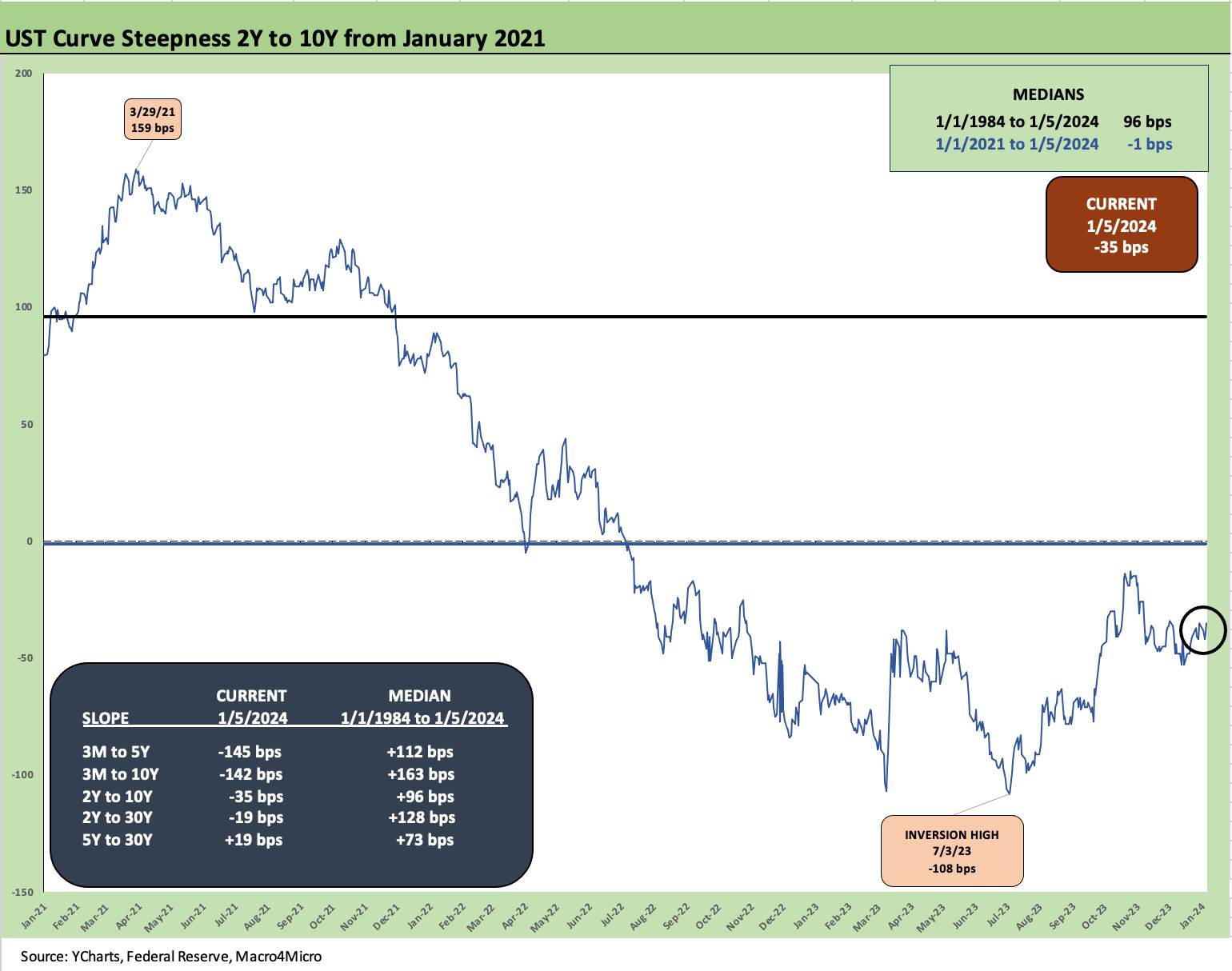
The above chart gives a shorter timeline view of the recent moves in 2Y to 10Y UST, but we include a box that updates the other notable yield curve segment slopes including a long-term slope median for each since 1984. Upward sloping is the rule for the long-term medians.
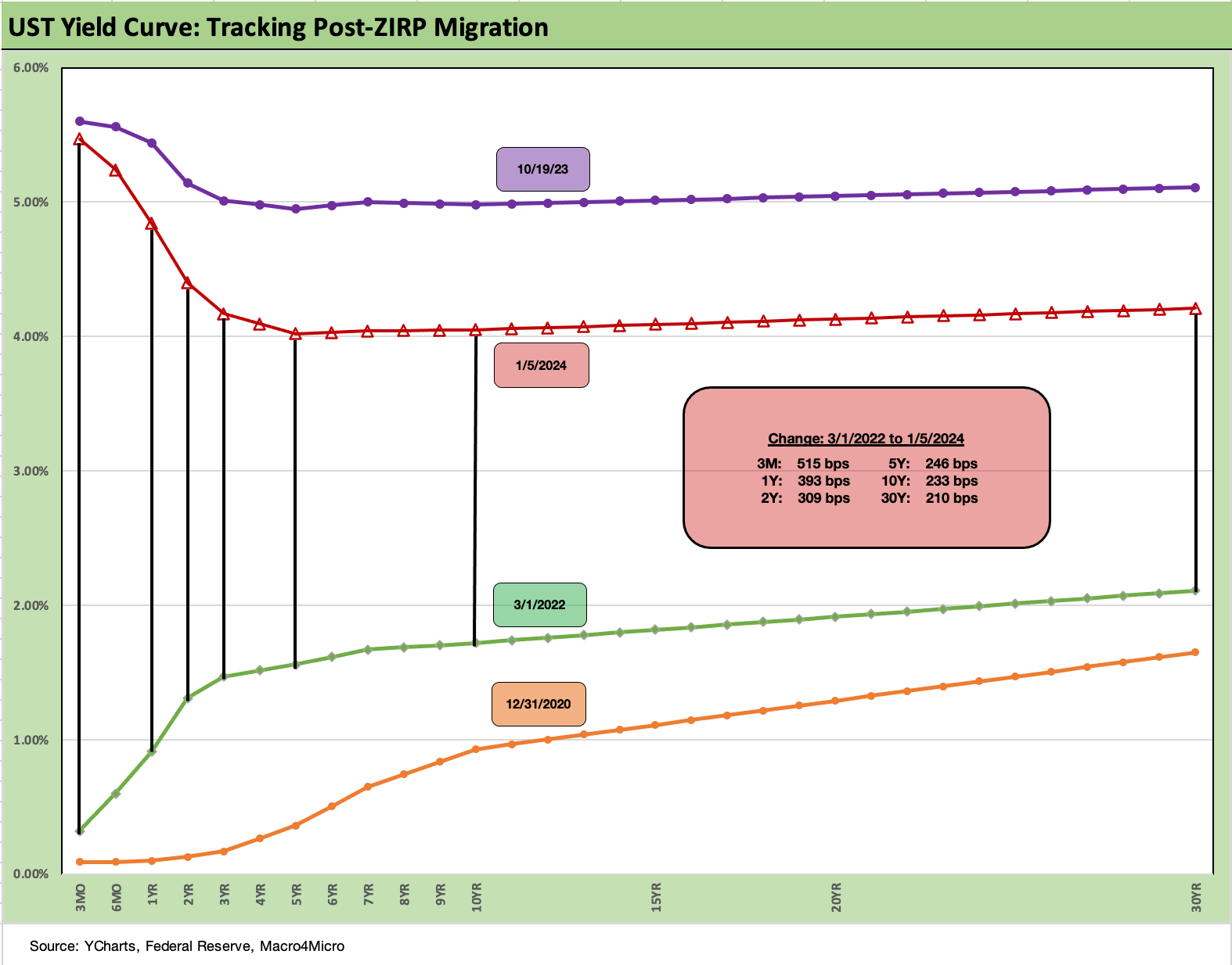
We end with our usual final chart that shows the running timeline from the start of tightening in March 2022. We include a 12-31-20 UST curve as a frame of reference. The UST delta box is derived from the March 1, 2022 UST curve vs. current. The migration started as a bear flattening and ended in the delta box as a bear inversion.
From here, we wait for next week’s CPI for the next test of “rally remorse” if those numbers do not pass muster as tangible progress on the critical services CPI lines. The services inflation line has been holding up the migration toward 2.0%. Shelter will be front and center again as the swing factor in headline and core CPI.
See also:
Credit Performance: Excess Return Differentials in 2023 1-1-24
Return Quilts: Resilience from the Bottom Up 12-30-23
Coupon Climb: Phasing into Reality 12-12-23
HY vs. IG Excess and Total Returns Across Cycles: The UST Kicker 12-11-23
HY Multicycle Spreads, Excess Returns, Total Returns 12-5-23