US HY Spread Histories: Weird Science, New Parts
We update HY OAS with the repricing still well below July 2022 and with an inadequate adjustment for the risks.
“I think you need some repairs…”
In this commentary, we update the increasing volatility of US HY spreads as post-SVB, post-CSFB bank fears sent the market into an upward ratcheting repricing pattern. The volatility and expectation of more spread widening is going to be harder to shake as banks work their way through funding fears and some high-profile transactions. The more regulatory relief and bank crises are in the headlines, the more the market will be suspicious of how many problems there are behind the curtain in the banks.
We took an initial look at spreads in an earlier note this weekend after a week of insanity across the regional banks even after the CSFB crisis escalated (see Spreads Across Tiers: Decompression + Volatility 3-18-23). We dig in some more in this note on where HY OAS stands. We look at the Hi-Lo BB vs. CCC differentials and the BBB vs. BB incremental OAS relationship along the speculate grade divide. We then frame some yield relationships.
On Sunday, the screen was showing reports of UBS agreeing to buy CSFB for a price tag ($1 bn per FT but then bumped to $2 bn). That is less than a typical credit desk inventory in the 1990s and a dramatic markdown from Friday close. That is just one more data point to make markets nervous around what is going on over the wall in the banks. That is a testament to how much risk may be lurking and the worries around funding challenges that are built into the pricing of the UBS deal.
CSFB has a lot more counterparty knock-on effects in capital markets than Silicon Valley Bank, which was seized by the FDIC the prior Friday (see Spreads Across Tiers: Decompression + Volatility 3-18-23). SVB was very important in so many ways, but CSFB is a case study in counterparty tentacles. There is a lot of action to play out as we head to an important FOMC meeting and update this week, but the ability to cure a confidence problem will not be taken care of with a plus-or-minus 25 bps fed funds debate or a carefully worded Powell press conference. It will be worse if the CSFB deal falls flat. As of now, it looks like it’s going through.
For US HY risk pricing, there is little exact science to the exercise, but the HY OAS history matters in context for inputs. The SVB blowup is more about the broader impacts on regional bank funding nervousness and what that will mean for credit contraction and bank lending impact from midcaps down to small caps and community banks. That holds great significance to the macro picture under the traditional rule that “credit growth = expansion” and “credit contraction = recession.” Too much of either drives bubbles or hard landings.
The above chart brings forward some of the detailed histories of US HY spreads. We looked at more of the time horizons and detailed histories in some reports during 4Q22 (see Old Time Risk: HY Season Faces Challenge 11-7-22) and earlier this year (see BB vs. CCC Spreads; Choose Wisely 1-8-23). The variety of underlying factors across the default cycles from the 1980s LBO boom and then across the TMT implosion and the credit crisis show how different the credit cycles are in terms of trigger points and severity (see UST Curve History: Credit Cycle Peaks 10-12-22).
The material repricing outside broader default cycles as seen in the fall of 2011, late 2015 early 2016, and a mini-wave in December 2018, offer a reminder that a lot can happen outside default cycles and recessions. We are clearly not in a default cycle right now even if the default rate doubles in 2023.
Meanwhile, the recession worries are more a forward-looking “to and fro” forecast with the US economy still expanding with very low unemployment. In spreads, however, a lot can happen in a hurry, and it is a challenge to see an immediate end to this banking quandary. That is especially the case when Washington looks more like a drunken saloon brawl from an old Western movie. Crises are opportunities to exploit more than a need to execute on sound policy (debt ceiling anyone?).
The history of the HY spread waves run the full gamut of causes from the fundamental to the systemic, but the current price action will be the first one set off against a backdrop of high inflation that sees a concerted effort in monetary policy to beat inflation back. Inflation during the late 1990s TMT cycle was not that high.
In contrast, the Volcker inflation fighting years of 1979-1982 did not feature a HY bond market as we know it today. There were bad credits and risky bonds, but those were delivered the old-fashioned way, i.e., deteriorating credit quality. They did not get underwritten that way. Back then, the world of LBOs was mostly a private placement “insurance company thing” (with some action from GECC and Westinghouse Credit).
In other words, this variety of factors continues the history of every credit cycle being unique in the modern HY bond era. To add to the challenge of the differences, there is a very small sample with arguably only four HY bond credit cycles and one of them under Glass Steagall, one when banks were pouring into the space, and now with a record-sized market but the fewest active market makers since the 1980s.
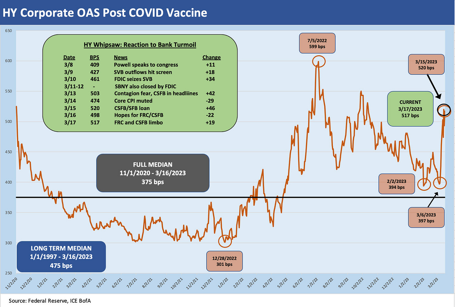
The above chart shortens up the recent time horizon for better visuals on the swings. We start the time series just before the headlines hit on the COVID vaccine that kicked off the next stage of the risk rally. The spike in demand for risk went into even higher gear. The 2021 appetite for speculation flowed into a record refi-and-extension cycle across asset classes from home mortgages to US HY bonds and fueled an IPO boom that many are still paying for.
With the recent HY index spreads of +517 bps OAS (ICE BofA), the market is a long way from the almost +600 bps levels of early July 2022. We see a few waves across this period from late 2020 with the big pop in mid-2022 as the market struggled to absorb the potential effects of war and an oil spike along with increases in fed funds.
We also saw an upward migration of the entire yield curve on a scale not seen in four decades (SVB did not get that memo). The HY OAS in Sept 2022 and early Oct 2022 saw some low to mid 500 bps OAS handles (+550 on 9-29-22), so the current OAS pricing is not a 5-alarm blaze and could even be considered quite muted given the health and credit risk appetites of banks and bond investors is under a cloud. That is why we see spreads very vulnerable from here. You can’t wind up this situation with a few bank deals and a strongly worded voice of support in the middle of an ugly political divide.
The Fed policy and inflation debate is still here also…
Debates on how high fed funds would need to be was a big bucket of opinions across 2022 and remain so. That will heat up this week again with a new ingredient in the bank system stress. The fact remains that real fed funds were negative across the past year and look to some more like the failed early/mid 1970s approach than the Volcker success story (see Fed Funds-CPI Differentials: Reversion Time? 10-11-22, Fed Funds vs. PCE Price Index: What is Normal? 10-31-22). The chances of success in beating inflation without driving bigger problems in banking confidence is a major challenge. The actions by Powell and the FOMC this week might be set up as a PR lose-lose with inflation and recession fears on two front burners.
As someone who started working the same month the Misery Index hit 22% (see Misery Index: The Tracks of My Fears 10-6-22), the absolute rates the past year were not a shock per se, but the action was being taken in a market with record sized balances of HY bonds, leveraged loans, and private credit after being hooked on ZIRP and minimal rates and QE even when the Fed did make sporadic efforts to normalize in the post-crisis markets (e.g. 2015 to 2018). Risk management perhaps took a back seat (at SVP, “this is your brain on ZIRP”). The pace of rate increases was brutal (see House of Pain: Markets Jump Around 10-13-22), and 2022 ended up with equities and duration both slaughtered (see The 2022 Multi-Asset Beatdown 12-31-22).
HY vs. IG Corporate OAS differentials…
In the next series of charts, we look at some OAS differentials and yield comparisons across the credit tiers. The full spectrum asset allocators that diversify exposure to credit broadly (IG, HY, loans, EM) needs to be sensitive to the full spectrum of credit tiers, but the same is true for IG-only players with high BBB exposure (e.g., insurance). The HY funds need to move around their relative credit tier concentrations by industry and credit tier and be ready for redemption risks, so it is never easy.
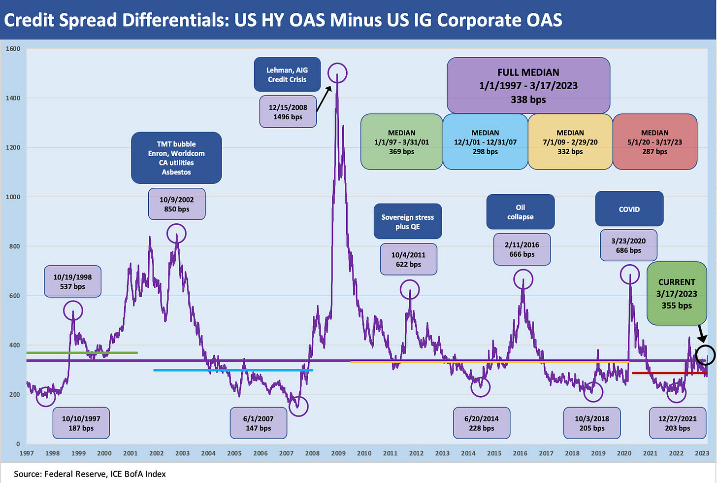
We have looked at these OAS histories in prior comments and throughout this piece, and the time series always reminds us how ugly repricing can be whether tied into a default cycle after an excessive origination cycle (LBOs in the 1980s, TMT in the 1990s), tied to an industry crunch (e.g., oil and gas) or a bank systemic shock (2008). The current backdrop is a hybrid of bank (and thrift) stress like we saw in 1989.
Turns in credit cycles typically requires asset stress tied to borrower debt service risk, but this current problem stems from the UST, agency, and MBS portfolio on yield curve driven losses. The CSFB situation is far more involved after years of issues with stress points in 2016 and beyond (e.g., Archegos) that raised the lights on more than a few issues.
Funding stress and confidence problems just don’t go away quickly, and the deals struck, regulatory actions, and a pending distressed sale of an iconic global banking/brokerage firm (CSFB) with a major market presence in the US across the cycles just cannot be erased from the risk aversion ingredients. That leaves capital markets risk pricing very vulnerable even with good news on a CSFB deal. “Good news” is the absence of collapse or a low bar.
The current HY-IG OAS differential of +355 bps captured in the picture is only modestly above the long-term median of +338 bps. Making allowances for the fact that the HY index is higher quality now than in past cycles has to be considered as well. The mix distortions also apply to the absolute levels of interest rates and how the risk premium fits into the picture in proportion to the risk-free asset (UST) or investment alternative to US HY. For example, a 400 bps OAS on a 5Y UST of 3.5% is not the same as 400 bps on a 1% 5Y UST with respect to the components of risk premiums rolled into the all-in yield expectations.
We feel like a lot of the HY-chasing to start 2023 was in part tied to the concept of yield expectations finally being satisfied. The problem is the yields in recent months had shown spreads hanging around median levels in a market that was not a median risk backdrop.
The OAS level in a rapidly shifting UST market gets back into the old debate of spreads vs. minimum expected yield vs. relative yields for investment alternatives for a given set of risks. The alternative is often either IG bonds or loans in the allocation of a portfolio to credit risk exposure and relative income levels. More on that topic some other time.
The investment grade vs. speculative grade divide…
The next chart looks at the BBB tier vs. BB tier pricing. The BBB tier at this point is the size of Germany (i.e., much bigger than France and the UK) while the BB tier is the largest in the US HY market. In contrast to long ago cycles, these two tiers are the core of the US credit markets even if the A tier is much larger than BB. The relationship between the BBB and BB sets the tone for the investment behavior of many institutional funds.
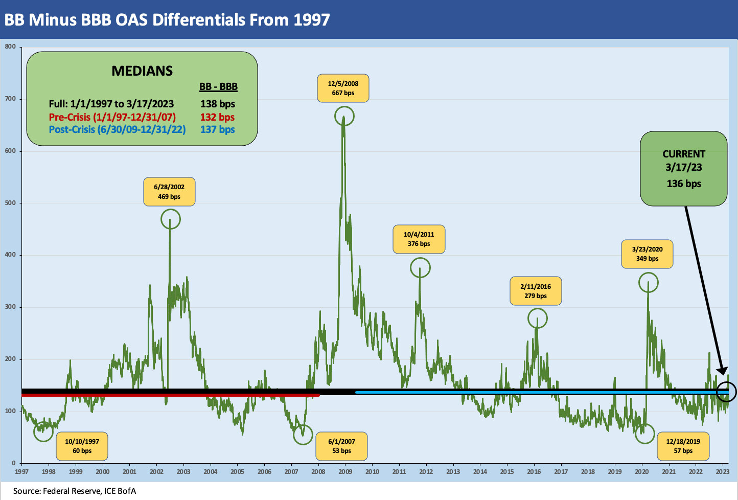
The above chart updates the incremental spreads in the market for the move from BBB to BB. From the perspective of those looking to play the spread differentials at the cusp the differential can be seen as the “cost of being wrong” (on the downgrade) or the “winnings for being right” (on the upgrade).
The long term median is +138 bps, and that means the most recent levels are hanging around the median. If we look at the median for the pre-crisis cycles and the post-crisis cycles in the box on the chart, the medians are still pretty close. Before Dec 2007 (the cyclical peak), we see +132 bps. After June 2009 (the cyclical trough), we see +137 bps. If we drop in all OAS data points from the start of 1997 we see +138 bps.
The above chart can be used a few different ways. If you believe that downward trajectories in credit cycles drive quality spread widening from the bottom up, then this BB/BBB relationship is one you watch to see how much pressure comes from weaker demand for the CCC tier and weaker B names.
You can also see a shift in risk appetites from above as the reach for yield impulse from traditional BBB buyers dipping down gets dialed back. That affects the incremental risk premiums and incentives along the speculative grade divide. It also frames the “cost of being wrong” for an investment grade only portfolio. We also look at the BB vs. the BBB OAS differentials in a separate IG bond commentary.
Our takeaway from this chart is that the cyclical pattern should be exposed to some material decompression from this point. The BBB and BB tiers can widen in lockstep and the differential can hold steady, but then you get into a range of other issues on how longer duration BBB tier exposure will be hit under that scenario and the more nuanced analysis of loss exposure there.
We also have the risk factor that the banks could be a big part of the current problem and pricing trends from here unless the structural risks are addressed. That has a direct impact on BBB OAS but more importantly on lending practices into the riskiest exposures. That is when the market can start talking about a default cycle and more material repricing from the CCC and B tier upwards. When banks are in trouble, the most exposed to credit needs and cooperation with the banks are the most at risk. That means HY issuers.
The Hi-Lo BB to CCC relationship…
The CCC tier is small in context with the BB tier 4.7x the size of CCC in market value (BB $611 bn market, CCC $129 bn). The simplistic way to look at BB vs. CCC is that BBs are bond risks and CCCs are equity risks even if that does not apply to all CCC names. In credit cycle downturns or in the case of industry or issuer stress, a CCC bond can quickly turn into a high risk stock with a coupon.
The CCC tier often faces steep discounts, thin liquidity, and highly inefficient markets biased toward those with more information access (banks and hedge funds have more windows to peak through, doors to listen at, and coffee machines to banter around). That can stack the deck when the shifts in pricing are rapid. The CCC tier can be where the most proprietary profits (and losses) can be generated. The history of pricing differentials drives that home below.
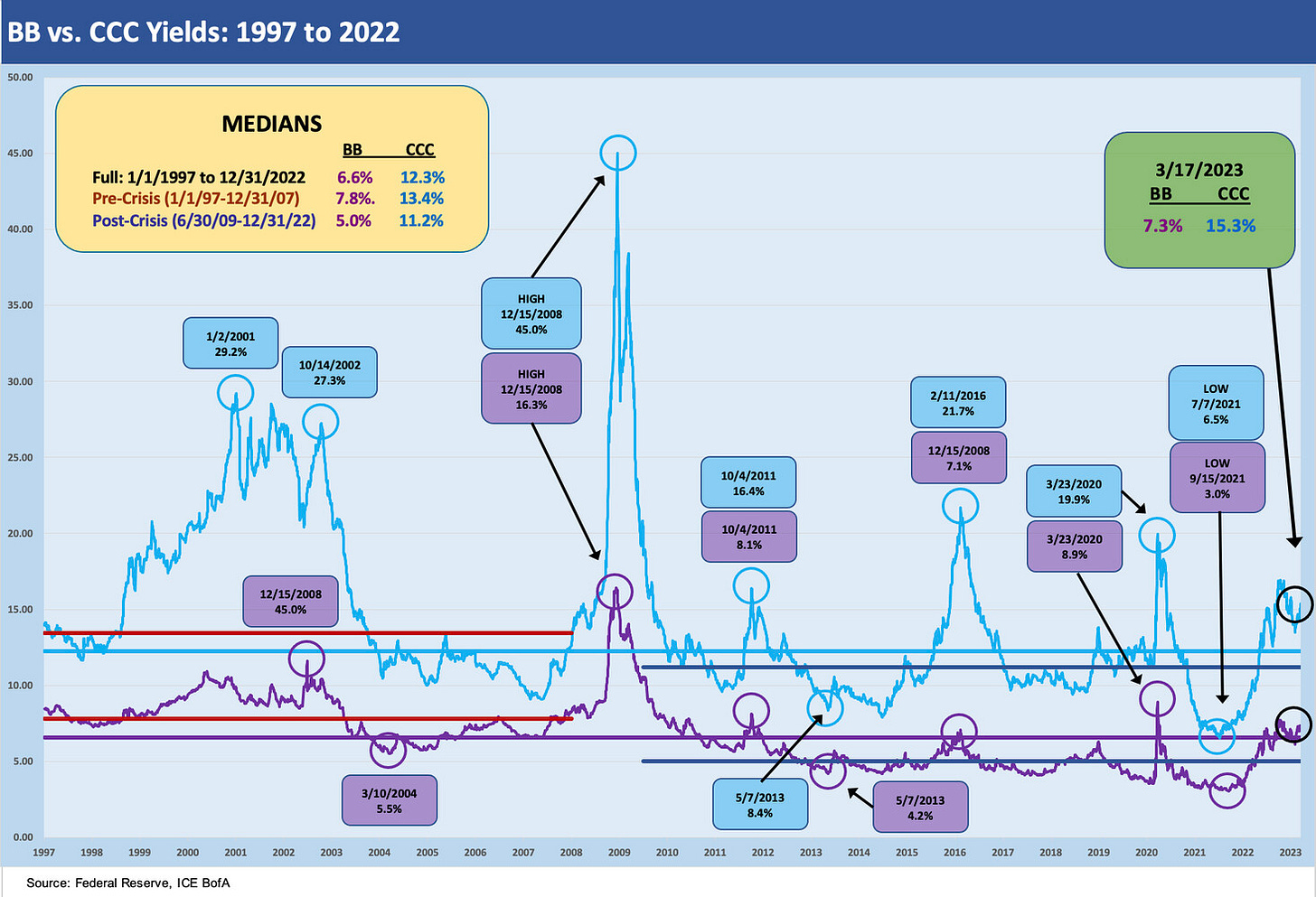
The above chart tracks the spreads for the BB and CCC tier OAS across the cycles. The CCC tier is obviously where the numbers really soar in downturns as the bonds shift to a dollar price framework from yields and total returns rule more than excess returns. The pattern for CCCs posted above speaks for itself.
The long term OAS median for BB tier is +310 bps and for CCC tier is +974 bps. The most recent spreads of +361 bps and +1159 bps for CCC at least allow the CCC tier to generate what are equity-like expected returns. In a ZIRP and QE world, even 1000 bps spreads framed against very low UST rates were barely adequate for the risks.
The spread differentials are captured above in a single time series line. What is striking about the longer-term medians is that the long-term differential of +635 bps is similar to the pre-crisis (1997-2007) median of +623 bps and the post-crisis (June 2009 to current) median of +623 bps (yes, the same). The current differential seen in the market is +798 bps or well above median. The spikes in the differential across the cycles stand out in the time series, whether in broader default cycles or industry crashes (e.g., the oil and gas sector stress of 2015-2016.)
Periods of stress of any sort bring major quality spread widening of this HY Hi-Lo differential with spread widening radiating up from the riskiest tiers across the B tier into the BB tier. We expect this relationship to be volatile but wider as more credit quality pressures weigh on issuers and industries in 2023. Such periods are also when skilled managers find the best opportunities to buy at steep discounts while riding out the mark-to-market volatility.
We switch over to BB vs. CCC yields for the next few charts. The above frames the gross yields. The interesting angle on the CCC tier is that the long term median for CCC tier is over 12%. This implies an expected return at the median in excess of the (very) long-term nominal return on equities, which is around 10%.
As a frame of reference, the two decades of bull markets in equities in the 1980-1990s ran around 18% per year. That sets the highest return expectation for fundamentally risky assets. The problem with CCCs is you buy then at par and only get par back (if all goes well). The trick is to get out when problems surface. Across time, the Sharpe Ratios on credit tiers show the BB tier to be the better value than CCC.
The above chart plots CCC yields vs. BB tiers as another frame of reference on the incremental compensation for the much higher incremental risk you take with CCCs. This shows the ratio of yields between the CCC tier and BB. We are sitting right at the median at this point. It’s a simple ratio to highlight the historical incremental yield relationship.
The adage is “buy CCCs that are CCC on layers and leverage and not on fundamentals” still has to be held up the reality that the default rates on CCCs are exponentially higher than the B tier and the B tier is exponentially higher than the BB tier long term average default rates. Of course, many of those CCCs started life as investment grade or BB.
CCC issuer selection is hard core analysis and more so than equities given the range of structural risks, the legal documentation labyrinths, and all that wrapped up with recovery rate estimates and stressed asset valuations. As Hertz underscored in its bankruptcy (26 cents on CDS, par plus on exit), the growth of asset lite services operations makes the CCC tier analysis and bankruptcy work more complex than ever.


