
Tale of the Tape in GDP: Trump vs. Biden
We look at a range of GDP line items to size up Trump vs. Biden just to inject a few more facts into the framework.


We update the quarterly GDP growth bar chart for Biden vs. Trump terms for a fact check update that tends not to get too much attention in some of the political media chatter and partisan spinning.
We also add in a visual on Personal Consumption Expenditures, the dominant driver of economic growth and a useful measure that ties into a range of contributing factors including policy, demographics, and employment.
We also add a chart on Gross Private Domestic Investment, which notably reflects fixed asset investment trends for each term as seen in capital expenditures and spending levels.
We take a look at the Nonresidential line of fixed investment as well since that is where the corporate tax incentive programs of the Trump term made a priority of the Equipment line while the Biden incentives targeted a wider range of those lines with his programs translating into a heavier focus on Structures given the construction-related effects.
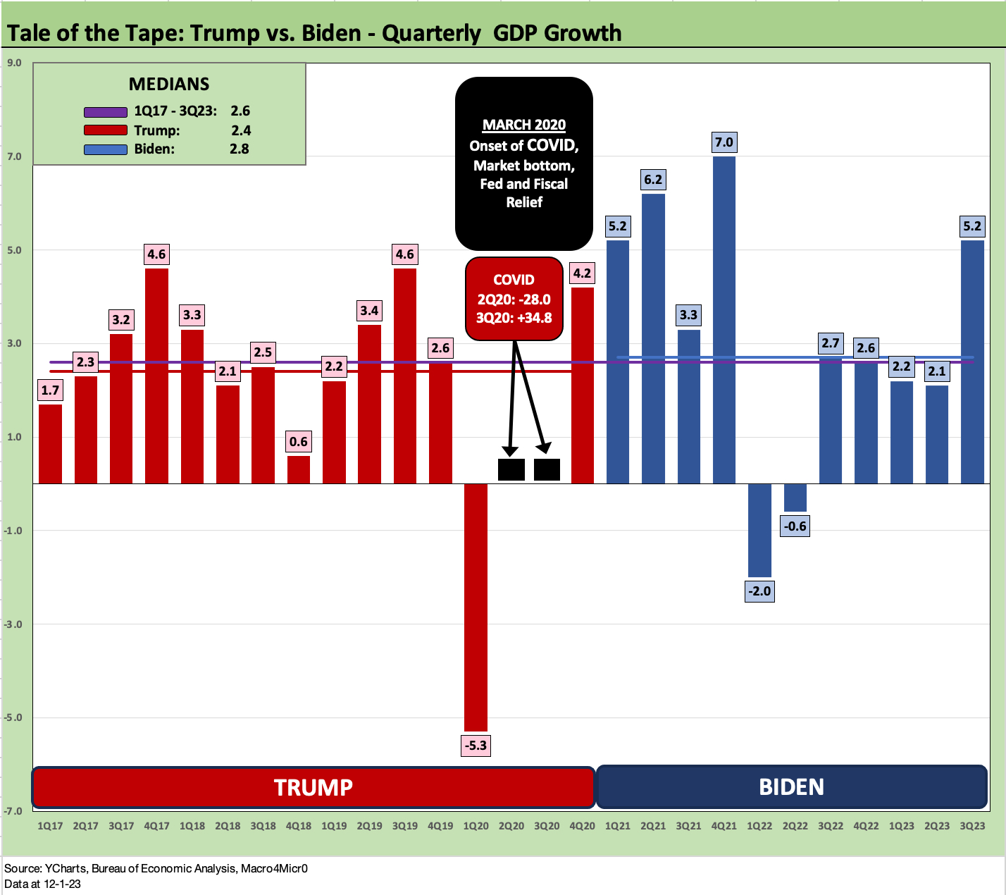
In the above chart, we update the recent histories of GDP performance by quarter across the Trump and Biden terms, which means 1Q17 through 3Q23. We can average the quarters or take the medians or ponder the highs and lows. We simply add in the medians in the chart that show the Biden median at 2.8% for GDP and the Trump median at 2.4%.
The overall median of 2.6% is in a US economy that has been a slow growth story generally in the new millennium across Bush, Obama, Trump, and Biden. Anyone laying claim to the greatest economy ever after the year 2000 is a liar, delusional, an idiot, or all of the above.
We frame the average GDP (vs. median) for Biden at 3.1% vs. 2.4% for Trump. We can take out 2020 as a pandemic anomaly and his 3 years averaged 2.8% using those numbers. The hardline budget hawks have a case to make that a weak US balance sheet undermines growth. The problem is that they can’t praise the Trump economic performance in the next breath. We lay that off on a mix of cowardice or ignorance or both.
Biden did get a big benefit from the post-COVID rebound, but he also had tangible spending and incentive programs and employment numbers to back up many of the claims. The fact that he almost blew it all up with Build Back Better is more a theoretical debate at this point.
Blur baby blur…
We like looking at the objective numbers for obvious reasons, since the numbers quickly get blurred and forgotten until the next one. We spend most of our time below the headlines whether looking at consumer indicators, PCE statistics, employment numbers, capex trends, industrial production stats, housing sector developments, various industry and company fundamental reports/guidance, and what signals the financial sector is sending.
The GDP numbers are not a hot topic generally since they tend to take the BS out of the “high level” (and we mean “high” in the lowest way) political trash talking and broad misrepresentation that you see “hourly” on the non-business channels. Those types don’t like too many facts cluttering up a good story.
For this commentary, the charts do the talking. Bar chart higher or lower? That is pretty objective. We condense the two main quarters of COVID (2Q20, 3Q20) into a box with those two quarters showing swings lower and higher around the 30% area. They would distort the visuals on the rest of the chart.
The GDP numbers above show the “height test” on each quarter of the Trump term and the Biden term through the most recent second estimate for 3Q23 GDP (see 3Q23 GDP: Fab Five 11-29-23). We have some more links to histories and directly relevant articles at the bottom of this piece.
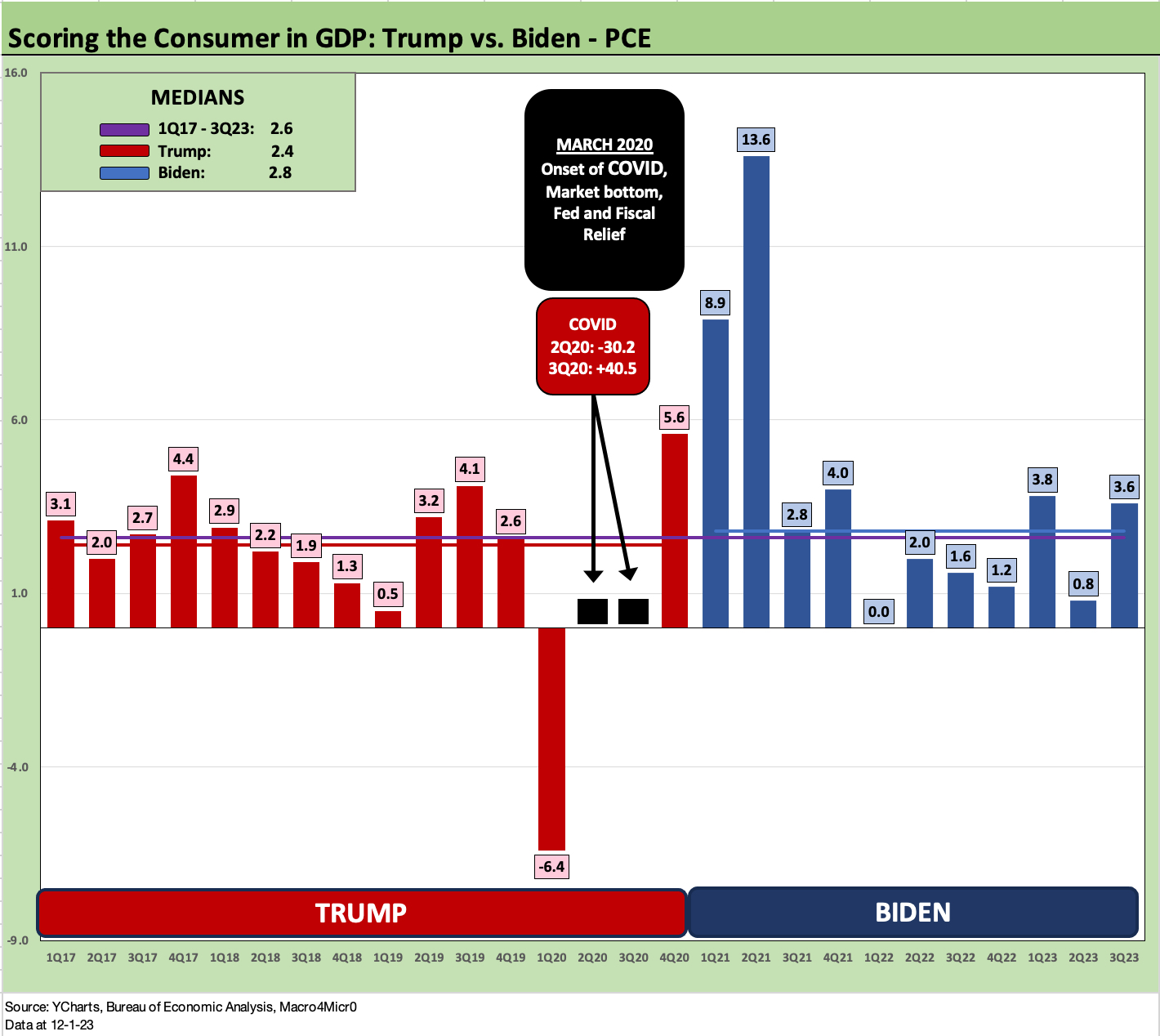
The above chart frames the PCE numbers that drive GDP at 68% of GDP for the most recent 3Q23 data. PCE is the main event, and it takes a lot of economic shock(s) to make it go lower. We had one with the pandemic. We also had one with the credit crisis and housing implosion.
Demographics and even remotely reasonable employment numbers bias this number higher. More people employed supports its growth. Retirees don’t stop eating and buying when they retire. Illegal immigrants keep spending. Even if a lot of spending is “off the books” in terms of income flows, 12 million undocumented people buy goods and services (even if in cash). In other words, the Big Mac rule applies (3 Big Macs is more than 2 Big Macs), and GDP growth has the pattern of growth it boasts for a reason. We also know that Trump eats 4 Big Macs.
Looking at the chart, we see the Biden median PCE growth at +2.8% with Trump at +2.4%. Biden has record population and record payroll. Both help. Trump had a record population also. So did Obama. So did Bush. (There’s a pattern forming here.) But PCE growth rates are still heavily tied into spending and jobs.
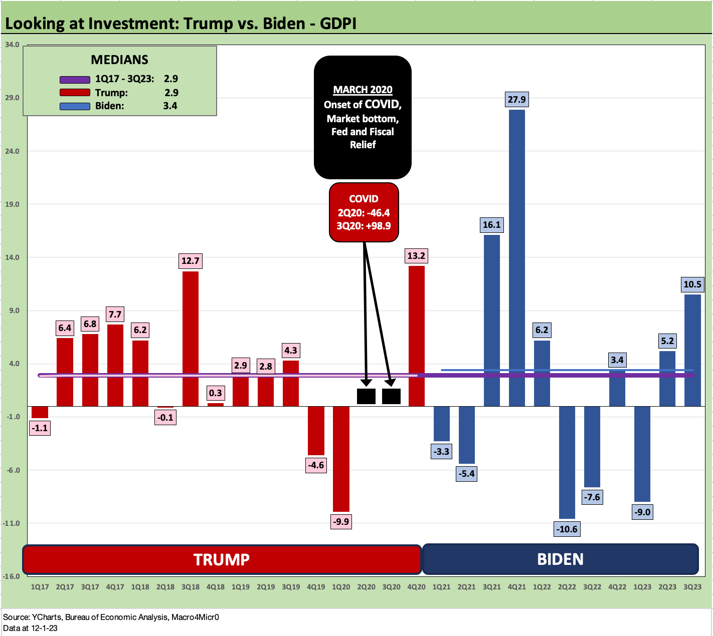
The above chart plots Gross Private Domestic Investment (GPDI) which is almost 18% of GDP. The main line items are Fixed Investment via Nonresidential and Residential plus small changes in private inventories. There is a lot of action in GPDI, but policy actions (taxes, legislative support, etc.) can be a major influence.
The chart shows median GPDI for Biden at +3.4% and Trump at +2.9%.
The Trump tax plan approved in Dec 2017 and the tariffs of 2018-2019 were designed to encourage equipment investment and repatriation of dollars for domestic investment in US sourcing. The idea was not well conceived on the sourcing side of it. That is a topic for another day.
The tax incentive and capex expensing essentially were based on old school deficit spending stimulus. This was among many reasons why the deficits soared. That policy was Ronald Reagan 101 for the GOP. Such spending is New Deal 101 to the Democrats, but some of them would argue that the Trump plan was a corporate giveaway. For fiscal hawks, the worry was that the plan would pull forward capex and just end up with a “sugar high” with a bigger budget deficit.
The sugar high was not that high in the end.
For all the excitement around the tax bill, the year 2018 saw the lowest returns on the “winning asset class” since bond indexes were invented. Cash was the top-performing asset class that year at under 2% total return. We have had much worse years of worse performing assets, but we had not had such a low return at #1 using all the equity benchmarks and fixed income asset classes as asset comps.
Capex actually faded somewhat into 2019, and the Fed eased to bolster the economy (that gets left out a lot on the discussion of the Trump economy). Then came the pandemic in 2020. So, the opportunity to win big in the GDP accounts passed Trump by. He lost that and then the election.

The above chart wraps up this piece with a look at the Nonresidential piece of the GPDI where so much private sector capex takes place. Nonresidential overall is 13.5% of GDP with Intellectual Property Products (“IP”) the #1 line at 5.4% of GDP followed by Equipment at 5.0% and Structures at +3.1%. The scale and scope of IP in a services-heavy economy is one of those variables that distinguish the economy today from the “old days” (some call the “old days” the 1980s, some include the pre-tech bubble 1990s). That is why the economy is so resilient even as it is diversified.
For Nonresidential, we see the Biden median at +3.4% and the Trump median at +2.9%. We can throw out the Hi-Lo outliers of COVID either way. Biden’s incentive for private sector investment and capex came out on top since he focuses on initiatives that encourage (or in some case coerced as a competitive necessity) companies and public sector entities to spend.
The spending by the public sector (recorded elsewhere in the GDP accounts) encourages more private sector entities to invest to meet that public sector demand. Protectionist sourcing rules in some cases annoyed allies, but that came to the benefits of US GDP lines.
Obviously, these line items above across the GDP accounts can be drilled down and explored further to extraordinary depths (E&P impact on Structures, infrastructure multiplier effects, tariff impacts, etc.), but the top-down angles show objective econ data and what happened under Trump and Biden.
The reality is that the US economy has been in slow growth mode since 2000 and the burden of wars, banking crises, massive UST borrowing etc., have taken a toll (see US Debt % GDP: Raiders of the Lost Treasury 5-29-23).
The data shows Biden numbers are the best of the lot since 2000. We just did a narrow frame here given all the election debates ahead. “Who did what and when?” is part of the politics in 2024. “Who will do what in 2025 onward?” will likely rule. The facts are often ignored, but they are there for anyone who cares.
See also:
Construction Spending: Timing is Everything 12-1-23
3Q23 GDP: Fab Five 11-29-23
Fixed Investment in GDP: The Capex Journey 10-30-23
GDP 3Q23: Old News or Reset? 10-26-23
Construction: Project Economics Drive Nonresidential 10-2-23
GDP 2Q23: The Magic 2% Handle 7-27-23
1Q23 GDP: Facts Matter 6-29-23