
1Q23 GDP: Facts Matter
We put the latest 1Q23 Real GDP print into context of recent Presidents.


We put the latest 2% 1Q23 handle GDP in the context of the stretch from Obama I and Obama II on through Trump and Biden.
The solid upward revision of 1Q23 GDP (third estimate) took some by surprise as real GDP growth popped to 2.0%, revised from 1.3% in the second estimate and 1.1% in the advance estimate.
The UST curve immediately reacted after one more sign of underlying strength in the consumer sector and fixed investment level that are weak but not showing the scale of erosion seen in past bouts of cyclical weakness.
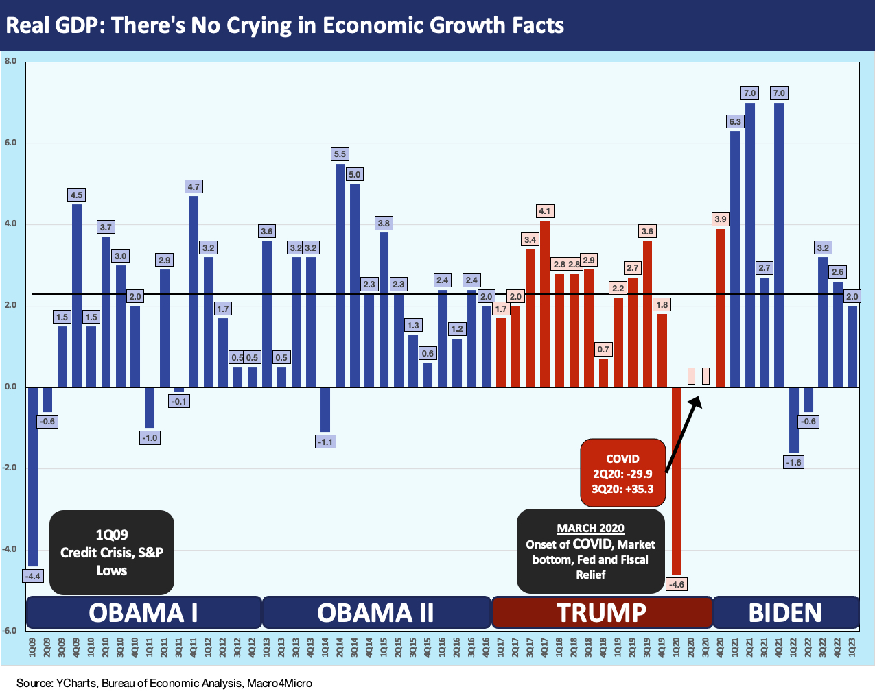
The above chart plots the quarterly real GDP growth rates by quarter going back to the Obama years and then across Trump and into the Biden term. We drop in the latest 1Q23 GDP after today’s third estimate saw upward revisions from 1.3% to 2.0%. The market continues to wrestle with the debate of whether slow growth will turn into contraction or, alternatively, more growth and more Fed tightening.
Today’s GDP report offered an excuse to detail the time series on economic growth as we enter a period where policy analysis gets challenged by too much political noise. Economic variables are influenced by many factors, and some are hard to interpret with a high level of confidence (e.g., taxes, trade policy, etc.). The objective inputs in the debate still flow from numbers like GDP growth even if many do not agree on what the weightings are of various factors for success or failure.
As we see in the GDP quarterly timeline chart, the stretch from 1Q09 through 1Q23 was if anything a wild ride during the Obama and Trump years. No one can argue that. Obama walked into a systemic banking meltdown and credit crisis in 2009 and Trump had a pandemic on his hands in 2020. Even away from those 100-year floods (recently downgraded to recurring 10-year floods of 100-year magnitude), the economic growth of the US economy has been weak and slow. The Obama and Trump years did not see a full year annual GDP (vs. quarterly) growth rate above a 2% handle until Biden in the post-COVID rebound year of 2021.
In the interest of keeping score, we detail the quarterly averages for the last few Presidents in the chart below. The debates around economic policies will only get more intense as the year wears on and we spill into primaries in 2024. In the old days, the primaries used to be politely dubbed “silly season” (a term stolen from the Brits and applied to the US), but primaries and debates have devolved into “toxic time” or “dummy days” or “slimy season.” With an election year ahead in 2024, these GDP numbers – like the US debt and deficits numbers – might be useful in starting some arguments or at least injecting some facts into them. Facts seem like a quaint sideshow these days in policy discussions.

The above chart zeroes in on some simple quarterly averages of the Presidents during their terms in office. We include an Obama I and II combined and one for each Obama term. For Trump, we include a 3-year bar for the pre-COVID years and add another for the full 4 years. For Biden, we have 9 quarters for 2 years plus 1Q23.
We would highlight that Obama I (from June 2009) and II and Trump’s first three years (plus the first two months of 2020) comprised the longest expansion in US history. We left off the Bush years for this one, but we cover the borrowing binges from 2000 onward in the earlier commentary as fiscal and monetary policy was as aggressive as possible every term by every President from Bush to Biden. Obama increased taxes. Trump put up the largest tax cut in history (but smaller than Reagan’s when framed vs. GDP). Reagan’s GDP performance got a lot more for his cuts as evident in the chart. Biden sought massive tax increases, and the numbers might look different if that did not get shelved by the Senate.
We capture the annual GDP growth rates below looking back across the decades by term. Both Obama and Trump underperformed Bush, Clinton, GHW Bush, Reagan, and Carter in GDP growth. There is more to the economic scoresheet than just the GDP and budget deficit numbers, but the objective metrics should not be ignored (or reinvented, misrepresented, or cast adrift in a sea of adjectives).
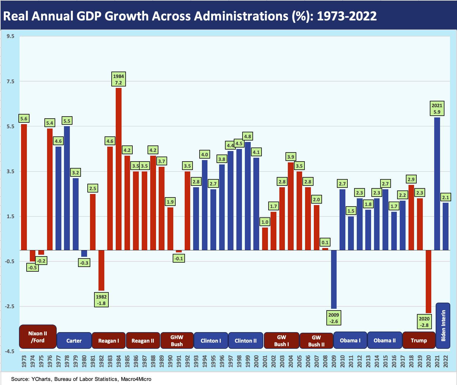
The above reproduces a chart we had used in our discussions of US government debt % GDP during the debt ceiling chaos (see US Debt % GDP: Raiders of the Lost Treasury 5-29-23). This annual GDP growth chart looks all the way back to the Nixon years. There were many tectonic shifts in the 1970s and since then (see Inflation: Events ‘R’ Us Timeline 10-6-22). The stories are always more complicated than the headline econ indicators.
The chart tells a multicycle and multidecade story of economic growth, and the visuals seem more significant today when so many outlandish commentaries are made on “who did what when” in economic performance. When we first used this chart, we were feeling bipartisan and colored the bar chart purple. After all, most of these economies had mixed GOP and Democratic White House/Congress combinations. The Reagan years had Democrats controlling Congress. Clinton had the GOP at the reins for most of those years after the 1994 election (aka the “Republican Revolution”). Just for the sake of argument (literally in many cases) we made this one blue and red.
One takeaway from the chart is that intelligent bipartisan dealmaking of the sort seen in the 1980s and 1990s was good for growth. That approach is the rare exception now. When a bipartisan action is taken that helps the economy (infrastructure, CHIPs, etc.), those crossing the lines get vilified since it is a “win” for the other guy. That is not the way President Reagan and Tip O’Neill wrote the playbook.
The 1Q23 GDP numbers…
For 1Q23, the increase in the Services personal consumption line was the main event with some lower negative numbers spread around Gross Private Domestic Investment. We had looked at the 1Q23 numbers when first reported (see GDP 1Q23: Devils and Details 4-27-23), and the PCE lines are still driving the bus. As we have covered in past GDP commentaries (see 3Q22 GDP: It’s the Big Little Things 10-27-22), small moves in some line items (net exports, inventories, etc.) can swamp the headline numbers. 1Q23 was not one of those quarters even if the negative private inventories line weighed in at -2.14% (contribution to GDP).
The main events in our view are going to remain PCE and Fixed Investment. For the third estimate, the PCE line contribution of 2.79% is a solid data point. Fixed asset investment remains weak in absolute terms, but government spending (Federal + State/Local) combined to add 0.85% to growth for its highest contribution since 1Q21.
In framing cyclical risk and recession handicapping, the Personal Consumption Expenditure lines are the “meat” of the analysis and Fixed Investment is the “potatoes.” Our take since the fall, when so many were announcing that the US “was already in recession” was that high employment levels and steadily solid PCE lines make recession a very tough sell (see Unemployment, Recessions, and the Potter Stewart Rule 10-7-22 ). It is even tougher now.
See also:
GDP 1Q23: Devils and Details 4-27-23
GDP 4Q22: Thin Sliced 1-26-23
Hard or Soft Landing? Part 3: The “Capex” Lines 12-30-22
How Do You Like Your landing? Hard or Soft? Part 2 12-28-22
How Do You Like Your Landing? Hard or Soft? Part 1 12-23-22
3Q22 GDP: It’s the Big Little Things 10-27-22