
Jobs ‘R’ Us: The Perils of Plenty by Occupation
We look at the hot jobs number and how it framed out by occupation category.


The age-old problem of poverty midst plenty is now the poverty of confidence with plenty of jobs as we review the deltas by occupation in the charts below.
The UST curve is already taking duration to the woodshed with the morning after diagnoses likely to be that more of the same steepening will not be good for housing (affordability), banks (unrealized losses anyone?) and will create more than a little debate about the fallout for the short end of the curve and the next hike probabilities.
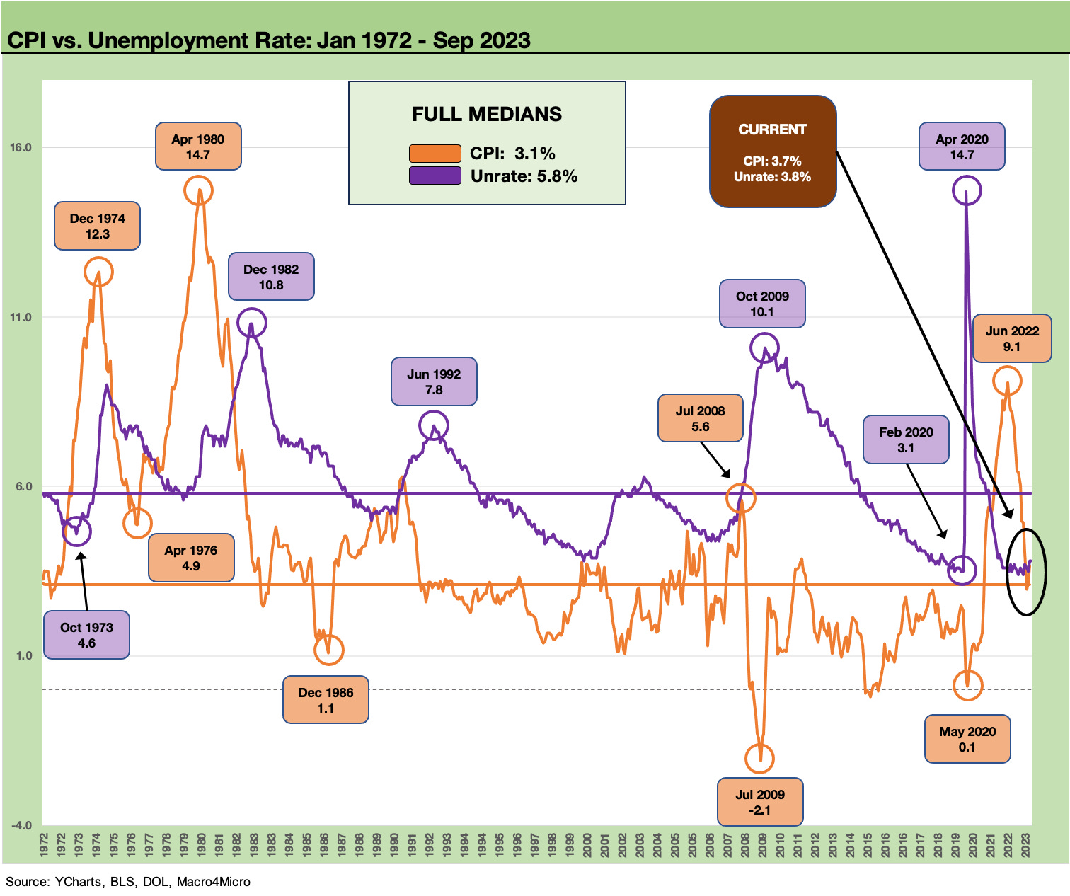
The comparisons to the stagflation years are often politically motivated but hard to defend intellectually with inflation and unemployment so much lower than the bad old days of the 1980-1982 double dip and the 1973-1975 recession.
A Sept 2023 jobs number that was “2x” expectation has shaken the UST curve again and sent ADP back to the “old news” category. The curve damage assessment and how much of a threat rising interest rates will be to the economy just moved back into very high gear (it was already in high gear). The stock market initially dropped then bounced sharply higher as we go to print. The fallback in such headlines is “Mo Jobs, Mo Money, Mo spending.” The trick is the Fed of course, and that is business as usual.
As we consider Scrooge in the visual above, record payroll beats a Malthusian workhouse applauded by Ebenezer for the perceived utility of those institutions. Today, labor demand and the markets are pushing wages higher while unions and some cities and states are doing the same.
As the “worst in decades” theme gets hummed daily, consider that old fashioned Misery Index that combines Unemployment with Inflation (see Misery Index: The Tracks of My Fears 10-6-22). I got off the train in June 1980 to start work in NYC and the Misery Index was 22%. As of now in Sept 2023, it has a 7% handle. That means it can get a lot worse. On the other hand, the current political spin that we are in a stagflation time warp is a bit overstated and self-serving in some corners.
We are nowhere close to those dark years of the mid 1970s and early 1980s even if inflation got within whispering distance in June 2022. There is no question the repricing of products over the past two years is a household problem that wages are looking to address in this market, but those of us in the workforce in 1980-1982 or pondering a future in high school and college in the 1970s recall some bleak times with energy dependence at the top of the list.
I would just say “picture high inflation with no job.” In the half empty cracked glass view, comparing today to 1973-1975 or 1980-1982 is like saying we are eating the glass shards at 3.8% unemployment, record high payroll, and 3.7% CPI (1.9% Ex-shelter, see August CPI: Inflation Fears…They’re Back?! 9-13-23). That negative view on today’s economy is a forecast by some and clearly not a state of affairs today. There is a difference.
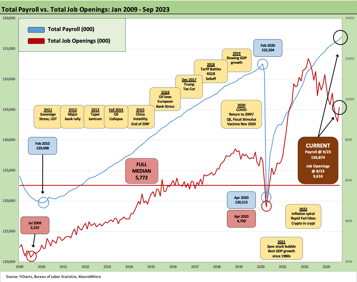
The above chart updates the run rate on payroll vs. job openings (see JOLTs: Staying Alive 10-3-23). Record payroll is the anchor for personal consumption expenditures that supports GDP. The construction markets (discussed below) and manufacturing sectors help the fixed asset line. Those two are the keys to avoiding recession.
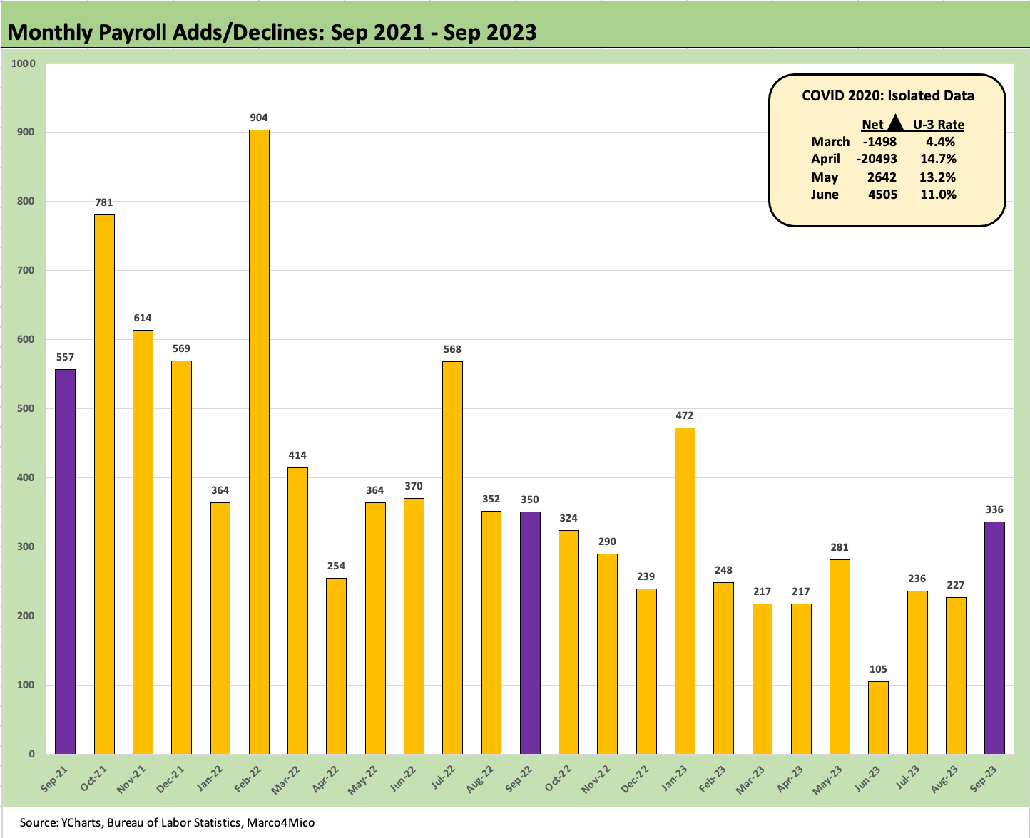
The above chart plots the monthly job adds back to fall 2021. The recent numbers reflect revisions. Obviously, Sept 2023 stands out in the context of YTD. It is notable that both July (by +79K) and August (by +40K) were materially revised upward with this release.
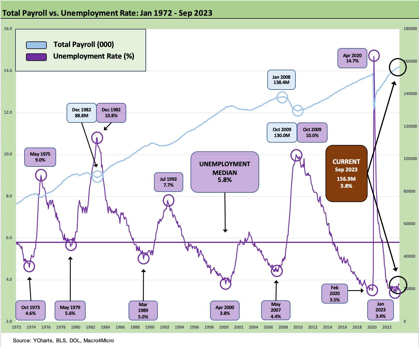
The above chart just offers up a different view on the time series for total payroll vs. unemployment rates. We see the lows and highs more easily. The 9.0% in 1975 was at the back end of a very tough time for the economy and was started by the Arab Oil Embargo in 4Q73. The 10.8% in 1982 soon saw the bull market of the 1980s kick into gear under Reagan, a leader with a positive view of America and very aggressive economic stimulus planning.
Reagan was positive in his tone and honored veterans (even the dead and wounded ones, see Political Economy: The Contrasts are Not Hard to Find These Days 10-3-23), worked in a bipartisan manner, and saw economic growth that should embarrass some of the US leaders after the year 2000.
The breakdown by occupation…

The above chart summarizes the top-down view in total payroll and by headline occupation category. We see +336K in total including government and +263K for private sector payrolls. For the private sector, we see +1.8 million YTD, +2.6 million LTM, and +4.7 million since Jan 2020 before COVID. The +2.6 million jobs added LTM in the midst of tightening and rising rates is no small achievement in the economy.
The debate will now unfold about Fed hikes, the reality of real rates being higher, and whether the UST curve is doing the “dirty work” for the Fed (a CNBC quote from Bob Michele, CIO and Head of Fixed Income at JPM Asset Management). The UST curve is headwind now, but the 5% boogeyman of 5Y and 10Y UST is a long way from the 23% prime plus loan I had in 1981 and even the 8% 90-day T-Bills of the late 1980s.
As we note above, the timeline of employment vs. inflation is worth putting into context as the “good is bad” theme gets stretched to its limits. Inflation is not anywhere near the ugly times of the stagflation years of 4-5 decades ago. Employment has been resilient in 2023 even in the face of a brutal tightening cycle now leveling off. The priority for the Fed is making sure CPI does not get back to those earlier, bleak days.

The above chart frames the trend line in manufacturing, which is the ground zero of fighting for a shift in US payroll mix and the biggest challenge to “closet industrial policy.” Adding jobs in manufacturing totals at all is a victory in historical context, and the total is at least up in total manufacturing by +94K in total LTM with +131K in durables. Since Jan 2020, we see +158K in durables, so LTM has been a key stretch. The ability to drive manufacturing will be a hot topic in the election year of 2024.

The above chart breaks out nondurables, which is the Death Valley of secular job loss. We have looked at these categories over longer time horizons going back to the pre-crisis years (not shown), and it is not pretty. Many of these jobs are never coming back. Commodity-like categories (Chem, Petroleum Products) and food manufacturing are holding the line. Textiles, apparel, paper/printing are going the way of moderate political candidates (slowly disappearing).

The above chart breaks out the job trends in Construction. As we recently covered in detail (see Construction: Project Economic Drive Nonresidential 10-2-23), the mega-projects and range of policy incentives have driven an underappreciated boom in nonresidential. Then again, United Rentals and Caterpillar appreciate it (see Rental Equipment: A Cyclical Confidence Booster 9-15-23).
We see 155K jobs added YTD, 217K LTM, and 434K added since Jan 2020. The construction category impacts a lot of supporting infrastructure industries such as metals and chemicals in basics, equipment in manufacturing (including construction vehicles, machinery, and light trucks), freight and logistics in services, and a long tail of financial services providers.

The above chart breaks out the diverse categories in a services economy, which is reflected in the wide range of occupations on the Service-Producing Payrolls. We see another 234K jobs added in September with Leisure and Hospitality in the lead and Health Care and Social Assistance in second. Services is +1.6 million jobs for the YTD period, +2.2 million LTM, and +4.1 million since Jan 2020 ahead of COVID. The mix of Health Care and Social Assistance do not make the “multiplier effect” list the way Goods providers drive activity, but services drives consumer spending. In the end, services is essentially the nature of the US economy.
The jobs vs. inflation vs. rate problem…
The wish here is that Biden did not seek to name “economics” after himself as his branding wizards thought was a good idea. If he did not name it “Bidenomics,” maybe more folks on the other side would look more closely at jobs and GDP numbers for Biden vs. Trump. Stimulus policy is not new as a concept, and the better strategy in a partisan world would have been to name something bad after Trump (remember “tax and spend liberals,” etc. That has been pretty effective and often accurate). Just don’t call it the “New New Deal.”
As noted above, the Infrastructure, CHIPS, and Climate policy actions (IRA is a tax saving plan that was another bad branding move) across a combination of end markets is driving an extraordinary amount of fixed asset investment and brought multiplier effects in jobs directly and indirectly.
The inflation threat and rate pressures are not going away as we head into an election year, but the architects of what is unfortunately now called Bidenomics should be highlighting the differences between today and the recurring “worst in over 40 years” theme.
There is no shame in making demand stronger, but there is inflation risk and monetary policy risk. That crisis lookback trash talking will remain a strategy near term, and the UST curve steepening will raise pressures. Politics tend to distort the factual, and facts have not been the main menu item in socioeconomic or political dialogue for a while now.
Record payroll count and CPI ex-shelter below 2% is not a bad place in the jobs trade-off (see August CPI: Inflation Fears…They’re Back?! 9-13-23). That said, it could be better, and services inflation has been a serious sticking point in a services economy (PCE: It Takes Two to Ease 9-23-23).
The 2024 election process will not allow for objective framing of the economic metrics. We are not clear what Trump would have done in this market since he had the worst combination of employment growth and GDP growth of five decades worth of Presidents (see Political Economy: Topics Where Facts Matter 8-23-23, Employment Across the Presidents 8-15-23). Trump claims his was the greatest economy since Romulus and Remus quenched their thirst. He just keeps repeating it to the point of repetitive stress in wagging his tongue. Facts say otherwise.
The real problem as we see every 10 minutes on cable business and political news is the systemic government debt problem—which is quite real. That has been a bipartisan binge since 2000 with UST debt % GDP peaking under Trump (see US Debt % GDP: Raiders of the Lost Treasury 5-29-23). For the near term, that will not get better without higher GDP growth.
Contributors:
Glenn Reynolds, CFA - glenn@macro4micro@gmail.com
Kevin Chun, CFA - kevin@macro4micro@gmail.com
Certain the train will continue rolling along as long as there is $1 trillion every 90 days or so to throw into the boiler...but hey how long can that last?