
PCE: It Takes Two to Ease
We look at August PCE numbers that are still a long way from 2% but with a mixed picture.


The PCE numbers added up essentially to “status quo” in terms of where the FOMC dot plot left off that included a 12-7 balance in favor of one more tightening by year end.
Consumption stayed steady but inflation remains sticky with Core PCE at 3.9% YoY while headline YoY PCE ticked up to 3.5% from 3.4% in June and 3.2% in May.
The fine print of the MoM vs. YoY trends can get used by bulls or bears to spin a story in the direction of their trading axes or their baseline forecasts, but the reality is that PCE inflation is a long way from 2.0% with a lot of economic indicators to play out.
The above chart plots the time series for Headline PCE inflation and Core PCE from 1997. We also include the timeline from 1972 further below, but this one really hammers home the scale of the deviation in 2022-2023 from the TMT era and credit cycle peak through today. When we drop in the hideous stagflation years of 1973 through the 1980-1982 double dip in the longer timeline chart, the scale looks very different.
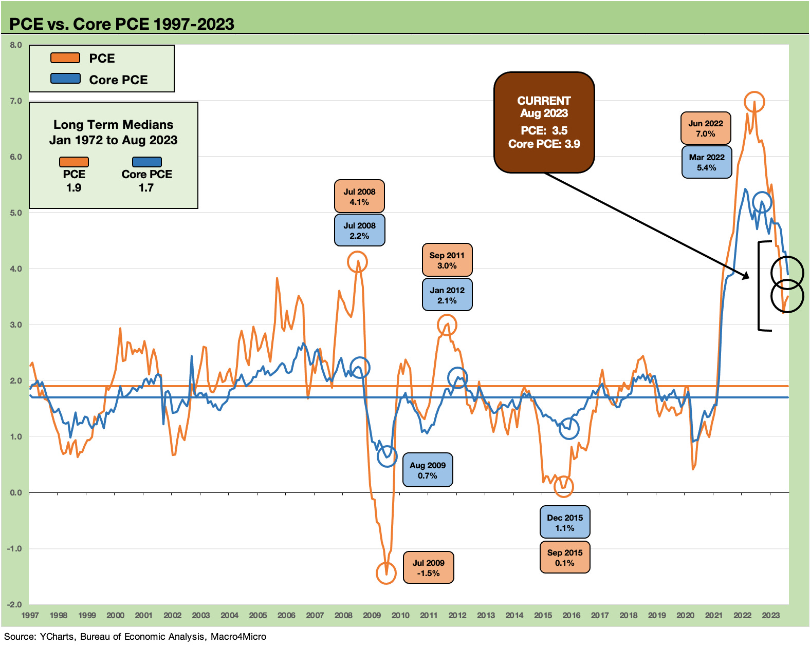
The current 3.5% on headline PCE YoY is down 2 points from the 5.5% of January 2023 but up from 3.2% in June 2023 and 3.4% of July 2023. The Core PCE of 3.9% marks the first sub-4% level of 2023. Food was at 3.1% YoY on its own and “Energy goods and services” stood at -3.6% YoY. Durable Goods was -1.9% and Nondurables +2.1% while Services weighed in at +4.9%.
The monthly PCE drill in a nutshell…
Everyone needs to pay attention to PCE inflation and related metrics since the PCE price index is the Fed’s favorite. As we have mentioned in the past, one can dig through old Fed speeches and papers and find disagreements among FOMC types on what the target inflation metric actually is for the 2% (Headline PCE or Core PCE inflation). Either way, these days Core PCE gets more airtime given the distortion of the Russia-Ukraine war, the uncertainties of OPEC+ cartel behavior, and the reality that the Fed needs to stick with its traditional views on food and energy.
When the Personal Income & Outlays release comes out each month, the simple checklist revolves around a few questions:
Inflation:
Is YoY headline PCE up or down? How about MoM?
Is Core PCE up or down? MoM?
How do Goods (Durable and Nondurables) vs. Services flow into those trends?
Note: You can quickly grab those lines off page 1 and Table 5 and 6. The restatements sometimes can make you regroup and we try to capture those in our detailed table broken out in this piece further below.
Income and Outlays:
The focus on inflation sometimes downplays the value in looking at Personal Income and Disposable Income (personal income after taxes). There are key disclosures on Personal Consumer Expenditures. As with the Retail Sales data each month, we prefer using current dollars (When was the last time you walked into a store and asked if they take 2017 Chained Dollars?).
For other line items by category, there is a lot to look at, but a very quick review of PCE inflation, Personal Income, and Consumption trends give you the main flavor you need.
The takeaway is that inflation is very sticky in Services (the recurring problem), and that the Consumer seems to be slowing (but certainly is not going underground yet).
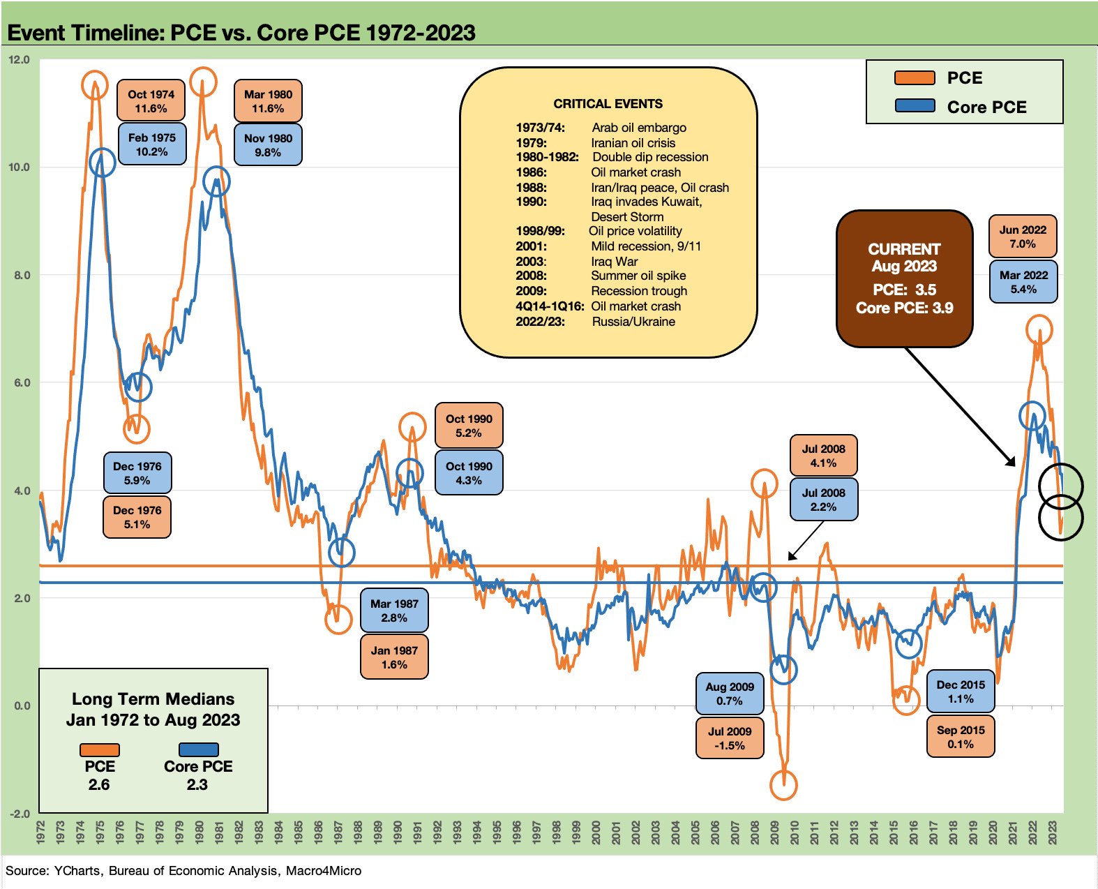
The above chart gives the multi-decade PCE inflation trends. Those of us doing odd-even license plate days for gasoline in early 1974 remember oil as a national security and socioeconomic issue and not just a debate over “drill baby drill” vs. “climate crisis” in the policy debate.
Optimizing that trade-off in the age of “energy dependence or independence” tends to see politicians avoiding facts and instead focusing on general themes and not doing the topic justice.
The latest GOP debate was another one light on facts and especially in Energy. An easy question: If the US is producing record amounts of natural gas and will reach record oil production in 2023 and 2024 (per EIA), what is the main problem? There are plenty of problems with the Biden energy policies (notably project approval, etc.), but it would be nice to see if one of these “leaders” could draw a line from record volume and high exports (or make a distinction between crude, NGLs, and LNG, etc.) to an actual gameplan.
The simple question is “What would they do?” Getting them to admit record production would confuse the hell out of them. With oil above $90 again, it is a major household income and inflation topic. That is a topic for another day.
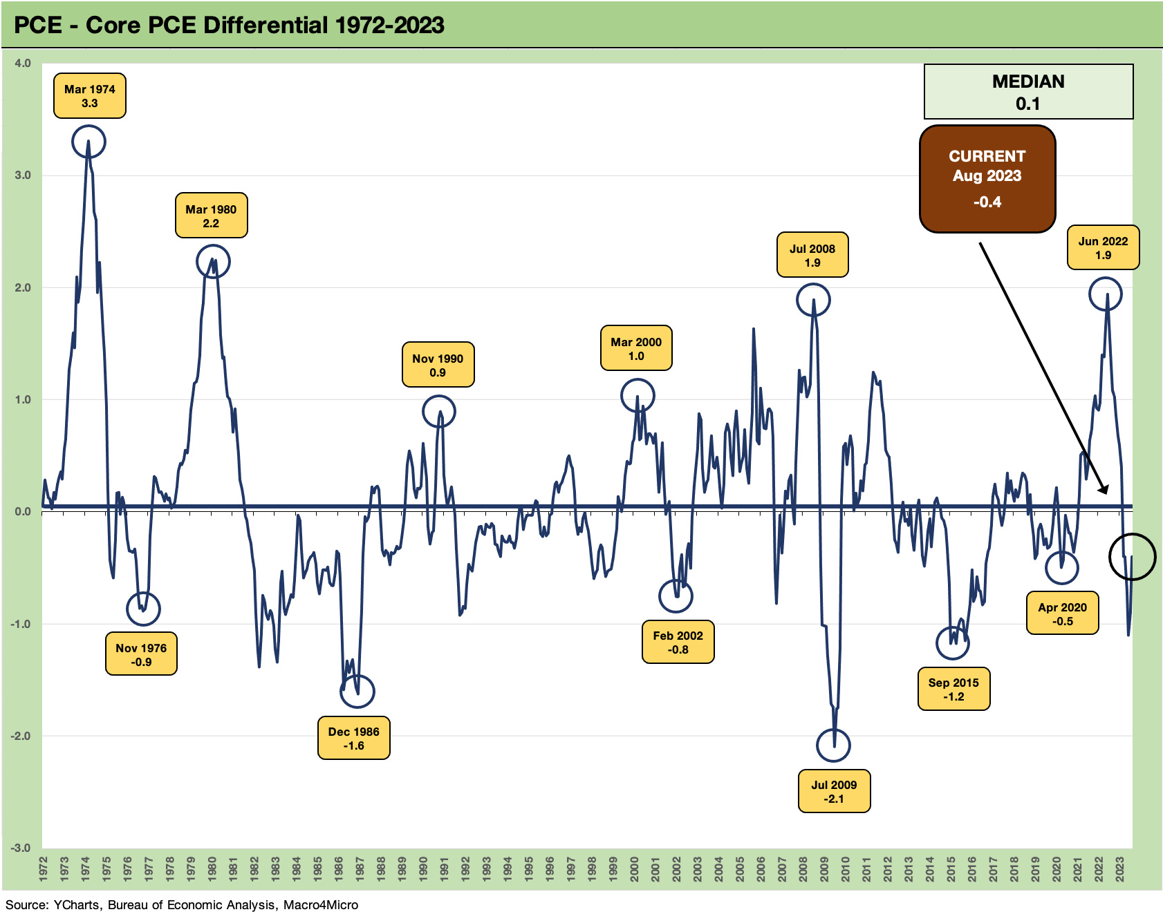
The above chart updates the long-term differential between Headline PCE and Core PCE inflation. Some of these differentials mean more to household budgets than to the macro modelers of the world. The big swings translate into only a small median differential.
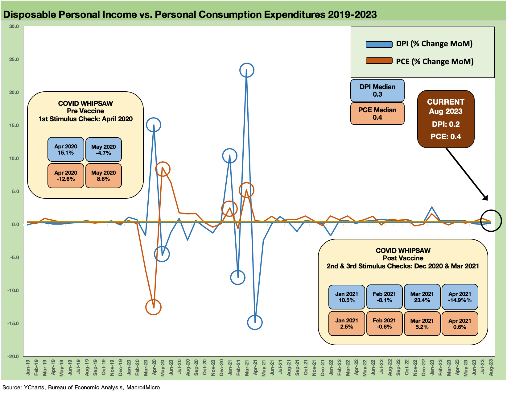
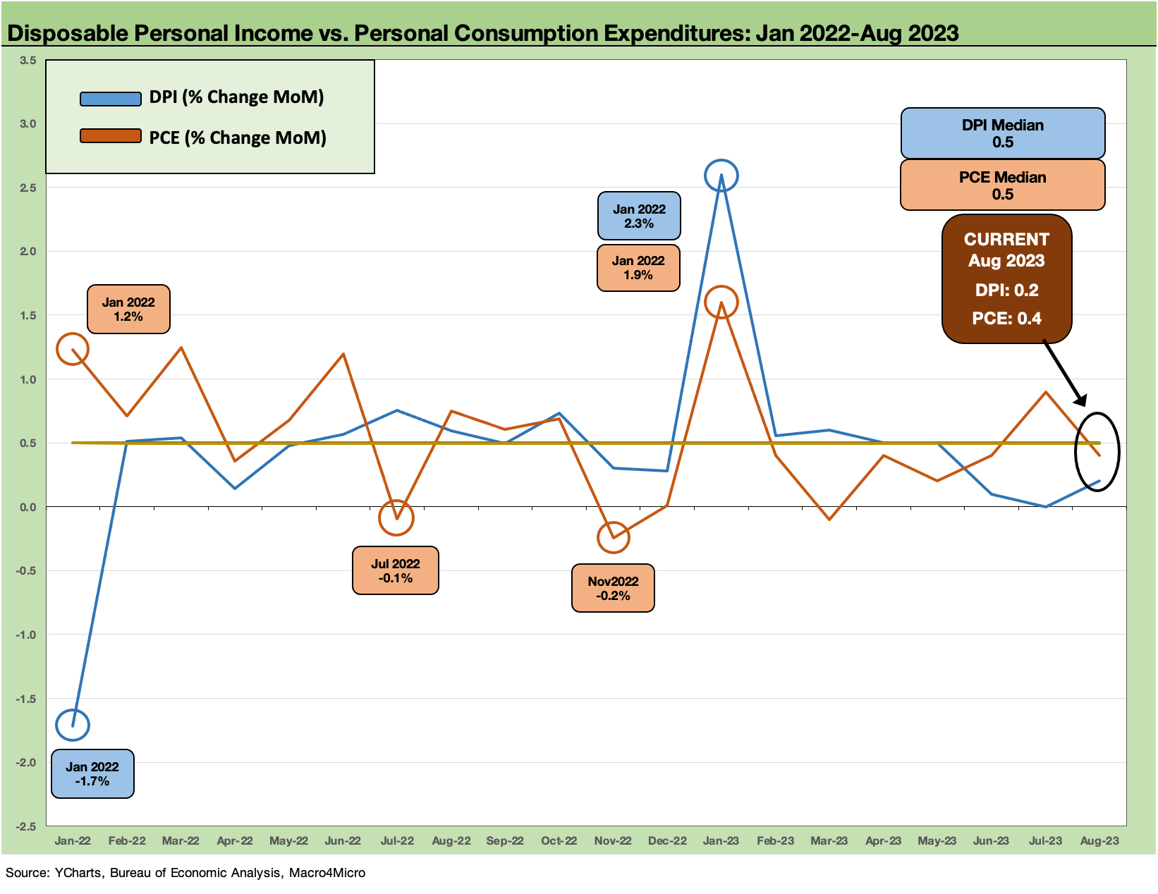
The above chart starts in 2019 and runs across the MoM changes in Disposable Personal Income (DPI) and Personal Consumption Expenditures (PCE). DPI is softening MoM vs. 1Q23 and April-May despite the headlines on wages broadly. We see a soft streak the past 3 months on DPI. At +0.4%, PCE is down sequentially from a strong July (+0.9%) and well below the high of Jan 2023 of +1.6%. We see a few others at 0.4% scattered along the way. The PCE watch continues.
The above chart adds in more color on the wild ride across the tightening cycle. It is very hard to find a pattern, but the median monthlies are solid enough and the US has a record payroll count. Income is higher and so is PCE. That has kept the rolling GDP growth in the black from the PCE line.
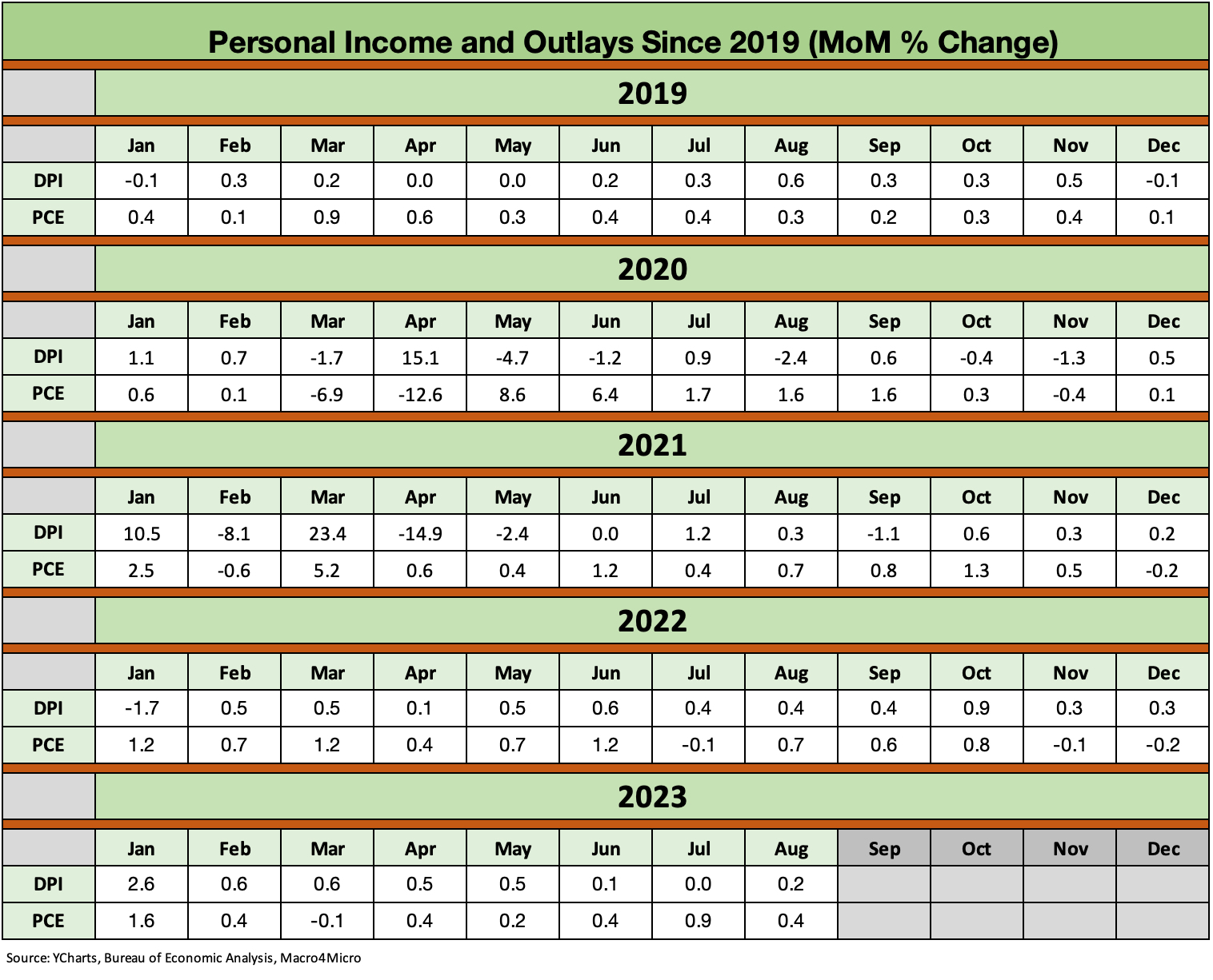
The above chart looks back across the monthlies for the DPI vs. PCE lines as a reference. When debates kick into gear around what the stimulus packages did or did not do, these numbers help (see Inflation Rorschach Test: Looking at Relief and Stimulus 2-7-23).