
Footnotes and Flashbacks: Week Ending April 2, 2023
We look at 1Q23 returns across subsectors and industry groups including Regional Banks, automotive (Retail, OEMs, Suppliers), BDCs, and Homebuilders.


“Portfolio risk strategies continue to evolve.”
This Week’s Macro: Asset class and ETF sector returns; Regional banks mixed recovery in equities tells a reassuring story but deposit flight fears remain very real even if just on the economics of cash returns; We frame the current UST and mortgage rates vs. 2005 (home sales peak) and 2006 (RMBS starts to crack).
This Weeks’s Micro: As the spring selling season arrives, we look at 1Q23 comparative performance in equities for Auto Retail, Auto OEMs, and Auto Suppliers; we do the same for Homebuilders as mortgage rates are slightly friendlier; BDCs see small cap anxiety set in, private credit gets trash talked, and short rates peak.
MACRO
After an abysmal 2022 for the broader equity and fixed income markets on inflation and yield curve migration, 1Q23 returns saw a wild intra-quarter swing from an unsustainably bullish Jan 2023 into a bank system panic in March tied to push-button depositor flight. The ebb and flow debates continue around bear market rallies vs. a changing macro backdrop that could signal rising recession risks. The “declining recession risk” started to carry the day in early March to the point where a 50 bps Fed hike was seeing higher odds. Employment trends during the quarter (notably JOLTs jobs openings, record low unemployment rates and record high payroll count) appeared to anchor the PCE line in GDP accounts, but that view is now in flux.

The above chart breaks out the running returns for the main debt and equity asset class benchmarks. We line them up above in descending order of total returns for the rolling 3-month period. The upper section of the chart details debt and the bottom section equities. The dispersion across the equity benchmarks is much more pronounced while credit returns are very compressed despite duration and spreads going on a ride in 1Q23.
The longer tail in equities tells a story of US-centric cyclical anxiety…

The above chart details the longer equity tail of the “1500 and 3000 series,” and the numbers are less impressive for the quarterly period with 4 of the 6 we highlight in the red. Among a range of reservations on the quality of the equity rally is the lack of breadth in the recent rebound. We see strength in Growth stocks vs. Value above, and the Tech bounce is consistent with the moves more narrowly in large caps. Meanwhile, Value has been getting punished. We look at a narrower mix of industry groupings in the ETF section below.
If one associates Value with a higher mix of mature subsectors/industries/names and more cyclicals, then this mix of returns above is showing some forward expectation worries on the cycle. That has flared up with the regional banks noise over the past month as well as for the 1Q23 period. Tighter financial conditions are expected by many. Financials were understandably hammered by the SVB collapse and collateral damage of a spike in depositor flight.
ETF Returns as Industry and Asset Class Proxies
In the following charts, we look at some broad benchmarks and a mix of ETFs that serve as industry proxies and the same for fixed income as an asset class. We detail 21 different categories. The 1-month scoresheet showed 12 positive and 9 negative after posting an 8-13 record in last week’s issue (see Footnotes and Flashbacks: Week Ending March 26, 2023). The running 3-month tally this week was 14 positive and 7 negative to wrap up what was a decent quarter as the crow flies just by having more positive than negative.
1-month ETF and Benchmark Returns (%)

The 1-month performance was led by the Tech sector (XLK and IXIC). The bounce in Communications Service reflects Meta and Alphabet holdings while over on the far right we see the carnage in Financials with XLF at -10.5%. We do not include the regional bank ETF (KRE) in our peer group of 21 ETFs and benchmarks that we track, but we include it in a box posted in the chart. The 1-month return for the Regional Bank ETF was -28.9% in what has been a body slam for the sector. We look at a cross-section of regional names further below.
The small cap Russell 2000 index (RUT) is second to last, and it is notable in that it reflects fears of domestic credit contraction and the related fears of recession. BIZD as the BDC ETF is third off the bottom on fears of small cap fundamental pressure and the idea of a peak for short rates in floating rate asset base that the sector benefits from in cash income flows. We look at the BDC sector with some issuer-level data in the micro section of this commentary. BIZD got off to very solid start to the year on rates and sustained expansion potential until the SVB and regional bank noise brought some clouds into the picture.
3-Month Total Return Across Benchmarks and ETFs (%)

The big winners over the running 3 month mirrored the tech rally catching daily headlines with Tech (XLK) at #1 followed by Communications Services (XLC), NASDAQ (IXIC), and Consumer Discretionary (XLY) in double digits. XLC comes with the asterisk of concentration exposure to Meta, Alphabet, and Netflix while XLY has Amazon and the monster rally in Tesla. Financials and E&P are in a near dead heat for last place. Energy has lagged generally, and Health Care (XLV) has been held back by United Health Group (#1 holding) and weak YTD Pharma performance.
Bank anxiety eases modestly but depositor flight risk is now higher on the checklist….
The level of anxiety eased with the market able to observe the tangible support from various liquidity alternatives for regional banks after being tainted by SVB and Signature and the First Republic swoon. Slowing depositor outflows made some headlines while Washington and the regulators kept jawboning support (with Yellen doing some more “cleanup in Aisle 3” in her language). That helped rally IG spreads in particular, and the market saw material retracement in US HY.

The above chart updates the cross-section of regional bank equities we have been looking at in recent commentaries to capture a broader picture of the sector. We lined them up from best performance to worst performance for the period from 3-8-23 (just before the SVB implosion) through Friday March 31. The ugly performance does not need a lot of explaining at this point.
While the SVB situation has been picked over (see Silicon Valley Bank: Loans and Haircuts 3-27-23, SVB Reprieve: Hail Powell the Merciful 3-12-23, Silicon Valley Bank: Depositor Frames of Reference 3-12-23, Silicon Valley Bank: How did the UST Curve React? 3-11-23), the next question is not just how depositors will react but also what actions the banks will be promising to calm nerves in earnings season. In theory, many will be discussing adjustments on funding and liquidity “defense” in the periods ahead to guard against any fresh cases of nerves.
The expectation of more defensive lending and what that means for credit contraction risk will be a theme that will not go away for some quarters (see Risk Appetites Get Bloodied 3-15-23) The banks will need to detail more efforts to build up liquidity in cash and equivalents and more short-term defensive assets to protect earnings from loan loss reserve surprises.
Stockholder and depositor perception will need some steady reassurance along the way. For depositors, that might include some higher payouts to take the edge off the flight to money markets and higher short UST rates. That could immediately flow into downward revisions on net interest margins and could roil stockholders, but we would expect the depositor flow data to be more important to stockholders at this point than some fine tuning of NII metrics. That will just have to play out.

The above chart updates where the European banks have followed up on the CSFB meltdown with the profile of equity returns not as grim as what we see in the US regionals. For the period from 3-8-23 to 3-31-23, we only see one bank (ex-CSFB) slightly worse than -20.0%. The US regionals were uglier.
The yield curve gyration continues…

The above chart updates the running differentials of the UST curve since March 1, 2022 as ZIRP ended by mid-March that month. The box shows the running tally of the UST curve migration higher for key segments of the yield curve from 3M to 30Y. The differential hit a peak on the short end of the yield curve just ahead of the SVB crash and the extraordinary, multiple standard deviation moves that ensued for the yield curve. That heightened interest rate volatility was splattered all over the headlines and street commentary. We looked at those moves in earlier commentaries (see Footnotes and Flashbacks: Week Ending March 19, 2023, Silicon Valley Bank: How did the UST Curve React? 3-11-23)
In terms of cash asset allocation strategies, that 3-8-23 peak in short T-Bills was always going to be out in front of the depositor base if the cycle was starting to look shaky, and money markets already had seen extraordinary inflows. There is going to be a lot of inquiry on what the banks will be thinking about to retain depositors and whether they can get away with low, uncompetitive CD yields when they may in fact be a materially riskier exposure than UST based funds for the uninsured portion of deposits. That is especially the case for corporate customers and retail customers with a high cash balance.
The mortgage rate trauma framed vs. housing bubble years…
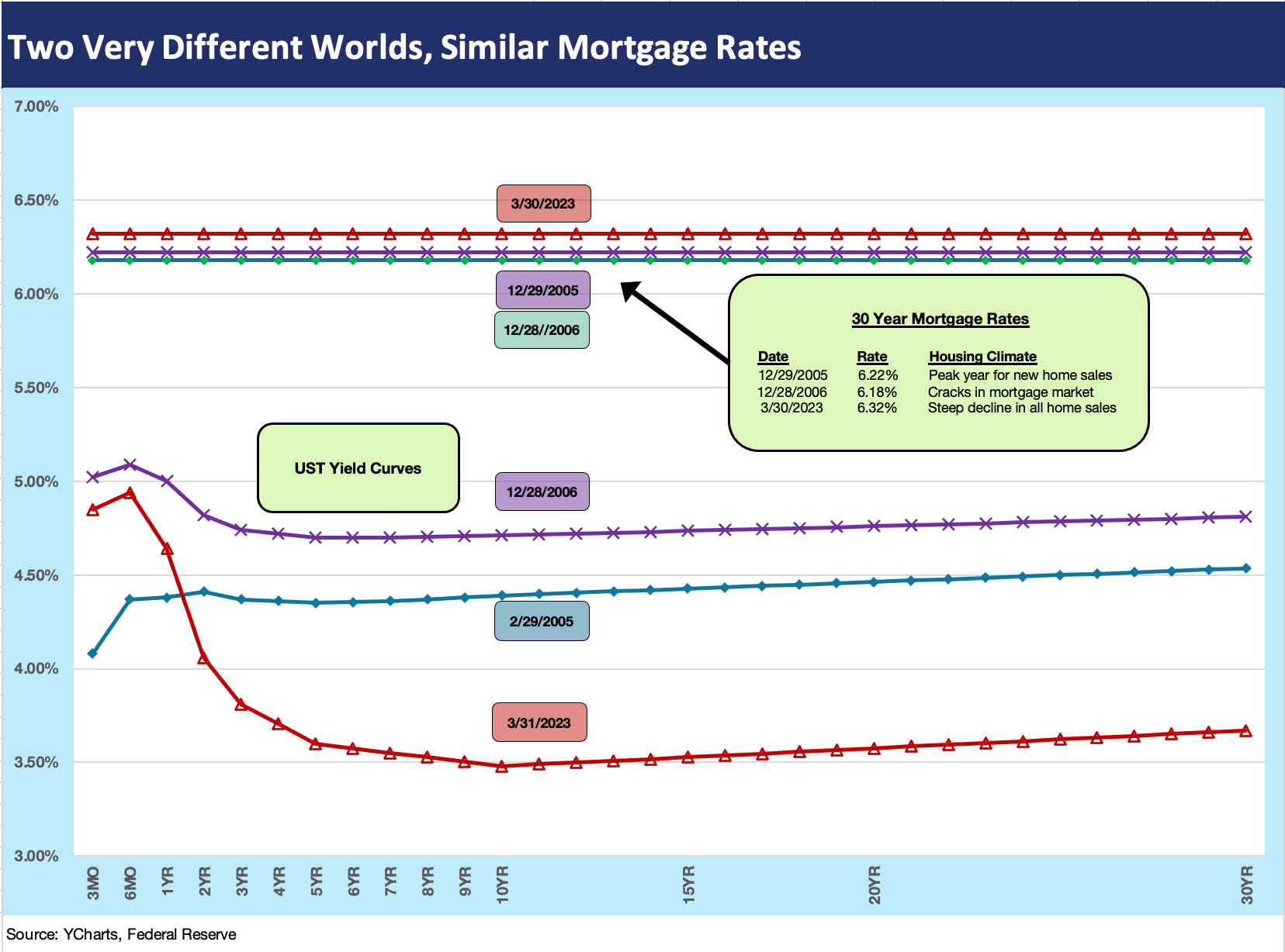
The above chart takes three yield curves from three relevant dates: today (using the 3-31-23 UST curve), the end of the peak year for new home sales (12-31-05) and the end of 2006 as the housing bubble cracks were starting to show. Above those three yield curves we plot a single horizontal line showing the most recent 30Y mortgage benchmark rate (released on a Thursday by Freddie Mac). We have looked at the wild times of the housing bubble in other commentaries. The 2005 period was the home stretch for Greenspan before he retired in Jan 2006 (see Greenspan’s Last Hurrah: His Wild Finish Before the Crisis 10-30-22 ). The mortgage rates then and in 2006 looked not too different than today.
The most striking aspect of the chart is how clustered the mortgage rates are for the three yield curve periods. We would not dare to analyze MBS spreads and how mortgages are set in the market of 2022-2023 other than to reiterate that those rates tend to key off the 10Y UST. The fact that spreads are so much wider today has been addressed by the mortgage gurus of the street and the industry.
While leaving the slicing and dicing to mortgage experts (I met too many of them at Lehman to cross that line), the fact remains that residential MBS was a dominant feature in the SVB portfolio (Residential MBS securities comprised almost 75% of SVB’s Held to Maturity portfolio of $91 bn at 12-31-22). Clearly SVB was on a duration risk bender and not minding the store. The mortgage chart above is very relevant to the housing and homebuilding market (monthly mortgage payment levels) as well as the unrealized losses in the banking system.
The good news is that the consumer has seen 6% handle mortgages before and it was a very robust market for borrowers. The moving parts of the homebuying decision (or the rent vs. buy decision) are a function of underwriting standards (including the non-QM lenders) and the willingness of a buyer to buy less house for their dollar. There is also the decision on how much of a down payment they will make and to what extent the builders are offering incentives in the form of temporary mortgage buy-downs and fee incentives from their mortgage units. The builders are clearly doing a very good job of stabilizing the situation of late, and the faith of equity investors is very much in evidence in the stock returns in this market (see Micro section below for more on the topic).

In this chart, we take a look at the longer timeline of 30Y mortgage rates vs. the 10Y UST. We break out some medians for the 30Y mortgages as detailed in the box inserted into the time series. We flag a few highlights along the way such as the 1981 peak rates and the journey of the mortgage rate to a 9% handle to start 1987. That was after a 1% handle CPI in 1986 and an oil price collapse.
Looking back at the medians on mortgages across the decades, there is a tendency for the older crowd to look at 6% handle mortgages and yawn. Of course, they never had protracted ZIRP and double-digit basis points on 5Y UST and 10Y UST rates. They also never had the threat of the cascading domino effects of a global banking system collapse on bank interconnectedness exposure (via counterparty and derivatives). That event in 2008 set off the great ZIRP period and the world of QE.
There were no shortages of bank collapses along the way on this chart whether Texas Banks during the oil patch meltdown or wholesale thrift seizures that spread nationally over time in the 1980s. There were brand name bank meltdowns and one-offs such as Bank of America and Continental Illinois, but counterparty risk and the world of derivatives changed the rules of the game in terms of opaque risks that can cause confidence vulnerability when other factors are flaring up. Depositor flight was back again in 2023.
Derivative counterparty exposure had turned into the explosive mix of the bank systems back in 2008 with too many hedge funds also rigged to blow under the right (aka wrong) set of conditions in the areas of credit contraction, weak collateral value, and tainted asset class scenarios. That was supposed to have been mitigated by reform, but the fear came back briefly with the CSFB crisis in recent weeks. After SVB, we now need to add push-button depositor flight to the list of risk aversion trigger points – even when asset quality is sound and regulatory capital requirements are met with room to spare.
MICRO

The above chart is the first of three that look at the major automotive subsectors from Auto Retail to the OEMs and the peer group of major suppliers. We line up the companies from highest to lowest total returns during 1Q23.The franchise auto retailers have performed quite well in 1Q23 as production volumes were expected to pick up pace after all the supplier chain problems. Some also took share in used cars back from Carvana and CarMax on the increased trade-in volumes of used cars that come with higher new car sales. Those also feed F&I profits.
The dealers were among the names hit hard this past month after such a heady run over multiple trailing time horizons across 3 months and 6 months. The industry and the investor base are still sorting out the risks in the auto cycle after such a wild period of supplier chain disruptions and the distortions in new vs. used car pricing (see Market Menagerie: The Used Car Microcosm 11-29-22). Used car giant and incumbent player CarMax has been a material underperformer while Carvana has been operating in a world of its own after the plunge in its stock price. CVNA stock was irrationally priced during 2020-2021 (see Carvana: Prisoner’s Dilemma, Used Car Getaway 3-22-23, Carvana: Credit Profile 3-5-23, Carvana: Wax Wheels 12-8-22) and now is bouncing around single digits after a $370 high.
We still see the optimism around franchised dealers as well founded after what in essence was a recession-level volume during the supply chain problems of 2021-2022. The auto dealers will be beneficiaries of record payroll levels and rising wages and the ability to sustain strong numbers in F&I products (finance, insurance, warrantees, etc.) and Parts and Services operations are still supportive.

The above chart lines up the major Auto OEMs in descending order of total returns for the 1Q23 period. Autos have been a material outperformer through the first quarter as optimism around jobs, wages, and consumer credit availability for new vehicles. That combines with easing supplier chain stress. That in turn drives optimism on volumes and high average transaction prices. We see only Toyota lagging the S&P 500 in 3-month performance. Stellantis has been the clear outperformer with Hyundai also a solid winner looking back across more time horizons.
There will be a slew of factors to sort through in 2023 from balance sheet questions to the high rate of spending on the process of transitioning from ICE to EVs. Then there is the capex that will not bring profitability from the emerging technologies for some OEMs potentially for years. There will be the material cost question, strategic production planning, and the same supplier chain risks but with higher stakes if geopolitics turn uglier on the China front. The need to do more deep dives on the EV side of the ledger will only become more pressing as those business lines see some more disclosure as we recently saw with Ford.

The above chart shows the peer group of major Auto Suppliers. We line them up in descending order of total return based on 1Q23 performance. These are volume sensitive companies that have struggled through the supplier chain crisis and recession level production rates tied to chips and COVID disruptions. Some could be more adversely affected than others by trade conflict with China (e.g., Aptiv).
The more tech-based higher margin operations run very different risks and financial profiles than more traditional ICE products that could be vulnerable to obsolescence risk over time. To the extent OE suppliers are investing heavily to serve the EV market, the capex demands could clash with the low initial returns and negative cash flow tied to such growth markets.
The analysis of these names cuts across a range of variables from the markets served (e.g., light vehicles vs. commercial vehicles), the OEM customer mix, the relative value added and pricing power of the product mix, and the exposure to emerging technologies and EVs (including who will see volume declines on diminished demand for traditional ICE products). As you look back across 5 years and 10 years, the struggles of some of the issuers are very apparent.
We see some of the usual suspects near the top (Autoliv, BorgWarner, Visteon, Aptiv) and also some traditionally strong players that delivered a bad quarter (Magna). The operating profiles of these companies and their convoluted histories (spin-offs, mergers, post-bankruptcy evolutions, etc.) take a lot of trench work. We will be working on more of them with stand-alone research as the spring selling season unfolds and quarterly earnings season rolls out.

The above chart lines up the homebuilders in descending order of total returns for 1Q23. All of the companies noted outperformed the S&P 500. The ability of the builders to navigate this market has been demonstrated already and will be closely watched as the peak selling season of spring kicks into gear. Volumes and prices will decline, but most builders have shown their ability to generate respectable margins at lower volumes. That is supported by the guidance color from the builders and looking back at past margins. That is what the equity market is pricing in the above chart.
From a narrower perspective of mortgage rates and affordability in housing, the half full story line on 6% mortgage rate handles (detailed earlier in the MACRO section) is that 6% mortgages are old territory. Such mortgage rates were a feature of the housing boom of the pre-crisis years in 2005-2006. Wages are rising in 2022-2023 and there are vastly more bodies employed today. Jobs matter and the demographic need is a tailwind for demand. That combination of factors (jobs and wages) takes some of the edge off the builders risks ahead.
The willingness of a buyer of a new or existing home to take on a higher cost mortgage for later refinancing is not a simple handicapping exercise. Getting a potential home purchase executed in a given area at a given price is a personal decision that could include priorities for buying a home in a given location. A yield curve forecast is not always the main event for a homebuyer. If rates go down, you can eventually refinance. If they go higher, you might be glad you pulled the trigger when you did.
One question will revolve around how much prices will need to decline to get transaction volume higher and instill more confidence in potential home seller and get them more inclined to sell into a market like the one today. One barrier is the number of sellers sitting on 3% handle mortgages on the property to be sold and the mortgage rate they will see on a “move up” purchase. More existing home sales could bolster the inventory of choices for buyers but also would compete with newly built homes. For now, new homes have the edge since existing homes are still down materially (see Existing Home Sales: The Sun Will Come Out…When? 3-21-23).

The above chart breaks out BDC equity returns. We line up the companies in the descending order of total return for 1Q23. The list shows a mix of some of the largest BDCs in the equity markets (most with a growing bond market presence as well), and we see a wide range of returns from high to low. These names have a median range of dividend yields in the 10% area. The majority underperformed the S&P 500 over 3 months as the weakness in regional banks and small caps spread to BDCs, which have some commonality with the regionals in small cap and microcap credit exposure.
The market is also hearing chatter that the larger private credit players were circling around “SVB shrapnel” before last week’s acquisition news on the SVB loan portfolio sale to First Citizens (see Silicon Valley Bank: Loans and Haircuts 3-23-23). The BDC managers are some of the best credit players in the market. They have a vested interest in loan performance and expanding their reputation in private credit for asset gathering, so they have more skin in the game beyond the fees on the BDC. That helps the confidence factor beyond just the earnings reports and quarterly results and disclosure. Performance in earnings and asset quality has been solid enough through the December 2022 quarter. The March quarter results will be interesting.