
Footnotes & Flashbacks: State of Yields 12-16-23
We look at the shapeshifting and migration of the UST story after a very busy week.


The sustained move lower in UST yields has lit up the screen in recent weeks, but the UST downdraft really cranked up the demand tailwinds for credit and heightened the impulse to chase yield after the FOMC gave the dot plot a makeover.
The broader flows into credit have accelerated and mortgage rates have dropped sharply, in turn spinning up more scenarios around what could bolster housing sector activity despite the golden handcuffs still very much in place at even 6% handle mortgage rates.
The sobering reality is that the UST curve still looks more like the end of 2022 than 2021, but a 5% front end and 3.9%/4% area intermediate to long UST yield curve profile is well below 2005 and 2006 when the credit markets were rocking.
We update the 3M to 5Y UST slope and the 2Y to 10Y UST as both inverted a bit more in a risk rally.
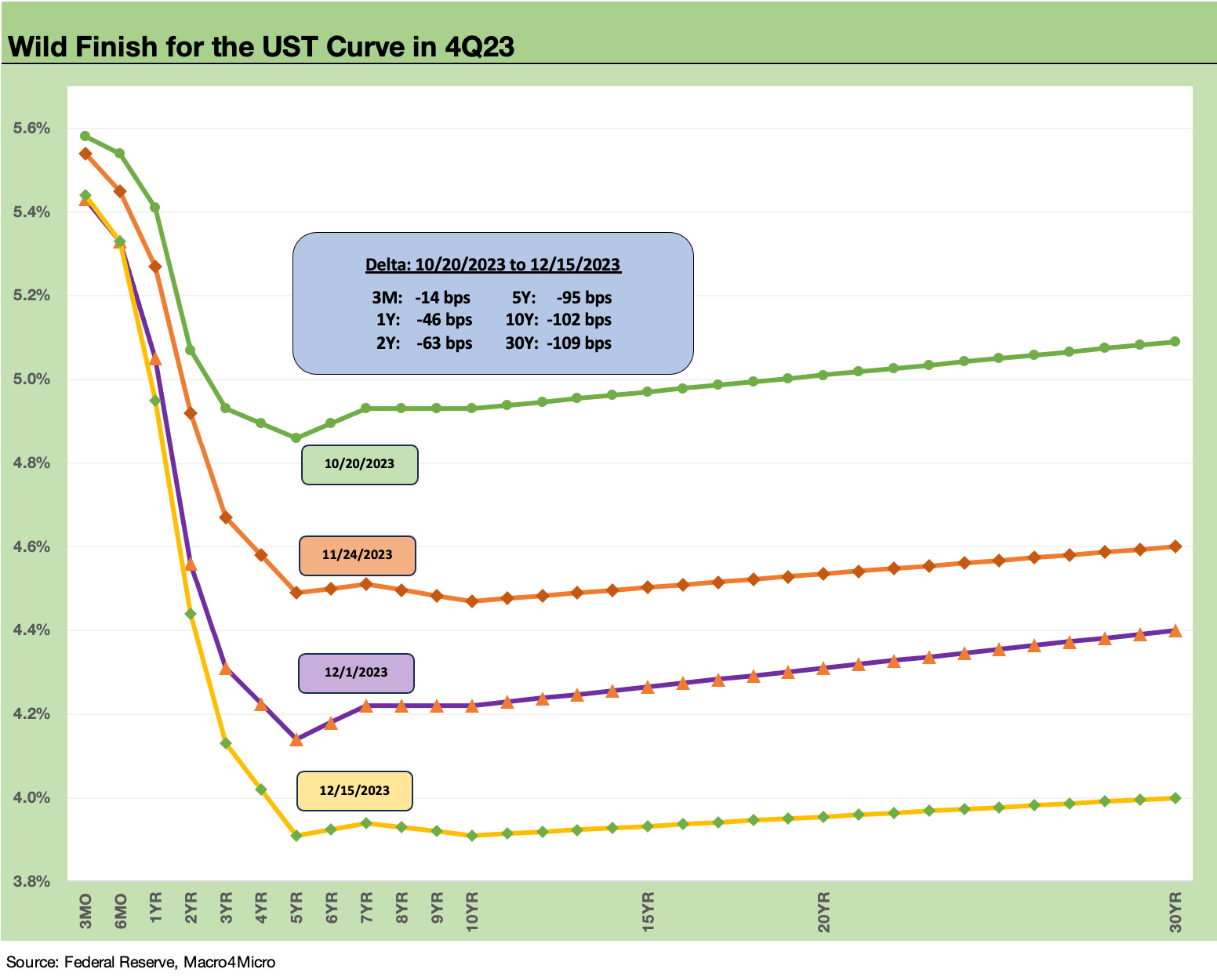
The action in the chart above tells the recent story as it posts several UST curves over the past two months. We plot the 10-20-23 UST curve during a time when the markets had been getting beaten up and the trailing 1-month and 3-month asset returns that we cover were in the red (see Footnotes & Flashbacks: Asset Returns 10-29-23).
The market has traveled a long distance in a short period from that week’s asset return and UST profiles. We then show the downshift in UST across Nov into Dec with the 12-15-23 UST curve at the lows and the 5Y and 10Y UST back under the 4% line and 30Y hanging around just over the line.
The new forecasts from the Fed reverse the direction of the early fall. The dot plot had been targeting a 2024 median fed funds rate for 2024 at 5.1% in the Sept 2023 meeting. As of this past week, the Dec FOMC posted estimated medians dropping to 4.6% as it unwound its earlier estimate. The new estimated target rate of 4.6% is from the current 5.25% to 5.5% range (see FOMC: Hail Powell the Dexterous 12-13-23).
The collective Fed forecast is basically three 25 bps cuts at the midpoint. If we look back at other Fed easing actions around a cyclical peak, we see 2019 as fixed investment struggled. For the rationale on those FOMC actions in 2019, see their statements, but it was straightforward at the time coming off a very poor year for asset returns in 2018.
We note that cash was the top performer across the main debt and equity asset classes in 2018 with less than a 2% return. Clearly the returns in 2023 are dramatically higher than 2018 ahead of the 2019 cuts. The asset returns in 2023 have been remarkably strong as has economic growth in general. That means any fed funds cuts in 2024 will turn on any combination of inflation progress or potential problems that are more a matter of speculation than fact at this point.
The short explanation for easing in 2019 was that investment had flagged. Trump’s version of reality notwithstanding, concerns included a worry that “growth of business fixed investment has been soft” (July 2019 FOMC statement), “business fixed investment and exports have weakened’ (Sept 2019 FOMC) and “business fixed investment and exports remain weak” (Oct 2019). The Fed maintained its fed funds rate target in the Dec 2019 meeting and then came COVID in 1Q20. These three cuts in 2019 were to support an economy during what has been modestly described by the former President as “the greatest economy…ever.”
At the time, the focus on tariff excess had spooked decision making on policy uncertainty and fears around investing without assured consistency across administrations. Corporations loved the tax cuts, but capex and long-term planning for supplier chains was another matter.
In Biden’s case, this next round of cuts in an election year would in theory be more tied to inflation success or if the Fed sees renewed changes flowing into favorable PCE inflation or CPI numbers. Otherwise, they would need to see fundamental weakness not yet in evidence. Investment and consumption has been strong (see 3Q23 GDP: Fab Five 11-29-23) and jobs are still plentiful even if overdue for some setbacks not yet seen in the weekly numbers (see Employment: What 200K Handles on Initial Claims Means (Not Much) 12-16-23).
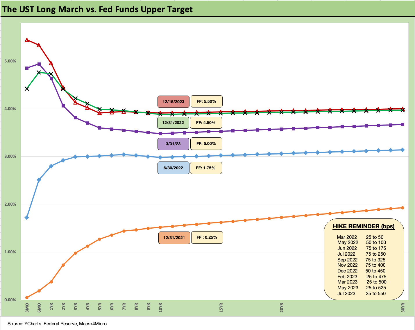
As noted in the above chart, the UST curve is essentially back on top of the year end 2022 UST curve except for the front end. As always, the Fed sets the short end of the curve, and the market determines how the longer end shapes up.
The CPI release during the past week was not all that bullish for the declining inflation theme on the CPI story line and certainly not one that would merit a UST curve celebration. That is, unless you are embracing the ex-shelter school of how inflation should be viewed at this point. Services inflation remains high and largely on the back of the Shelter line (see November CPI: The Big 5 Buckets and Add-Ons 12-12-23).
There has been a good case to make around the distortions of the owners’ equivalent rent slice of the CPI index, but we have not heard Powell make that as a major point. Goods inflation is well under control with durables in deflation and the same for nondurables ex-Food. This week we will get the updated PCE price index numbers for another read on the Fed’s favorite inflation index.
To add to the confusion on what should be driving inflation certainty before easing, we saw reasonably constructive Retail Sales numbers this past week (see Retail Sales: The Consumer is Not Suffering Yet 12-14-23) on the heels of the FOMC meeting and then a balanced Industrial Production and Capacity Utilization release (see Industrial Production: Steady Course, No Signs of Fade of Flourish 12-15-23).
Once the Fed members were free to comment, there was an immediate round of defensive statements around the probability of cuts and where some stood on the matter as the markets ran with the FOMC day good news. Equities rose to a mix of all-time highs (the Dow) and new weekly winning streaks for benchmarks, while credit spreads tightened as well in IG and HY.
We look at this week’s asset returns in our separate Footnotes publication. Interest rate sensitive ETFs were star winners on the week with the top quartile seeing Regional Banks (KRE) at #1 for the week (+8.1%), Homebuilders (XHB) at #2 (+7.1%), small caps continuing their comeback at #3 (+5.6%), Real Estate in recovery short term at #4 (+5.5%), and the long duration 20+Y UST ETF (TLT) at #5 (+5.2%). The market could relax in a week where 30 of the 31 benchmarks and ETFs we watch were positive (only Midstream AMLP at -0.7% was in the red on the week). The story line is not all that complicated. Everything seems to win across duration risk, credit risk, and equity valuation.
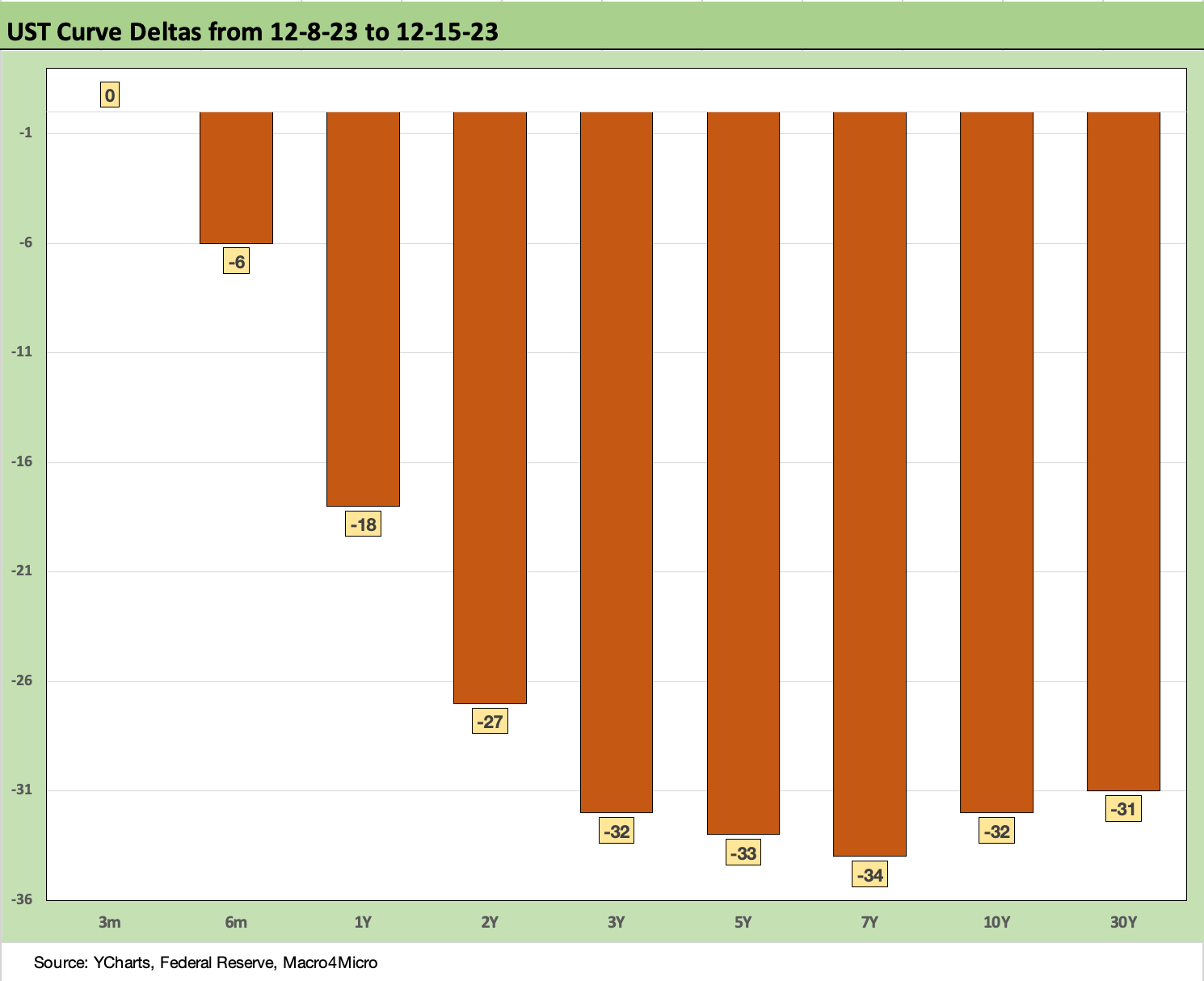
The above chart frames the weekly UST deltas. The move in the UST curve was a headline item already, so we don’t need to overdo the curve deltas. The bull flattening was a downward shift from 2Y to 30Y as noted. The 3Y to 30Y bps move was remarkably consistent.
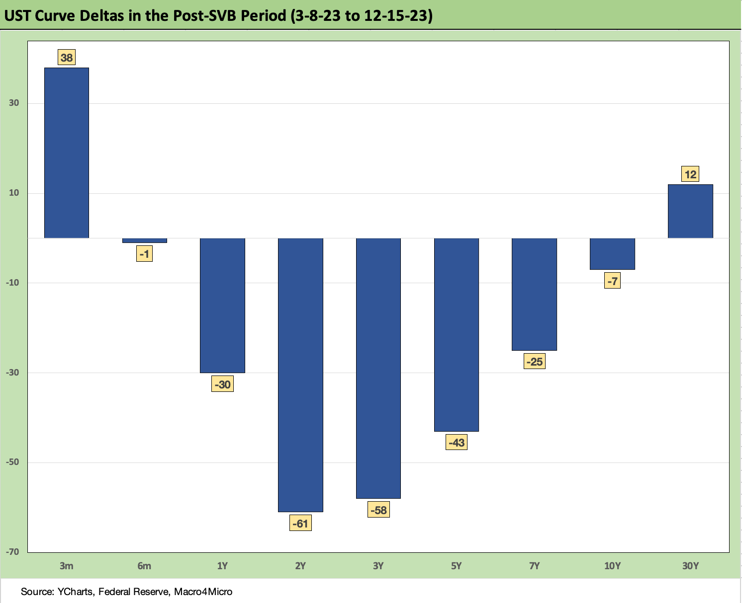
The above chart updates the post-SVB UST moves since the last clean trading day before the SVB collapse. The trend until recently had been a bear steepener with recent weeks showing some moves into lower rates on the front with the 2Y. This chart as reshaped this week tells how far we have reversed into an unusually pronounced downshift.
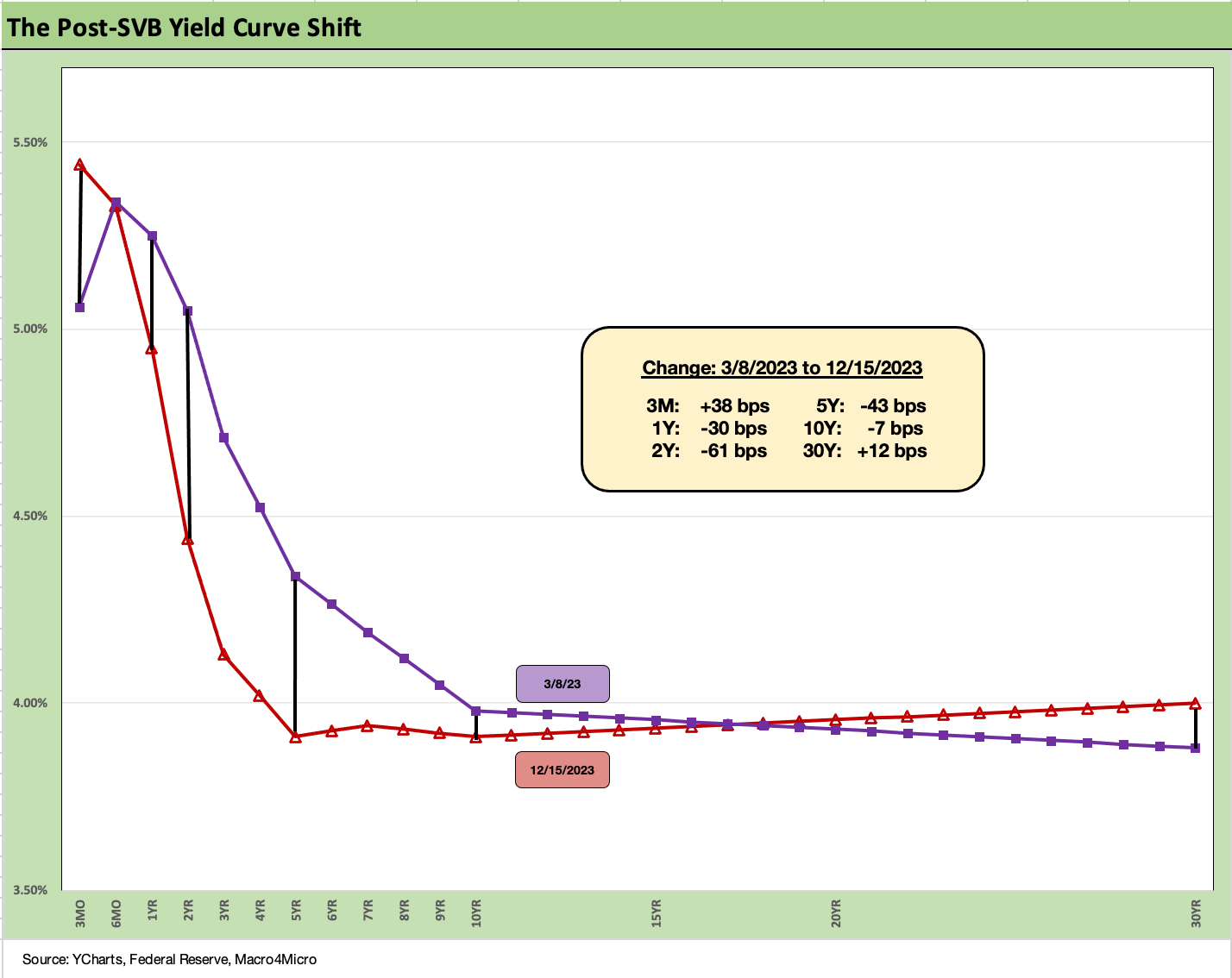
This chart takes the post-SVB UST deltas and plots them in a curve format. We may drop the SVB timeline out of the chart collection after this move. The regional bank mini-crisis of March 2023 remains a very unnerving event on the calendar since it opened up the long-tailed risk of a “push-button run on the bank.”
That said, the regional bank “event” no longer seems to factor into curve developments. The regional banks have mounted an impressive rebound on a more confident investor base and the various UST moves. As an ETF sector, Regional Banks (KRE) are still in last place YTD but only in single digits at -7.4%. That is a long way from -32.5% for the YTD return as of 10-27-23.
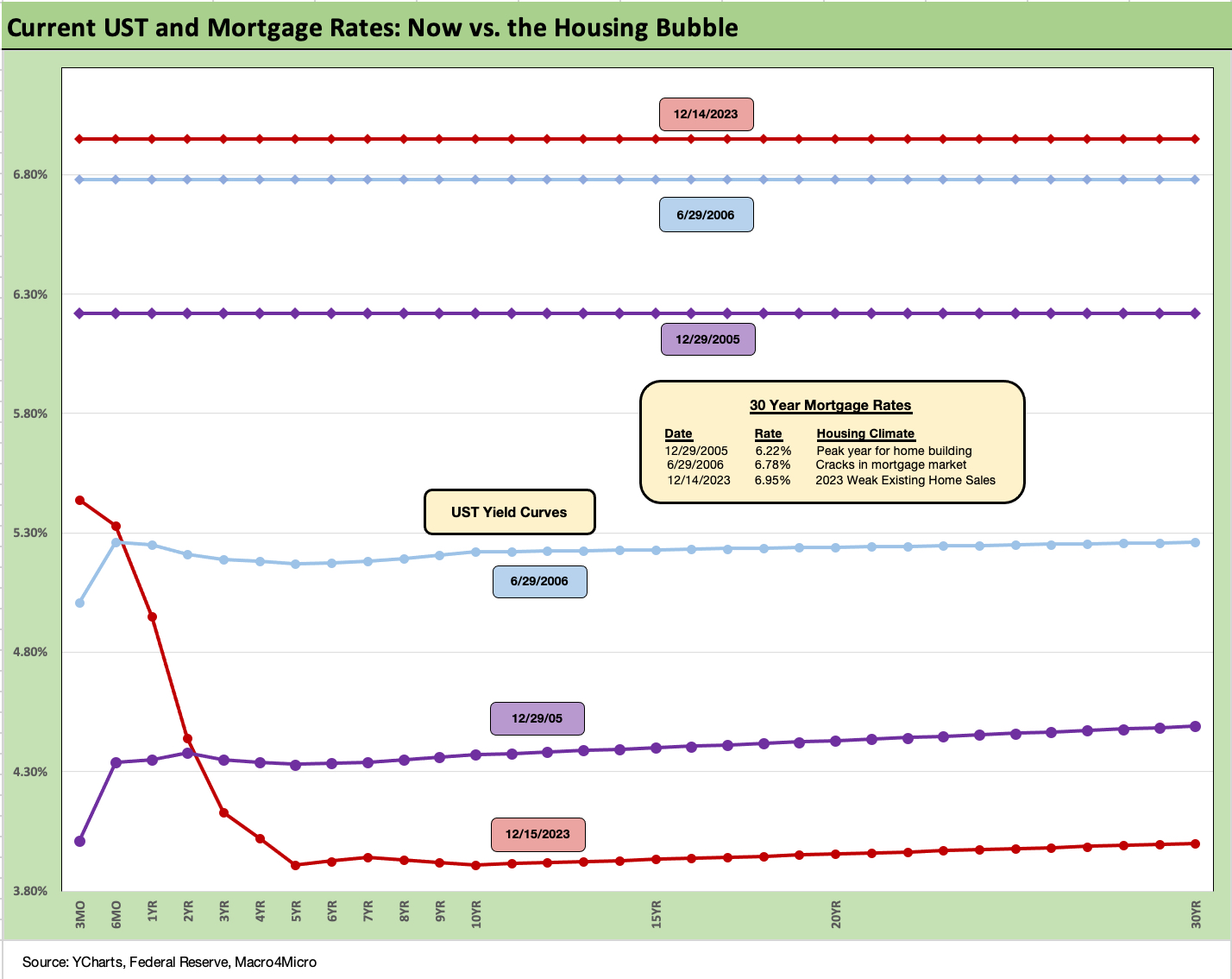
This is a chart where we carry over some of the commentary each week since we get new readers on an ongoing basis. The comparison of current mortgage rates in today’s market to the peak of the housing excess of 2005 and 2006 makes for some interesting input on how to consider what factors can drive activity on new residential construction (“starts”) and existing home sales. We try to update as appropriate and tweak/add where needed.
The post-FOMC UST moves saw some 30Y mortgage quotes in the mid 6% area to end the week, but the Freddie Mac weekly benchmark weighed in at 6.9%.
As we cover in the separate Footnotes weekly publication on asset returns, homebuilder equities have turned in a stellar performance this year even in the face of a painful shift higher in mortgage rates across 7% and all the way to 8% before the recent rally. We have now retraced back into the 6% handle range. That still includes painfully higher monthly payment effects from this tightening cycle.
The Homebuilder ETF performance YTD ranks #1 of the 31 we track. Builders are at the top of the high return quartile followed by 5 Tech or Magnificent 7 heavy benchmarks and ETFs. Interestingly, the bottom of the top quartile has the BDC ETF (BIZD). That sector is highly sensitive to the credit cycle and demand for credit risk exposure.
The bubble lookback years…
With this chart above, the exercise of looking back at prior periods of excessive risk appetite is worth considering. The same is true in gauging what 6% means to housing demand. We drop in the UST curves and the Freddie Mac 30Y mortgage benchmark for two periods from the housing bubble. The Freddie benchmark gets released each Thursday.
The historical comparison above gives context to how strong demand can be with a 6% handle mortgage rate such as in 2005 and 2006. With the recent move in the UST curve, we are looking at a broader cross-section of mid 6% area 30Y mortgage offerings in the markets based on our perusal of the mortgage trade rags.
There is still the challenge of how much home prices soared in 2020-2021 ahead of the Fed tightening cycle. We include the year end 2005 date as the peak homebuilding year and the middle of 2006 when the “liar loan” phenomenon and subprime excess was cresting.
In 2006, subprime was starting to show some cracks but was not yet sending the credit markets into a case of nerves. That would take more quarters to go by. Even then, equities only folded later in the fall of 2007 before the onset of a recession in Dec 2007 (that “official” date for recession was set much later by NBER).
It is notable that the current UST curve is now below the end of 2005 in 10Y UST (it has been running above it recently) and even further below the intermediate and long end of the UST curve seen in mid-2006. Despite that UST configuration, the 30Y mortgage levels of 2023 are well above both 2005 but converging on 2006 in the Freddie Mac benchmark. The 30Y mortgage rates were pulling away before this latest UST curve rally in Nov and Dec 2023. The mortgage vs. UST relationship is a reminder of how mortgage spreads have trended in this cycle (much wider) vs. the years of overconfidence in the pre-crisis period.
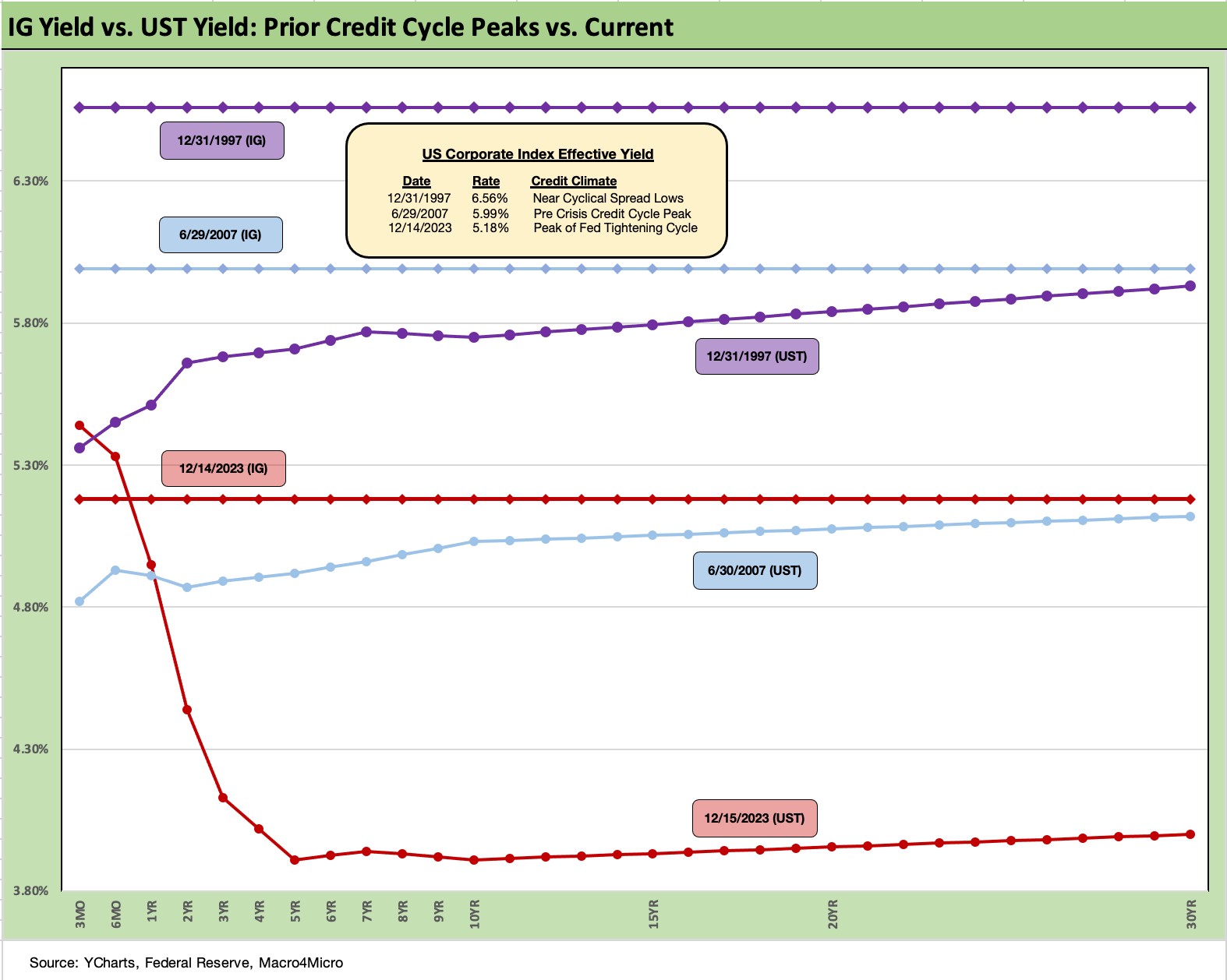
The above chart goes through a similar “then vs. now” exercise for the current UST curve and IG index yield. We compare current days to earlier credit peak periods (1997, 2007) when the IG corporate bond market was at or near credit spread lows.
Spreads were tighter in those peak periods of 1997 and 2007 than recent times, but this latest run in IG is closing in on 2007 with the ICE IG index closing last week at +104 bps (12-15-23). For the past week, IG spreads tightened by another -6 bps. That makes -18 bps tighter on the trailing month, which is a strong performance by IG standards. The BBB tier is -20 bps over the past month.
The ICE IG index OAS is around -30 bps through the long-term median, so spreads are not in any way signaling trouble or fears around a material spread wave along the speculative grade divide (see HY Credit Spreads: Migration, Medians, and Misdirection 11-6-23). The demand for IG bonds is being driven by asset allocation waves that include retirement funds that are racing to gather up yields that they have not seen for years after prorated bouts of ZIRP in the post-crisis era.
The repricing of spreads and the UST curve has now taken IG all the way down to under 5.2% YTW as of 12-15-23 or right around (but below) 3M UST bills (5.39% as we go to print). You were not getting paid a term premium before for duration risk, but you just got paid handsomely anyway for being long duration.
In the world of Goldilocks, that UST rally and steeper inversion came alongside a risk rally in credit and equities. The market is in one of those worlds right now where investors are debating hard vs. soft landing in one room and talking about strong fundamentals and lower credit spreads and higher stock prices in the other. The strong fundamentals are also being juxtaposed against a directional path of lower inflation.
Compression flashbacks…
As we look back across periods of spread compression near credit cycle peaks, the +70 bps for the IG index at the end of 1997 was lower than today even if the difference is narrowing (the low was in Oct 1997 at +53 bps). The 1997-1998 average for IG OAS was +95 bps. Those spreads and the yields cited in the charts above offer some historical context for today’s post-rally levels. Current IG spreads as we wind down 2023 are moving in the direction closer to the lows of the late 1990s period.
Looking at the credit bubble period of 2007 for comps, as the market was looking questionable by midyear, IG OAS was at +100 bps at 6-30-07 at the credit bubble peak. IG spreads were widening by mid-2007 after the period from 1H04 through 1H07 saw IG OAS averages in double digits at around +93 bps. The lows in 1H07 of +86 bps and IG OAS of +100 to end June 2007 were not far from the lows in 2H06 at +90 bps and 1H06 at +87 bps.
The takeaways from the 1997 and 2007 periods were that those risk premiums were in stages of the cycle that were on shaky ground given the direction of credit quality. That is where the “What comes next?” questions come in today whether they be around Fed policy, cyclical trends, geopolitics, Washington policy actions, underwriting quality, outflows away from less liquid assets, and the list goes on.
As we now know, the market events got very noisy after those 1997 and 2007 periods and dramatically so after June 2007. The 1998-1999 period rolled onto a stretch of global credit volatility (Asia, EM, LTCM, etc.) ahead of the launch of the eurozone credit markets to start 1999. For TMT, it ended badly.
We also saw some headline controversies in the BBB tier ranging from fraud (Enron 2001, WorldCom 2002) to criminal activity that was far less damaging than initially feared in terms of credit risk (Tyco 2002). These events led to a lot of changes in the credit markets, underwriting and regulatory oversight (Global Research Settlement of 2003).
The resilience in the risky asset markets (HY and equity alike) in the late 1990s was remarkable in retrospect given the ability of the US credit markets to decouple from Asia and then the broader EM turmoil that helped send LTCM into a “soft bailout” crisis.
The ability to turn away from risky Yankee deals in late 1997 and into 1998 was clear enough, but the tech enthusiasm in the equity markets was hard to shake with the NASDAQ at +86% return in 1999 even with the default rate materially higher by 4Q99.
The credit markets in 2023 have shown a lot of resilience, but the fundamental backdrop and underwriting cycle in credit and issuer mix in the HY index is much higher quality today than in 1998-1999. If there is excess unfolding, oddsmakers would usually place their bets on the newest and least transparent market with the most asset gathering and fee opportunities ahead. That would be private debt and direct lending.
The anxiety factor around private debt is not showing up in the BDC quarterly numbers yet even if the behind the wall chatter on growing private credit mixes bulls with bears in their usual “all good vs. all bad” faceoff. If one sees BDCs as a front door to the private credit house, the results have been favorable to date even if the super bears show up for every major new asset subsector expansion. That is rooted in the assumption that market participants do not evolve or change.
BIZD as an ETF has been a very strong relative performer in 2023 as we cover in our asset return publications. The BDCs in the market are overwhelmingly investment grade. As a disclosure item, I have owned numerous BDCs the past two years, divested some for gains and hung on to many as good cash yield investments. The dispersion of performance indicates investors are making issuer specific calls on the names.
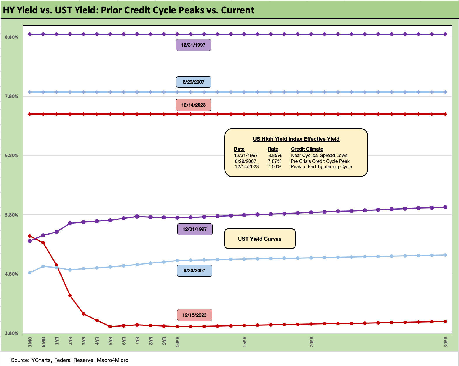
The above chart does the same drill for the US HY market as we did for the IG markets. We use the same dates (1997, 2007) as IG to frame the symmetry of risks today. We saw HY OAS at +296 bps (12-31-97) although HY OAS had been inside +250 bps in Oct 1997 (+244 10-17-97). The 1997 period saw average spreads of +282 bps in 1H97, +270 bps in 2H97, and +298 bps in 1H98 before the summer storm of Russia and LTCM rolled in from August into the fall.
The peace and quiet of 2007 was very short-lived relative to 1997. HY OAS averaged around +270 bps in 1H07 vs. HY averaging +270 in 2H97, so the two periods have some common features in spreads. During the crazy period of June 2007 as the market fuse was burning down, we saw HY OAS of +298 bps on 6-30-07 (as tight as +244 on 6-1-07) vs. the +351 bps to end last week (12-15-23).
We saw another sharp move tighter with -24 bps of HY OAS compression last week. Quality spreads from CCC to BB compressed on the week. We like to watch quality spreads for hints of the bottom-up decompression threat (see HY Credit Spreads: Migration, Medians, and Misdirection 11-26-23, Quality Spread Trends: Treacherous Path, Watch Your Footing 10-25-23). It is impressive how well spreads have held in during 2023 after the 2022 turmoil neared +600 bps in HY and crossed the +500 line a few times in the summer and fall.
In terms of this latest compression wave, HY OAS was a dazzling -49 bps tighter during the week of 11-3-23. The BB tier was -52 bps tighter during the big rally week of 11-3-23, the B tier -47 bps tighter, and the CCC tier -24 bps tighter. For the trailing 1-month through 12-15-23, the BB tier is -34 bps tighter, the B tier -47 bps tighter, and CCC tier -73 bps tighter. YTD, the HY index is -130 bps tighter.
Closing in on 2018 and 2014 tights…
For reference points, we can once again start talking about the June 2014 lows (+335 bps on 6-23-14) and Oct 2018 lows (+316 bps on 10-3-18). Those 2014 lows and 2018 lows are 1 or 2 good months away. Those lows were not like 2007 or 1997, but lower +300 handle HY index OAS levels are rare.
It is worth remembering that the periods after the Oct 2018 lows and June 2014 lows did not go well in the immediate aftermath. Late 2018 was a bloodbath with an ugly Dec 2018 quality spread widening and oil crash while late summer 2014 brought the Saudi oil price war looking to recover market share.
The all-in yields are hard to resist for many. In contrast to 1997 and 2007, all-in HY index yields in 2023 are much higher than in 2014 and 2018. On 6-23-14, the HY YTW was 4.85% while 10-3-18 posted YTW of 6.24%. Both of those yield backdrops are substantially below the 7.86 % HY index YTW to close on Friday (12-15-23).
An asset allocation strategist can be forgiven for chasing yields as high as they are currently, even if the risk premium is too low in historical context vs. lower risk alternatives. Yield bogeys can carry the day for many, especially after 15 years of yield starvation since the credit crisis.
The UST curve has moved so quickly, we are already down under the 8% line in HY. HY YTW was 9.5% on 10-27-23 and down to 8.76% on 11-16-23. Equities and credit spreads and long duration all ran in. Whether you bought a long duration UST ETF, a small cap ETF, or IG bonds, victory was to be had in the wild finish of 2023.
HY vs. IG: fundamentals vs. duration
The 5.2% yield in IG corporates now leaves ample room for debate on the relative asset class value of IG vs. HY in expected returns. If you are thinking soft landing or mild recession and easing, the old trade-off of duration and interest rate risk vs. credit risk comes into play. If you are thinking hard landing, then IG is the safer play vs. HY. That is a topic for another day in planning for 2024.
Fundamentals have been in aggregate solid, and 3Q23 earnings season did not signal trouble in the immediate context of spreads. Equity watchers cite the bottom of earnings YoY trends and a favorable outlook ahead for earnings growth.
For the HY energy sector names, oil has been well behaved so far in all the Mideast turmoil and even dropped briefly below $70 handles in the most recent week for WTI before getting back above the $70 line. OPEC differences on supply and production quotas have been in the news in recent weeks even as fresh news came of more record US oil production and natural gas production. The demand side of the equation (notably in China) is seeing some second guessing.
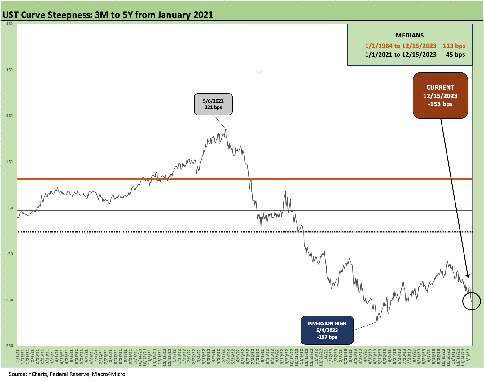
Each week we select some UST curve segments to update slopes. The above updates the 3M to 5Y UST as the increased inversion is underway again. We wrapped the week at -153 bps as it inverted more on the 5Y UST decline. We remain well above the -197 bps of May 2023.
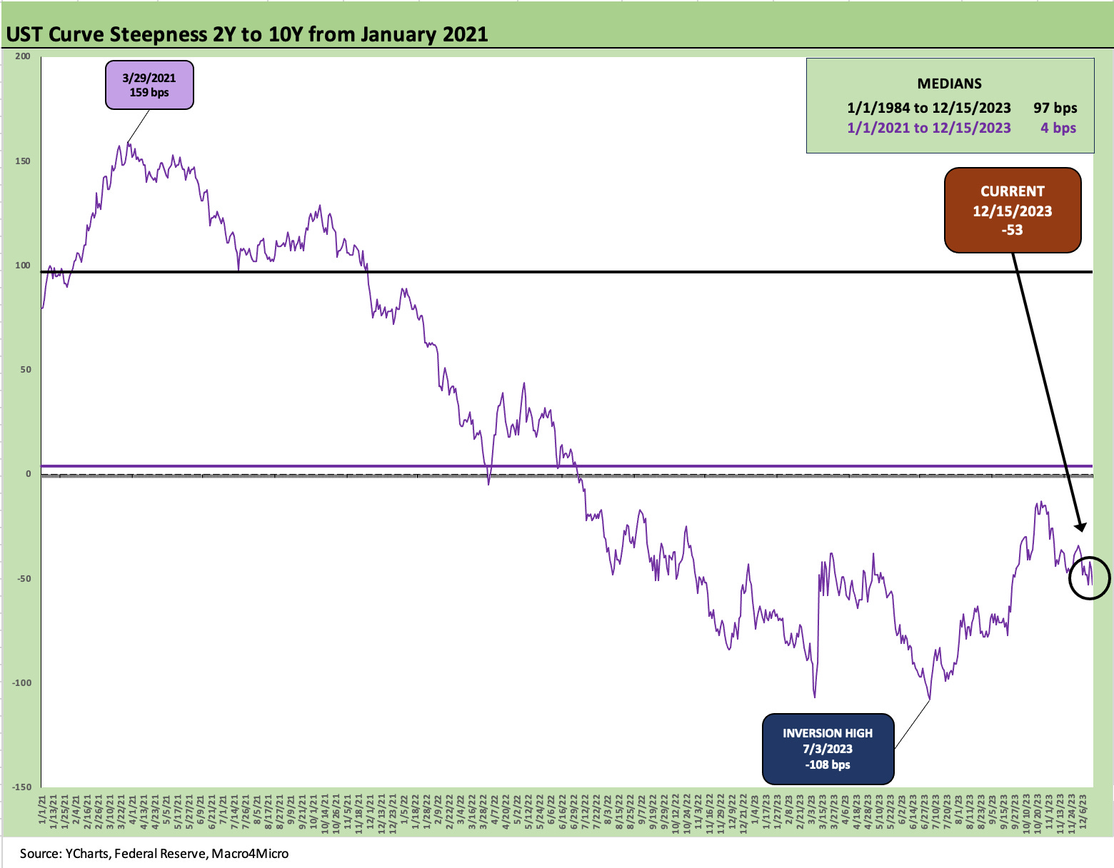
The above chart updates 2Y to 10Y which also remains inverted at -53 bps with the inversion growing more pronounced this month for a segment of the curve that is typically upward sloping. We saw more of the “inversion = recession” crowd back in circulation this week. At some point there will be a recession and they can declare victory, but in the meantime the unusual backdrop is showing economic expansion and a risk rally plus inversion.
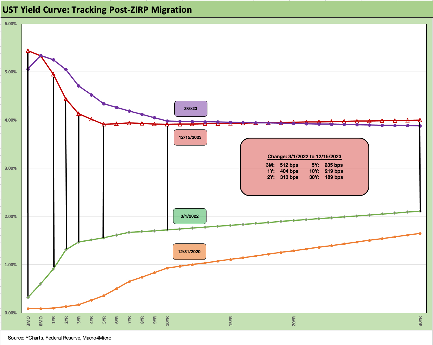
We wrap up the Footnotes and State of Yields weekly with the usual chart framing the deltas from March 2022 when ZIRP ended and the tightening cycle kicked into gear. Back near the end of October 2023, the 30Y was +292 bps higher and is now down to +189 higher (shown in the box above). The 10Y was +312 bps higher in the 10-27-23 weekly and is now down to +219 bps. The 2Y was +368 bps and is now +313 bps.
The big swing higher and now lower has been one not seen for a long time, but is occurring against the backdrop of a 5% handle 3Q23 GDP (the final GDP estimate is released this week), a record payroll count, and at least one all-time high for an equity benchmark (the Dow) printed this week. Overall, this has been a very strange confluence of factors in a market where an inflation fight is ongoing.