Fed Funds vs. Credit Spreads and Yields Across the Cycles
We frame fed funds vs. HY and IG bond yields and spreads across cycles for the past vs. prologue discussions on tightening impact.
We look back across time as a memory jogger on how rapid Fed tightening cycles on the way into the “recession debate” stages of the expansion show an ugly history.
Each cycle had its own distinctive structural features, bank system health backdrops, asset quality risks, underwriting “behavior” patterns, inflation rates, and how the employment risks fed into personal consumption and consumer credit quality.
The potential for systemic shocks lurk more in geopolitics now than in “death by debt ceiling” but the fundamentals are much better in 2023 than in 2007 or 2000 when the tightening cycles did not end well.
The major exception on the risk checklist in this market is the sticky services inflation of today that limits Fed options and even threatens more tightening.
With the recent “hawkish pause” behind us (see FOMC: Hit Squad or Suicide Squad 6-14-23), we thought it was worthwhile dusting off some yield and spread histories across prior tightening cycles. The hawkish dot plot from the FOMC could send fed funds past the housing bubble/structured credit crisis levels (5.25%) and get within shouting distance of the TMT bubble tightening cycle that crossed the 6% threshold (6.5% peak rate).
As we revisit in the charts below, what followed those fed tightening cycles was not pretty. The above chart just offers a reminder of the fed funds journey relative to the 10Y UST. The chart frames the wild swings from steep to flat and inverted and back again. These curve moves across expansions and recessions are a part of history. The recent inversion has not been seen since the Volcker years. The fed funds in today’s market stands out given its relationship with the 10Y UST.
UST curves reflect symptoms of fundamentals and are not the main cause of markets cracking…
We emphasize that we are not of the cause-and-effect school that material tightening must lead to a hard landing. The Fed tightening was just one more ingredient in some past cycles that already had a toxic brew of risks in the mix. The checklist across the cycles included high systemic leverage, underwriting excess in traditional credit, and a spike in supply of untested (and mis-rated) structured credit products with limited actuarial histories.
We also saw sector concentrations in high-risk credit (e.g., TMT, E&P in HY) and fragile OTC liquidity where all market makers move in the same direction at the same time and start limiting exposure across a smaller number of those intermediaries in record-sized markets. The 2007-2008 markets featured counterparty risks that ran from improperly measured to recklessly incurred.
Fed funds finally exceeds inflation and qualify as positive real fed funds…
We framed many of the cyclical histories and fed funds trends during the fall of 2022 as the fed action was running full steam from March 2022 and hikes were fast and furious. The reality of the fed funds history is that historically fed funds had run ahead of inflation to generate positive “real fed funds” (see Fed Funds-CPI Differentials: Reversion Time? 10-11-22, Fed Funds vs. PCE Price Index: What is Normal? 10-31-22). That was not the case until recently. The upper range target for fed funds is now above headline and core CPI and headline PCE. Fed funds is just short of Core PCE. We will get a fresh PCE print at the end of next week.
As we covered in those fall commentaries, that negative real fed funds relationship was always our biggest concern. Either inflation had to come down a lot or fed funds needed to go materially higher. The market levels are now at least posting some semblance of balance. The fed likes headline PCE for their 2% target, but the relationship of fed funds with inflation calls for fed funds to be higher, and that is barely the case now. Negative real fed funds implied the policy was (in theory) still accommodative. That is somewhat common sense, but rate shocks have their negative effects one way or the other when they move higher quickly.
The only major victory over high inflation was executed by Volcker, and he pushed a monetary policy that saw fed funds above inflation for a protracted period that extended into the 1980s expansion (recession ended Nov 1982). The few exceptions in the Volcker years were when the Fed let fed funds swing dramatically when its focus was fixed on monetary aggregates growth. We plot those histories in the “Fed Funds vs. PCE Price Index: What is Normal?” piece. We include a section in that article on the history of CPI vs. PCE.
Fed funds and the IG bond market….
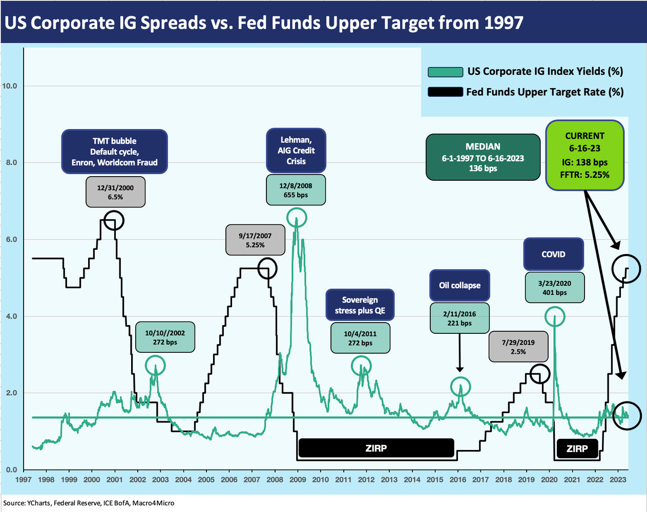
The chart below plots corporate bond yields and fed funds across the timeline from the 1997 credit market peak year through current times. We say credit market “peak” in general terms for 1997 since that year was arguably the top of that credit cycle as it marked the spread lows in US HY. There was also a flood of Yankee corporate EM paper getting sold into the US market in 1997. That market access had changed dramatically by 1998.
Late 1997 saw the onset of the Asian crisis on the way into the chaos of the summer 1998 with the Russia default, EM contagion, LTCM, and fed intervention on multiple fronts. The NASDAQ still printed an +86% return in 1999 as the TMT boom was cresting. The HY default cycle was rolling in by the fall of 1999. Inflation was edging higher in the late TMT cycle, and aggressive Fed action made the implode-a-thon that much worse as it tightened into a credit market swoon.
In the charts, we note the peak fed funds rate at the date just before the period when the fed funds rate decline set in. For example, the May 2000 to Dec 2000 peak fed funds of 6.5% is dated right before the cut to 6.0% in Jan 2001.
The above chart plots the steps of the fed funds upper range against IG corporate index yields. The timeline history is not reassuring and is easy fodder for the “past is prologue” bear crowd to point at. Our research reiterates that each cycle is quite distinctive with each having its own set of moving parts across market structure, regulation, economic variables, bank system health, etc. (see Expansion Checklist: Recoveries Lined Up by Height 10-10-22, Business Cycles: The Recession Dating Game 10-10-22). The yield time series shows 8% handle yields in the tightening and market turmoil of 2000 and 9% IG yields in the credit crisis of 2008. Spreads sent yields much higher. The post-crisis tightening cycle of Dec 2015 to Dec 2018 was fairly benign, and the Fed was easing in 2019 as the economy was faltering.
The periods on the way into the 2000-2001 and 2008-2009 market swoons included sustained tightening and defensive market making. The world changes in 2009 under the ZIRP regime, and the focus until 2015 was in ZIRP support, periodic QE, and monitoring any signs of systemic stress such as what we saw in 2011 as the Eurozone and UST debt ceiling roiled spreads (notably IG banks).
The earlier tightening and easing cycle before 1997 is not addressed above, but it came at the back end of the 1980s corporate debt boom. We do not have the spread history for that period, but we have looked at that in detail in other commentaries (see Greenspan’s First Cyclical Ride: 1987-1992 10-24-22). The basics are the bank system was under duress (especially Citi), and Greenspan worked hard to support a recovery of the financial services sector (including the securities industry) well into the expansion. He did the same after the TMT bubble (see Greenspan’s Last Hurrah: His Wild Finish Before the Crisis 10-30-22). The significance of the Fed in defending on the downside and often overdoing it is a matter of history.
What the above chart drives home is Volcker’s victory over inflation was the pivotal battle that set the stage for the sustained forward downshift in the yield curve since the credit cycle peak of 1989 (see UST Curve History: Credit Cycle Peaks 10-12-22). We will not get anywhere near the absolute rate levels of the late 1980s and the peak UST flat curve of late 1988 and 1989. The history shows that the protracted easing (notably 1991, 2001) set the stage for strange times in the 1990s and post-TMT structured credit and housing boom of the 2000s (see Fed Funds, CPI, and the Stairway to Where? 10-20-22). The 2001-2004 series of actions is a set of moves that came against a very soft landing (ultra-mild, brief recession in 2001) and set off market activity the world is still paying for.
The above chart takes the same fed funds timeline and posts that against IG spreads. The late cycle Fed tightening obviously preceded a lot of trouble on the other side of the hike. That came after the longest expansion in history during the 1990s (later eclipsed by the post-June 2009 recovery).
The crisis of 2008 had a laundry list of causes, but the importance of banks and brokers in the IG OAS picture is underscored by the 600 handle spreads of late 2008 as banks were collapsing and thus market making was also hampered in an OTC market for corporate bonds.
That 2008 crisis was not about the fed funds tightening of 2004-2006. It was about what took place in risky asset markets and derivatives. Finding a parallel of the credit crisis to the market action today is a task more contrived than real even if we can see some deposit run parallels to the S&L crisis of the late 1980s.
We have covered these cycles in detail in the links we include in this piece, but the main takeaway in 2000 was that the outcome was tied to the worst equity and debt underwriting cycle in history (that is saying something) and excessive systemic leverage in the system to boot (think LTCM).
The Fed easing all the way to 1% fed funds in 2004 (3 years into the recovery) contributed to the worst mortgage securities and structured credit underwriting in history. That was accompanied by the most unbridled (and sometimes unmeasured or inaccurately measured) counterparty binge in history.
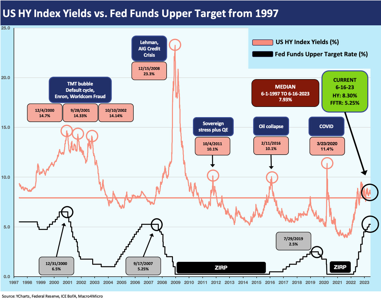
The chart above and the next chart do the same drills for US HY that we just did for IG. We highlight the ZIRP years for visual impact. The point in US HY is that OAS saw the risk premium and yield being essentially one and the same across the ZIRP years. The notorious asymmetry of US HY bonds in bad markets is captured as usual. The pattern of the yield action in this short duration sector is more driven by the fed funds impact given the inevitable high level of exposure to floating rate debt from high levels of bank borrowing whether for term loans or in managing working capital and revolver needs.
The HY bond yields capture the riskiest bond issuers in the market. The risks of a flat and inverted curve that shifted up so rapidly goes well beyond the HY bond market with loans more important than ever across the corporate landscape. We see a soaring volume of loan-only issuers all the way down to small cap and microcap companies. The private credit wave involves an expanding universe of private small companies.
With the rapid growth of private credit in current times, the fed funds flow-through impact will break some new ground in scale across nonbank lenders and in relatively more transparent structures such as Business Development Companies (BDCs). Opportunistic BDCs had prudently tapped into low-cost unsecured bond market options to lock in low rates and extend out the curve. Many BDCs were literally ahead of the curve and have locked in favorable interest margins in the face of an inverted yield curve.
In the interest of disclosure, BDCs became of more interest to me as I was building an income portfolio. I own a cross-section of major BDC names with no single name over 2% of my overall portfolio. (Emphasis: this is not an investment recommendation).
The use of secured, floating rate loans with high income characteristics was already mainstream but is growing rapidly for numerous reasons. The dynamics are that rising fed funds and short rates bring higher income, but they also pressure the costs and cash flow of issuers. The delicate balance of leverage and cash interest demands on the borrower vs. income opportunities for the investor is not a new tradeoff in risky credit markets.
The fed funds journey across expansions and downturns in the credit markets or broader economy is not as easy to generalize about. The outsized moves in HY OAS can also be dictated by a lot more than short term rates. Multiple HY market meltdowns during the ZIRP years such as 2011 and early 2016 certainly hammered that home. In the case of the late 2015/early 2016 dislocation during the peak of the oil crisis, the fear of redemption waves was enough to dislocate pricing across the asset class.
The earlier bout of stress in the markets was tied to systemic risk fears as the Eurozone sovereign stress period in 2H11 (Oct 2011 peak OAS) sent the market into a spread gap even as the US was downgraded in the late summer. Volatility in credit risk remains a factor, but systemic worries always lurk. We saw the banking system in IG was a factor in 2011 and into 2012 that extended down into HY rated structurally subordinated bank securities. The monster rally in bank paper in 2H12 covered both IG and HY markets. Those material swings occurred in a ZIRP and QE world.


