
Initial Claims: Historical Context on what 211K Means
We put the most recent initial claims number in multicycle context.


Is 200K claims a side view mirror moment? We doubt it.
The recent jump posted today puts initial unemployment claims back in the 200K-handle bucket we saw in 4Q22 after so many 100-handle numbers in early 2023.
In this note, we look across the cycles from 1973 through today and include some time horizon subset medians for frames of reference.
The main takeaway is that claims are exceptionally low in absolute terms and especially low considering demographics and payroll count now vs. prior periods.
Initial claims for the week ending March 4 weighed in with a modest but important jump to 211,000 or an increase sequentially of 21,000. While that uptick offers some relief for now, the payroll details by industry group that come out tomorrow will be more interesting. The Powell and FOMC wage trend focus is a direct offshoot of the supply and demand for labor, but it will take a lot of 300K handle numbers (and more) to move that labor supply-demand intersection. We had looked at this topic before in detail (see JOLTS: More Bodies for More Jobs, Demand is Strong 2-1-23), and this note is just a quick update.
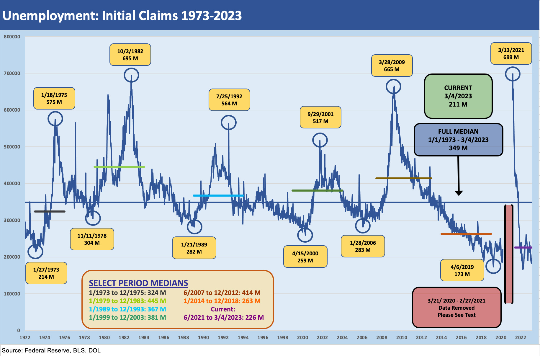
The above chart shows the time series for long-term initial claims (weekly) across the cycles from early 1973 (the cyclical peak was Nov 1973 after the Arab Oil Embargo started in Oct 1973) through today. The chart above highlights some relevant segments of the timeline where we break out median initial claims numbers for those periods. The long-term median for claims is also a highlight in the mid-300K range for the entire timeline.
You can just as easily juxtapose that number vs. the record payroll count and give this very low claims number a measuring stick (Jobs: The Human Wave Continues 2-3-23). When framed against record high payroll and demographics across time, it is safe to say that a 200K+ claims number “just ain’t what it used to be.” While the inflation watchers are glad to see a sequential move higher, it is way too early to sing the song “jobless days are here again, the skies above are dark again…” on the way to a deflation celebration. The JOLTs numbers are still telling a story of lopsided hiring demand (see A Fresh JOLT but No Shock 3-8-23) vs. supply. The headline noise in tech and a growing base of businesses doing layoffs has a long way to go with 3.4% as an unemployment starting point.
Medians and histories….
The median dates above were selected for a range of reasons from simple recessions to periods of recovery and notable market milestones. For example, Jan 1973 to Dec 1975 covers a cyclical peak period leading up to the Nov 1973-March 1975 recession. That was an ugly one. The Jan 1979 start date coincides with the Iranian Oil Crisis to Dec 1983 after the last recession year (1982) and then into the first expansion year of 1983. That stagflationary double-dip recession of 1980-1982 is a period we had looked at in other commentaries.
At the risk of repeating ourselves, we try not to lose sight of how much smaller the payroll counts were in those earlier days. Those medians in the 1970s and early 1980s were brutal and the economy was going through some very rough stretches of structural change and deregulation. The 1980-1982 period included two recessions and some 20% fed funds moments. The credit markets also included both record inversions and record steepening of the curve. Volcker monetary policy was sacking cities and industries and the restructuring in manufacturing industries was gut-wrenching. A prime-based loan (“prime plus”) in the early 1980s could easily be 23% or more. Cost of capital was high and so was unemployment.
The June 2007 to Dec 2012 median period covers a lot of trouble with the crisis of late 2008 being the highlight. The 2007-2012 median covers the time from the credit cycle peak of summer 2007 (e.g., hedge funds were starting to blow up, Countrywide was ticking, LBOs were getting scrapped, and Bear Stearns management was in turmoil) to Dec 2012. The 2012 period was the end of Obama’s first term when the market had by that point been very slow to see jobs come back since the June 2009 trough. The 2011 sovereign debt noise and the threatened US default of the late summer offer some parallels to today. The 2012 action came after a stretch of QE1, QE2, and QE3 across those years. By late 2012, risk appetites were soaring again.
The 2014-2018 period included a wild stretch for the Fed and for US HY markets that included two cyclical lows for HY OAS (one in June 2014 followed by the low tick in early Oct 2018). That stretch covered the oil price crisis and even ended with a sharp sell-off in oil again in late 2018. The volatility included the end of ZIRP in Dec 2015 and the end of hikes in Dec 2018 as trouble started to mount. The period from Dec 2009 to the Feb 2020 peak was the longest expansion in postwar history (see Expansion Checklist: Recoveries Lined Up by Height 10-10-22).
We also drop in a median for mid-2021 when the markets were rolling on through the today. The median of 226K is close to (but above) the claims number we just saw posted. In other words, the claims number released today is below the period that set off the inflationary wave.
Tomorrow’s monthly employment number should be interesting for more sea level color across industries.

We roll forward one of the earlier charts for a read on what happened during the COVID spike. The gap we created in the historical time series in our first chart above was to improve the visuals on “normal” cyclical patterns. To the extent a spike to 10% area unemployment in past cycles can be considered normal, we needed to separate the mid-Mar 2020 through Feb 2021 claims numbers. The details on the COVID claims activity go under the heading of “FYI.” Or maybe “WTF.”