
Nov 2023 Jobs: A Sad Story of More People Working
We run through the employment time series and trend lines by occupations in our monthly jobs chart set.


The “good is bad” theme is always a strange concept for people who do not have their Fed tunnel vision glasses on, but the ability of more households (at a lower rate of growth in record payroll count) to keep living paycheck to paycheck fits in with the soft landing and no landing scenarios that the equity markets and HY market are looking for.
The problem for some forecasts is that the resilient hiring may not support material Fed easing to the triple digit level in 2024 as the inversion, flattening, and steepening point-counterpoint discussions will continue.
The need for PCE contraction to have a recession and a requirement for a hard landing is likely to remain on its heels without some market shock from the outside world.

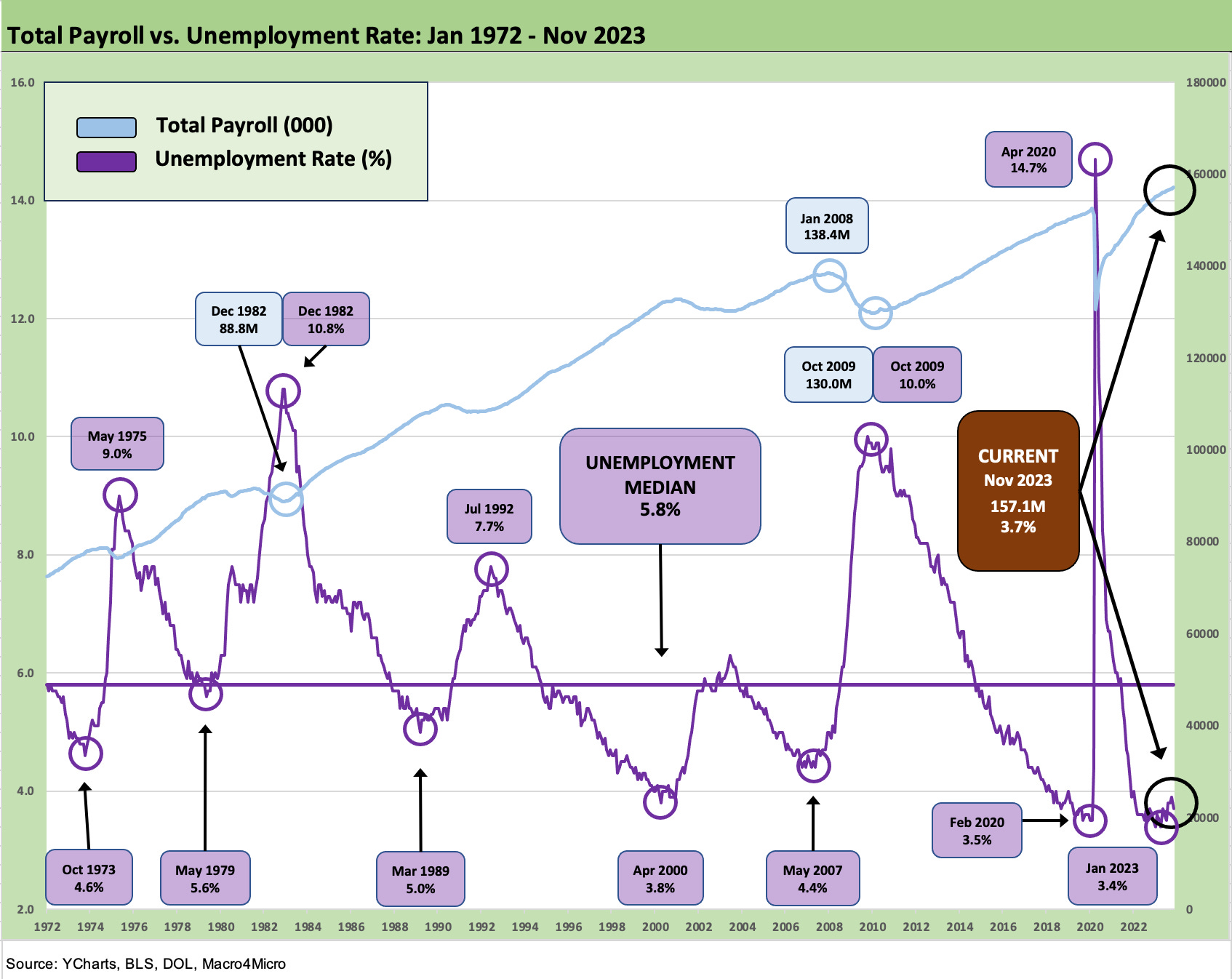
The above chart updates CPI vs. the unemployment rate over the long term. The time series from the bad old days of the early 1970s when (from first-hand knowledge) minimum job wages were hard to find as the late 1973 recession kicked into gear and stayed ugly into early 1975. The timeline of the chart then moves across the cycles and the grim 1980-1982 double dip and then on into the strange new world of rapid GDP growth of the 1980s-1990s. The steadily shifting demographics and a material change in mix from manufacturing to the services sectors just kept rolling along.
As it stands now, we can say “record payroll” again in an economy where gross headcount matters at a time when we also have record retirees on the books and most likely record undocumented workers/spenders “off the books.” In other words, that’s a lot of PCE on the demand side.
We also see the cluster of months in the 3% unemployment rate zone on the lower right. The dip to 3.7% from 3.9% is tied to rising jobs, a downtick the number of unemployed from 6.51 million to 6.29 million, and a higher labor force count that rose by 532K on the month. The decline in unemployed and higher labor force (167.7 mn to 168.3 mn) is old school long division to get to 3.7% from 3.9%.
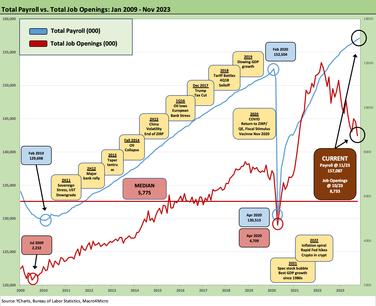
The above chart maps the payroll count vs the job openings in the JOLTS data (see JOLTS Oct 2023: Lights Blinking? Dimmer or On-Off? 12-5-23). The JOLTS data comes at a 1-month lag, but the relationship of job openings to total unemployed just got a little better.
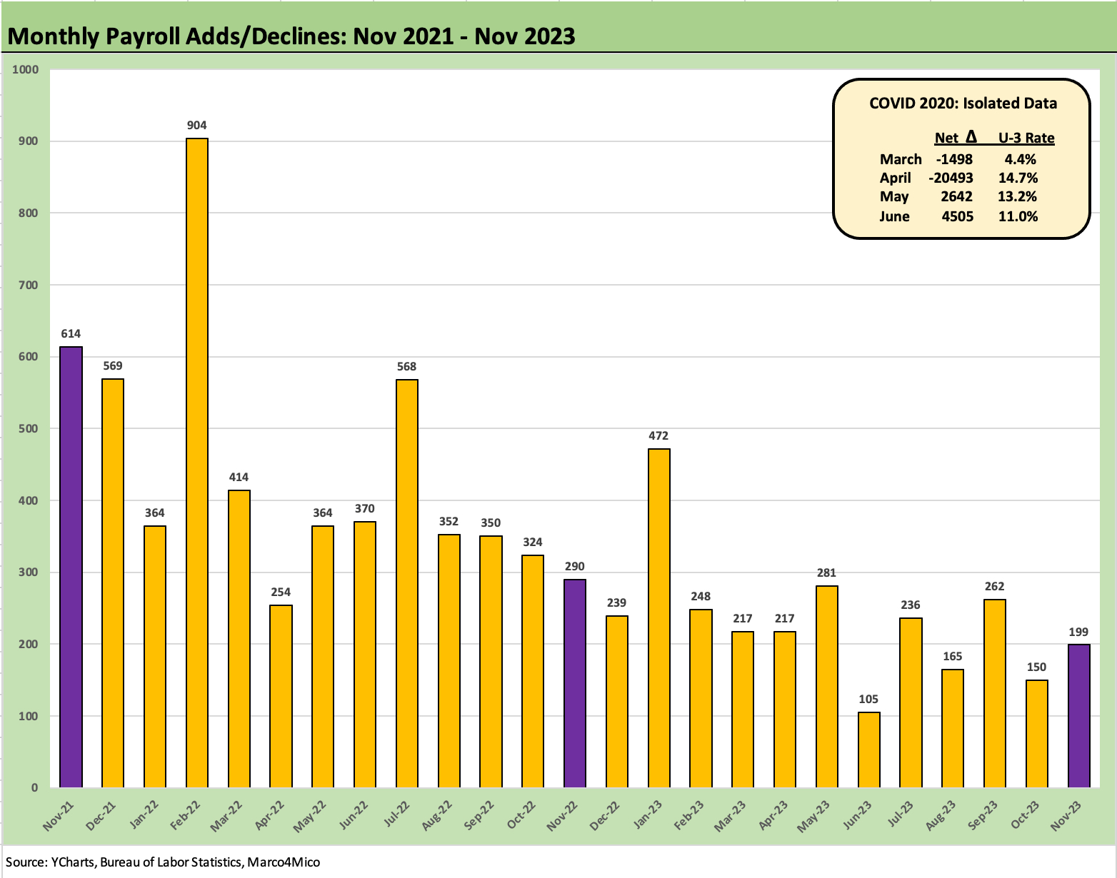
The above chart plots two years of months of “job adds” data. We update the time series for a small downward revision to Sept 2023 numbers. The Nov 2023 data ranks 4 off the bottom for the trailing twelve-month period with June 2023 the lowest, Oct next, and then August.
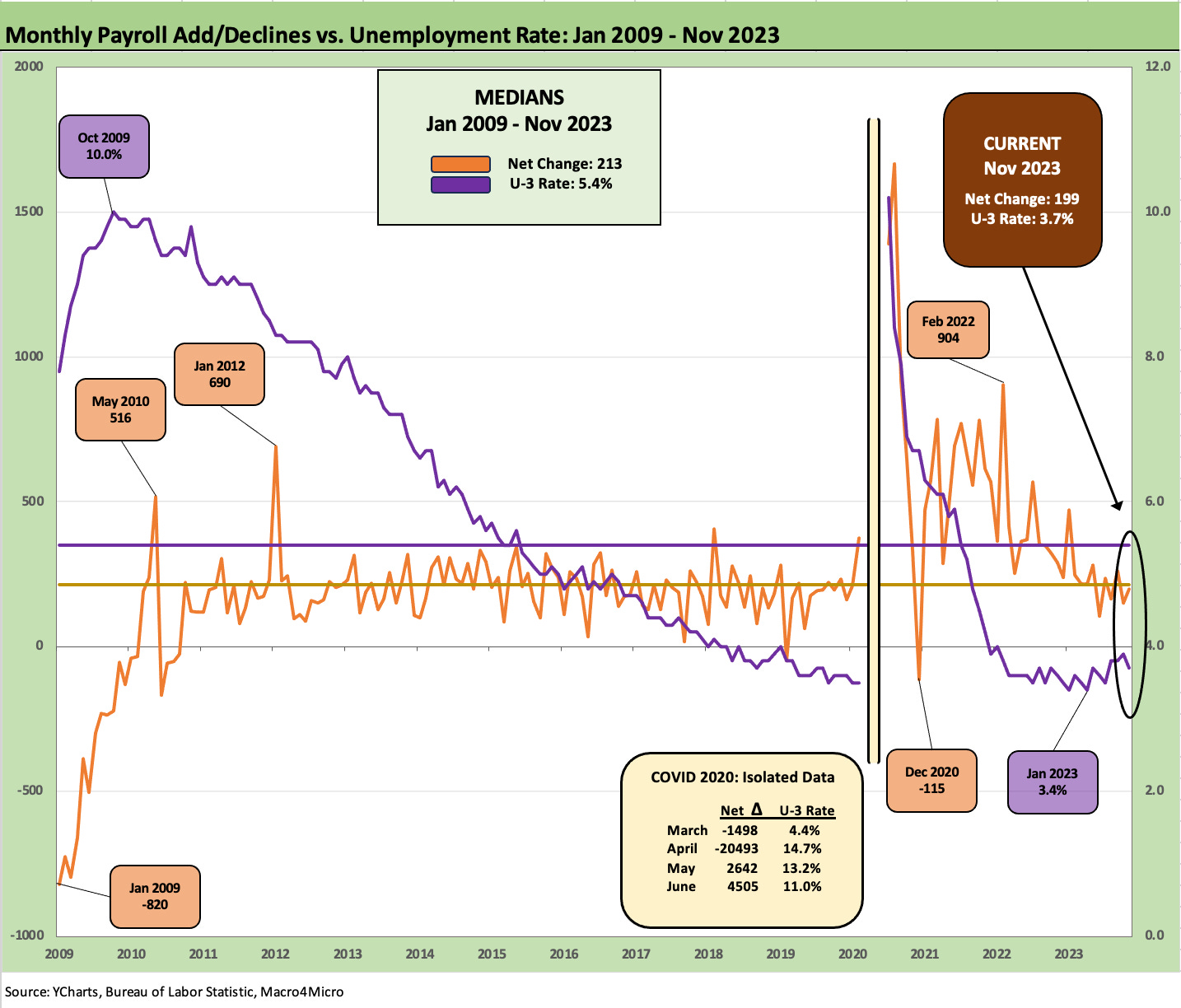
The above chart plots the “adds” again but alongside the unemployment rates from the credit crisis period of Jan 2009 through Nov 2023. We also offer some infill on the wild swings during COVID as a memory jogger. We put the COVID numbers in their own box to avoid blowing up the visuals on the chart.
Record payroll counts, a 3.7% unemployment rate (down from 3.9%), and declining inflation is not a bad place to be. The interesting twist on the household payroll count and wage increases is the ability of the newly employed to soak up (rent) the growth in multifamily rental units coming online. The Shelter inflation line has been such a dominant factor in Services inflation and headline inflation that the ex-Shelter line tends to tall a better story on the overall picture (see October CPI: The Big 5 Buckets and Add-Ons 11-14-23). Rent as a primary residence is a stand-alone number but rent also rolls up into the Owners’ Equivalent Rent number that is by far the largest single line in CPI.
The more recent month’s wage inflation in the employment release sent more signals in the payroll numbers that life will not get easier on YoY comps near term with +4.0% YoY even if the month-to-month move was not a surprise. That is still a distance from the magic 2.0% metric.
The above chart updates one more angle with the payroll count plotted against the unemployment rate. Our natural bias is toward counting heads when so many like to watch the unemployment rate. The consumer online (or in line at register) includes those with paychecks, those with unemployment checks and those retirees with whatever pension or social security, or family/government support they have work with.
It is a numbers game in some ways. There are reasons why it is so hard to have a PCE contraction in quarter – let alone across multiple quarters. Record population tends to have a good story for the PCE line even if the menu selection has been strained by a bad stretch of inflation. The odds and ends of changes in inventory and trade flows can swing it negative, but PCE and fixed investment carries the day in cyclical trends.
Drilling into the Occupations
The remainder of the charts run through the occupations and which categories are up and down and by how much.

The above chart plots the payroll differentials across the noted occupation categories since Jan 2020 when COVID then set the world on fire and drove dramatic swings in payroll over a handful of months. Services dominate the leaders with Professional and Technical Services at #1 followed by Health Care and Social Assistance and then Transportation & Warehousing.
On the “Goods” side of the ledger, we see Construction at #4. The Construction markets really have not gained enough attention in jobs or the contributions to GDP in our view. The trends have been very impressive in adding jobs and demonstrating a high rate of investment (see Construction Spending: Timing is Everything 12-1-23).
One of the most notable laggards across the time horizon from Jan 2020 has been the Leisure and Hospitality sector, which was crushed by COVID and is now in the running negative category since Jan 2020. That line has been soaring more recently and its payroll has been up by over a half million jobs on an LTM basis. The shift from goods to a services boom had travel and leisure and eating and drinking higher up on the list of consumer priorities.

The above chart breaks out the same mix with the month to month move. We see the move in government hiring in the new fiscal year for many, and we see a rally in Leisure and Hospitality sustained over the short-term moves.
Below we look at post-Jan 2020 deltas along with LTM, YTD, and Month-on-Month (MoM).
Payroll mix: into the weeds…
The next round of tables dig into the more granular occupation line items in total and across Goods (Durable, Nondurable) and Construction as well we in Services and Government payroll lines. Mining and Logging includes the E&P sector, but the direct payroll counts are small compared to the broader economic significance of the industry.

The above chart breaks out the “slow and steady” rise with 2.14 million private sector jobs added LTM and 4.8 million since Jan 2020. In total adding in the public sector, the LTM adds are 2.79 million and 4.99 million since Jan 2020. We look at the industries and subsectors next.

The above chart details Manufacturing with a look in more detail at the line items for Durables rolling up with Nondurables into a total Manufacturing payroll increase LTM of only 17K jobs. We see Durables up by 76K (the good news) but Nondurables continuing the secular decline at -59K to reduce total manufacturing to only +17K. The Durables increase was concentrated in Transportation Equipment.
These numbers underscore the challenge of regenerating the manufacturing sector in the US. The solution for whichever party gets the brass ring(s) in 2024 is that the distortion of economics (aka protectionism) is going to be the game plan to keep manufacturing rolling.
That need to turn to protectionism will be called “fair trade” and will also get a lot of airtime in the campaigns. We will be interested to see if anyone admits the “buyer pays” and that the tariffs are either inflationary or dilutive to employer earnings. Trump still thinks the seller pays. No one has filled him in perhaps. China will be the main target, but the targeting of Mexico despite the new NAFTA (USMCA) will be one to watch as well. Mexico can’t be targeted without blowing up the trade pact.

The above chart details the Nondurables pain with the broader category only at +51K since Jan 2020 and -59K LTM. Food manufacturing is the main category that is expanding while Chemicals has less labor intensity but the competitive advantages of low-cost, natural-gas-based feedstock in the US production base.
As we have covered in past commentaries, most of these product line items are in secular decline outright or have been “offshored” to lower cost regions (notably textiles and apparel) or regions with less regulatory costs (notably environmental and safety). Some categories are just disappearing entirely or radically downsized (e.g., many print products).

We have looked at the construction markets in detail in recent commentaries (see Construction Spending: Timing is Everything 12-1-23, Construction: Project Economics Drive Nonresidential 10-2-23), and the jobs numbers are a material source of strength in the “Goods” categories. The addition of 200K jobs LTM and 453K since Jan 2020 make a statement given all the multiplier effects of economic activity that come with construction.
Those job increases cut across Residential and Nonresidential and “Heavy and Civil Engineering and Construction.” Demographics, legislation, tax/fiscal support, and the need for more skilled and semi-skilled employees all are high on the list of key drivers. We cover those trends in our housing research and construction reviews.
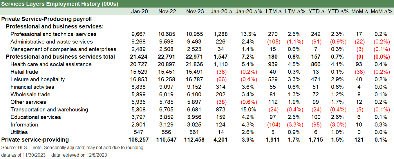
Services dominate the payroll ranks at 84% of private sector payroll and 72% of total payroll. We see Services up by 4.2 million since Jan 2020, 1.9 million LTM. and +121K MoM. Leisure and Hospitality is +528K LTM and is a sharp recovery phase now relative to the -66K since Jan 2020 after the battering across COVID.
Health Care and Social Assistance is +939K LTM. This is a line items that is tied into more than just demographics and baby boomers getting old. It also flows from insurance coverage and medical care services for the old and/or infirm (Medicare, Medicaid etc.). If one is to take Trump at his word that he plans to kill ACA benefits and preexisting conditions will lose protection (the near miss of the first term), then this massive payroll line could be under a cloud over the intermediate term. It is more likely to keep on growing in 2024 until the political risk starts to rise as the election nears.
The breadth of diversity in services is one major reason why the sheer scale of the economy sets a higher bar for a hard landing in 2024-2025. The 1980-1982 structural change in the economy and the series of regional crises and financial services excess in the late 1980s and into 1999 made for a series of rolling hard landings.
The industry concentration of TMT and Energy had brought its share of ups and downs in regional economies, but the upward growth in payrolls across time are easy enough to gain comfort from. A global systemic financial crisis and a once-in-a-century pandemic certainly tested the theory that GDP and employment cycles should be less volatile.
That brutal recession after 2007 with the credit crisis and the dislocations of COVID is why the “breadth and diversification theme” now comes with a warning label around exogenous shocks (the “war, famine, and pestilence” clause). We used to think 1 of 3 were no longer low probability (regional wars) but now it has been bumped up to 2 out of 3 (pandemic and virus mutations). The famine part is a climate risk debate. That might come in future years but not yet – at least in the US.
The irony of the lower fixed-cost-intensive services is balance sheet misbehavior and financial shocks can drive massive credit contraction. That severe tightening and credit retrenchment scenarios is Econ 101 for how to cause a hard landing. We do not see that risk in place now without the extensive asset concentrations and outsized counterparty risk of some past cycles. The problem with shocks is that they tend to unleash things that lacked transparency (the UST basis trade and counterparty anxiety).
In financial services, we see +314K since right before COVID and +55K LTM. The vulnerability of the financial services payroll numbers are always here at turns in the cycle and well beyond Wall Street.

The above chart wraps up the jobs update the mix with Government payroll. We usually leave out the Government payroll in our monthly look across occupations, but the Government has been a net positive in the payroll count since Jan 2020 at +184K and more materially LTM at+643K with State and Local (not Federal) and main drivers at 88% of the total additions.
The more interesting topic at the Federal level ex-defense is the 2.35 million Federal payroll line ex-post office. With Trump promising to clean house in the Federal bureaucracy, running for office with a guarantee to terminate hundreds of thousands of jobs could be a tough sell in some swing states. Federal jobs are not just in Washington obviously.
The Trump pledge to “kill the civil service and sort’em out later” reminds me of Sen. Sanders and Sen. Warren proposing platforms in the 2020 primary lead-in that would terminate the livelihoods of many thousands of private sector jobs and supporting infrastructure workers serving private health insurance. “I will terminate many thousands of jobs” is not stated as such but it is in substance an unusual political strategy.
That job threat did not get much airtime from that angle in 2020 since Biden ran away with the nomination after South Carolina. We would think that sales pitch by Trump to voters he already has in his pocket (slay the deep state, everyone is against you, fire them all. etc.) will not play as well to those he does not already have locked up (and who might not be crazy about Biden either). Jobs matter and threatening jobs is a plan that might work against those running with it.
Contributors:
Glenn Reynolds, CFA glenn@macro4micro.com
Kevin Chun, CFA kevin@macro4micro.com