
Systemic Corporate and Consumer Debt Metrics
We look at the latest round of systemic debt metrics for the consumer and corporate sectors with the latest Z.1 report.


With the filing of the new Z.1 for June 2023, we run through the updated timeline on systemic debt in the corporate and consumer sector.
The good news is that the overall balance in 2023 has been in check as GDP growth and relatively measured moves in systemic debt shifts do not break too far from trend lines and set off any alarms.
Moderation in systemic residential exposure is the main source of support for the composite consumer debt line that is on everyone’s watchlist.
The plunge in GDP with COVID drove a material break from the long-term trend line, but active fiscal and monetary support stepped in front of what could have been a default cycle for the ages based on other historical moves of such magnitude.
The term “systemic debt” gets tossed around a lot from the UST side of US sovereign debt exposure (see US Debt % GDP: Raiders of the Lost Treasury 5-29-23). We also see it cited in the corporate sector (see US Corporate Debt % GDP: It’s All in the Mix 5-31-23) and in the context of household and consumer debt (see Consumer Debt in Systemic Context 7-13-23).
Our main goal in tracking such metrics is to put some objective frames of reference to what often gets “adjectived to death” in commentary. The natural yardstick for debt is GDP since it is a measure of economic activity where asset values and liabilities are naturally growing along with the economy.
Where the credit markets have run into trouble in the past is when there is a material expansion in debt (or liabilities more broadly) that materially breaks from the historical trend line. Those breaks are when the financial market structure may not be adequate to meet the challenge (investment demand, market making liquidity in OTC bond markets).
The risks of asset quality erosion and/or supporting capital base in the banking system might not be up to the demands that come with such growth (such as resilience in a cyclical downturn or ability to withstand material market or economic shocks). We saw that in the late 1980s, the late 1990s and the mid/late 2000s, so those challenges (and failings) are not new risk factors in the equation.
At the very least, it is important to be aware of the history and where current relationships stand across the timeline of the various cycles and what that could mean if life does not go exactly as planned.
It is useful to remember the limitations of risk measurement. That includes counterparty risk and theoretical credit lines for derivatives (and bank interconnectedness risk) and legacy liabilities that are not always clear in their accounting treatment (think Medicare/Social Security at the sovereign level, and pensions/health care across the years, etc.).
We are not revisiting all the war stories here. Instead, we are updating the corporate and consumer debt metrics vs. GDP as part of a routine update with the filing of the Fed’s latest Z.1 report.
We run through the corporate debt lines we like to watch and the same for the consumer sector. We plot some long-term time series from the 1970s and some shorter timelines from the 1990s. At the bottom of the commentary, we include a table that details the more granular moves of recent years.
Corporate systemic debt hanging in a steady range…
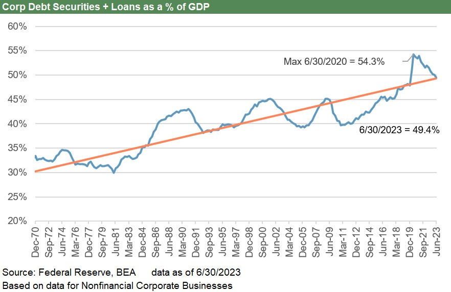
The above chart plots the timeline for corporate debt (bonds, loans) vs. GDP. The leveraging of corporate America during the credit market deregulation of the 1980s and disintermediation of the banks with their inherent capital limitations is an old story at this point. Companies are more aggressive in financial policies. There are more AAA universities than companies. The US BBB corporate tier is larger than the UK or France and is closing in on Germany.
In the chart above, the sharp break from trend line along the way ended badly for defaults and the credit cycle. The HY market was born in the 1980s, and Glass-Steagall did not work as well as sentimentalists sometime like to pretend. Then derivatives were born and begat more systemic leverage in the 1990s even as banks poured capital, energy, and manpower into the deregulated markets that saw banks and brokers converge. Of course, the TMT bubble was born in that timeline. That ended badly, and Washington took action to reel in banks and brokers. That did not work so well as the new source of trouble moved over to mortgages and structured credit. The casino bender was on.
The 2008-2009 meltdown shows rising systemic leverage off the post-lows but not a material break in the corporate sector. That is a fact that is often not remembered so clearly. That credit crisis was ignited by bank interconnectedness and mortgage chaos and way too much systemic leverage in those hard-to-measure areas of counterparty risk. The following credit contraction took out the corporate sector along with the bank system. Credit contraction and defaults in corporates were the cart and not the horse.
The next big break from the long-term trend line was COVID as GDP (the denominator) tanked, bank lines were drawn, and waves of borrowing to plug cash flow holes were rampant trends.
That new break in Corporate Debt % GDP would have led to the Mother of All Default Cycles, but the Fed and fiscal activists (GOP and Democrats alike) took very aggressive action with ZIRP and very low rates along the curve, in turn bringing a record refi and extension cycle.
The interesting twist is that in historical context, the market is now very high in systemic corporate debt even if down as a % GDP from the COVID highs. Those low coupons and easy terms for all that borrowing are “on the clock.” However, that will lead to all kinds of theories as time goes on and it becomes time to refinance those mountains of low to minimal coupon debt in the post-ZIRP, post-tightening world.
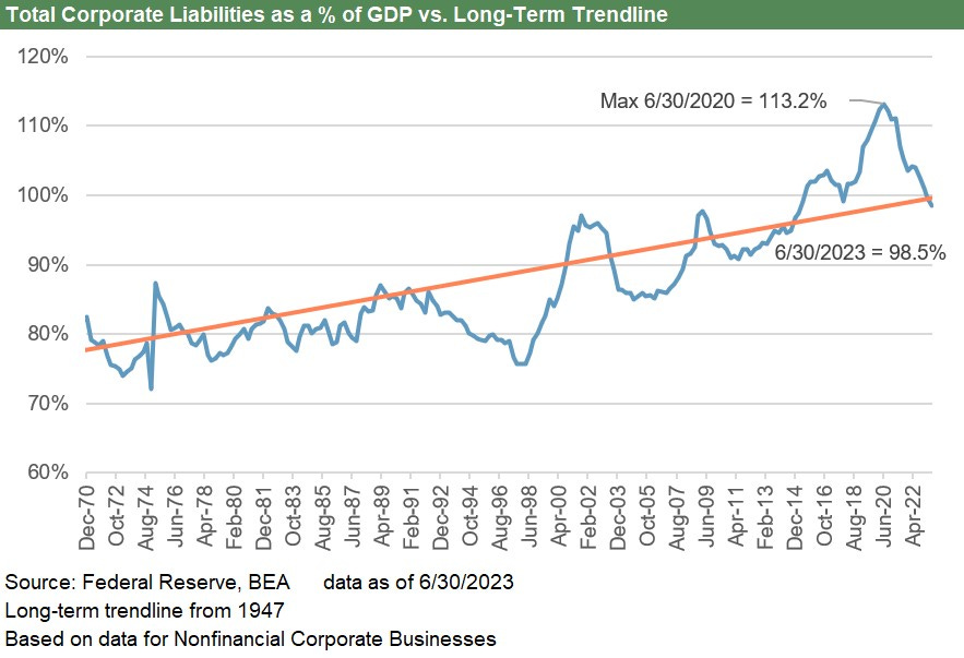
The above chart just tweaks the corporate time series for total liabilities. Both show the same peak at June 2020 as the full pain of the GDP contraction weighed in.
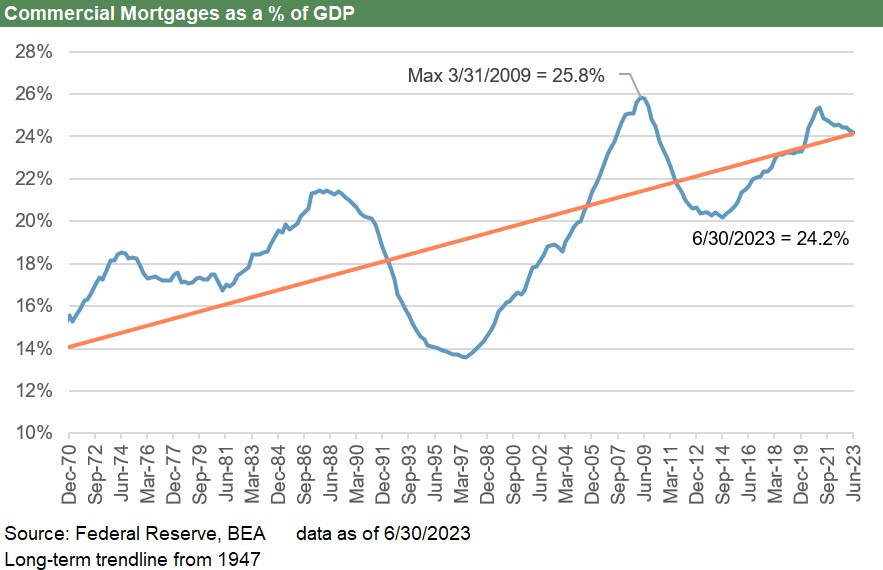
The above chart updates the timeline for commercial mortgages % GDP looking back across the timeline from 1970. The wild swings in the commercial real estate cycle are very much in evidence with the overbuilding of 1980s (notably in the oil patch and financial hubs) and the excess of the pre-crisis period where real estate was featured in many leveraged transactions from CMBS to additional sources of leverage in LBOs.
The small break from the CRE trend line during COVID was minor in comparison to earlier bouts of excess, but the divergence in quality across legacy assets in the CRE mix (notably in offices) is getting a lot of focus these days in the context of carrying values and potential risks to the regional banks. The good news is that the market’s new construction focus and mega-projects are tied to secular demand and myriad policy incentives (see Construction Spending: Demystifying Nonresidential Mix 5-9-23) and not building for the sake of short term revenue generation and fees.
The consumer is the main event at the cyclical turn…
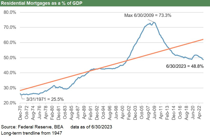
The above chart updates the residential mortgage history from the early 1970s through recent times. The good news for this critical metric is that the systemic side of the residential mortgage cycle is well below the insane spike and record peak of the housing bubble.
High mortgage rates above 7% today are driving more potential home sellers underground on the “golden handcuff effect” (see New Home Sales: Low Bar for Comps YoY, Sequentially Mixed 7-26-23). The supply-demand imbalances are keeping home equity high and owners feeling good about their balance sheets. The housing shortage and high employment is a good combination for asset risk.

The above chart adds some bars to capture the growing dollar totals while the residential mortgage numbers remain low as a % GDP.
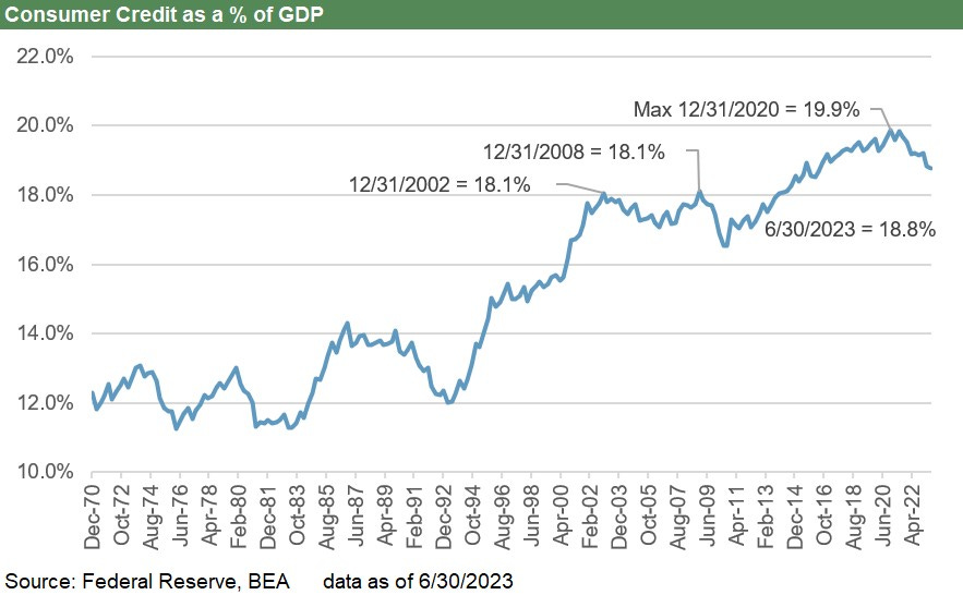
The above chart shifts into the nonresidential mix of consumer credit across student loans, credit cards, auto loans, and miscellaneous. The total consumer credit balance is below 2020 levels but still higher than some past trouble years such as 2008 and 2002 when credit quality was weakening materially.
That quality question will remain on the front burner in the current cycle as we move into 2024. There are some signs of delinquencies ticking higher, but the threat in residential is low and the collateral values in both autos and housing are not in the zone of past crises. The student loan issue is likely to get worse as the payments become due again, but that is not a new problem.
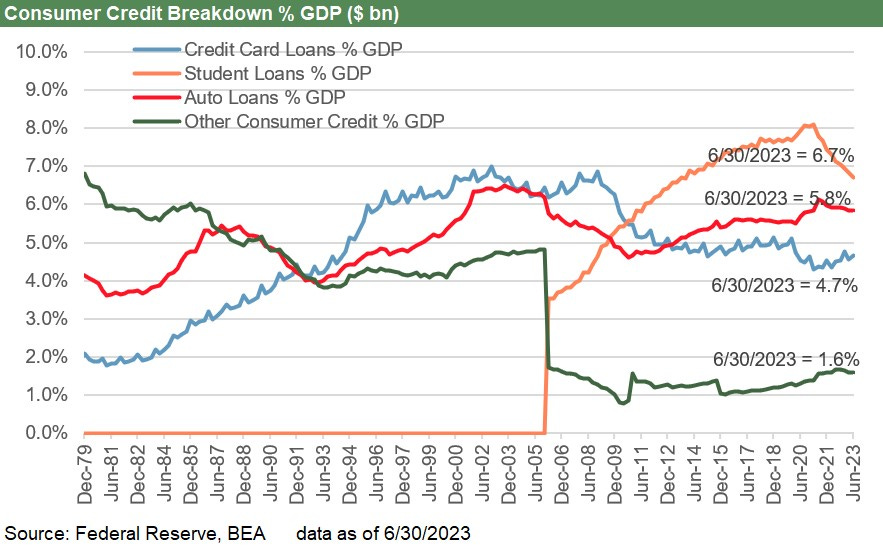
The above chart breaks out the timeline of the major consumer credit categories. The growth of the student debt line is one that Washington is having a hard time with along the partisan divide. We see the sequential uptick in credit cards, but the overall trend has been to move lower in % terms vs. GDP relative to where the market was in 2021.
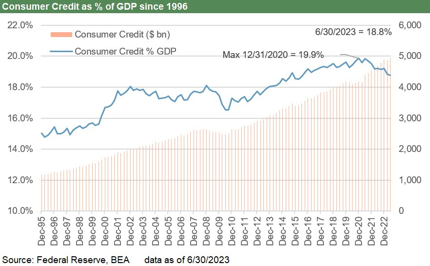
The above chart frames the dollar prices vs. the systemic level % GDP. As one would expect, the dollars kept rising, but the systemic mix vs. GDP is down from the Dec 2020 peak.
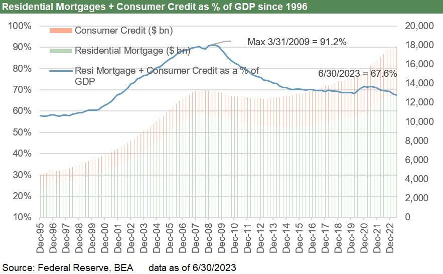
The above chart combines residential and consumer credit into a total and frames both dollars and systemic exposure % GDP. The comparison vs. mid-2009 is night and day on the residential mortgage differential. Housing valuations are strong in the current market and a record high payroll count is a source of support with wages rising. That makes for a tough backdrop for a panic.
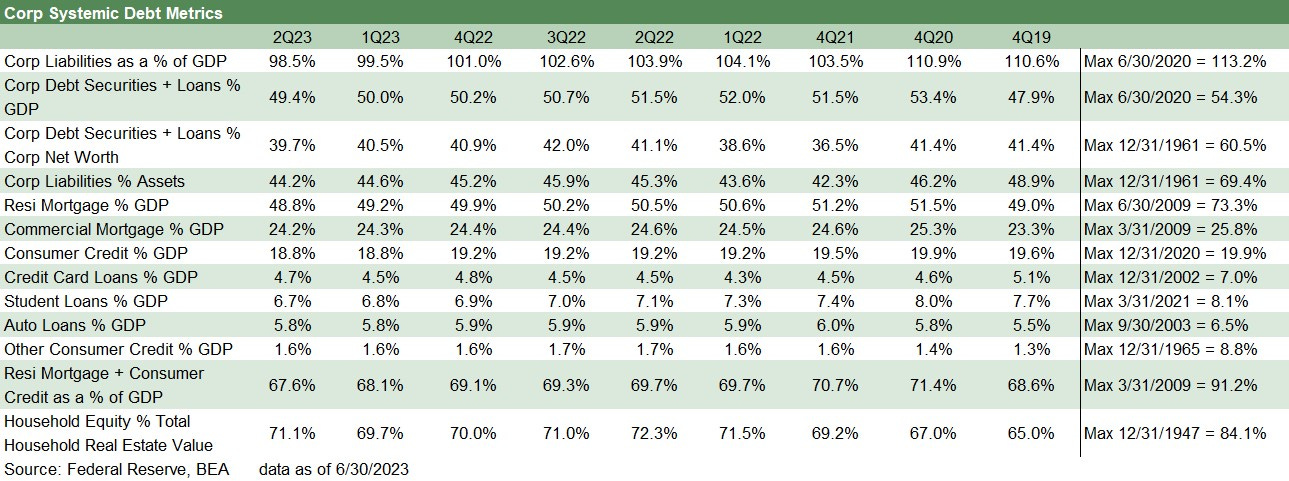
The above table is provided for more granularity across recent periods from 2019 through current times. We show the end of 2019, 2020, and 2021 and then quarterly across the 2022-2023 period as the tightening cycle unfolded.
Contributors
Glenn Reyolds, CFA (glenn@macro4micro.com)
Kevin Chun, CFA (kevin@macro4micro.com)