July Employment: Fine Tuning but No Setbacks
We do a deep dive on the July payroll deltas across occupations for a range of trailing time horizons.
The YoY wage growth will keep the Fed honest, and even a slower rate of employment growth keeps the beat going on a record payroll count.
We look at the employment trend lines and dive into more of the deltas by occupation as some of the usual suspects in Services still rule the numbers.
The lack of a major upside surprise in the payroll number for July was a relief for those worried about more yield curve pain, but the steady economic growth theme is intact on the employment side.
The above chart plots the monthly job Adds/Declines each month from July 2021 through July 2023. We see July 2023 posting the lowest additions to nonfarm payroll on the timeline presented. The July 2022 adds last year were triple what we saw this past month. On the “half full” side of the ledger, that YoY increase from July 2022 (when inflation had just peaked in June 2022) shows July 2023 total payroll at a level (156.2 million) that highlights 3.4 million more jobs were added to the count on a YoY basis. That’s a solid number of jobs added in the trailing year by any measure.
If we return to last summer, the rhetoric around the economy and policy was pretty ugly. If you said in the summer of 2022 (as the Ukraine War raged and US politics were in a new state of ugly) that we would see more than 3 million jobs added, a guy with a butterfly net might be knocking on your door. At the very least, the word “recession” was already in play and for many had already arrived.
In the Aug 2023 world of today, the Ukraine War is still more brutal than ever as the summer offensive campaign sees that victimized nation counterattacking Putin’s invasion again. Oil prices are in the $80 handle after recent increases, but gasoline prices have come down drastically for the peak driving season. Travel is booming in the air, on the land, and on the sea.
Meanwhile, the US political scene is still quite ugly with a near-debt-default scare under its belt. The market saw another downgrade of the US credit rating during the past week. Some would argue (including us) that the debt ceiling mess was the trigger point even if no one will admit it (see US Downgrade: Pin the Tail on the Sovereign Ratings Criteria 8-2-23).
The US political situation is a trainwreck with a few more trains coming at it from different directions. The sequence will play out in the courts and in the election process with a potential government shutdown ahead with the new fiscal year needing a budget.
The net takeaway from the headline is that the economy is still adding jobs at a rate well above what is needed to stay in line with demographic needs (that demographic need number seems to run from 60K to 100K depending on what and who you read). The reality of even more jobs in July invokes various versions of the “Mo Money, Mo Spending” rule as investors and economists try to handicap where the crucial Personal Consumption Expenditure line of GDP will head in 2H23. Where some of these jobs have been added is addressed in our reconciliation of occupational payroll deltas that we break out in tables further below.
In the end, this latest July 2023 jobs release drives home that the labor market is still tight even if the rate of jobs added is slowing. The JOLTS numbers showed slowing but with high demand for labor still the takeaway (see JOLTS: Job Openings Lose Some Velocity 8-1-23). We saw a 4.4% YoY hourly wage increase to keep the Fed focused. That 4.4% YoY wage increase is in line with the 2Q23 Employment Cost Index (see Employment Cost Index: Rings of the Redwood 7-28-23). The labor tightness challenge is a slow mover as the market gears up for some very high profile (and very high) UAW wage and benefit demands in the current contract round. That is a story for another day.
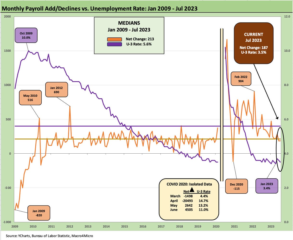
The above chart updates the history of total nonfarm payroll numbers vs. the unemployment rate. Payroll edges slightly higher to 156.3 million on a SAAR basis to a new high (down slightly sequentially for not seasonally adjusted). We see the highs and lows across history in unemployment rates with a 3.4% to 3.7% range since ZIRP ended and the UST curve migrated materially higher into its current inversion across that span of time (see Footnotes & Flashbacks: State of Yields 7-30-23). The tick down from 3.7% in May to 3.6% in June and 3.5% in July is certainly not a sign of core economic weakness.
The above chart updates the timelines for Add/Declines since the credit crisis. We include the COVID 2020 swings in the box embedded in the chart. Those job deltas were so large we could not include them in the line chart time series without distorting the scale and taking away the context of what “normal” (sort of) economic cycles looked like from a 3.4% unemployment rate low in Jan 2023 to the 10% handle highs in the aftermath of the credit crisis in 2009. The pandemic era swing of 20 million in April 2020 was a true application of the term 100-year flood.
The above chart updates the timeline for total payroll vs. job openings. The latter is released at a 1 month lag in the monthly JOLTS release (see JOLTS: Job Openings Lose Some Velocity 8-1-23). The relationship is clear enough. High job openings bring higher payrolls when some of those openings get filled. Slower rates of job openings or outright declines bring slower payroll increases or job declines. We have not moved into the job decline stage yet.
The significant excess of job openings over the current 5.8 million unemployed is a strong metric. The latest job openings total of 9.6 million is a healthy relationship for employment prospects. The trick is finding the fit between the 5.8 million unemployed and what those 9.6 million openings require across regions, occupations, expectation for wages, etc. The next section of the monthly employment update gets into the weeds of where jobs are being added or seeing where separations are bringing some line item declines.
The layers of employment trends by occupation…
The above chart updates the headline categories that comprise the 156.3 million in nonfarm payroll including 133.6 million in private sector payroll and 22.7 million on government payrolls. The chart above and those that follow plot the payroll differentials since Jan 2020 ahead of the COVID outbreak. We also detail the changes for LTM, YTD, and month-on-month.
We highlight that the 4.4 million incremental jobs from Jan 2020 underscore that all the COVID job losses were recovered plus another 4.4 million added above that. For LTM, we see 3.4 million added and YTD 1.8 million added. Most of the “net adds” since Jan 2020 were this past year, and that makes a statement. That is a very impressive economic backdrop considering the market is in the midst of a Fed tightening cycle with inflation starting out very high a year ago, moving sharply lower since then but still stubborn on the Services side (see Chasing the Dragon: 2% Handles Beckon for PCE Inflation 7-28-23, June CPI: Big 5 and Add-Ons…A Big Win 7-12-23).
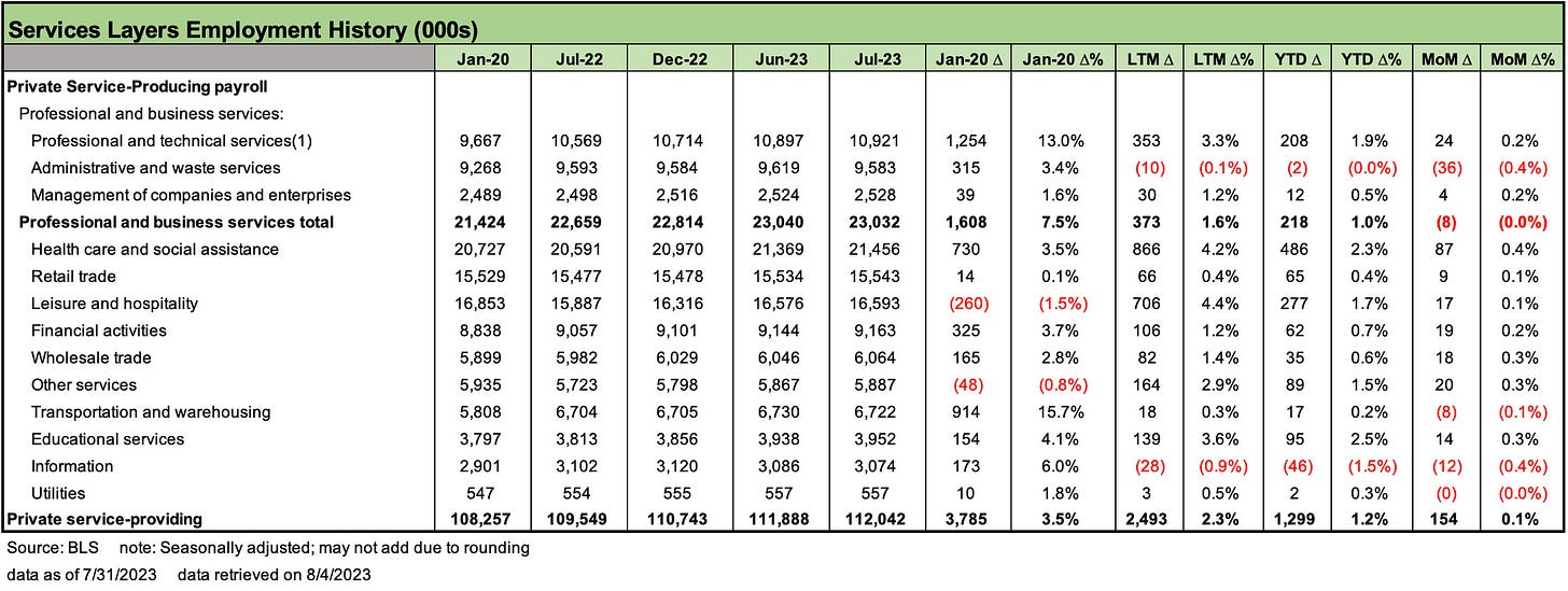
The above chart details all the same payroll deltas as the prior chart but does it for the 112 million jobs in the Services sector that in total comprise almost 72% of the total payroll and 84% of the private sector count. We see 3.8 million jobs added in the categories since Jan 2020 and 2.5 million over the last year.
The Services lines are where we see some of the biggest moves higher but also the most volatile in the month-to-month JOLTS data where we see many incoming (hires) and outgoing (separations) on a monthly basis. Our view on the Services payroll is that this is the epicenter of wage inflation with the non-union affiliated employees being the big driver of YoY inflation.
While UAW, Teamster, and Pilot groups grab a lot of headlines, the sheer scale of the lower paid services sector is where the numbers really add up. That is not changing the reality that there will be some very big headlines around major pay and benefit raises ahead in collective bargaining actions.
The above chart updates Construction payroll trends. We see 391K added since Jan 2020 to almost 8 million in July 2023. We see almost 200K added in the LTM period spread across numerous residential and nonresidential categories. Specialty trade contractors were relatively balanced across Residential and Nonresidential.
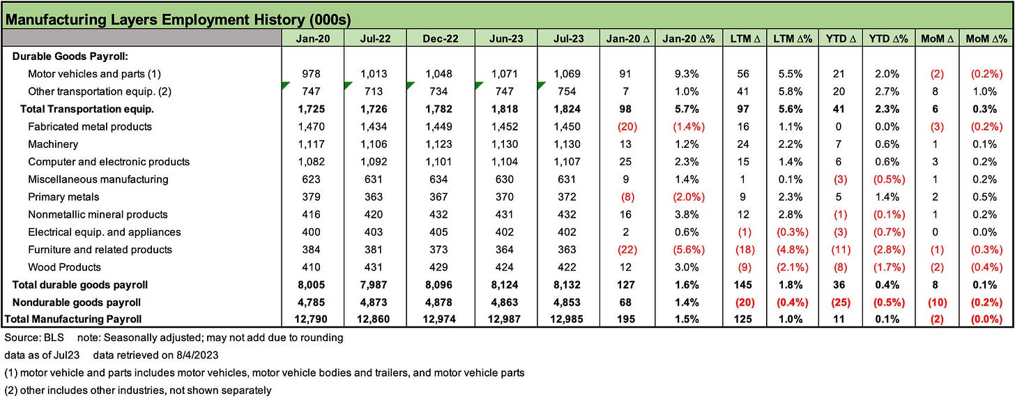
The above chart frames Manufacturing payroll numbers with a more granular look at the Durable Goods lines. Transportation Equipment is a major line item in the Durables bucket, but the extended supply chains and such categories as Machinery and Fabricated Metals are high in total but low in net growth. The Durables Goods line items is where the onshoring and reshoring trends will need to make a dent. The challenges there are especially acute with relocation of low-cost assembly operation to Mexico that is separate from the various China and low cost county outsourcing histories that are the main headlines in trade policy.
The above chart covers Nondurables. Some of these line items are case studies in outsourcing to low cost countries. In some cases (printing and related support), we see jobs that will never return and have in many cases left the planet and not just the country. Food Manufacturing, Chemicals and Plastics are the markets that have sustained their numbers since 2020 but have been slow growth or declining LTM.
The July employment numbers brought good news to the curve sensitive and good news for those who worry about a sudden fade in fundamentals. There is nothing in here to take the Fed out of its current thought process.


