Income, Outlays, Inflation: Rerun? Or Trilogy of Terror?
We look at the monthly PCE inflation and consumption numbers that just shook up the markets.
The latest move higher in inflation will keep the market on edge and push terminal rate expectations higher as a very solid fundamental January and decent earnings season guidance will keep the heat on FOMC.
The trade-off of healthy spending and demand resilience is still a winner’s and loser’s game by sector and how to handicap when the party ends for some industries and companies.
The idea that Fed funds need to be higher than inflation metrics is not going away as markets contemplate the adequacy of even a 5.25% terminal rate.
In this commentary, we update the history of PCE and Core PCE along with the fed funds relationship and some trends in Disposable Personal Income vs. Outlays (PCE). The time series include the revisions of prior data (Source: BEA, YCharts). The Personal Income and Outlays release get a lot of attention from the Fed for its read on the consumer (income, consumption) and the PCE inflation metrics for its broader basket of items (e.g., rural) and more flexible methodology (e.g. use of substitutes to take out outliers in some categories). We are like most in focusing more on CPI, but “more is better” when it comes to watching the FOMC, who for now remains on the opposite side of the “more is better” concept when it comes to the consumer.
We look at inflation first since that is the usual fixation in the PCE monthly release, but the sequential jump in current dollar income matters on the demand side and with respect to consumer confidence. Personal income rose 0.6% in the month vs. 0.3% in Dec 2022. Personal Consumption in current dollars rose by 1.8% vs. -0.1% in Dec 2022. Real PCE was up 1.1% on the month vs. -0.3% in Dec 2022.
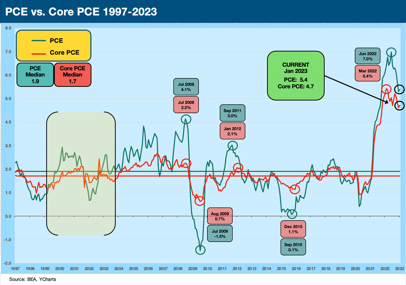
This month showed higher inflation sequentially, and many in the market will stop right there as the main event and move on. Fair enough. The YoY PCE weighed in at 5.4% vs. 5.3% in Dec 2022. Core PCE posted 4.7% in Jan 2023 vs. a revised 4.6% (from the earlier 4.4%) in Dec 2022. PCE was at 6.1% in Oct 2022 and Core PCE was at 5.1%, so the rolling trend from mid-2022 is doing what it is supposed to do (decline from highs), but the recent resurgence of jobs and the consumer sector is not going to help those thinking the next hike will be the last or that we will see only two. The next round of indicators will just get elevated in importance.
The above chart updates the long time series from the oil embargo inflation years across the Volcker arrival (1979) and his war on inflation across 1980-1982 that saw a 22% Misery Index in June 1980 (see Misery Index: The Tracks of My Fears 10-6-22). That was the month I got off the train from Boston a few days after graduation to start life in NYC (about that food inflation…).
The role of oil markets and commodities inflation has been important along with the rest of the commodities family, so we included a historical event timeline chart in the above chart around major energy sector events. The chart highlights the wild PCE spikes of the 1970s and early 1980s. We already discussed the history of oil and natural gas prices in these swings for the consumer in a prior commentary (see PCE Inflation: Wild History, Recurring Oil Volatility 1-29-23).
The above chart zeroes in on the period from the credit market peak of 1997 through today for a better visual scale on the swings in PCE and Core PCE. The Volcker years throw off the scale with the 11% handle PCE numbers. It is clear the current market is unusual in the bond markets as mutual funds and pension funds saw explosive growth since the early 1980s. As we already covered, the disconnect periods between PCE and Core PC are also noted above with the plunge or spikes in energy markets being the main driver.
Fed funds vs. PCE as a measure to ponder…
We have been updating the relationship of fed funds vs. CPI and PCE since the fall (see Fed Funds-CPI Differentials: Reversion Time? 10-11-22, Fed Funds vs. PCE Price Index: What is Normal? 10-31-22). Positive real fed funds are one of those nagging topics of market history that we are falling short of even after all these hikes. Positive real fed funds can be in the chart as a fact of life before the credit crisis years sent ZIRP and QE on a multiyear (and now multicycle) journey. Those were revisited with COVID. We have now reached a point where the Core PCE of 4.7% is a touch under the upper bound for fed funds. The rest of the inflation family tree in PCE and over in CPI remain above fed funds (reminder: Core CPI 5.6%).
The above chart shows the timeline of the effective fed funds rate plotted against PCE. The inflation years of the 1970s and early 1980s showed some more distinctly positive numbers for fed funds vs. PCE. The Volcker stretch of inflation fighting shows a telling pattern on the one major victory achieved over inflation by Fed policy. It was such a victory that we did not have to see it battled out again until the post-COVID spikes. Below we just show the long-term differential between fed funds and PCE as a single line with a positive median.
In recent periods since 2020, the supply-demand disruptions/distortions, the fiscal activism, and the monetary support all played roles. The supply chain issues were new to many and were not easily embraced as a major factor in a world that is now far more globalized than in the earlier stagflation years. Initially, the supply chain issues seemed like the braille method of analysis for many policy makers. It was a struggle as a traditional framework could not break it down into economic effects as the freight and logistics broke down. Sharply rising demand and then the Delta spike in late spring 2021 brought the supply problems into much better visibility. In today’s policy world, the first reaction seemed to be figuring out how to blame someone on “the other side.” That did not help the problem.
On a side note, we could have just as easily used Core PCE for the chart above, but I recall too many gasoline lines in 1974 to consider ex-Energy. I also ate a little too much Franco-American canned spaghettiOs in the 1970s to ignore food inflation. For many Americans, things can get worse, so inflation will not be a small topic for political spinmeisters to put into play. Wage inflation is below PCE, so that is supposed to limit purchasing power and drive lower volume purchased in the goods basket (in theory). Then again, there are also a lot more people on payroll to go with more retirees out there consuming.
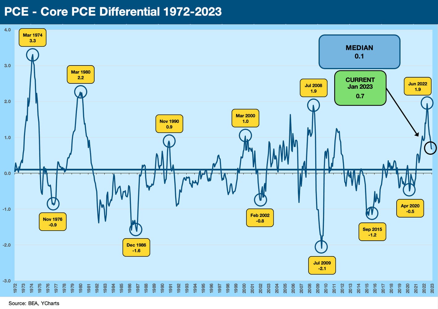
The charts above and below plot the difference between PCE and Core PCE for some context. The Core PCE is the favorite metric for some, and PCE overall is favored by the Fed over CPI. In the most disconnected markets, energy is usually the main culprit, but the 1970s and early 1980s did see some “other worldly” food inflation periods along the way as well. Very often, energy costs, fertilizer costs, and freight costs were big parts of the food inflation.
Income and outlays are still in the tailwind category…
In the charts below, we update the direction of disposable personal income vs. personal consumption expenditures. The demand side of the equation is a big issue for the Fed since they can (try) to deter that as a driver of inflation. So far, that does not seem to be working out. Services has been especially tricky, and Services is dominating the PCE growth with real PCE on Services at +4.1% for Jan 2023 vs. real DPI at +2.8% for the month. Real goods consumption was -0.7% on the month.
On a YoY basis, the real PCE inflation number of +5.4% included +4.7% inflation for Goods and +5.7% for Services. Food was 11.1% and Energy was +9.6% in Jan 2023. Those consumers who don’t eat, drive, heat their home, or wear synthetic materials can take solace in the 4.7% Core PCE only being slightly below the upper bound of the fed funds target.
Disposable Personal Income vs. Personal Consumption Expenditure as an indicator…
The chart below underscores what a solid January 2023 we just saw with today’s numbers. We also plot the LTM along with the monthly data across 2022 through today’s release. These reflect current dollar outlays. As a reminder, DPI is just Personal Income less taxes.
DPI and PCE re relevant focal points given the consumer culture of the US. If more people are working and wages are rising even in nominal terms, the potential for sustained high rates of spending would seem like a logical expectation. Record payroll headcount and very high job opening in JOLTS data that we have been writing about all add to the propensity of the consumer to consume. It is not just about real purchasing power per capita. It is also about how many “capitas” are getting a paycheck.
The above chart just updates the DPI vs. PCE timeline on an LTM basis, but we update the wild run across COVID again below. The time series reflects the revised numbers since mid-2022 that came with the latest Jan 2023 release.
The chart below looks at the same relationship in the context of the COVID relief and stimulus actions of 2020-2021 and the political spin that it caused inflation. We recently wrote on this topic (see Inflation Rorschach Test: Looking at Relief and Stimulus 2-7-23).
A note on Trilogy of Terror (picture at the top of the note): The made-for-TV movie (starring Karen Black) came out in 1975 in the last year of the first stagflation-driven recession that was kicked off in Oct 1973 by the Arab Oil Embargo. Anything scary from the 1970s made sense for today’s topic. The trough was March 1975. This is what long gas lines will do to your smile.


