
Footnotes & Flashbacks: State of Yields 9-16-23
We update the state of yields after a fresh round of data and another adverse curve move before the FOMC session.


With the FOMC set up for what should in theory be a non-event this week, the market is coming off a week of mixed macro signals that saw the curve edge higher.
The CPI release was noisy but a setback in most eyes, industrial production put up good numbers, retail sales were reasonable, and consumer sentiment eased slightly although inflation expectations ticked lower.
We add some new charts to the mix this week that frame IG and HY benchmark yields of past peaks and consider the context of comparative UST curve during those respective cycles.
The slow upward migration of the UST curve continued the past week with duration once again not the friend of the bond investor. The week saw negative returns for the S&P 500 and NASDAQ while fixed income proxies in the ETF market (GOVT, LQD, AGG, and HYG) posted slightly negative price action. We look at asset returns in a separate “Footnotes” publication.
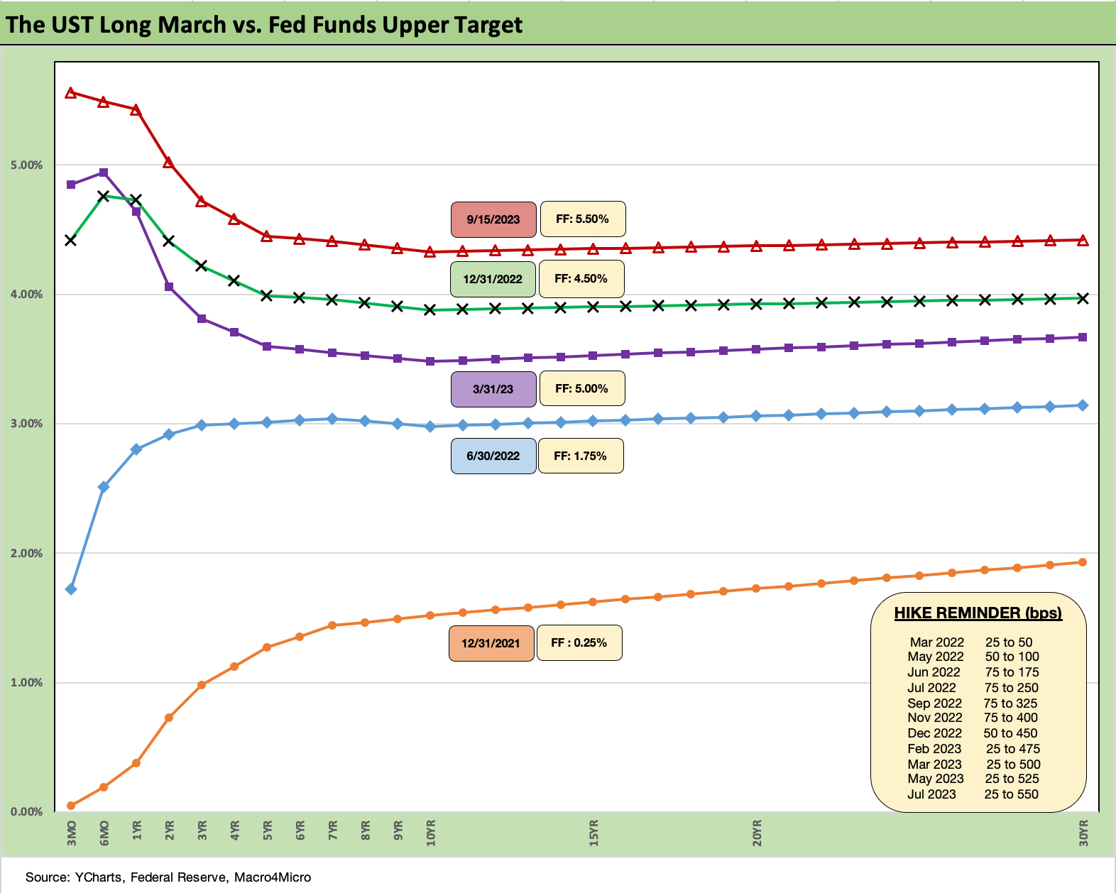
The chart above updates the UST migration across the period from the end of 2021, the 2022 tightening transition, and the rise during 2023 to the latest print. The move from 1Q23 to the current levels tells a story of a rough stretch for bonds despite the generally downward trend in inflation until recent months (see August CPI: Inflation Fears…They’re Back?! 9-13-23).
The mix of fundamental trends has still been constructive, but the indicators have kept life challenging for the FOMC. That includes some finesse on how the wording will be phrased with this week’s FOMC meeting. This past week, the Retail Sales numbers (see Retail Sales: Consumer Watch on the Front Burner 9-14-23) and Industrial Production/Capacity Utilization release (see Industrial Production: From Rock Steady to Rocky Road 9-15-23 ) show some cooling in broader context, but still makes the case for “higher for longer.”
This coming week we have some important housing data (starts, existing home sales) that tie back into the consumer sector and yield curve themes (mortgage rates). Some bigger news items come the following week with Personal Income and Outlays and the Fed’s favorite PCE inflation metric along with what might be the last clean look we will get for a while at Durable Goods shipments and inventories before the UAW strike effects weigh on the numbers. The automotive production chain disruptions will flow into the September and October numbers and perhaps longer if the UAW strike action takes too long to get worked through.
If we have a UAW strike running in tandem with the government shutdown, the economic performance attribution exercise and framing the complexity of the multiplier effects will get downright crazy. Whether that will impact consumer habits is guesswork, but it is safe to say that the reaction will not be good. According to the University of Michigan sentiment survey, a shutdown has not been a hot item yet.
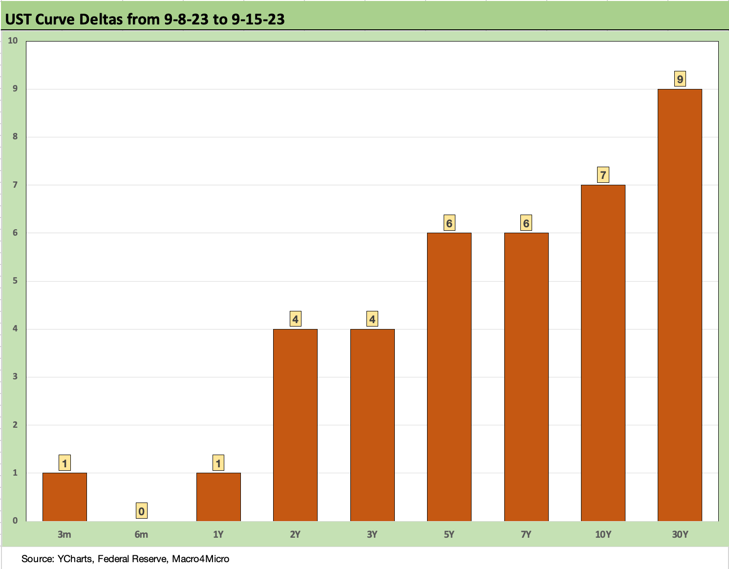
The above chart updates this week’s UST curve deltas. The move was once again in a negative direction for duration with another modest bear steepening. That is not helping the bond return story line as we cover in a separate note.
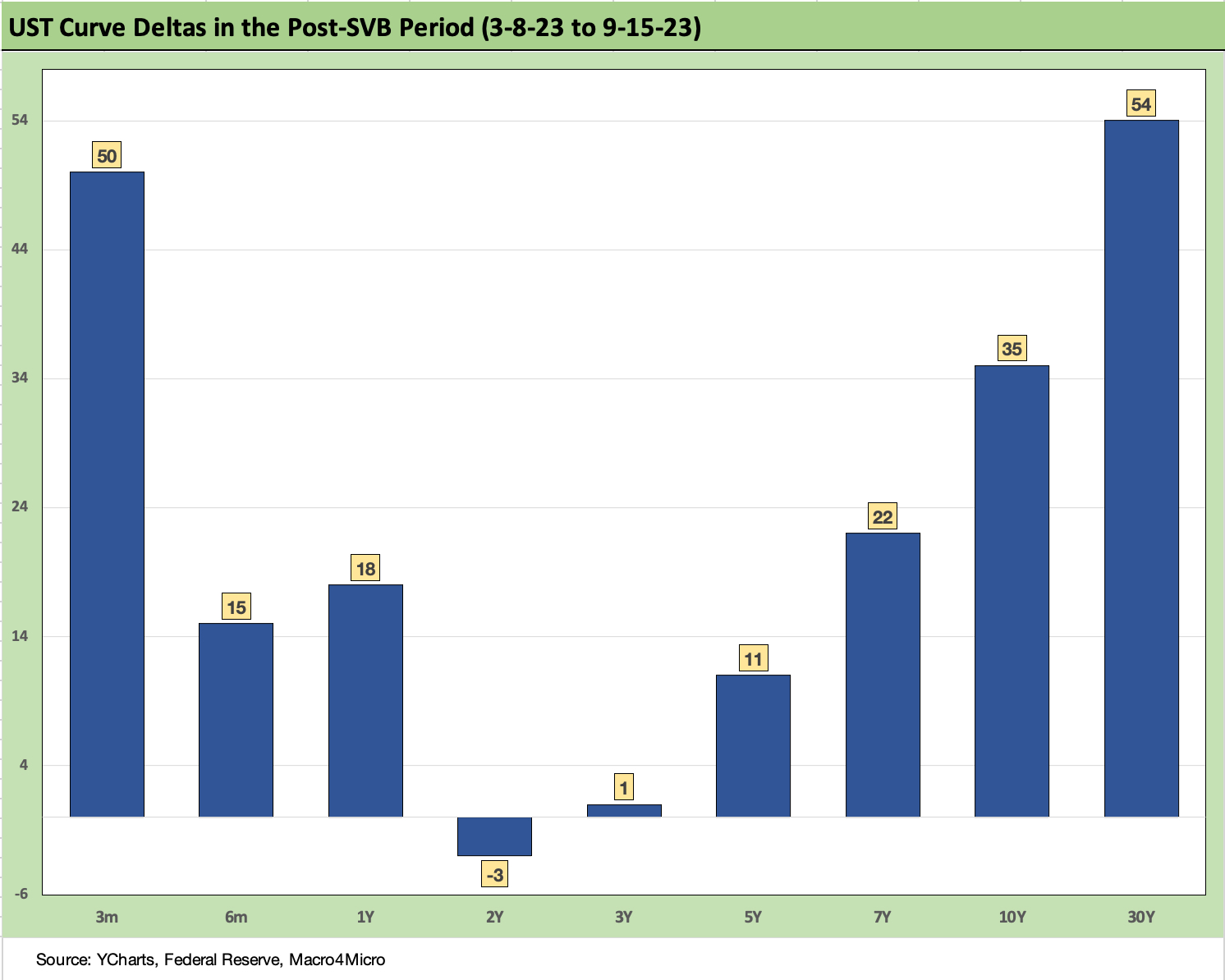
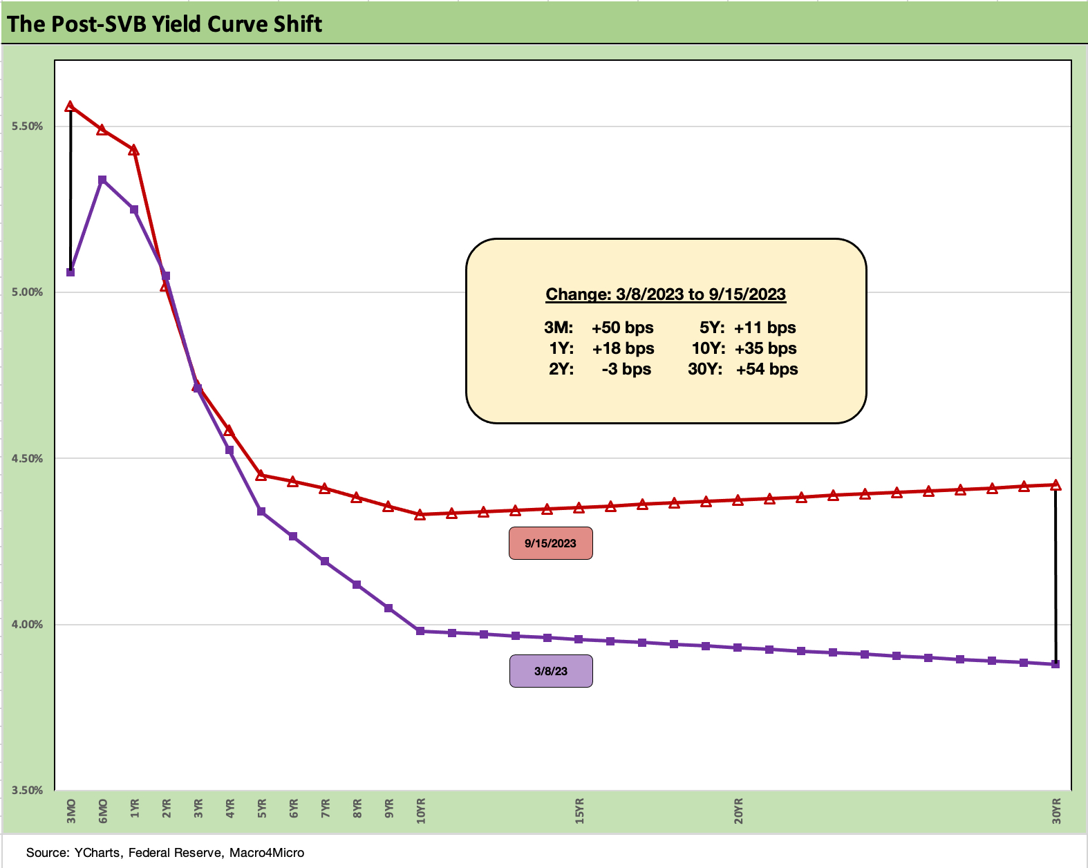
The above chart updates the post-SVB curve move from March 8, 2023 when the regional bank mini-crisis kicked into gear. The 2Y UST is still very slightly in the negative zone, but the upward UST move and steepening pattern from beyond 2Y UST is evident.
The above chart just offers a different visual on the post-SVB move. The upward shift and steepening has not been supportive of bond returns as duration was hit hard and the rise in mortgage rates was one of various headline setbacks for the markets. With this type of UST shift, the high-quality fixed income asset classes are running at sub-coupon returns. Those coupons are already well below yields as it is!
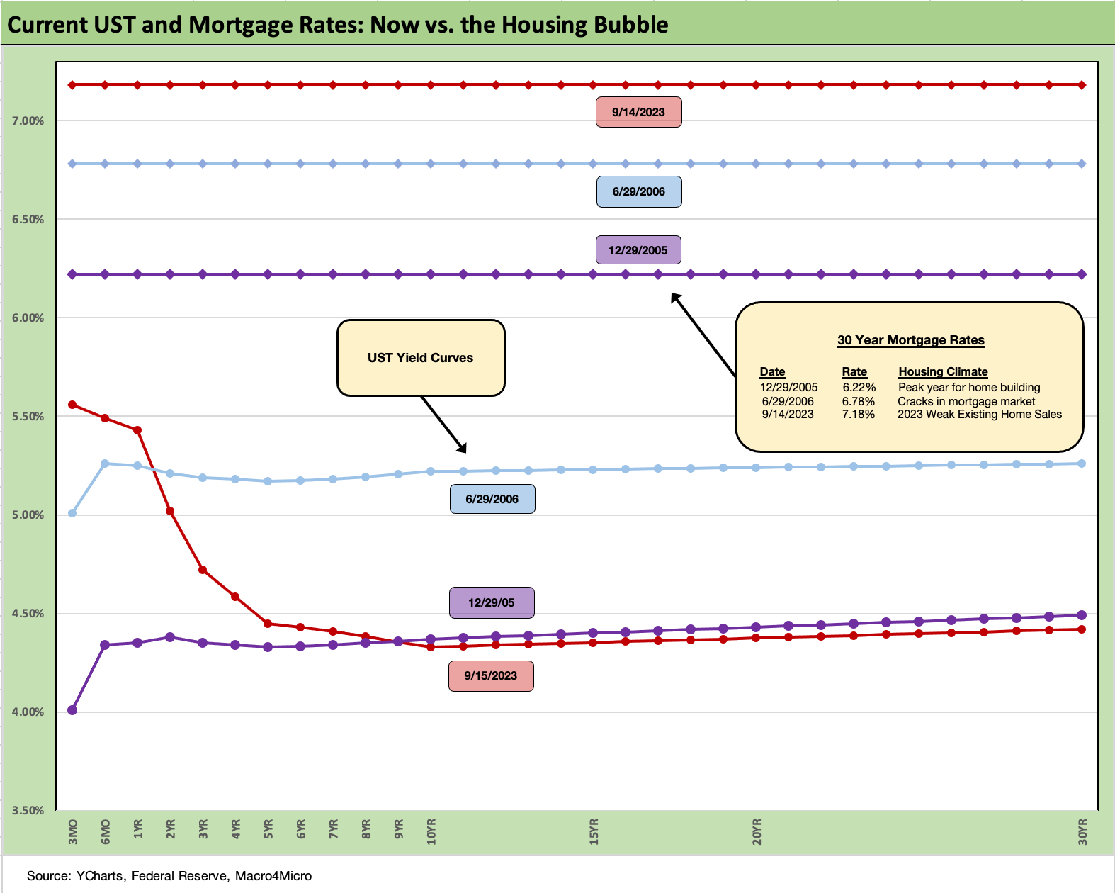
The above chart updates our recurring mortgage timeline comparison where we frame the current UST rates and 30Y Freddie Mac mortgage benchmark to those during the housing bubble. We use the end of the peak homebuilding year (2005) and the mid-2006 period as frames of reference.
The current UST curve beyond 10Y is below the 2005 UST curve and well below the mid-2006 curve. The 2006 UST curve was when the housing market and structured credit excess was showing some signs of early cracks (the earthquakes came in the summer of 2007 and the meteor struck in Sept 2008).
The current 30Y mortgage rates have continued to pull away from these earlier housing peak periods despite the lower long rates and higher short rates seen now. The 7% mortgage handles have swung 100 bps wider this year after flirting with rates more comparable to the bubble years earlier in the year. The 7% range-bound realities of late have weighed on existing home sales inventory and home seller appetites but kept builders in a position to pick up market share of total home sales.
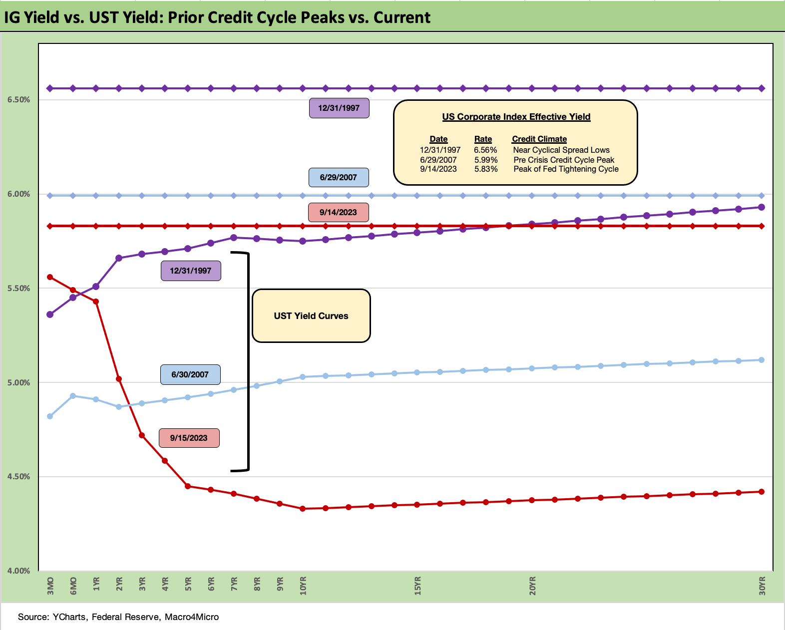
The above chart uses a similar approach to what we did with mortgages by comparing the UST curve yields and today’s IG Corporate Index yields to some notable past periods. In this case, we use the credit market peaks (or near peak) of late 1997 and the credit bubble peak of June 2007. The actual spread lows for IG in 1997 was in October, but we rounded to year end. June 2007 was the bottom tick in US HY OAS just ahead of the summertime credit market freeze that set the stage for the 2008 crisis.
The differential in the UST curve today relative to late 1997 and mid 2007 is glaringly evident. The 1997 UST curve was materially higher and flatter but spreads also much tighter. For 2007, the UST market was just coming off a sustained bear flattening and tightening cycle with intermediate rates not moving much (unlike 2022-2023) but the front end was rising quickly from 2004 to 2006.
That 2007 market was a case study in credit market excess along the credit spectrum and the mortgage and CDS excess was reckless on its best day. The 2023 market has been much more disciplined (and regulated) but with fewer market makers and much larger balances in the market.
The next leg of the journey after 1997 was a highly volatile 1998 (LTCM, Lehman scare, EM contagion) and then the default cycle was underway in late 1999 even with the NASDAQ posting record numbers that year. In other words, life got very interesting after that. The Fed had even eased in late 1998 to deal with market turmoil. In the meantime, the aftereffects of 2007 do not need a lot of review as it rolled into a systemic crisis.
We have two late-cycle flattish curves in late 1997 and 2007 vs. today’s lower and inverted curve. That is where rising rates and a UST steepener keeps life interesting since inversion is supposed to send signals on recession risk.
There are many material differences between these markets and today that we have covered in other commentaries, but the sense of scale on the relative UST curves and credit yields is worth keeping in mind when framing asset quality and refinancing risks. Life before ZIRP and the crisis years included a lot of 5% and 6% IG issuers. The same is true in mortgages.
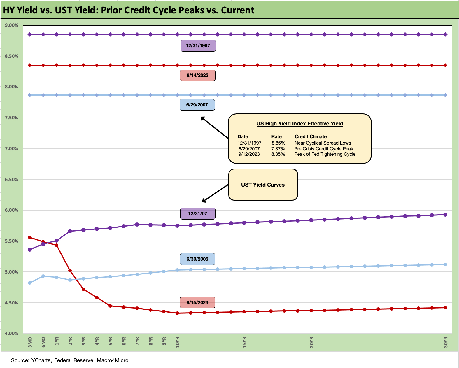
The above chart does the same exercise for US HY index yields and the related UST curves. The positioning of June 2007 HY index yields hammers home how extraordinarily tight HY spreads were in those days. The quality mix in June 2007 was lower as well vs. today’s more BB centric HY index.
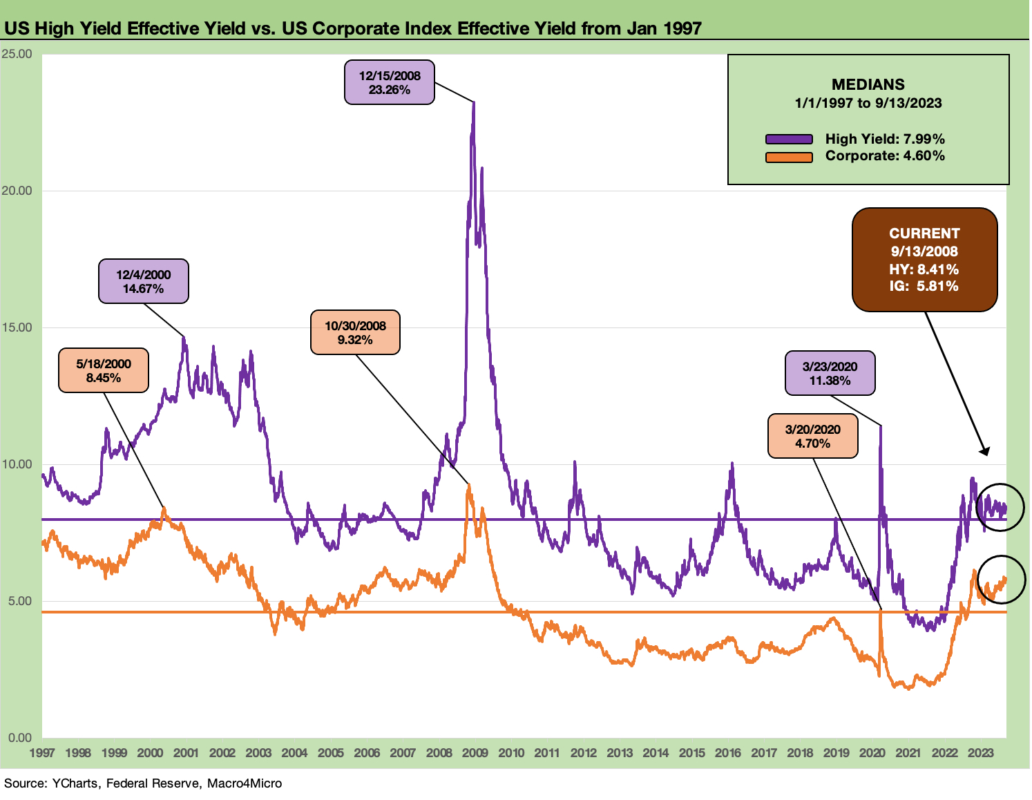
The above chart plots HY index yields and IG yields across time as the UST curve and spread backdrop swung wildly across the years. HY was hit especially hard in spreads during the crisis period of late 2008/early 2009 and again in the 2011 sovereign meltdown and during the oil patch crisis of late 2015/early 2016. Those were the periods where the all-in yield was about the OAS and not the curve.
In the current market, the curve is driving the all-in yields and not the credit risk compensation. That is supposed to give more investors pause about their allocation to HY until the credit risk side of compensation gets more compelling.
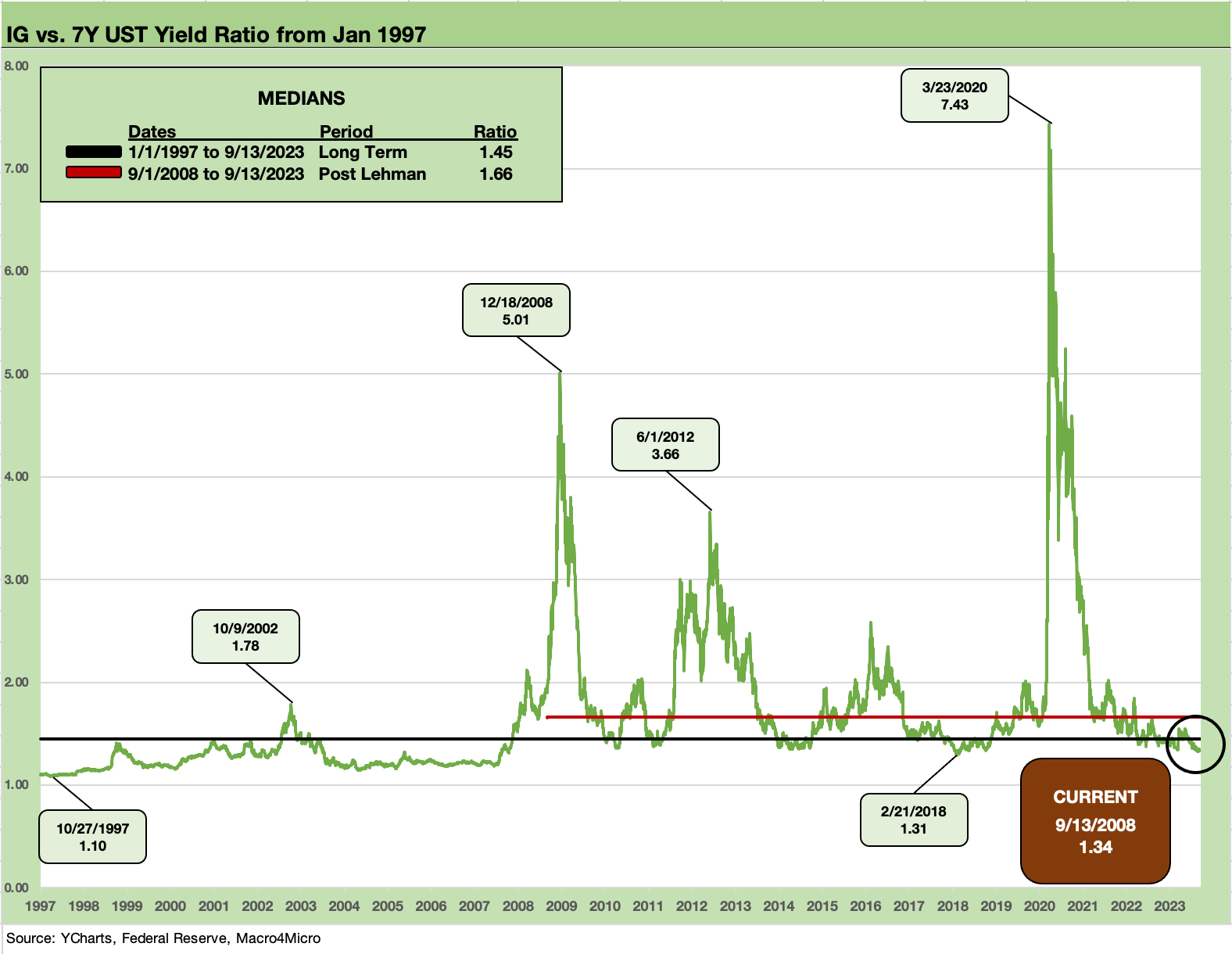
The above chart plots the ratio of the IG index to the 7Y UST across time. We use the 7Y rather than the 5Y UST to get closer to the IG index duration. We have plotted these types of charts in the past, and the main goal is to give relative value context across time for how much incremental yield you get for the incremental risk taken.
The debate of absolute yields and expected return for a given set of risks as opposed to “relative yields” is an old debate, but the reality is the asset class constrained need to deal within the long-term asset allocation strategy and asset class constraints.
Basically, the HY, HY Lite, and/or BBB heavy investors have a mandate. More defensive positioning and the usual relative value name-picking all along their assigned segments of the credit spectrum is the order of the day for many.
The ratio of 1.34x for the IG to 7Y is currently below median as detailed in the box in the upper left of the chart. If we look at the median from 1997, we see 1.45x. If we narrow the timeline to the ZIRP-heavy post-Lehman years (i.e., from Sept 2008), the median ratio is 1.66x. In other words, with the tightening cycle and upward migration we have seen to date, the relative value has deteriorated for IG bond comparative yields.
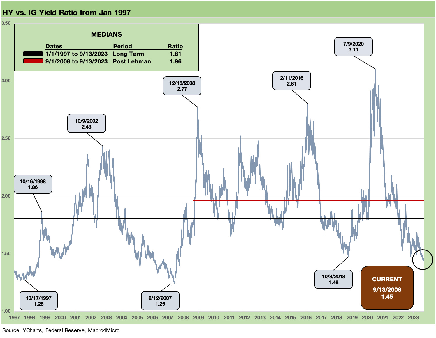
The above chart plots the ratio of HY to IG yields with the same goal of framing the history of relative yields. This relationship is one we have looked at from a variety of angles in the past, and this just offers another view on the relatively low compensation for additional credit risk in the move from the IG basket to the speculative grade basket.
The IG market is much more BBB heavy than in past cycles and the HY index is more BB heavy, so there are always more layers to peel back including industry mix and the general credit quality and fundamental and cyclical backdrop. We see the HY market as rich and vulnerable, but there is not much on the immediate horizon for a major repricing. We do see room for widening in aggregate through year end, but the main drill is still name by name and industry by industry.
Updating some yield curve slopes…
In the next two charts, we update the UST slopes for the 5Y to 10Y UST segment and the 10Y to 30Y UST. Last week, we updated the 3M to 5Y, 2Y to 10Y, and 2Y to 30Y (see Footnotes & Flashbacks: State of Yields 9-10-23). We use the shorter timeline from the start of 2021 and include details on other timeline medians in the box for each chart below. The main drift of the moves is “a steepening toward a flattening” with the front end somewhat anchored by the Fed for a while even if forecasts for cuts are still out there for 2024.
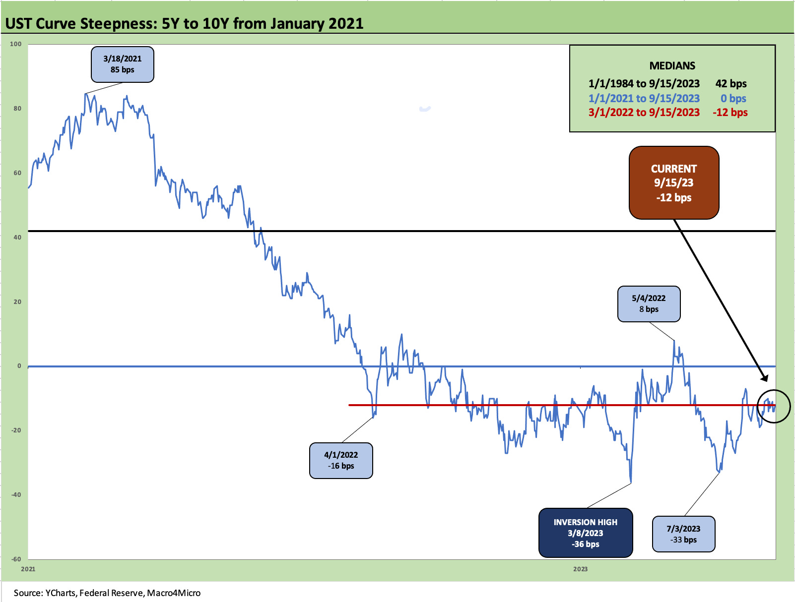
The above chart highlights that the 5Y to 10Y is still inverted at -12 bps even if that has scaled back from -33 bps as recently as early July after the timeline peak inversion just before the regional bank meltdown. In the early 2021 period before ZIRP ended and the Fed started the tightening cycle (March 2022), the UST curve from 5Y to 10Y was steepening as inflation pressures and recovery dynamics played out. We see +85 bps in March 2021. The risks associated with extension are not offering investors compensation to extend from 5Y to 10Y. In the end, interest rate risk is managed at the portfolio level, but the security level is not making a great case unless you are a duration bull.
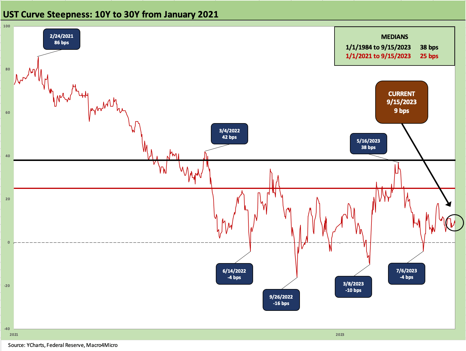
The 10Y to 30Y is slightly upward sloping at +9 bps but well below the +86 bps of early 2021. The long-term median is +38 bps from 1984 and +25 bps from the start of 2021. The shape of the curve is not rewarding extension.
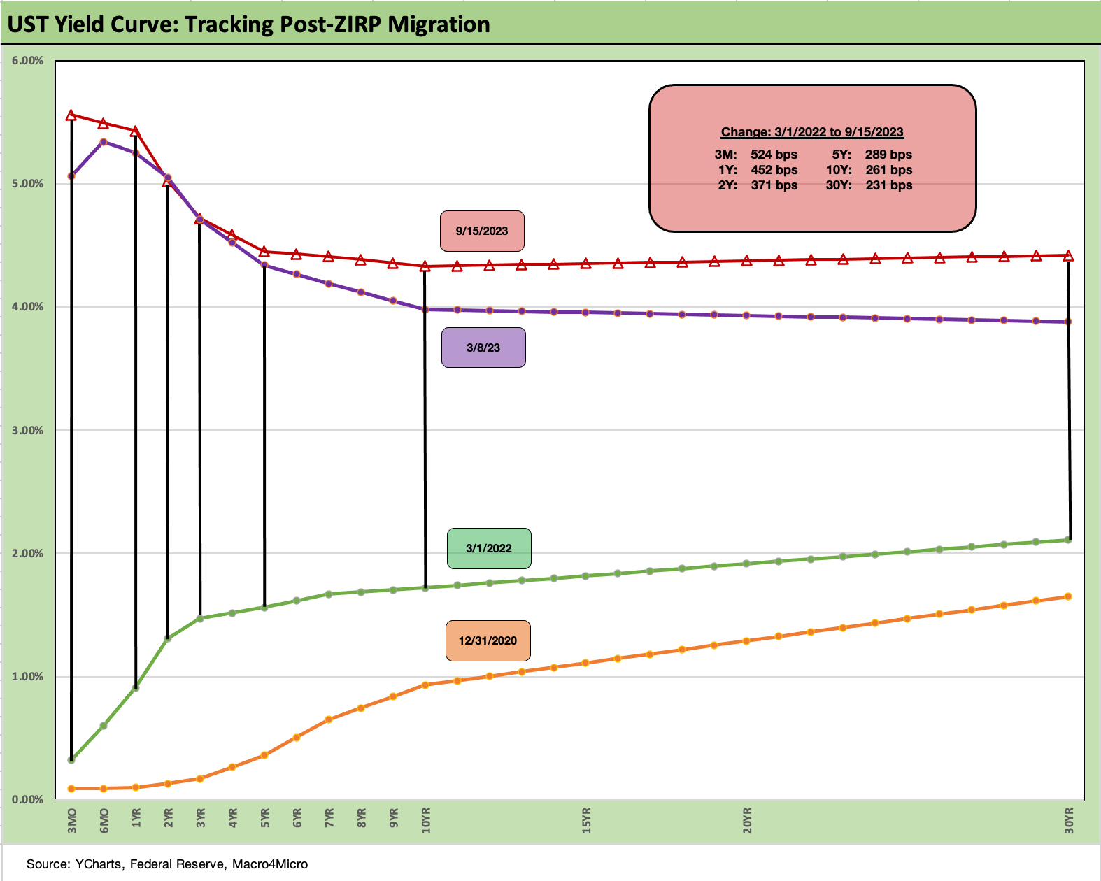
We end with our usual summary timeline chart that breaks out the bps move since March 2022, the month ZIRP ended as the tightening cycle kicked into gear. We also include a Dec 2020 UST yield curve for a visual. The box breaks out the running UST deltas with the 3M +524 bps higher than March 1, 2022 at the current mark, the 5Y at +289 bps, the 10Y at +261 bps, and 30Y at +231 bps in a bear inversion pattern across the curve.
We look forward to seeing the next round of forecasts and the ever popular dot plot out of the Fed.