Footnotes & Flashbacks: State of Yields 7-16-23
A bullish week for duration came with a positive week for credit and wasn’t an either/or proposition.
The week revisits the bull inversion trend after an optimistic CPI trumps the bearish UST tone of the prior week with supportive moves in both credit risk and duration.
With 2Q23 earnings season now underway, there will be much to digest with the FOMC meeting next week (July 25-26) along with the first look at 2Q23 GDP.
This week we see more sea level releases including Retail sales, Industrial Production and some key Housing numbers (starts and existing home sales).
With the front end of the UST curve near highs and the UST curve shifting lower last week, inversion theories are still struggling to set a wedding date with the cycle bears as earnings and some subsector trends holding up and some in fade mode.
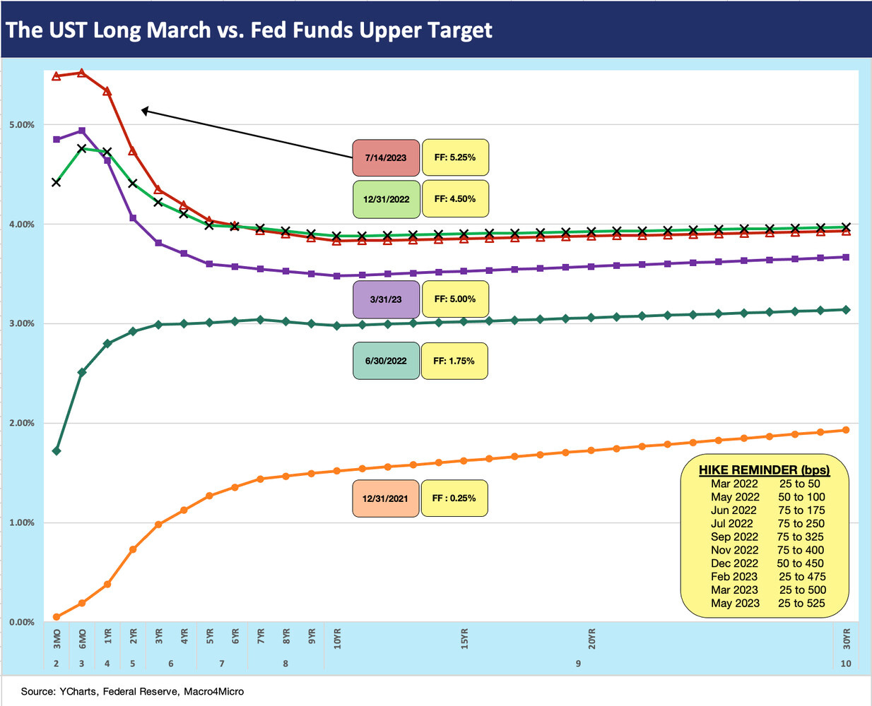
The ebb and flow of good news/bad news for duration continued this past week with a CPI release that rallied the UST curve (see June CPI: Big 5 and Add-Ons…A Big Win 7-12-23). That comes after the market sold off the prior week under the influence of jobs numbers (see Footnotes & Flashbacks: State of Yields 7-9-23). The chart above updates the journey from the end of 2021 as the UST curve dropped down from across-the-board 4%+ levels to a few 3% handles out the curve to end this past week.
After converging on the pre-Silicon Valley Bank UST curve levels of 3-8-23 (broken out in the above chart) and crossing the 4% and 5% handles across the curve, the past week saw maturities in the 2Y to 10Y part of the curve moved lower again this week (detailed in other charts herein).
We have a slew of cyclicals reporting in coming days and their guidance on earnings and capex will bring important color beyond the supposedly infallible prediction skills of the UST curve. What companies and consumers do with their dollars has a more immediate impact on the cycle than what the UST symptoms say.
We have a lot of guidance wood to chop in coming days and more color from the Fed at the end of the July 25-26 meeting. Then the FOMC goes MIA until September (but presumably with a lot of speeches by the members before then). The regional banks and consumer banks will be out on the screen this week, and investors will be looking for more granular details on interest margins with those 5% handle short UST rates from 1 month to 1 year. The provisioning policies in corporate lending and real estate will be seeing shareholders and analysts looking for some reasonable depth of detail.
The above chart breaks out the yield curve details for the week, and the power of that CPI print is clear enough. The fact that we saw the CPI ex-Shelter index YoY under 1% was the most notable item to us.
In terms of asset allocation and yield curve dynamics, investors are looking for when to play their duration cards rather than moving down the credit risk spectrum. The theory is that either IG bonds or HY has to win this battle in 2022. IG is more tied to the curve and HY to credit spreads. This past week duration and spreads win in HY. IG bonds performed well on duration and HY on both duration and excess returns. We look at the asset return metrics in a separate “Footnotes” publication.
We still see IG as clearing 2023 with the better total return and still expect widening in 2H23 in HY. Over the years, the 1H vs. 2H differential can be material in the credit markets as we have seen too many times over the years. Examples include 2014 and 2018 among others. COVID and the aftermath were not part of a normal cyclical story line as supply-demand whipsaws and inflation derailed many industries and changed the cyclical patterns of consumer action and late cycle reinvesting.
There is a lot more going right than wrong in fundamental risk right now, but there is a lot of game left, notably in manufacturing on the real economy side, and in Services inflation on the FOMC policy side. The purchasing manager color has been consistently weak of late but guidance in 1Q23 from major manufacturers was pretty stable. Automotive has been performing well after a recession level volume year on supplier chain problems. With Industrial Production out this week, we will see what the top-down numbers are saying. Retail Sales are also teed up.
In the above chart, we again update the comparison of the UST curve and mortgage rates of the 2005-2006 housing boom/bubble with what we see today. Looking at where the UST curve is now vs. where 30Y mortgages are positioned (we post the weekly Freddie Mac 30Y benchmark) tells a story of wide mortgage spreads in a market where 30Y mortgage ranged from low 6% to low 7% this year but from a UST curve well below those earlier periods.
We decided to keep this in the regular collection in part because it is so strange but also because we are in the peak home selling season and homebuilders have been stellar performers in the equity market. We routinely update the macro stats on new home construction and the volumes of new and existing home sales each month. The homebuilding cycle is a major employer with its multiplier effects from materials to freight and logistics and a range of related services (finance, mortgages, insurance, real estate brokerage, etc.).
This mortgage vs. UST disconnect in this market is a critical variable for the real economy and household confidence in the value of the home equity base. We looked in detail at consumer debt including mortgages and other consumer debt this past week (see Consumer Debt in Systemic Context 7-13-23), and the household balance sheets are in good shape in aggregate as is the overall economy relative to history. We should get a better idea of consumer asset quality erosion in the earnings wave with many consumer finance and SMid bank numbers out the next two weeks.
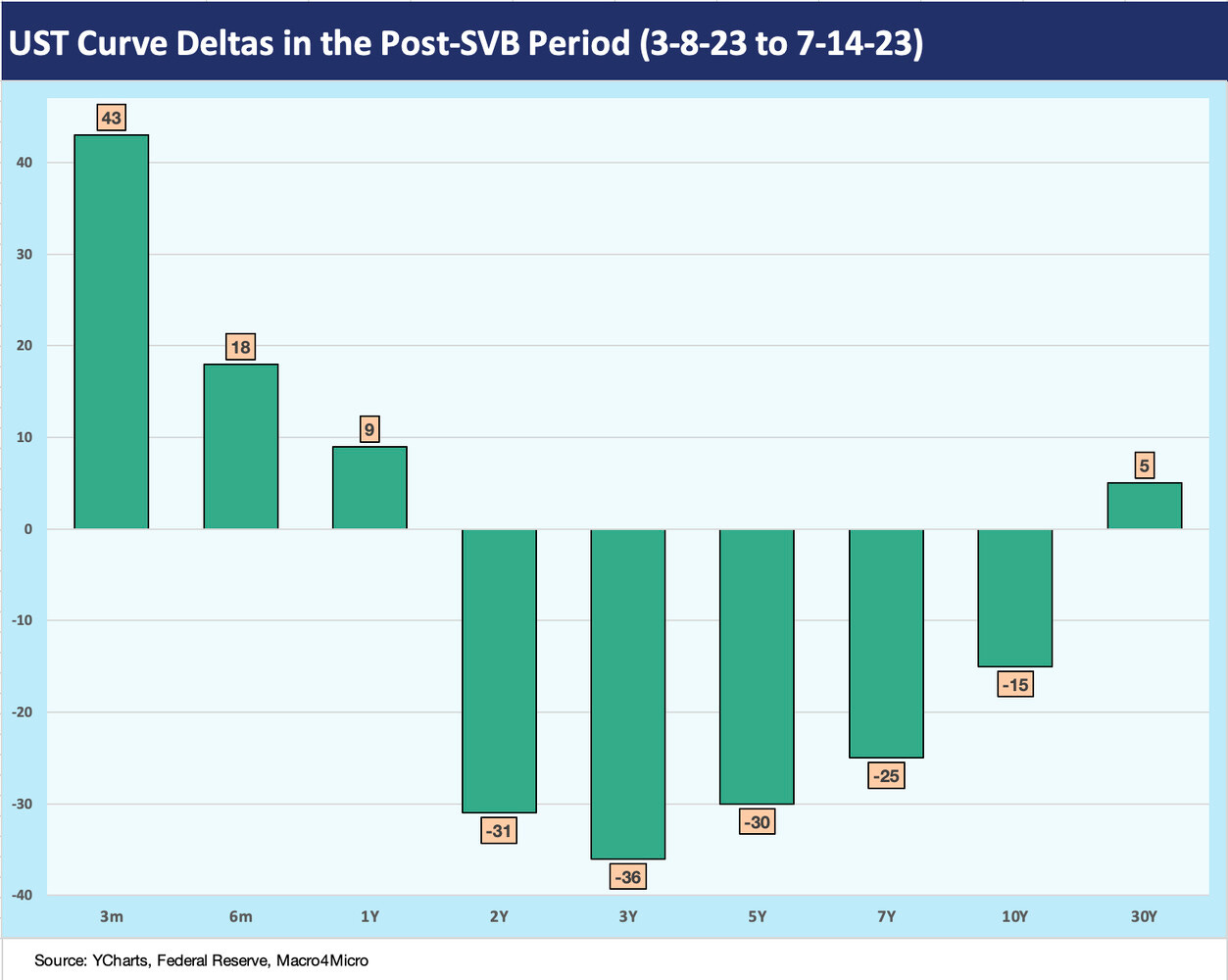
The above chart updates the yield curve deltas since the SVB crisis and regional bank carnage that kicked into gear in late 1Q23. The UST numbers had a big move this week and bolstered duration gains in the meat of the corporate sector curve from 2Y to 10Y.
We look at the UST slope shapeshifting in the 2Y to 10Y in charts further below as this very distinctive monetary and economic cyclical combination defies attempts to put the trends into historical context. Just the fact that it has been four decades since the last threatening bout of inflation complicates the ability to play the “past vs. prologue” game in global and domestic markets that have both changed so much over the decades. Of course, that does not stop us all from trying.
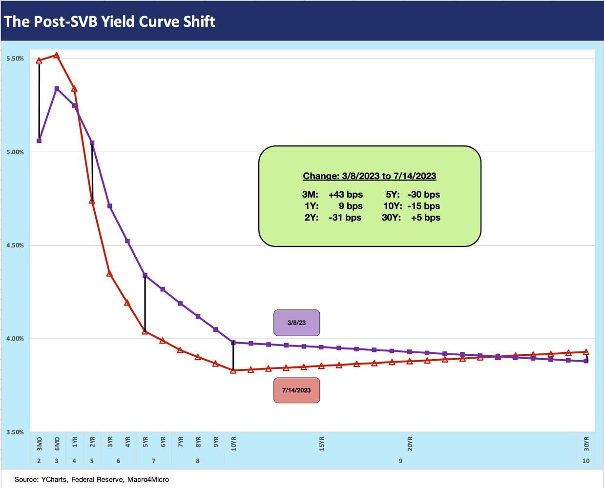
The above chart offers up a yield curve visual shift that reflects the UST deltas we just reviewed. We post the actual UST deltas in the box within the chart. That move from 5Y to 10Y UST is a major driver of investment demand for fixed income in asset allocation and also shapes the direction of mortgage rates, which typically key off the 10Y UST.
Some yield curve slope samplers…
Below we look at the UST slope history for the 2Y to 10Y and for the 5Y to 10Y. We look at two timelines for each. First, we look at the long-term trend from 1984 to current days for a sense of the multicycle patterns. Then we follow with the shorter time horizon from March 2022 to the end of the past week to get a more granular look at the short term moves during this most recent tightening cycle.
With investors debating that extension from intermediate bonds to longer duration bonds, these UST curve movements play a big role with such a protracted inversion. The “shape” (bear steepening vs. bull flattening/inversion) and the “shift” (higher or lower) in the shapeshifting handicapping has made for a wild cycle. The FOMC controls the front and the “market vote” controls the longer end. The two votes have been at odds for much of the post-March 2022 period.
The above chart plots the 2Y minus 10Y slope across the decades. The median is +98 bps vs. the steep inversion seen in recent months including a peak inversion of -108 bps in early July and the most recent inversion print of -91 bps. Even though such a protracted inversion is used for recession predictions by many, the fundamentals of many industries (and even more of consumers) are not cooperating with that theory – yet.
The above chart zeroes in on a shorter timeline for a better visual from March 1, 2022, or immediately before ZIRP came to an end in mid-March 2022. We see a median inversion across this stretch of over 15 months of -47 bps vs. the current -91 bps. The market was at -107 bps right before the SVB collapse and a major flattening move after that as the short end of the market rallied.
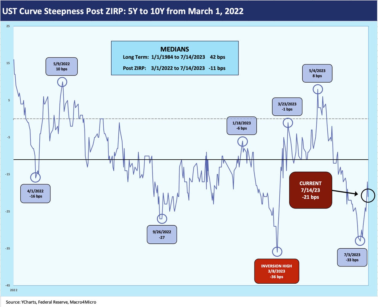
The above chart looks at the long-term trend line for 5Y to 10Y. That slope is important in the extension trade. The long-term bulls on duration gains are looking hard at this asset allocation decision with 5% handle yields available in IG credit. The long-term median is +42 bps, so that raises the stakes of how that shape would unfold from here and when. That could be a very good trade if you are a believer in inflation breaking and an economic contraction unfolding that brings a downward shift on the long end and across the curve.
The flip side is a soft landing and steady economic fundamentals drive a steepener trends as the Fed holds steady and the 2Y to 10Y steepens while shifting higher. Whether you take the duration risk in the UST or IG market is another debating point on how you view the threat to excess returns and the credit cycle. We have been of the “buy IG over HY” school for the next leg of the cyclical journey, but so far HY has hung in better than duration.
For the shorter time horizon from March 2022, we see a median inversion of -11 bps vs. the current -21 bps on 5Y to 10Y. More than a few forecasts out there are calling for a bullish move in 10Y UST, but a high 3% handle is not overly compelling to us since we are constructive on balanced economic fundamentals at this point.
We also see HY spreads as too tight for the timeline and mix of factors looking through to year end. We have been of that school since the year began but HY had won the 1H23 contest (see Footnotes & Flashbacks: Asset Returns 7-2-23).
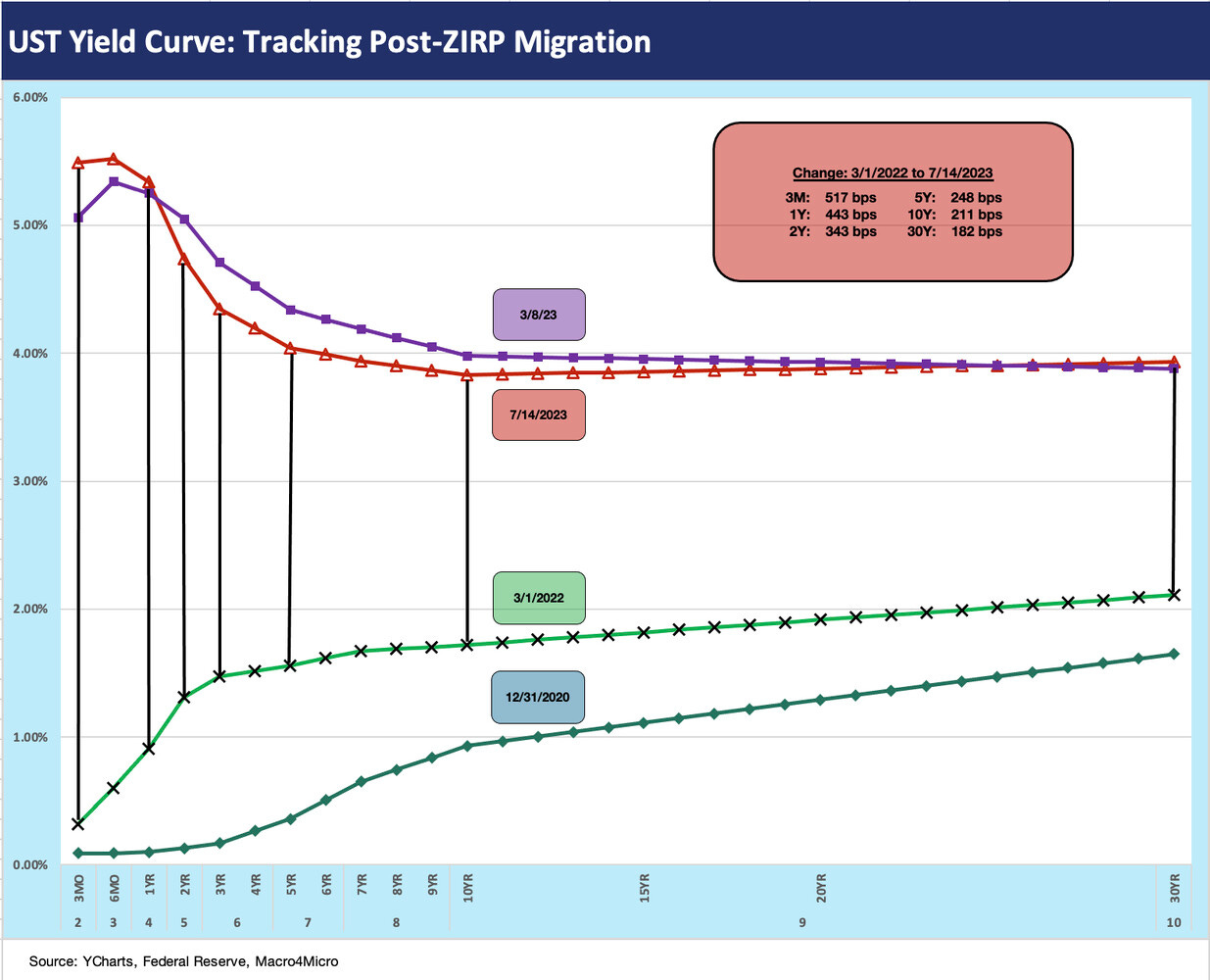
The above chart wraps up the yield curve collection with a last look at the journey from the end of ZIRP to where the curve is now. We drop in a year end 2020 UST curve as a frame of reference after that year saw oceans of QE, a range of liquidity backstops to support credit market confidence, and sustained ZIRP all flood the market with support action from the March 2020 crisis peak on the road to the vaccine in early Nov 2020.
The chart leaves the 3-8-23 UST curve date in the mix as part of a pivotal timeline. We had just moved ahead of that UST curve last week with 5% and 4% yields across the curve before the rally this week. In the meantime, we are likely headed for a 5.5% upper target on July 26 when the Fed ends its two-day session and perhaps offers a less hawkish commentary. Earnings season could play a role if we see any major surprises.


