Footnotes & Flashbacks: State of Yields 8-20-23
The market is making heads spin on how to frame risks from UST steepening to China.
Another round of steepening fear is catching on with market anxiety making an immediate leap to the fear of 8% mortgages.
The China noise is picking up, but China hard landing scenarios have seen a lot of predictions in the past with broken clock frequency across the cycles.
Decent 2Q23 earnings season numbers/guidance and sustained constructive macro indicators left various brand name street leaders shelving recession scenarios.
The cyclical optimism has taken us back to the “good is bad” theme again.
The worries about the UST curve ranked ahead of China fears on the market worry list this past week. The UST curve moves of late are the most tangible and evident in the asset performance metrics while China remains more a 30,000-foot macro topic.
We saw constructive indicators this past week on the cycle across Housing (Housing Starts and Permits: Single Family Advances, Multifamily Backpedals 8-16-23), Industrial Production (see Industrial Production: The Recession that Wouldn’t 8-16-23), and Retail Sales (see Retail Sales: Consumer Stands Firm 8-15-23), so it is hard to throw a fundamental panic party and have anyone show up. Spreads are quite tight (see Credit Spreads: Proportions Matter in Risk Compensation 8-14-23), but the fundamentals are still mixed but strong enough to keep the UST curve moving higher and risk premiums compressed.
We also did a lookback exercise for how employment trends worked out across the various Presidential administrations this past week (see Employment Across the Presidents 8-15-23). The charts offer a stark visual of how extraordinary the recent employment trends have been. While that is good to run on for an economic platform, it is not reassuring for those hoping/expecting the Fed to ease.
Unlike the folks running for office and running cable shows, the Fed tends to look at facts for what they are. Even if they don’t come up with the right solutions, the Fed does use facts without mistaking them for opinions and spin room fodder.
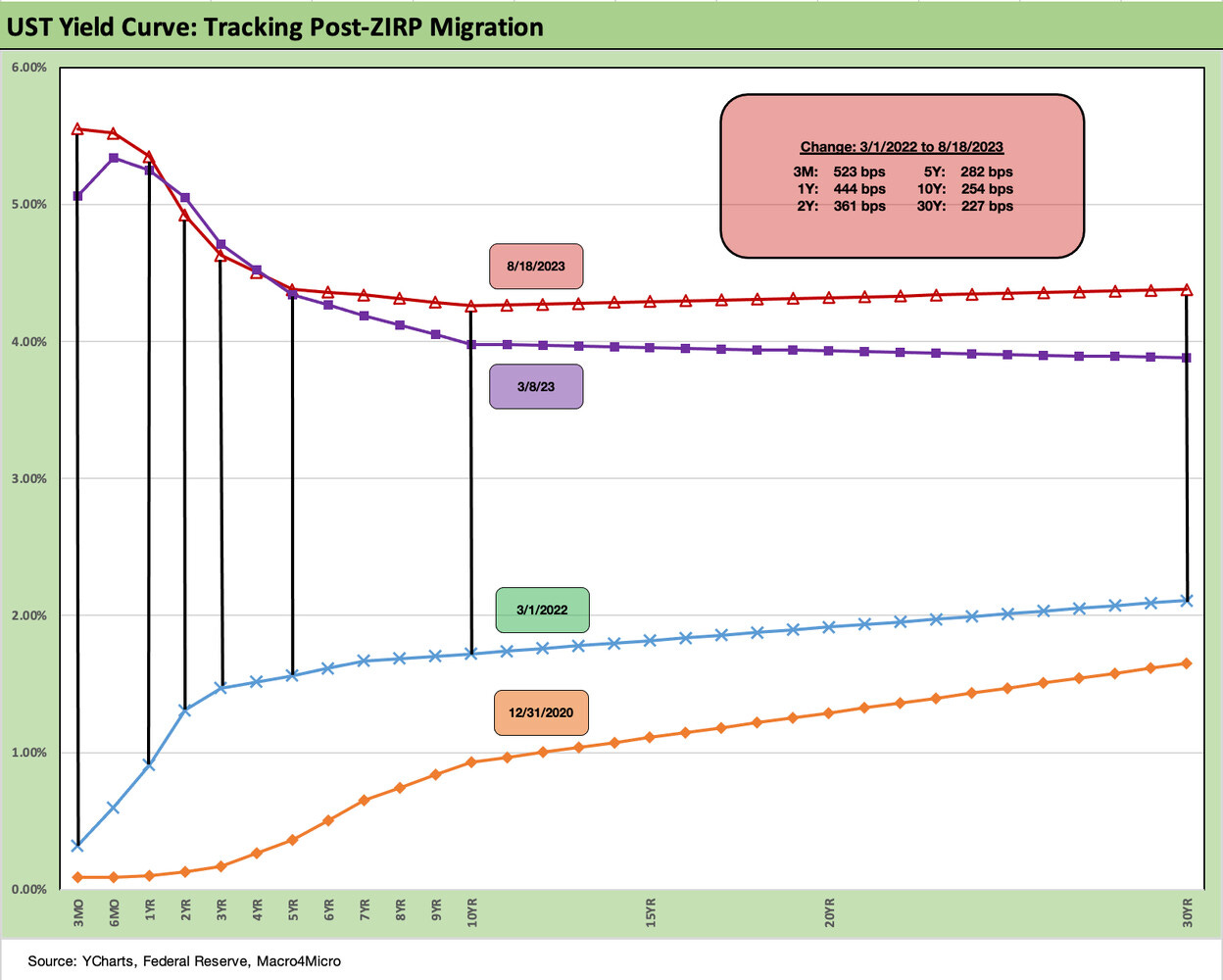
For the timeline on how duration risk played out in 2023, the path from the end of 2022 and the end of 1Q23 to where the UST is positioned today is evident in the chart above. We include a Fed hike reminder in the box within the chart. We detail the curve migration metrics in other charts below. The outcome is poor returns on duration pain.
The past week thus brought more of the same performance with fixed income staying weak. We cover the asset returns separately, but the index benchmarks for debt that we watch are all negative for the past month. Meanwhile, the fixed income ETF proxies are all negative for the past week and 1 month with 3 of 4 Fixed Income ETFs negative for the trailing 3 months (HYG posts up a small positive for 3 months). That about tells the story. (See Footnotes Flashbacks: Asset Returns 8-20-23.)
We see steepening on the UST curve side running alongside weak performance in equities in recent weeks. As we cover in our separate “Footnotes” commentary, the debt and equity benchmarks and industry ETFs were almost shut out the past week with 25 of 26 ETFs/benchmarks in the red for the week and one high dividend midstream ETF (AMLP) made it (barely) into the black.
The rise of the long end of the curve can at times almost instinctually drive a more bearish view on long duration equities (on the short list of least favorite terms for those with a fixed income background), so that has not helped the tech sector in recent weeks after a smoking hot stretch. Given as well as they have done with rates creeping higher, we don’t buy the interest rate rationale for equity weakness lately. That said, many see this as a key driver of tech equity dips. Combining rising rates with subjective forward valuation parameters (and finger in the air multiples) can get markets unruly at times like this.
The above chart frames the yield curve deltas this past week. We see a pure steepening but with everything higher 2Y and out. When it comes to steepening risks, some of the questions get back to the basic view that if the Fed is either pausing or raising rates in a strong economy, then the UST curve must move higher since a recession and easing is less likely. The idea is that there will be less flight to longer UST and more to equities or short UST until the duration risk downside peaks.
The other pieces of the puzzle/theories go like this:
The Fed is no longer a captive buyer for UST or mortgages, so demand is at risk.
The old crowding-out effect is alive and well and the natural demand is for short UST and bills, which in turn means the ability to prudently extend liabilities requires the UST to “pay up” on the longer end (thus steepen).
If investors are more worried about an upward shift in the curve, more sellers of duration will surface and rebalance to less long dated risk.
If China is under pressure, they may start to downsize UST holdings and retrench on new buying.
The soaring interest costs could keep investors more rooted in the short end until the cyclical signals and Fed game plan is sorted out. That will show up in money market funds vs. longer bond funds.
If central banks are concerned about their currency, UST flows could see some new pressure as they seek to buy their currency.
The reality is that there are a lot of moving parts, and the cyclical dynamics are a constant debate. CPI and PCE will help in this process since UST rates are headed the wrong way for bond investors while inflation is heading in the right direction. That is especially the case if we ignore the Shelter line that is so out of whack with economic reality at this point but which dominates the CPI index weightings (see July CPI: All About the Bass 8-10-23).
The above UST curve deltas for the post-SVB period (using 3-8-23 as the last market day before the regional banks were unraveling). We see a distinctive steepening on the long end with the 2Y and 3Y slightly lower. For this time cut, we see the 30Y move slightly faster than the 3M (note: the UST is still materially inverted).
The above chart just gives a yield curve visual of the post-SVB deltas we have already detailed in the prior chart. The steepening beyond 10Y is obvious enough. So is the upward shift past 5Y UST (“steepening” by another name as in “less inverted”). The “steepening” term vs. “upward sloping” are two different worlds for the most part during these times. That is where the long term upward sloping norms come in. We look at those long-term slope histories in some form each week. Further below we look at 3M to 10Y across recent time frames and we also update the 2Y to 30Y.
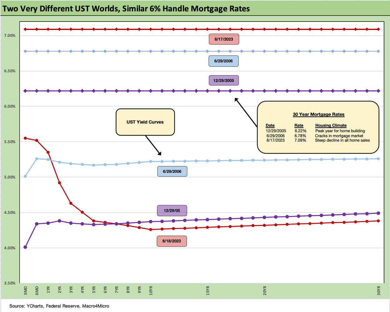
Mortgages stole a lot of headlines this week as the sustained move above 7% has people already screaming 8%. The 7.09% posted by Freddie the past week is on the lower end of what you see cited on various mortgage runs. The above chart details an interesting comparison of the current UST (the lowest in the group from 10Y UST to 30Y) vs. the UST curve at the end of 2005 (the peak housing year of the bubble) and midyear 2006 as the RMBS market was starting to crack and the noise behind the scenes was getting louder in trading circles. By that point, structured credit of all types had started to become a late cycle binge.
What stands out in the chart is that today’s UST is the lowest shown at the 10Y UST, but the 30Y Mortgage rate today is notably the highest. That is where the fixed income asset allocators are making their relative value case given how wide mortgage spreads are as captured above.
The magical mystery tour of mortgages is outside our wheelhouse, but something is very out of line in this picture when mortgages are wrapped around conforming (GSE) mortgages with high quality borrowers and 20% down payments.
The mortgage trade rags are taking great pains to keep the market informed on how to look at these quotes since they vary with other moving parts such as points up front and related fees. The Freddie Mac benchmark 30Y published each Thursday is what we plot above. The traditional benchmark we use had been built around assumed points and high credit quality and 20% down payments, but even that has morphed at Freddie into a more diverse blended average with points data no longer required disclosure.
Anyone who needs more background can check out the Freddie Mac site where they detail the benchmark. The easy version is that if you pay points and fees up front, your quoted contract rate is lower (that means you already paid some of the interest).
Homebuilders can “game” this to their advantage by offering mortgage buydowns and other fee incentives and work with their mortgage operations. It is the same general idea as discount financing for auto retail. Whether it is a marketing cost or a price haircut in substance, it is a way to get business done. Life for existing home sales could now get worse, but builders will find a way and pick up more share of total sales.
UST slopes, steepeners, and duration angst…
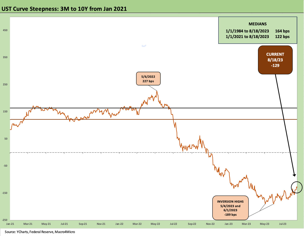
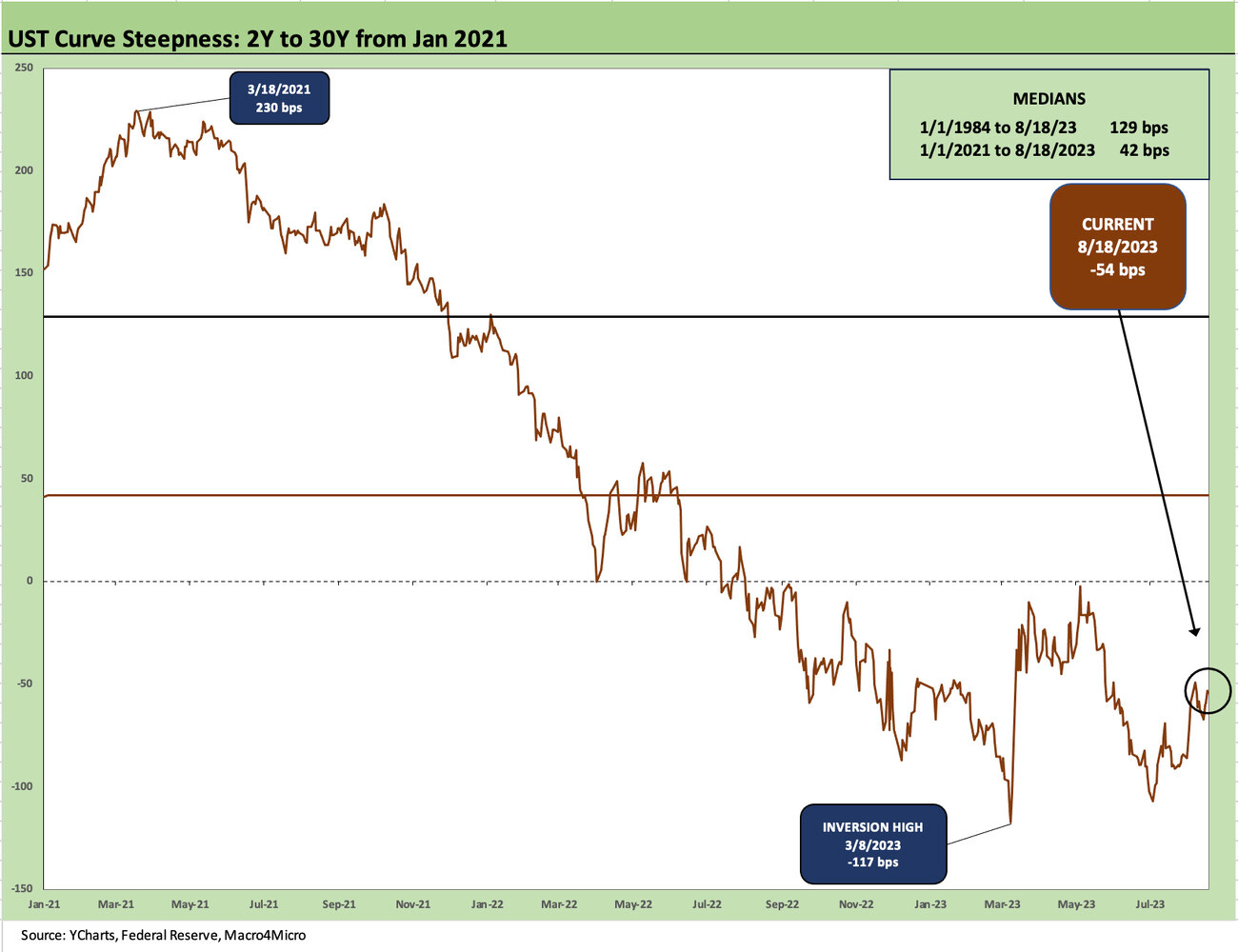
Below we update the 3M to 10Y UST slope followed by the 2Y to 30Y. We plot the path just from 2021 for better visual granularity. We have looked at long-term time series in many past editions, so we did not clutter it up this week. We did include the long-term median as detailed in the box in each chart.
The charts from the start of 2021 naturally show slopes migrating from upward sloping to inverted as the Fed hiked. The longer end of the curve was already moving as the “market voted” on inflation well ahead of the end of ZIRP by the Fed in March 2022. We see the peak inversion in June 2023 at -189 bps. The slope did not cross into negative until well into 2022.
The 2Y to 30Y has bounced off the peak inversion of -117 bps just ahead of the Silicon Valley meltdown as noted. The recent -54 bps reflects the risk in 30Y and a decline in 2Y since SVB. The 2Y to 30Y is a much watched metric. Fear can take hold of investors on the basis that more steepening will be needed, and that an inversion this long would be just too much of an anomaly for a “no landing” scenario.
The migration recap…
Below we wrap up this weekly with our migration timeline and the details of how far the UST curve has moved since March 2022. We end with this chart each week as a summary. It has been a long time since the market has seen moves this radical as we cover in our yield curve histories that we have posted in past notes. We can say 1980-1982 was much crazier, but this current one was quite a shock after such a protracted period of ZIRP, historically low longer rates, and low inflation.
The duration threat has been a debate all year after some false starts on UST curve optimism and when it was safe for the “time to extend.” The mixed threats to bond returns in UST has been about the curve, and for high grade it has been about both the UST curve and compressed spreads. The IG market has not gotten relief this year-to-date period. Total return YTD in the IG market is just above 1% despite tighter spreads. The UST market is slightly in the red.


