Credit Spreads: Proportions Matter in Risk Compensation
We update IG and HY spreads and relative % premiums vs. UST in a compressed market.
The age-old problem of determining what is rich and what is cheap always gets back to the eye of the beholder and how risky one sees an asset class, industry, or issuer, but some scales help the thought process.
The conceptual twist in a rising UST yield environment is that you get to look at a more generous framework for all-in yields, but the math means you are getting proportionately less reward in the risk premium (spread) for that risk all other things being equal.
Knowing how quickly the backdrop will see the risk changing is the challenge, and the spread decompression fears and the timing of the inevitable quality spread widening still makes for a tough call with all the ongoing cyclical debates.
We look at the recent path of IG and HY spreads and how those risk premiums frame up in % terms vs. UST as the curve migrates higher.
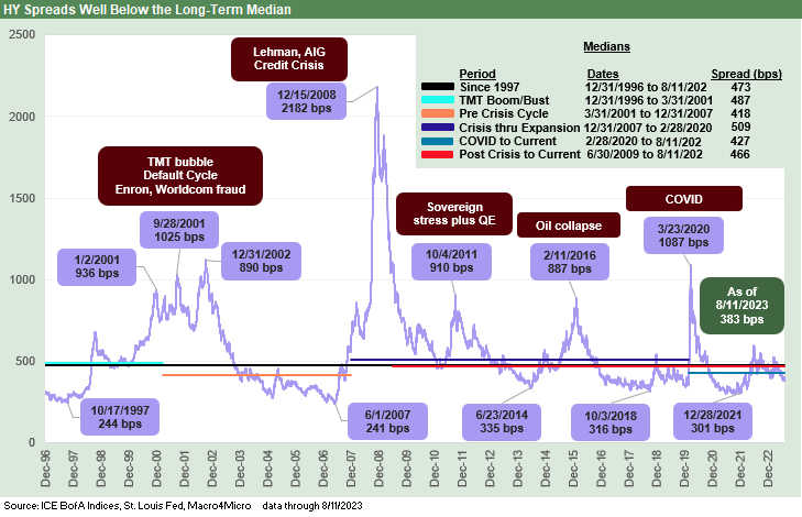
In the chart above for US HY and in the next few charts looking at spreads and various relationships across time, we explore a few historical relationships and recent trends in HY spreads and IG spreads. We put recent spreads in the context of long-term medians. We also look at a range of shorter timeline medians across some notable time segments across cycles – whether those be economic cycles, credit cycles, default cycles, or monetary cycles. The word “cycle” gets freely applied for a reason.
In this market, current spreads are inside the median for all the periods detailed in the median box. We have been asking the same question for a while in terms of looking back across the long term median from 1997:
Is this market in 2023 a median risk market, a below median risk market, or an above median risk market?
We are still of the opinion this is an above-median risk market for US HY given the combination of rising rates and what that might mean for the cycle eventually. In HY, we need to consider the sustained interest burden on many leveraged issues. From the top-down vantage point, there has been a lot of press on the topic of the shortening maturity schedule for many US HY issuers who in most markets would embrace the strategy of “refinance and extend early and often.”
For a CFO or corporate treasurer to refi and lock in coupons at double their current rates (depending on borrower) is a very bold call and implies you see rates moving higher. To lock that in and then see rates go lower might be bad career planning. Similarly, the current floating rate exposure on revolvers or term loans keeps the pressure on financing costs with the UST curve inversion. A company looking to clean up liens and reduce encumbrances will need to do so at high fixed rates.
In terms of IG, we also see this market as above median risk even if just on the sheer scale of the BBB tier on the way into a period of cyclical uncertainty. We would have made the statement that the banks and broader financial system have not been this safe since some of us started in the business (a low bar looking back at LDC debt, thrifts, brokers, hung bridge loans, etc.), but we will skip the history debate for purposes of this commentary.
The regional bank mini-meltdown after SVB shook that opinion somewhat, but the underlying asset quality got me back to the constructive view on the financial system (not to mention memories of more than 10 years at Lehman in the 80s and 90s). The online run on the regional banks still leaves many pondering what else can go wrong, but the diminished counterparty exposure and tighter bank regs helped.
Overall, we will still go with above median risk in IG on the basis that the BBB tier dominates with a full curve of massive balance sheets with IG covenants and a historically low number of market makers in a record-sized credit market.
Spreads and proportionate risk premiums…
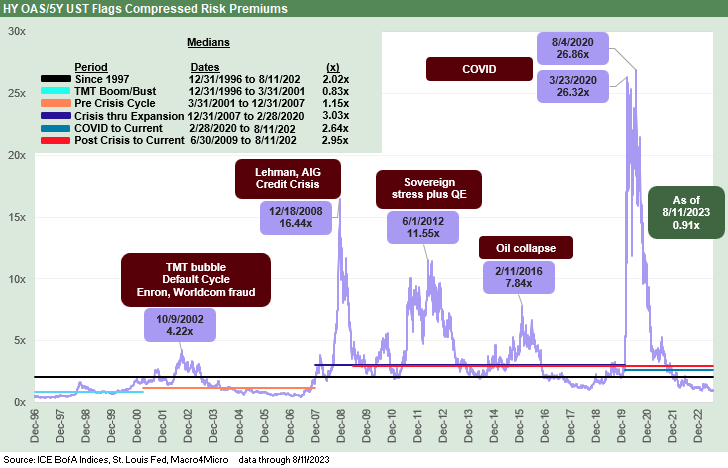
The above chart takes composite HY OAS and divides by the 5Y UST. In doing this exercise, we include charts that frame those benchmark index spreads against a relevant benchmark UST rate that is at least in the duration neighborhood of that credit subsector. For US HY, we use the 5Y UST as a relevant benchmark for that index. For US IG, we use the 7Y UST.
Those comparisons offer a timeline for spreads as a % of the risk-free alternative. “Proportionate risk compensation” is one way to look at it. The question is “How much incremental risk compensation am I getting for taking more default risk than with UST?”
You don’t need the Math Club All Star Team to suit up in full quant pads for this one. This is long division. The ratio brings a timeline that begs an explanation rooted in facts and concepts. There are other ways to slice and dice it, including quality spread differentials across the credit tiers. Compressed spreads are just that – as in tight – but their ability to stay tight is a key consideration.
Relative yields vs. minimum return expectations…
Relative yields vs. absolute minimum return expectations is one of those debates without end, but at least now there is a reasonable amount of income available in this market all along the credit spectrum. During the “dark years for income” after the credit crisis across the protracted world of ZIRP and bouts of QE, you might see 5% handle on a new issue CCC tier name and 4% on more than a few B tier names and a routine 3% (even some 2%) on BB tier bellwethers. Now you get 5% on UST out to 1Y UST.
There is a much smaller income penalty for cash these days in timing portfolio rebalancing. In fact, there is often a cash income penalty for bonds relative to cash. Many HY and medium grade legacy bonds come with low. Short UST has higher cash income than the par weighted coupon in IG under 4%. That at the very least complicates the decision and relative value thought process. Time horizon matters, but the moving parts include a potential hike in the fall and curve steepening risk meaning more hits to duration.
Everyone has to tailor their exposure to their own risk tolerance and portfolio parameters (CFA 101) and cash income from dividends and fixed income is a common one for retirees or those living off a portfolio. That is also true for mature defined pension fund portfolios in the corporate sector given the rate of benefit payments.
The fixed vs. floating decision is a more common one in credit markets these days with so many alternatives in loans (whether mutual funds or BDCs, etc.). The 60-40 portfolio may be obsolete, but which asset classes you assign to the 60 bucket (higher risk credit) and which is in the 40 (high quality credit and cash holdings at 5% yields) makes for an interesting thought process. The compelling decision on fixed to floating by itself is a challenging one.
There is no question that the relationship of HY and UST went on a wild ride during a ZIRP period that ran from late 2008 to Dec 2015 and then was revisited during COVID in March 2020 until the Fed got back off ZIRP in March 2022. The ZIRP years and double-digit 5Y UST denominator effect is a good way to discard the whole idea until you remember the simple fact that the low denominator is your investment alternative.
The swings were so wild that we used multiples instead of % terms for the ratio in US HY. Whether the market saw spiking spreads or evaporating 5Y UST rates (or a combination), the discussion of risk premiums often gave way to playing the dollar price game and consideration of coupon income to come up with projected (and acceptable) total return targets over a loosely defined time frame. Sometimes the choice came down to “Which issuers will make it to the logical redemption/refi date?”).
We see a long-term median from 1997 to 2023 of 2.0x for HY OAS vs. the 5Y UST. We are currently below 1.0x. You look back at the TMT Boom-Bust years from 1996 to March 2001 (technically the end of the expansion) and we see just under 0.83x. The post-TMT housing boom period from 2001 to 2007 was 1.15x. COVID to current times is 2.6x. The post crisis expansion (starting June 2009) to current was 2.9x. Like any other metric, this is just food for thought. That beats starvation on the topic.
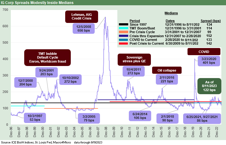
The above chart plots the path of IG OAS across the years from the end of 1996 through the past week. The current market at +122 bps is modestly inside the long-term median of +134 bps, but we see medians from prior periods that are tighter. We see an IG OAS median of 114 bps in the late 1990s to 2001. We also see a +99 bps median on the way into the housing bubble stretch from March 2001 through the start of the recession at the end of Dec 2007 (see Wild Transition Year: The Chaos of 2007 11-1-22).
As a reminder, we use that March 31, 2001 date more as a convention since the NBER flagged that as the end of the expansion. The reality is that later 2001 and 2002 was a train wreck in the credit markets with Enron imploding in 4Q 2001 and WorldCom in mid-2002. The real housing bubble period ramped up after 2003 and Greenspan kept easing all the way to 1% into early 2004 (see Greenspan’s Last Hurrah: His Wild Finish Before the Crisis 10-30-22). That backdrop amped up the reach for yield impulse.
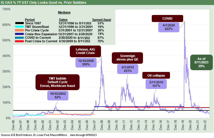
The above chart plots the IG OAS relationship to the 7Y UST in % terms. With UST rates rising to new highs, the IG benchmark performance in total return has struggled (see Footnotes & Flashbacks: Asset Returns 8-13-23, Footnotes & Flashbacks: State of Yields 8-13-23). As rates climb and spreads tighten, the proportionate risk premium relative to the risk-free asset also slides. That is now down to around the 30% area vs. a long-term median of 51%.
If we look at the pre-crisis years and the arrival of ZIRP, the 1996-2001 stretch shows 19% during a period where credit risk appetites were very high and downright frothy. Moving into the years of the housing bubble and post-TMT cycle from 2001 to 2007, we see a median of 26%. In other words, the current relationship is not too far out of line against those periods.
The ZIRP and QE years were part of a stretch when the spreads vs. UST relationship was more distorted. The period from the onset of the recession (12-31-07) through the start of COVID in Feb 2020 shows a median of 74%. From the start of COVID through current times we see 67%. From the end of the post-crisis recession (6-30-09) through today we see 70%.
Looking across the medians, the current level is not as bad as the TMT bubble years and closer to what was evident in the housing bubble years when banks were viewed as relatively bullet proof (before they got hit with a missile). The takeaway is still that spreads are compressed in 2023, but the levels clear the bar of the TMT bubble and Housing bubble years (that is not a great curve to grade on).
Fun with numbers…
In the above commentary, we frame credit spreads vs. UST. You can also frame US HY OAS vs. all-in IG yields to play with any range of relationships. UST yields got so low that some IG bonds became like UST surrogates for some investors (always a dangerous idea). The same is true across the HY tiers where the historical default rates rise exponentially (literally) as you move down the spectrum from BB to B to CCC. Framing the BB to CCC relationship is one metric we always liked to track. That is for another day.
The conceptual shorthand way to look at all-in yields during the ZIRP years was to consider how spread levels had to somehow put together an all-in yield anywhere near being an acceptable proxy for expected returns for the risk taken. For example, the 900-bps area HY OAS in the sovereign systemic craziness of Oct 2011 and Feb 2016 oil crash fallout were levels generated during an economic expansion (i.e., in contrast to the systemic crisis period of late 2008).
UST rates were so low at many points in past credit cycles that the all-in yields still could end up being underwhelming relative to the risks. For example, at the cyclical bottom price for US HY back on 2-11-16 when the market was in full-on meltdown around the oil crisis and HY redemption risk, the UST benchmark had a 1% handle and US HY was just over 10% at an 84-dollar price. That is a number in line with the long-term nominal return on equities. As an asset allocation decision, HY was a tossup with stocks as an asset class. That was for a significant multiple of UST rates as noted earlier at over 7.8x.
In the end, the point where credit risk looks more like equity risk makes for very interesting one-off buying opportunities. When credit is being priced for bond risk, however, the relative risk premiums are always worth second guessing. The best buys are almost never at the cyclical peaks.
Contributors:
Glenn Reynolds, CFA (glenn@macro4micro.com)
Kevin Chun, CFA (kevin@macro4micro.com)


Been thinking about compressed spreads relative to all in yield for a while now. I suppose the answer is C, close your eyes and buy bills. Nice read.