Footnotes and Flashbacks: May 7, 2023
GDP and April jobs keep the financial conditions equation complicated with the X-factor “plug” being how much bank credit tightens.
"Buy a vowel? Buy a bank? Solve the puzzle?"
This Week’s Macro: Asset class and ETF sector returns; various yield curve migration trends; UST curve deltas for last week and since SVB; updated 3M-5Y inversion high and 5Y-10Y slope history.
This Weeks’s Micro: Updated stock return profiles in regional banks for the past week, since the SVB implosion, and across various time horizons; we consider the much-discussed credit contraction risk.
MACRO
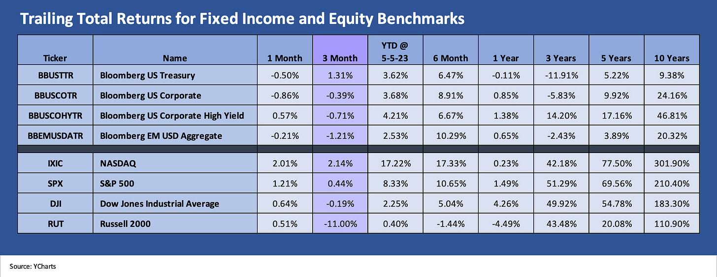
The above chart updates where the major debt and equity asset classes stand after the latest Fed hike, a very solid job report (see Employment April 2023: Post-COVID Deep Dive by Occupation 5-5-23), and the latest reassessment of GDP data this past week (see GDP 1Q23: Devils and Details 4-27-23). The rolling results above show a tough month for debt on duration and a volatile month for US HY OAS. IG OAS was slightly wider for the rolling month and ended up slightly tighter for US HY in what has been a period with notable swings.
As we discuss below in the Micro section, another 25 bps hike from the FOMC keeps the pressure on banks to raise deposit rates at a time they will see risks of eroding asset quality that will put some more loan reserves into the P&L. Deposit flight risk, net interest margin squeeze, and growing uncertainty around loan quality and key asset exposures (e.g. commercial real estate) is not exactly an aphrodisiac for investor demand.
The banks will need more liquidity cushion to deal with uncertainty around deposit outflows on their books. They will also need to worry about generating flag risks by tapping support lines that can reflect a sign of weakness. Banks are always a tough analysis (we always had pity for bank analysts) with murky and often inadequate disclosure and too many “net items” framing counterparty exposure.
The age of the point-and click deposit run is a new challenge. A smart bipartisan Congressional move to support the FDIC in insuring all deposits would make that problem go away. Confidence is the cornerstone of the FDIC concept of how to avoid bank runs. Otherwise, we could see more of the same under more than a few scenarios. We see proposals on the topic making the rounds.
For now, the problem is that “smart” and “bipartisan” as a combination has been outlawed in Washington. The “moral hazard” flag will get waved, but there is no good reason to use the word “moral” in Washington in a legislative context. It is too filled with irony. Bailouts of deposits are more about cost-benefit analysis and limiting the side effects of risk aversion. If the regulators do their job, that step should be less hazardous. Both could be a useful solution, but the immediate challenge is the need to keep the flames from kicking back up again in regional banks. As we detail in the micro section below, the markets remain very worried.
The above chart updates the longer tail of equities in the “1500 and 3000” series of equity indexes. We line them up in descending order of returns for 3 months. The “market breadth” topic (i.e., lack of breadth) has been a routine discussion this year, so we don’t have to revisit that too many times. The frequent reference to the “S&P 495” over the years (just google it) that excludes the Big 5 of the S&P 500 (Apple, Microsoft, Amazon, NVIDIA, Alphabet) is there for a reason. The Top 5 to 10 tend to dominate during earnings season also.
The above chart shows the anemic results of the Russell 3000 Value index with Financials, Real Estate, and Energy in the tank. On a rolling 3-month basis, we see 5 of the 6 broad benchmarks in the red and 2 of 6 benchmarks negative YTD even when the strong January is included. The steady Fed tightening and upward shift in the UST curve has not been kind. Regional bank anxiety has been brutal.
Comparative ETF and index returns…
In the following two charts, we look at 24 ETFs and broad market benchmarks. We plot total returns for 1-month and 3-month trailing periods. We break them out in the bar charts from highest to lowest returns. For the 3-month period, we highlight the Regional Bank ETF (ticker KRE) in a separate box to improve the visual presentation of scale (the 3-month returns on KRE are that bad and distort the other return visuals at -40% for the regionals).
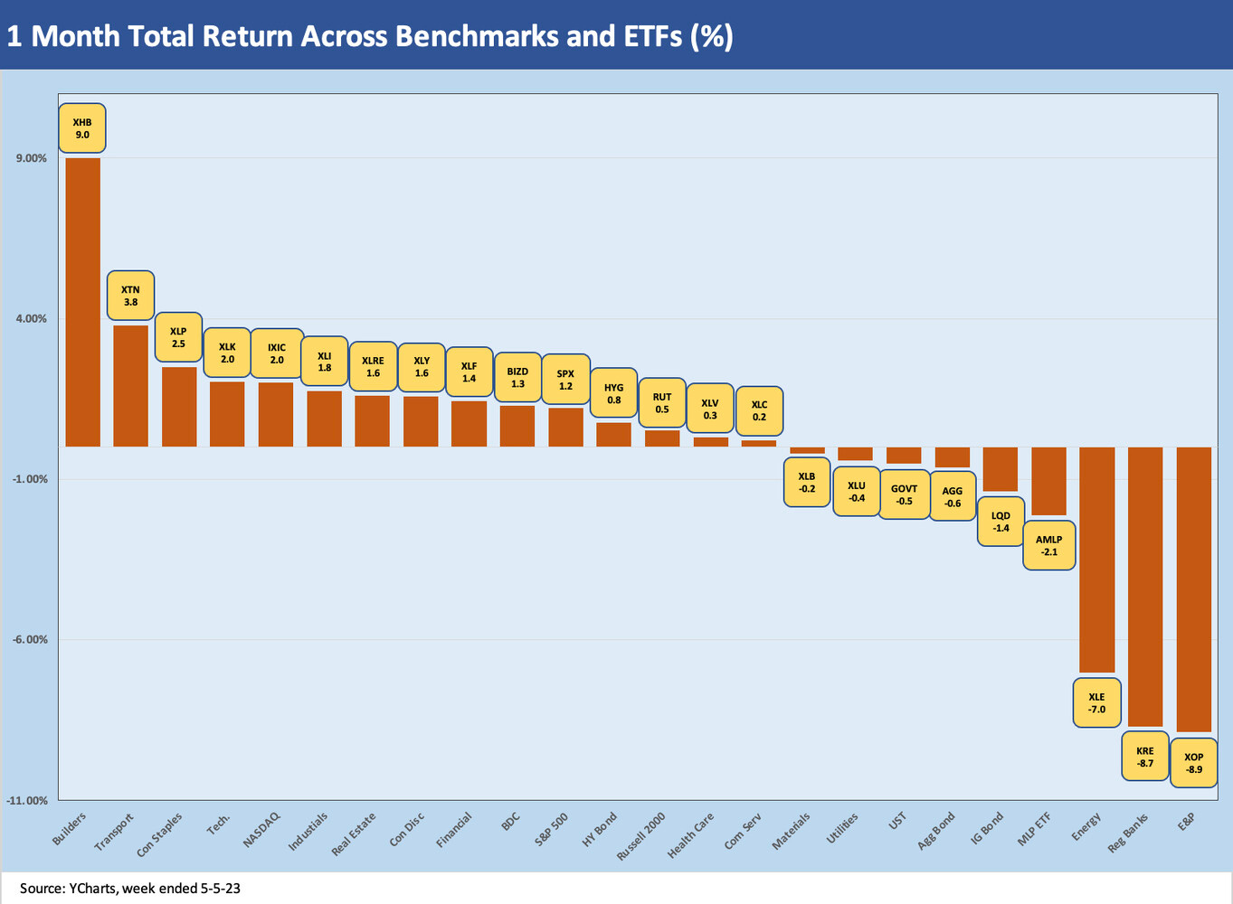
1-month ETF and index returns…
The 1-month ETF total returns show 15 of the 24 positive with a Hi-Lo range of 17.9 points of total return. The #1 performer of the mix that we track was the homebuilding ETF (XHB) as a decent earnings season and constructive sequential trends have supported a shift in sentiment.
The homebuilders have seen numerous names putting up good trailing returns including DR Horton, Lennar, Pulte, and Taylor Morrison among the largest names. The #2 through #5 still have two tech-heavy ETFs in the #4 and #5 slots but the Top 3 showed some diversity across builders, transportation and consumer staples.
Over on the right, we still see negative numbers for E&P (XOP), Regional Banks (KRE), and broader diversified Energy (XLE) ETFs in high single-digit purgatory. With MLPs fourth up from the bottom, we see 3 of 4 energy sectors in the worst performers. Rounding out the bottom 5 was LQD as the high grade corporate bond proxy with duration hurting returns and with a small dose of wider spreads for the 1-month period.
3-month ETF and index returns…
The 3-month time horizon has lost the benefit of a major Jan 2023 rally in the measurement period. We see 9 positive and 15 negative returns in the mix with the -40% Regional Bank ETF (KRE) in its own penalty box. Including KRE, the bottom 5 performers all posted double digit negative returns across KRE, Financials (XLF), the Russell 2000 index (RUT), Transportation (XTN), and E&P (XOP). If we take out KRE, the Hi-Lo range was 18.1 total return points for XLK vs. XLF, so these markets saw some material divergence by industry group.
The Top 5 for the trailing 3-month period saw a tech-biased mix with Tech (XLK) and the NASDAQ, but the UST (GOVT) took a weak #5 slot on the UST curve rally after SVB’s meltdown. Consumer Staples (XLP) and Utilities (XLU) qualify as defensive buckets in that rolling 3 months.
Yield curve migration…
In the next series of charts, we update yield curve migration trends and look at a few different time segments. We look back from the end of ZIRP in March 2022 and also do some recent time periods that capture the behavior of the UST curve since the regional bank chaos kicked into gear with SVB.
The chart above is the usual one we use in the weekly that measures the running yield curve shift since March 1, 2022 (ZIRP ended March 16, 2022). We record the yield differentials in the box showing the curve deltas from March 1, 2022 through Friday, April 28. We also plot the March 8, 2023 curve to timestamp the UST just ahead of the SVB crash. This past week was a mixed picture as the running curve moved higher in some maturities and narrowed in others. We post the 1-week UST curve changes in the bar charts below.
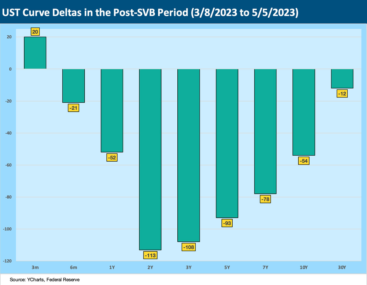
The above chart isolates the cumulative UST move from March 8 through the Friday close, and the numbers show some interesting shapeshifting. We see some steepening out past 5 years but with the inversion overall still quite pronounced with the Fed heading north while most of the curve heads south. We see a bull steepening (you don’t get to use that term too often) beyond 5 years.
UST curve slope and new inversion highs…
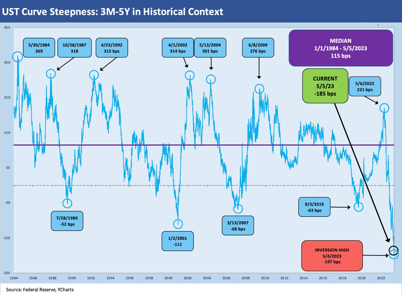
Below we look at two yield curve segments. First, we update the 3M to 5Y UST slope. We have done a lot of background work on the 3M to 5Y US in past commentaries (see The Cash Question: 3M-5Y Yield and Slope 10-19-22). That is our personal favorite since it holds considerable importance to the riskier end of the credit spectrum whether US HY or floating rate debt.
In the world of Fed tightening and inversion, the shape and evolving risks (duration or credit) and a wide range of potential outcomes makes cash a downright attractive risk-adjusted asset class. It does not make you a “saver” more than an “investor” but makes you an asset allocator making decisions. As with push-button depositor runs on banks, an asset allocator in this age can be a 100% equity-allocated investor by lunch after being 100% cash at breakfast.
The 3M-5Y is more than just about the Fed tightening and UST curve yelling “recession.” The slope is supposed to influence the incremental risk premium an investor should receive as compensation for extension out the curve in the riskier tiers of the credit spectrum (low BBB and below). In last week’s edition, we looked at the quality spread relationships of IG vs. HY and BBB vs. BB. That incremental spread has been underwhelming relative to the very unusual (and risky) series of events this market needs to navigate. Regional bank system stress gets added to the potential for Washington to unravel in the debt ceiling talks. It is hard to price in the scenario that Washington pursues the financial market version of the March of Folly.
The above chart looks at the 5Y-10Y UST slope, and we see another key UST curve segment doing some shape shifting. The 5Y-10Y inversion had peaked just ahead of SVB unraveling as the front end rallied with the regional chaos (see Silicon Valley Bank: How did the UST Curve React? 3-11-23). As we noted above, the steepening was out past 5Y UST with the smallest relative move on the long end. We break out the deltas in the UST curve charts below.
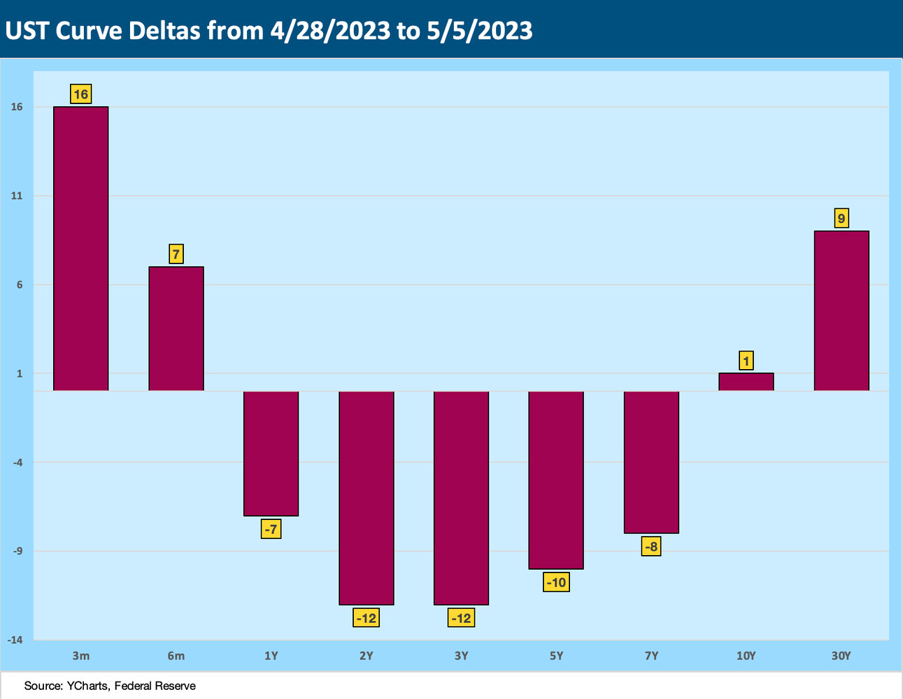
The above chart plots the US moves during the past week, which was also a Fed/FOMC week that hiked the short end. The 2Y, 3Y, and 5Y showed the biggest declines while the 3M posted a double-digit move higher.
The above chart frames the UST curve moves across the maturity spectrum since the key March 8 date. The 2Y to 30Y incremental moves reflect the UST curve rally with a strong vote from 2Y UST to 3Y UST that trouble lies ahead. The move higher in the 3M UST gets us back to the “Fed vs. the market” inversion debate and what the mix of variables means in terms of recession risk. The 2Y to 30Y timeline shows short rates lowering faster than long rates in a bull steepener pattern.
MICRO
We are in a market now where the “micro” (regional banks, subsector risks, and issuer-specific problems) end up as “macro” since the level of credit contraction at the regional banks and/or community banks becomes a swing factor (and a highly subjective one at that) for the Fed as it is framing (or rationalizing) its decision inputs. The expectation of credit contraction was immediate as SVB crashed and the risk factor of “push-button runs on banks” raced to the top of the list.
The debate immediately turned to how long would the credit contraction take to arrive in scale, how severe it would be, and then how to frame the transmission mechanism into problems across asset classes (notably commercial real estate, where small and midcap banks loom large) and more leveraged borrowers. The weaker credits would need supportive banks if a recession does unfold whether modest in scale (soft landing or otherwise) or in the event of more threatening scenarios (debt ceiling, more Fed tightening, etc.). The regionals will face risk management constraints ahead.
A regional bank peer group stock update…
Below we update how the regional banks have performed during what was another volatile week. We have done this exercise a few times. We chose this list back during the SVB crisis peak and whittled it down over time with First Republic taken out with this week’s action. The list runs across a wide range in asset size and market caps.
We line the banks up in descending order of stock returns from March 8, 2023. That marked the last trading day ahead of the SVB deposit run and stock crash on 3-9-23 before SVB failed to open and was closed and seized by regulators on 3-10-23. That brought wild times and risk aversion scenarios continue to be debated (see Risk Appetites Get Bloodied 3-15-23).
The past week was a strange one given the volatility of a few names mixed in with some calming action in some others. PacWest had the wildest ride of the group with a plunge and rally in the last week from low price levels. After a fresh reality check with First Republic, the result of even formerly “good banks” seeing equity and holding company debt wiped out does not leave much room for handicapping depositor panic even if the wind just blows.
Corporate clients have a fiduciary duty to be extra safe and uninsured depositors have low confidence their uninsured deposits will be safe. Many assume the same on insured deposits and question whether they are safe. That is irrational on the insured deposits, but that is why they are called panics.
Those who know a sub-$250K deposit total is backed by “the government” then turn on the TV to a debt ceiling crisis. The FDIC and UST get commingled in a blur for some. You can say “trust the regulators to be on top of this,” but then you need to brace for laughter or a stream of profanity after SVB. There must be a survey out there that covers that mix of insurance fund confusion and fear of regulators missing something.
The streaming headlines around changing the laws and FDIC insurance alternatives to mitigate the bank run risk are getting a lot of column space, notably for corporate accounts and payroll funds, etc. No one ever accused the average Congressional Rep of being overly analytical (even if they passed the bar exam), and one challenge has been to cleanse the ideas for rational solutions and limit the inevitable coloring of policy actions with ideology and political axes (you can hear Senator Warren saying “I had a plan for this” and “protecting millionaires and billionaires”) or some on the right saying “no bailouts, let the market work—even if we made them not work.”
The likely outcome will be new plans to improve confidence and mitigate depositor panic risk. There will also presumably be more accountability (aka blame game) for those who decided to go easy on asset-liability mismatches. After all, the Fed, FDIC, and OCC are supposed to be familiar with the idea of duration risk, and policy makers have been busy driving that risk higher. If you are a regulator, the idea of flagging the yield curve damage gets you sucked into the vortex of bile that has become Capitol Hill. That said, competence and high standards are supposed to be more than assumed. It is supposed to be demonstrated. That box was not checked in this regional mess.
The credit contraction question…
“Tight credit” or “credit contraction” are very amorphous term. The old school abbreviated approach was to turn to the “Senior Loan Officer Opinion Survey” (the SLOOS report) or mutual fund flows. The next SLOOS report is due tomorrow (May 8), so the market will at least have a benchmark. The SLOOS is taken from “up to eighty large domestic banks and twenty-four US branches and agencies of foreign banks.” The Fed pays close attention to it.
The SLOOS universe offers a very important indicator and base of lenders, but the term “disintermediation” of the banks has been around for a reason since the 1980s. Lending/borrowing outside the banks has been one of the dominant themes that launched the corporate bond market, the HY bond market, and the tradeable term loan market, which has grown to record size today.
Separate from the SLOOS report, there is still that massive and growing base of loans from pension funds and separate accounts and broadly from the burgeoning private credit sector. The old saying that “everything is AAA at a price” comes into play and that feeds the unknowns of cost of credit pressure on riskier credits (How much is floating? How much fixed? etc.).
Private credit has been an attractive asset class for pension funds and retail investors (e.g., BDCs) on the basis that the loans on their books offer very high yields that can be flowed through as high cash generating assets to direct or indirect owners. In other words, there will still be a lot of credit available, but it just might have to be repriced in the loan or bond markets. That is when the winners and losers among the owners of loans and bonds get shaken out. The same winners vs. losers game plays out for the borrowers.
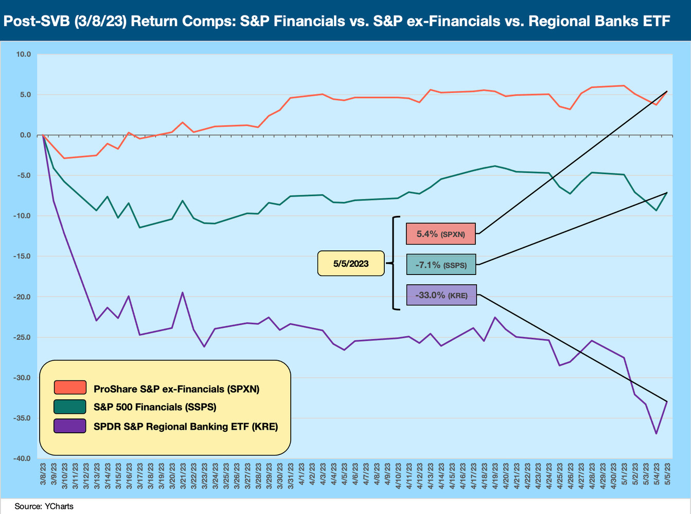
The above chart plots the total return since 3-8-23 (pre-SVB meltdown) for the S&P 500 Financial index vs. SPX ex-Financials ETF (SPXN) and vs. the Regional Bank ETF (KRE). The financial sector has been understandably less favored vs. the nonfinancials in the SPX. The regionals have diverged in much more dramatic fashion.
The flow of dollars and scale of loan commitments from the bank system across large, mid, small, and community level banks are obviously critical, but the regionals jump off the page as the subsector of banking that the markets are nervous about.
The major banks are not having it easy either since they have a lot to deal with ahead if the hard landing scenario does play out. The above chart plots each of the Big 3 legacy banks vs. the S&P 500 Financials. We use the same post-SVB timeline. JPM is the winner at essentially zero as of Friday close.


