Personal Income, Outlays and PCE Prices: Calm Before Confusion
Muted but still high PCE inflation is better than a hot number, but the real fed funds rate is only on the cusp of being positive.
“There's a pattern forming in the inflation picture.”
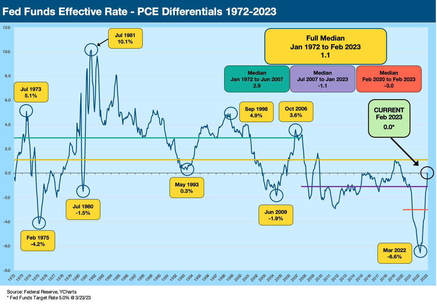
PCE inflation posted a quiet but slightly favorable trend for the inflation anxiety crowd, and at least the fed funds target upper range is now higher than Core PCE even if only in a dead heat with headline PCE.
The idea that it may take a positive real fed funds rate is needed to do the trick in inflation fighting is still an embraced theory by many as the debate around a mid-1970s replay remains on the economic debate circuit.
As important as PCE inflation is to the Fed, there is no hiding from the fact that more eyes watch CPI.
After a wild stretch of bank turmoil over the past few weeks, ongoing but moderating depositor flight, too many bad geopolitical headlines and the first indictment of a former President, a quiet Personal Income and Outlays report with a muted PCE Inflation trend was at least something soothing. The softer sequential Disposable Personal Income report will be a positive for the inflation watchers. The uptick in personal savings rate to 4.6% from a revised 4.4% in Jan 2023 was hardly a sign of retrenchment, but it is higher than the 3% handles of the fall. Taken in tandem with Personal Consumption Expenditure growth on the low side of recent months, the “cooler” modifier at least fits.
How real is real fed funds?
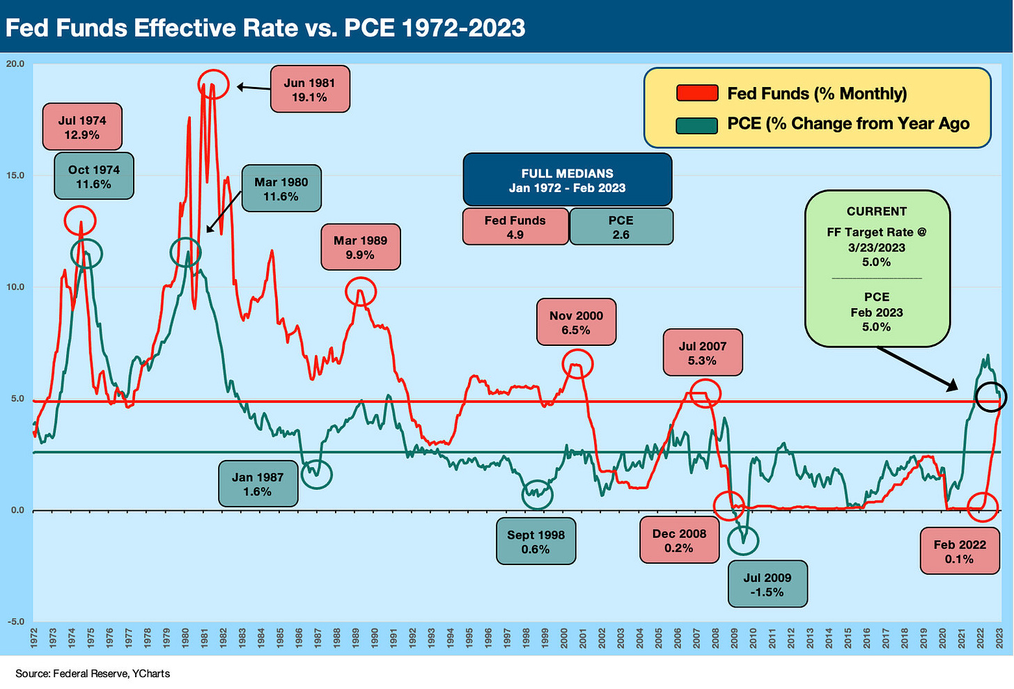
We always get back to the long term history on fed funds vs. inflation whether you use PCE or CPI (or both) or headline vs. core (or both). We tend to be in the “all of the above” school even if we are like many in focusing heavily on CPI. Maybe it’s a function of the days of stagflation and COLA themes of long ago. Or maybe it’s a “boomer thing.” We have looked at the real fed funds topic in detail in earlier commentaries, so we won’t replay here (see Fed Funds vs. PCE Price Index: What is Normal? 10-31-22, Fed Funds-CPI Differentials: Reversion Time? 10-11-22). We update the fed funds vs. PCE differentials below. First, we plot the gross PCE inflation and fed funds numbers and then in the second chart we plot the differentials as a single line.
The above chart highlights the very few major inflation battles since the 1970s through today. The very sharp increases in fed funds drove hard landings, and that is a matter of history. Most argue that the late 1973 to 1975 problems did not fully deal with the challenges that brought on the 1979-1982 pain. The fed funds history under Volcker gets held up as the only way to beat stagflation.
Today we are not in a late 1973- 1974 economic shock or the 1979 Iran energy turmoil and economic and structural shifts that brought on the 1980-1982 double dip. The long tail of Volcker tightening is evident in the chart, however, and the failure to get the job done the first time in the mid-1970s is also evident given how bad the next round was. The moving parts are much more complex than fed funds and inflation, but that theme of a “mid-70s policy miss” has stuck.
Today’s Fed is trying to split the difference in strategies, but the economy today is much stronger and more diverse than in those days. By a lot! The recent bank deposit scare was a reminder that things break when rates go up quickly. You just might break something you were not thinking about (like regional banks). High fed fund rates are not great for deposit competitiveness, and that is one variable that just hopped onto the front burner.
PCE inflation: still the main event for the Fed…
Even though the PCE inflation metric gets less attention than CPI in the world at large and on the political circuit, the PCE metric looms large in monetary policy given the Fed’s focus on it for inflation targets. Even then, the Fed commentary often dances around the 2% target and often just says “inflation.” Then most say the target is headline PCE even as the Fed and many other say the “Fed likes Core PCE more.”
The specific question of “Does the Fed focus on headline total PCE or Core PCE for its 2% target?” is often asked. Try googling around for an exact answer on whether that 2% is headline PCE or Core PCE. It is not as easy as it sounds and gets conflated with the discussion of whether they focus more on headline PCE or Core. James Bullard made it very clear in an article last fall entitled, “Making Sense of Inflation Measures.” His answer was “the FOMC target is nonetheless headline PCE inflation of 2%.” Not Core PCE. Not trimmed mean PCE. As a reminder, Bullard runs the Federal Reserve Bank of St. Louis and was a voting FOMC member in 2022 (rotated off in 2023). Some find it interesting that they are often ambiguous about that in press conferences.
Personal Consumption Expenditure makes all the difference in recession risk…
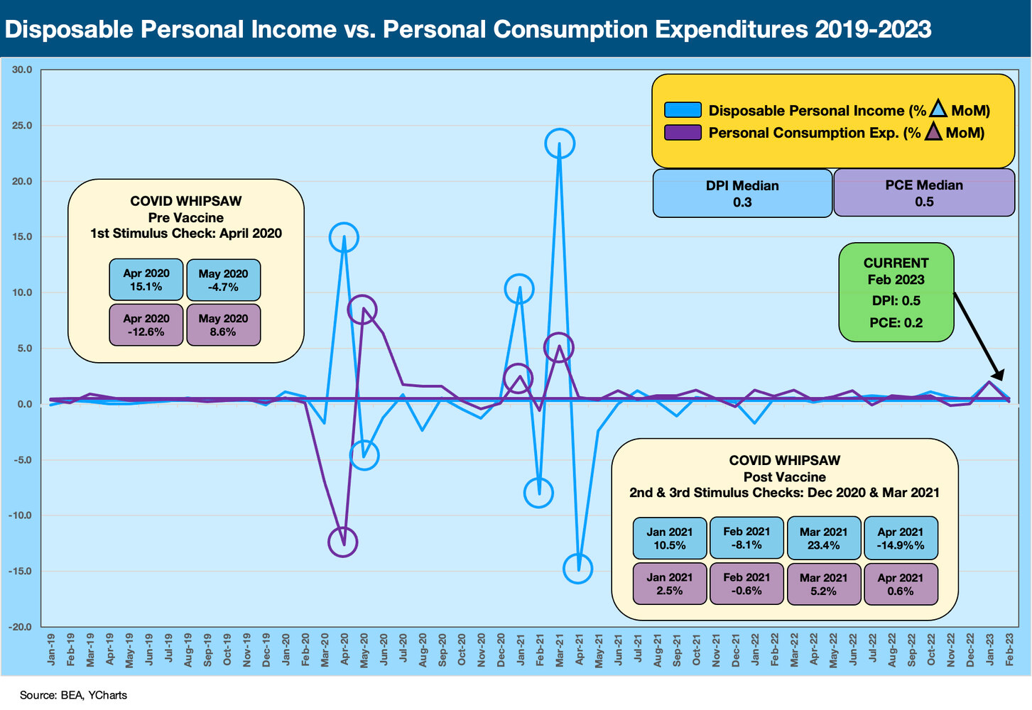
Personal income vs. personal outlays can be a chicken and egg debate on cyclical signals and handicapping recession risk. With a starting point still around a 50 year low in unemployment and all-time high in payroll body count, the economy at least begins the next leg of the journey at a pretty solid starting position. The month to month trends can swing around, but positive numbers are not signaling trouble on the important PCE line. The next two charts look at Disposable Personal Income (DPI) vs. Personal Consumption Expenditures or PCE (current dollars MoM change). The first chart looks at the period from the end of ZIRP in March 2022. The second one goes back to before COVID.
The DPI and Outlays number probably should get more attention in Washington since it can show what happened around the stimulus legislation during COVID (see Inflation Rorschach Test: Looking at Relief and Stimulus 2-7-23) and how PCE played out since then. Too much of the inflation debate is political in tone (there’s a shock) rather than rooted in policy analysis and fact. Depending on the direction of payrolls and inflation in 2023 and how that flows into purchasing power, the demand side of the equation is worth watching for those debating policy (budget cuts vs. tax increases) and framing the efficacy of past solutions on the monetary and fiscal side.
Since the Washington wars have the economy marching toward a government shutdown and then a debt default as part of the debt ceiling brinkmanship, we are not expecting a finesse game to lie ahead. The reality is that Congress might want to do some homework on what happened on the fiscal side, on the monetary side, and how that all dovetailed with the supply chain disruptions. Besides using the terms of choice for a punchline or political point, the left and right might want to remind themselves the topic is not that simple. Even these month-to-month swings before and after COVID need a lot of drilldown. The PCE and DPI details each month come with a lot of supporting data. More on that another time.
The above chart has a longer time horizon to back before the COVID insanity and the mad swings that came with mass layoffs and extremely supportive fiscal and monetary responses. The talking heads of Congress speak like they have all this figured out, including how to frame the moving parts in the context of inflation pressures today and how we got here. The challenge is that there a few sides that are 100% certain on opinions that are 180 degree opposites. This is consistent with the legal training. Around half of Congress is made up of B team lawyers with C team economic IQs, so we can assume they use talking points first, the art of repetition second, and there is no third (like due diligence, extra reading, or balanced discussion of issues). That is not changing soon, so the market watches the numbers. Right now, the demand side is cooling and credit contraction is likely to drive more of that effect.
The debate around where fiscal policy and corporate/household stimulus back in 2020 and early 2021 were filling in holes or stacking up inflation risk factors will not be settled (ever). It is easier to blame the other party’s fiscal actions (whether tax cuts and corporate relief or direct household payments) and blame slow moves by the Fed than to try to fit it all into the bigger picture of supply shocks, lasting supply-demand imbalances, pent-up demand, and waves and layers of demand support.
When you look at the above chart, you don’t see a lot of action after the peaks and valleys around COVID. The DPI and PCE also do not plot supply distortions. In other words, there are layers to the analysis but recent quarters since early 2022 are not showing major breaks in DPI and PCE. A continuation of recent patterns will slowly moderate inflation pressure.


