
Footnotes & Flashbacks: State of Yields 7-2-23
We update the state of yields after another bullish asset return week and month to punctuate an eventful 1H23.


Inversions may come with a big asterisk after this cycle since we have not had an inflation scare like this in decades, and that might impair the comparison with other inversions.
We review the recent UST curve deltas as a very eventful 6 months of FOMC mindreading comes to a close with a “hawkish pause.”
The duration pain of 2022 gave way to a mixed performance in 2023 that saw rising fed funds bring inversions to their highest levels since the early 1980s.

The UST curve ride will make for some very interesting handicapping in 2H23 after so much action since March 2022. The above chart revisits the journey and plots a few of the yield curve stops along the way. We include the fed hike memory jogger box in the lower right.
The path to today’s UST curve was a high-octane ride on the front end to levels on 6M UST just under 5.5% and just over 5.3% in 3M UST. Further below in this piece we update some slope charts including 3M to 5Y, 2Y to 10Y, 5Y to 30Y and 10Y to 30Y. There are no shortages of inversions to choose from in curve analysis, but the world still gets back to the cause and effect of cycles. The UST symptoms are just part of it.
The main goal is still to make the call on the transmission mechanism to recession. Consumer health? Corporate investment? Commodity spikes? Asset quality and credit contraction? There is a list over the decades, but the main cause is never “inversion.”
As someone who got off the train in NYC (in 1980) for my first job with a 22% Misery index and borrowing to pay for graduate school at night at levels well above 20%, the idea of 1% handle 30Y and sub-1% 5Y UST (closer to 0% than 1%) in the pandemic cycle (2020-2021) is a long trip across the universe. That said, the ride higher through 2023 to current levels is as close as it gets to the fed funds rates that we saw in 2007 and 2000. Both of those years saw steep credit cycle downturns in the aftermath. The 2022 and 2023 fed funds levels and curve thus have relevance to these past cycles despite some major differences.
The migration from steep and low to flat and higher and then onto higher and inverted do bring back some memories on what can go wrong. Where we stand now shows fed funds more like the pre-crisis period of 5.25% fed funds. Whether we get to the late 1990s fed funds level or early 2000 peak of around 6.5% is on the table (see Fed Fed Funds – Inflation Differentials: Strange History 7-1-23)
The 6% handle has been thrown into the possibility pile by the biggest bears by exaggerating the upper end of the dot plot from the last FOMC meeting (see FOMC: Hit Squad or Suicide Squad 6-14-23). We are nowhere near the early Volcker years at this point and not even close to early Greenspan years when the daily effective fed funds rate was up closer to 10% in 1989 (see 10-24-22 ). In other words, even a 5.75% upper target would not be an Armageddon rerun. There has to be a lot more cause on the path to the effects.

The above chart updates the weekly UST curve deltas with another move higher in the 1Y to 5Y segment with a double-digit rise in 7Y UST as well. The modest negatives in IG index return from the curve over the past week were more than offset by positive excess return and income. For US HY, these smaller curve moves have not registered much in the shorter duration asset class and solid excess returns with a material tightening this week (-35 bps per ICE) made all the difference.
It takes a fair amount of UST curve pain and spread widening over time to trump a decent coupon, so that has kept US HY total returns in the positive range in the vast majority of annual results except in extreme moves. The year 2022 certainly qualifies as extreme in duration pain and OAS widening as it also threatened the cycle and fundamental credit quality as that battle was fought out across 2022 into the current period.
Now we are getting smaller incremental UST moves, but those moves are usually related to stronger expected fundamentals in 2023. During 2022, the adverse UST curve moves were tied to inflation, fed tightening, and that caused fears of recession that drove spreads much wider to a peak just under 600 bps. That was the double whammy.

The above chart updates the UST deltas since the SVB meltdown. We use 3-8-23 as the last “clean date” before the regional implode-a-thon and depositor panic. We see the downshift in the 2Y to 10Y UST segment. Interestingly, the 30Y stands alone. This pattern keeps the inversion alive and well even if the UST and fed funds migrate higher on constructive fundamentals.

The above chart just puts the post-SVB UST deltas into full yield curve form to visually capture the shift. We detail the running changes along the curve in the box within the chart. The +37 bps in 3M UST is the main event and especially in framing deposit rate pressures on those same regionals.

The above chart updates the 3M-5Y UST inversion, which has now come down off the inversion high in early May of -197 bps to a Friday (6-30) closing level of -130 bps. That -130 bps trumps the next highest inversion of prior cycles of -111 bps to start 2001. That earlier peak inversion in 2001 marked the beginning of a wild easing response from Greenspan in what proved to be a brutal credit default cycle but a very mild economic contraction (see Greenspan’s Last Hurrah: His Wild Finish Before the Crisis 10-30-22).
As you look at the shape of the curve, it is not hard to see why cash equivalents have been so popular. With the 3M UST around 5.3% and 6M UST around 5.5%, you have frames of reference that do not encourage a rush to sort out the variables. The par weighted IG index coupon is around 3.9% and US HY around 5.9%. You get the accretion returns on the higher yield with the pull to par, but you also get the duration risk and credit risk to ponder as you sort out the variables. The short UST rates ease the pain of low confidence and at least do not penalize you for taking your time. We don’t have the usual cash return pain of foregone coupons with 5% handle cash returns.
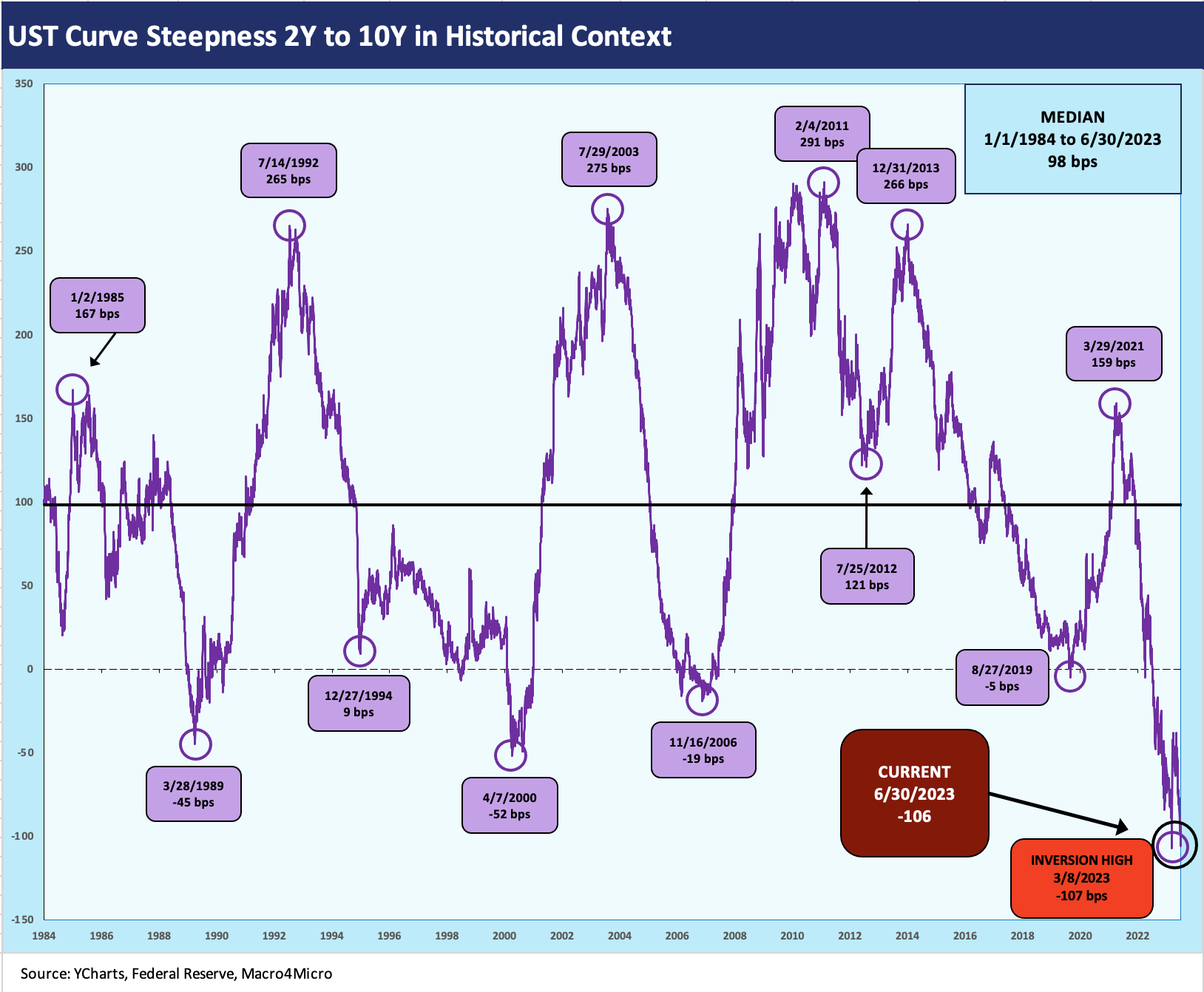
The above chart updates the 2Y to 10Y segment, which for many is the main UST curve slope to watch as either first or second choice. The current -106 bps is only 1 bp lower from the chart’s timeline high (post-1984) of -107 bps on 3-8-23. Spring 2000 (4-7-2000) is the highest inversion before this cycle at only -52bps. During April 2000, the NASDAQ had peaked the prior month, but the HY default cycle was already underway and defaults were up around 6% in late 1999 (yes, the year that the NASDAQ posted a +86% total return).

The above chart uses 5Y to 30Y UST slope as a frame of reference. We look at the swings during this shorter period from the start of 2022 into 2023 as the duration abuse was underway. This curve segment is favored by some but usually falls into the second tier. The slope in the curve does get into the discussion of duration extension and what type of compensation you should expect in spreads and notably in IG markets. The choice of intermediate bonds vs. longer duration funds is an old menu choice.
Inversions complicate the analysis by signaling recession while also needing more incremental spread regardless to get paid for the extension risk. As of Friday close, the inversion of 5Y to 30Y stood at -28 bps, which is inside the peak -46 bps on 3-8-23, just before the SVB collapse started pulling 1Y to 5Y UST yields lower (discussed earlier).
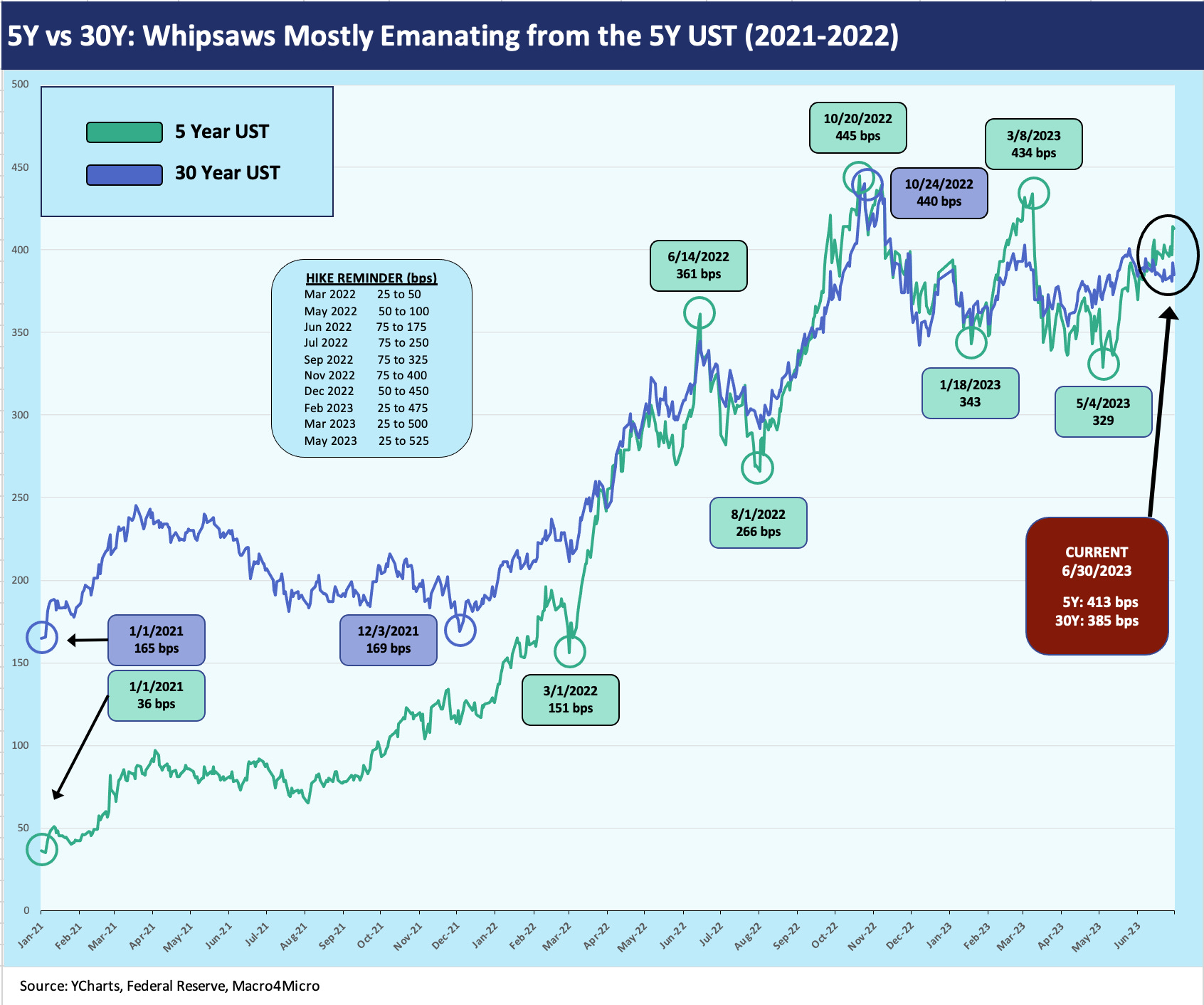
The above chart just adds a quick recent tour of the absolute levels of the 5Y and 30Y that we used to derive the 5Y to 30Y path to inversion. It is a telling visual on the bear flattening from the intermediate end even as the entire curve migrated higher. We added the year 2021 to the timeline to underscore the UST curve was already moving and was not waiting for the Fed. The absolute yield levels of early 2021 seem like a very long time ago.
On the road to the Friday close as detailed in the chart (5Y UST +413 bps, 30Y +385 bps), we saw a sharp rise all along the curve to the inversion. The low double-digit bps yield on the 5Y UST in early 2021 is a world apart. We see +36 bps yield on 5Y UST to start 2021 (up from a +19 bps yield in Aug 2020). Meanwhile, 1% handle 30Y UST still saw an upward sloping yield curve back at the start of the flattening after early 2021. Sometimes you want to doublecheck the numbers to make sure they are real.

The above chart breaks out the usual long term time series looking back to the early 1980s. The dates of the inversion all came before or during very ugly markets (notably 1989, 2000), and that always keeps the “inversion as perfect predictor” crowd on edge. No one likes to say, “this time is different” unless you say “they are all different” (which is our view).
As we look back at prior inversions such as May 2000 at -61 bps, we see a period then that was heading into the US HY double dip default cycle even if technically dated as still being in the expansion. The cyclical peak was March 2001 and the later trough was Nov 2001 per the NBER (see Business Cycles: The Recession Dating Game 10-10-22, Expansion Checklist: Recoveries Lined Up by Height 10-10-22). We have discussed the 1989 market backdrop in other commentaries (see earlier Greenspan links), but the fact is the credit cycle was over in 1989 even if the economic recession did not start yet (per the NBER) until the summer of 1990.
The history since the stagflation years and the post-Volcker inflation victory has been the UST curve gets steep on easing during the downturn, and then the fed tightens in the upturn. The upturn has traditionally always led to some form of business cycle shift of various causes or capital market excesses that exacerbate the problems. We have covered that to death in prior commentaries on whether inversion is a symptom or a cause and whether it is another “causation vs. correlation” debate. We see the UST curve as a symptom. Many inversions have not been predicting anything if you just look out the window. Sometimes, it has already arrived (1989, 2000). So far, this is not one of those times.

The above chart is one more for the input pile as the 30Y has not swung around as much as the short to intermediate end. The peak inversion for 10Y to 30Y UST was in late Sept 2022 at only -16 bps vs. the small upward slope of +4 bps now.
There is not much story value and indicator message here in our view unless you want to concoct a conclusion that the UST long end is not signaling trouble. The 1986 inversion came after Volcker tamed inflation and there was a widespread oil crash and weak economy that year. There were a few more years to run in the expansion.
Early 2000 saw a balanced US budget underway and a shortage of long-dated UST in the middle of a brutally bad debt underwriting cycle. The 2006 housing bubble and structured credit boom does not tie into the 30Y tiny inversion as far as we can figure out. The small 2022 inversion came against the backdrop of sharply higher fed funds and inflation, which brings us to much more pronounced inversions to consider.

The final chart updates our summary UST migration chart from March 2022, which saw the end of ZIRP, and then across the hiking, flattening, and inverting. We post the Dec 2020 UST curve above for visual effects, but the box tracks the running moves in bps from March 1, 2022. We also include a box tracking the UST curve moves through March 8, 2023 just before the Silicon Valley Bank meltdown reset the dial on the shorter segment of the UST curve as we detailed in earlier charts.
We recently looked at some histories on credit spreads and HY bonds across the various fed funds backdrops (see Fed Funds vs. Credit Spreads and Yields Across the Cycles 6-19-23). The good news is that spreads have been very resilient in 2023 across some treacherous pockets of risk from the regional bank mini crisis to the debt ceiling risk. Even if you viewed a UST default risk as low in the debt ceiling showdown, the human nature factor has been off the rails in recent years (think sacked capital and disavowing elections). Getting a firm grasp on the “means vs. ends” trade-off has been challenging at best in policy matters.
Whether you view Washington’s policy gambits as game theory, chaos theory, or just “dumb asses with power” theory, the fact is that the main events are behind us and Washington can go ahead and shut down the government in the budget battle without default risk being on the other side of it. The likely focus in the summer will remain on the FOMC, the next round of YoY inflation and sequential inflation comp trends, and a side dish of geopolitics as the Ukraine spring campaign heads towards the fall.