Footnotes and Flashbacks: State of Yields, 6-11-23
We zero in on the state of yields with the debt ceiling in the rear view mirror and CPI and FOMC this week.
"Regional bank yield curve management training."
We change the weekly format and break out the Macro into sections with yields and asset returns in separate postings.
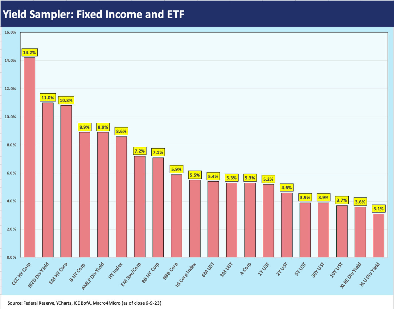
We include some breakouts on the yield spectrum across credit tiers, UST, and some benchmark dividend-oriented ETFs.
The week saw a mini-steepening move on the UST as the market awaits the CPI/PPI dynamic duo and the FOMC meets this week.
This week we streamlined our weekly release to break it into pieces. We typically review UST curves and the state of yields, but we will now break those topics out into separate “footnotes and flashbacks” comments with charts. We also look at asset returns in its own separate post. Anything else we post on the weekend will get its own piece. We found that long weeklies are not user friendly and no way to treat people in the summer (or those of us that proofread on Sunday nights). Experimentation is part of the free newsletter launch process!
Below we add some new charts into the mix that frames some yields outside the UST curve. We see a range from 3% to double digits with some risk-free (sort of) 5% handles in the middle.
The above chart details highest to lowest yields (UST, credit benchmarks, select ETF dividend yields) for some perspective on what income is available in various pockets of the risk free markets (at least risk-free for UST until Jan 2025), the credit markets, and across some ETFs that are fairly credit intensive (Midstream Energy, Business Development Companies) or are typically considered income-oriented equity sectors (real estate, utilities).
In the post-ZIRP world, there is a much broader menu of alternatives from 5% handles on short UST to double digits on dividend yields for BIZD (business development companies). The REIT returns offer little income attraction relative to what the income trade-off looked like vs. cash alternatives back in early 2022. You need to be bullish or constructive on the stock valuation for those to be used as a source of income. That gets back to the near-term attraction of short UST.
The CCC tier is more of an equity-like risk across a cycle, and the double-digit yields in the chart and 1000 bps areas composite OAS represent an all-in yield proxy for near term return expectations. 14% qualifies, but that is more about name picking. The CCC tier return is always a diverse mix running the gamut from sound companies with layers and leverage to moribund and “dead man walking” credits.
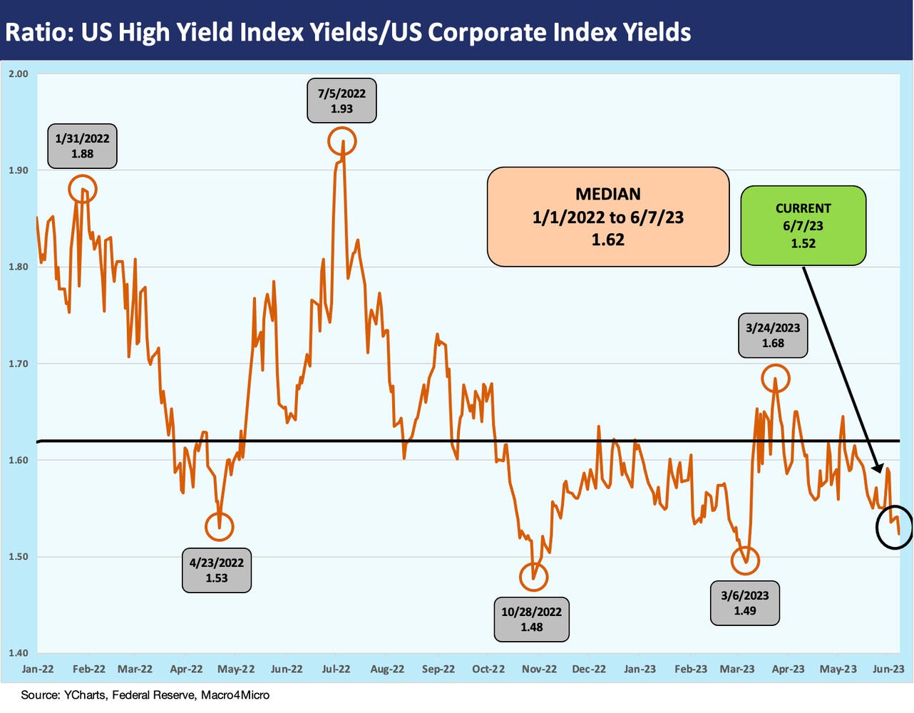
The above chart updates the ratio of all-in yield (UST + risk premium) for the US HY index vs. the US IG index. We have looked at the long-term trend line for these in past commentaries, but this chart locks in on the timeline from the start of 2022 to track the mix of yield movements across the period of UST migration and modest spread volatility in historical context.
The current relationship is below the long term timeline median (1997-2022) of ~1.8x and more in line with the pre-crisis medians of ~1.6x. The post-crisis (post-2009) median is closer to 2.0x (see Credit Allocation Decisions: Fish Selectively, Stay Above Water 11-14-22). The concept of the chart is simple enough: incremental yield for incremental risk.
These types of yield relationships can be sliced and diced for the shorter duration US HY index against 5Y UST (see Those Were the Days: HY Relative Yields, HY Relative Risk Premiums 2-9-23), but the main question is around whether the incremental return is in line with the incremental basket of risks (credit and duration). You can roll in duration adjusted metrics or more narrowly look at relative risk premiums (OAS vs. the absolute level of risk-free yields, etc.). The various inputs are all logs to throw on the fire and still have to be run through how the investor sees the relative risks on a forward-looking basis (credit risk or duration risk).
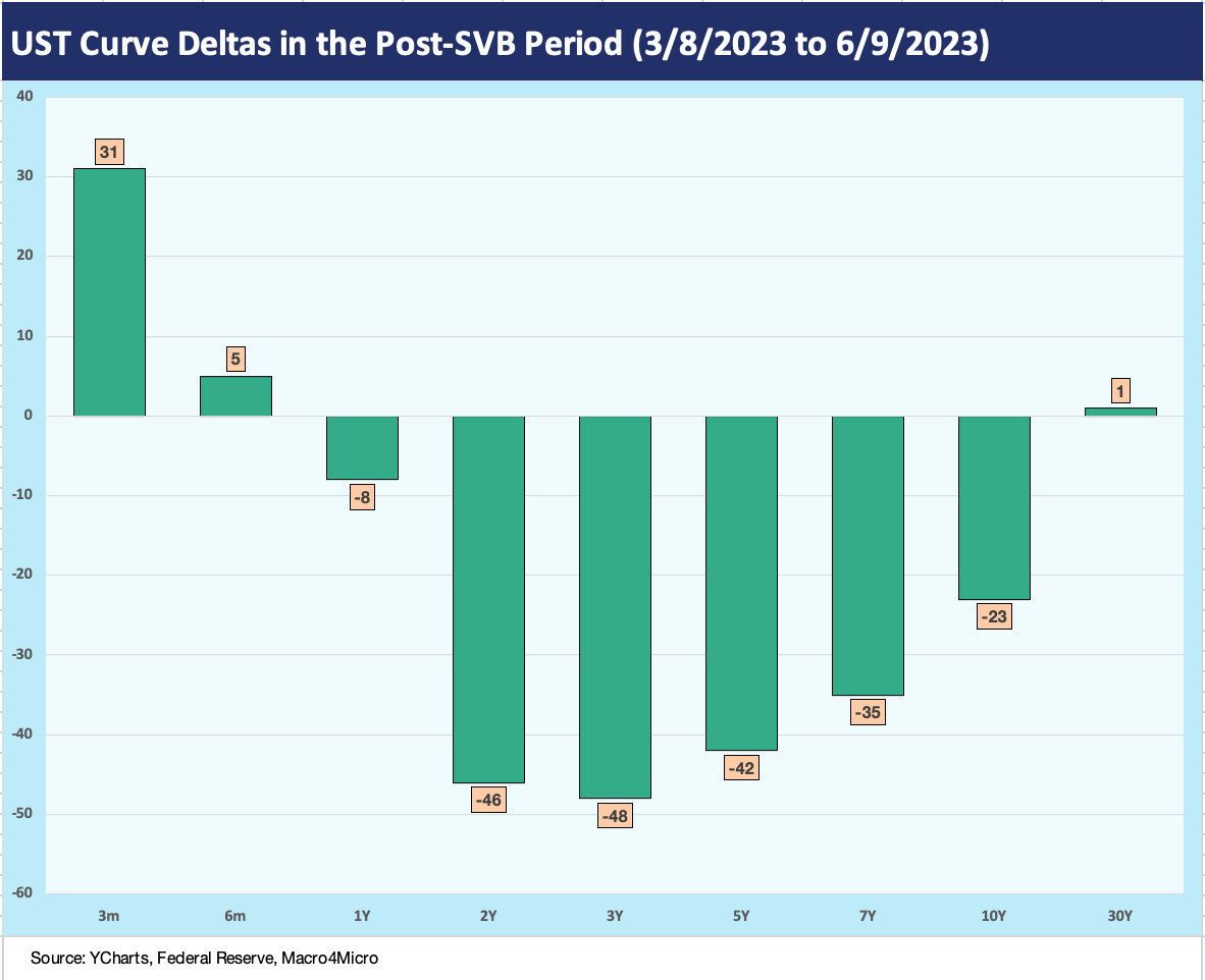
The above chart shows the UST deltas across the yield curve for the past week. We see a steepening action that drove some modest adverse return effects on the longer-duration IG basket while US HY won on the shorter duration end with some spread tightening.
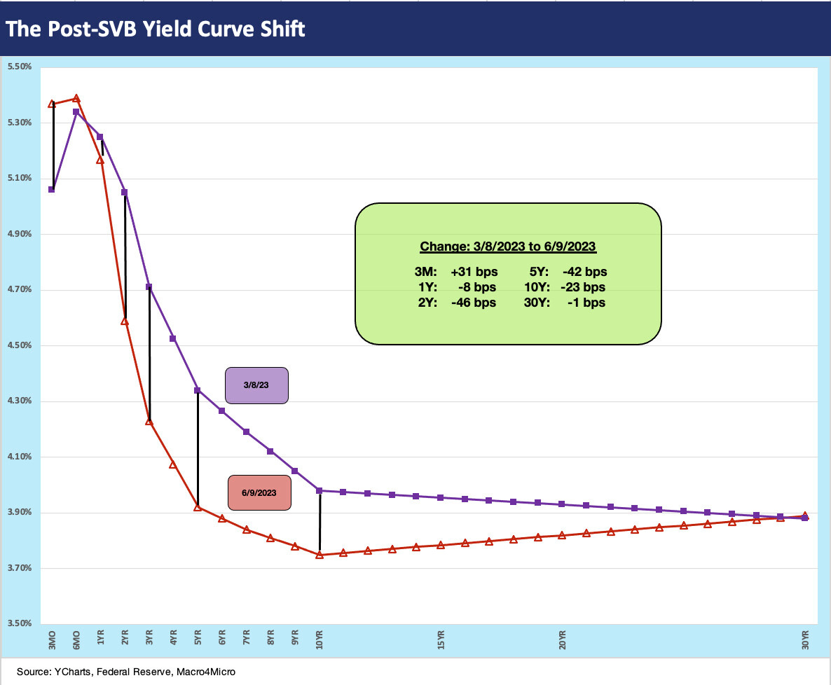
The above chart updates the post-SVB UST curve shift we have been watching each week. As a reminder, the 3-8-23 date was the last market close before the regional bank spiral started with SVB the next day. The UST curve pattern is for the most part a “bull steepener” with short rates (2Y to 7Y) moving down faster than long rates (and 30Y UST slightly higher).
The above chart gives another visual angle on the prior chart that shows the downward shift in the UST since SVB. The box in the chart breaks out the underlying shift in bps.
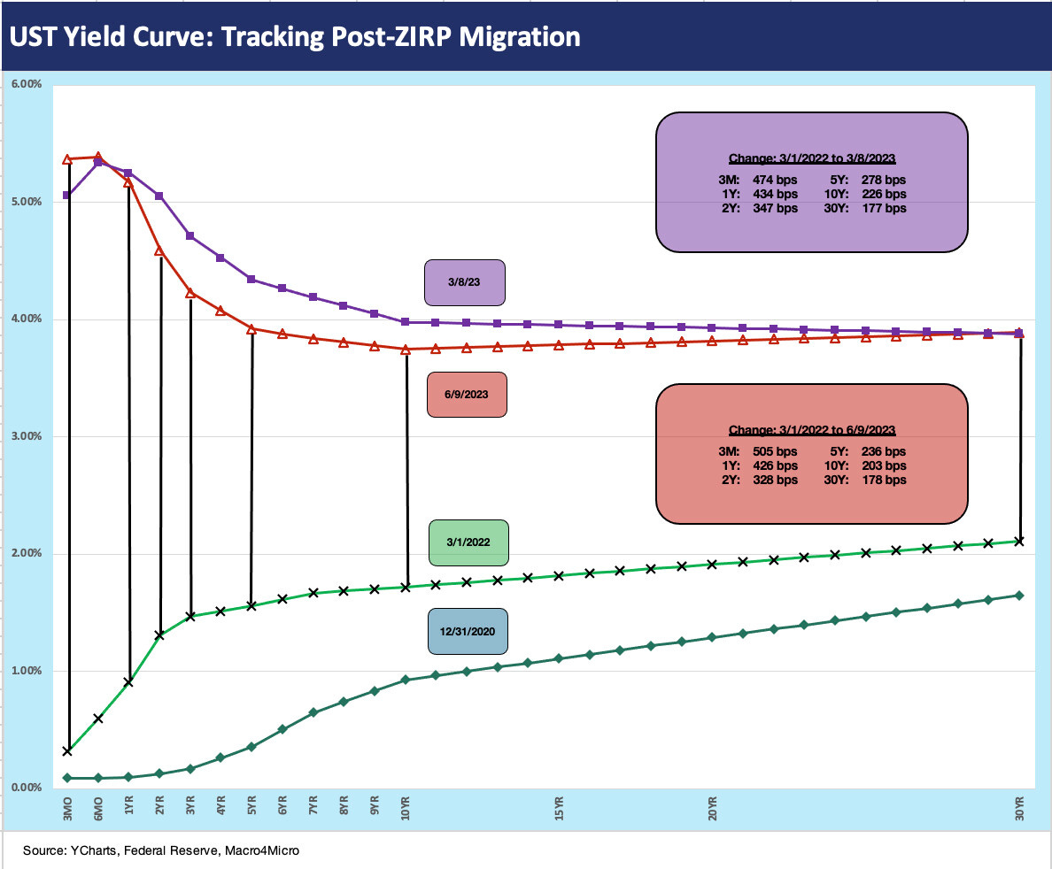
We wrap the yield chart mix for the week with an update of the running UST curve shift since the start of March 2022, the month that ZIRP ended. The cumulative impact was a bear flattener blowing through flat into a bear inversion. Those various inversions of the UST curve segment remain near highs for the 3M UST vs. longer dated maturities.


