
Employment Fixation: The Needle Will Move Very Slowly
Relief on tight labor needs major sector upheavals (no evidence yet). We look across cycles at claims history.


Be careful what you wish for…
With critical employment related numbers getting released this week, the Fed and the market will be closely watching the JOLTs report for any hint of a move in the job openings. There will also be focus on the “separations” mix of quits vs layoffs in the JOLTS data (see Jobs and the Fed: JOLTS Gets Heavy Powell Focus, Jobs Conundrum: Good is Bad, Bad is Good ). The employment picture is one the Fed has a much harder time influencing just with rates unless Powell goes “all medieval “ à la Volcker on inflation risk. With the recent improvements in inflation numbers and favorable YoY math ahead in 2023, a hard line now seems less likely without some material development in the macro picture.
The challenge from here is to frame the inflation risks inherent in a tight labor market and gauging what elevated initial claims or reduced job openings might mean for market sentiment. The flip side is what a steady strong labor market might drive for market reactions. We got a taste of the renewed focus on claims to wind the year down last week as a brief and minor uptick to 225,000 got the market excited briefly. A 200K handle claims risk number is a small scratch on the 153 million payroll count and over 10 million job openings posted in last month’s JOLTS report. Extrapolation from a few weeks of data points could lie ahead. That is where the debates get into whether the Fed has to overdo the tightening in magnitude (the 6% theory) or just extend it in duration (“higher for longer”).

Before we get into the weekly claims history, the chart above travels back across the cycles. We plot the unemployment rate (unemployed vs. work force as defined) and the total payroll (“employed bodies”). The payroll increase to record levels is on a logical path in an economy that grows over each cycle despite a small number of negative years that unfold during deep recessions. A growing population is also running alongside that growing economy. Those are materially larger numbers than prior cycles and attach an asterisk to the historical claims numbers in smaller economies and labor forces.
In the charts that follow, we zero in more on the weekly claims data across the cycles. We spend some time on the initial claims topic to underscore what a daunting task it is to move the needle on payroll at such lofty levels. That would take at least moving up to the long-term median of around 350K for a sustained period to get the market more comfortable with wage inflation pressure. Even then, the issue of where those job losses come from (wage tiers, skill sets, etc.,) come into play.
We also get monthly employment numbers this week with a look at the industry and payroll mix of jobs across the line items. The bottom line is that even rising claims numbers into the 300K zone against such a large number on payroll and lofty job openings makes for wishful thinking that the tight labor market is going to get much easier any time soon absent a major shock.
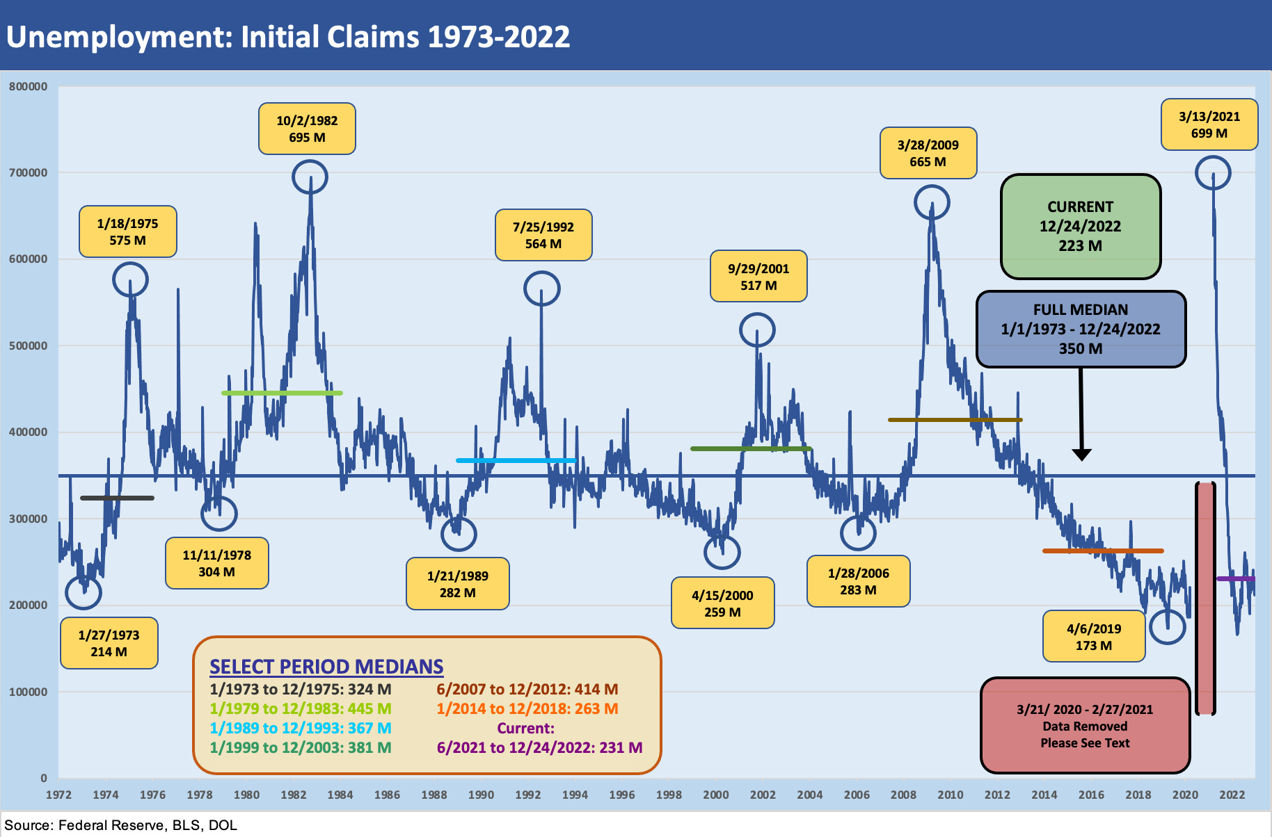
The chart above plots initial claims across time from the stagflationary recession of 1973-1975 on across the double dip of the 1980-1982 Volcker years and then on through today. We selectively choose some appropriate periods across the cycles to highlight the trajectory of claims into the recessions and the start of the expansions that follow. The box in the lower center left highlights the median weekly claims during those periods. We highlight that we exclude the COVID spike from the graphics to better capture the visuals of more “normal” periods. The COVID data is included in the long-term median of 350K.
Among the more notable periods that might resonate more with today’s labor mix, the post-crisis period after the June 2009 trough was an especially slow recovery in jobs. The Obama first term had to wrestle with an unprecedented systemic crisis as investment confidence was low, housing was in total disarray, auto companies and supplier chains had been radically downsized and banks were hit hard on headcount in mergers. The financial system was on a slow mend.
We see a 400K handle median claims tally from the June 2007 credit cycle peak (Dec 2007 was later deemed the business cycle peak) and into the expansion period of 2012. We picked 2012 since it also saw the easing of the Eurozone crisis after the “Whatever it takes” statement from Draghi in July 2012. The second half of 2012 also marked a massive risk rally in the markets.

We include the COVID claims details above since we left the initial claims spike out of the full multicycle claims chart. The rise to over 6 million in early April will be one for the ages. In the upper right, we break out how many weeks saw initial claims above certain thresholds from 1 million to 6 million jobs. The COVID employment pain is a well-traveled topic, but these levels add some granularity to how extraordinary the employment shock was even vs. the systemic crisis of 2008-2009. The credit crisis peak was 665K in March 2009 shortly after the stock market low and the recession was in its final stages (recession trough was June 2009).
We noted Nov 9, 2020 as “vaccine day” when the announcement drove a lot of excitement in the stock market (and everywhere else). The next claim release after vaccine day was still a lofty 738K number. The market did not get back to the early March 2020 levels until November 2021 as noted on the right. By then, inflation was already kicking into gear on the way to the end of ZIRP and high inflation of March 2022.