Reversal, Takedown, or Escape? Market Weighted vs. Equal Weighted
We frame the S&P 500 and NASDAQ benchmarks—market weighted and equal weighted—for some visuals on the divergence.
There is no shortage of charts streaming across the screen on the small number of market-cap-heavy companies dominating benchmark returns.
We look at the YTD numbers for the select ETFs tracking the S&P 500 and NASDAQ 100 for market weight vs. equal weight.
The post-debt ceiling outlooks will bring out reassessment of the cycle and how the UST curve might wag pricing.
We thought we would join the party trying to capture visuals on the lack of breadth in the markets and how market weighted benchmarks tell a small part of the story. The theme is not new, but when someone asks you “What do you think about the stock market?” the inevitable answer is a question: “Which stock market?”
As we have been discussing in some of our weeklies, the outsized returns in a handful of major names have been a recurring story line. Credit spread movement has been modest even in the face of the debt ceiling noise, so those have not distracted anyone from watching the big names as the main driver. The market sometimes seems to be flying circles around the concentrated market performance waiting for something to happen.
With the risky credit markets stable of late, there is always the question of how credit spreads will correlate in the event the “Magnificent 7” sees fresh doubt in the market and a new whipsaw as seen in 2022. As we see further below in the timeline from the fall, the equal weighted index held in better than the market weighted with rates rising and cyclical anxiety more acute. The cycle is perhaps less intensive now, but the interest rate worries could rise again. That is no small debate.
The other day we saw a chart fly across LinkedIn (did not catch the name of the provider) that plotted a time series line covering the very low percentage of names in the S&P 500 outperforming the broader index (which is based on market weighted capitalizations). The number was around 10%. That is amazingly low.
The chart below plots the YTD total return paths for the S&P 500 ETF (SPY) and the S&P 500 Equal Weight ETF (RSP). The divergence across the year makes a statement about the very uneven performance. It also reminds us how hard it is to build a well-diversified portfolio.
The YTD return on the equal weighted S&P 500 ETF (RSP) limps home at low single digits YTD in a market where the overall market weighted index posted materially higher numbers. Sub-2% YTD returns on the equal weighted are sobering. The usual bellwethers that dominate the market weighted are Microsoft, Apple, Amazon, NVIDIA, Meta, the Alphabet duo (Class A and C), and Tesla. Given how they have moved in tandem, that is a challenging market backdrop.
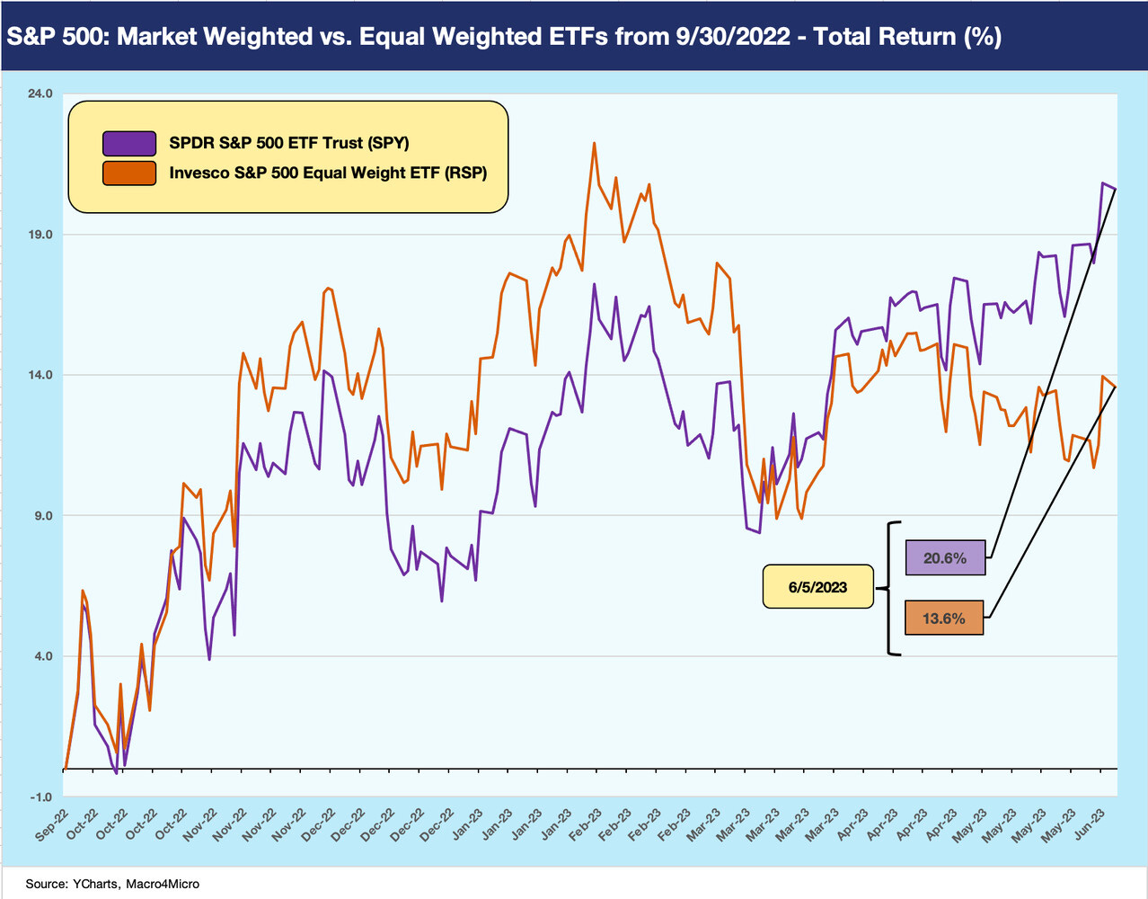
Below we show the trailing horizon back to the fall (from 9-30), and one can see the reverse effects as some bellwethers were taking a beating on rising rates. The market was also seeing serious reservations about the cycle as rising rates, inflation, and worries around the Russia-Ukraine fallout in global markets and the European economies especially.
During that 4Q22 period, the equal weighted index pushed above the market cap weighted index. We see some of the same issuer distortions in relative industry level ETFs that we detail each week as concentrations of select names are often the main drivers (see Footnotes and Flashbacks: Week Ending June 4, 2023). The equal weighted numbers are much closer to the overall index over that post-3Q22 time horizon but are at least both in double digits.
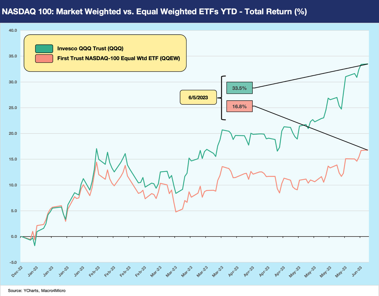
With our next two charts we switch over to the NASDAQ 100 for market weighted vs. equal weighted YTD. We first plot the YTD comparison, followed by the trailing period from the start of 4Q22.
The YTD period shows strong numbers for both in context of long-term equity returns but especially strong for the market cap weighted index. The largest holdings on the QQQ include the same 7 names that add up to over half the ETF weighting. Both ETFs turned in good YTD numbers, but the market cap weighted posted total returns 2X the equal weighted.
The post 9-30 timeline details the outperformance of equal weighted ETF in the 4Q22 period on the way to the two reversing later in 1Q23. The Silicon Valley Bank collapse and regional bank turmoil sent rates lower, and the simplistic view of the key variables for the growth stock surge often circles back to interest rates.
Fixed income people tend to hate the term “long duration equities” as a definitionally misplaced term of convenience for a perpetual (equity) that often does not pay a dividend in growth tech stocks. That said, growth stocks win in the markets when rates go lower. The discount rate rules.
Among the least logical conceptual applications we often see is what discount rate to use when playing the forward valuation game. We understand the yield curve shift can also mean lower discount rates, but those of us jaded by the TMT bubble might add that the valuation assumptions on the revenue side and cost side were more or less “made up” for many companies. The same for the multiple you picked and when it would translate into a sustainable set of valuation metrics (when in doubt, they would use revenue multiples!).
In such valuations, there is also the not-so-small matter that interest rates and the UST curve migrate across time and often go higher when economic times are good. We might cite a more recent example of Carvana, but that is to be revisited at another time (see Signals & Soundbites: Carvana 1Q23 1Q23 5-4-23). For a company such as CVNA, negative EBITDA companies (and very negative after interest expense and capex) need long timelines and lower discount rates to make the case.


the finance professors that push diversification of portfolios in college will need to add a chapter concerning the last 10 years cause it works less well now than almost ever before