
Footnotes & Flashbacks: The State of Yields 10-1-23
We look at another week of bear steepening and duration headwinds with 5Y to 30Y now upward sloping.

More duration pain goes along with the end of a bad month to complete a bad quarter with steepening and an upward UST shift on the week with mortgages feeling the same pressure.
The lineup of bond and equity benchmarks we watch just missed across-the board negative returns for the 3Q23 period, but all were in the red for the month.
With the curve having more impact than spreads in credit market returns of late, US HY eked out (barely) a positive rolling 3 months with the other fixed income benchmarks we track in the red on duration headwinds and the UST benchmark still putting up negative YTD numbers.
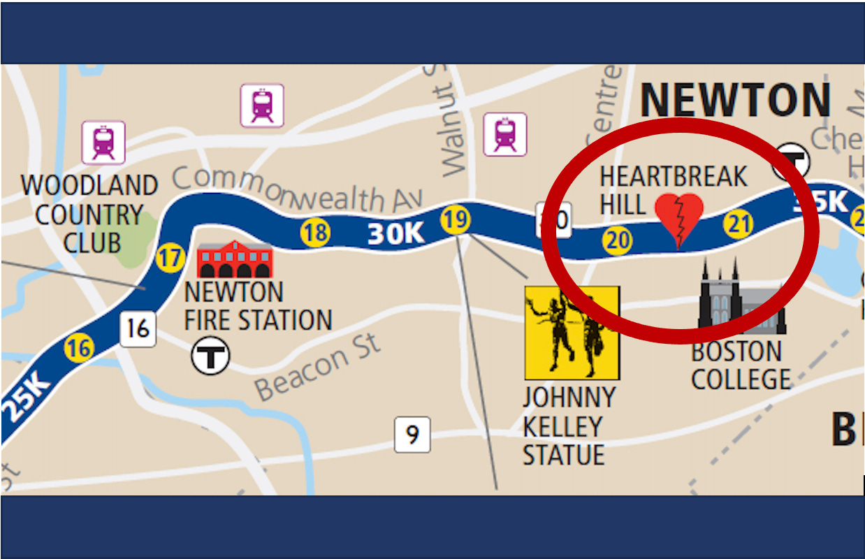
The picture at the top relates to the Boston Marathon’s “Heartbreak Hill” and its incline just at a point in the race where everyone is exhausted. The Boston Marathon is not a relatively more onerous race for elevation overall, but that hill comes at a time when energy is low and minds need to buck up. That may be the flavor of the end of 2023.
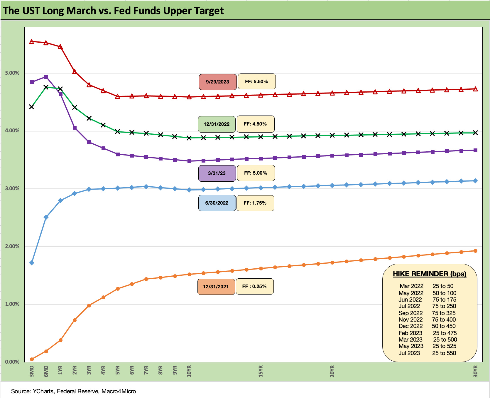
The above UST is starting to see some elevation, and the chart updates the running UST curve migration higher. The move from 1Q23 to 3Q23 tells a very clear story on where the extension trade has not worked out yet.
The chart starts at the end of 2021 and travels across the bear flattener period of tightening into an inversion and now a steepening out the curve. Meanwhile, the front end is possibly facing one more hike this year with the longer end rising in the direction of a flatter curve. We have discussed those trends every week for a while now.
Duration has been a headwind buffeting bond returns across the tightening cycle with inflation running on parallel with massive borrowing needs. That plagued asset returns once again this week as covered in the separate Footnotes publication on returns (see Footnotes & Flashbacks: Asset Returns 10-1-23).
The “recession wait” or more likely a more clearly stated “Fed pause wait” is so close (but yet so far) but will be data dependent. As of the last FOMC meeting, the dot plot was still 12-7 in favor of one more hike this year and a much more divided view of 2024 (see FOMC: Higher for Longer, Confused for Shorter 9-20-23).
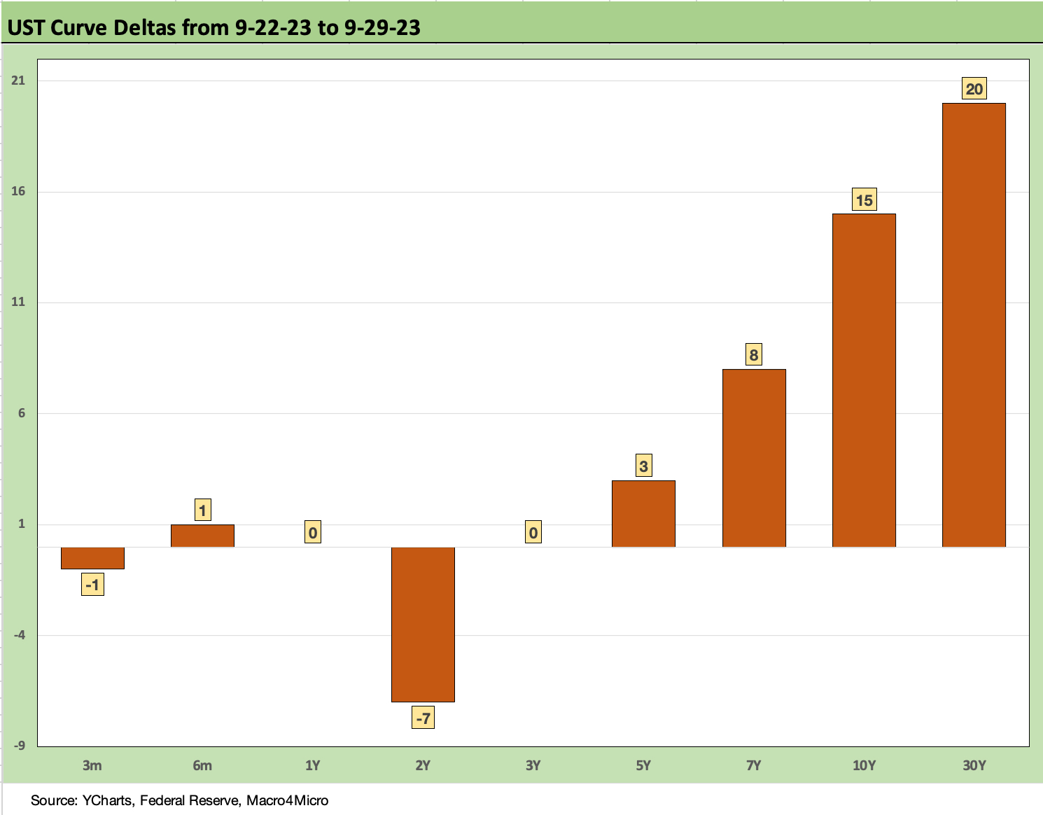
The above chart frames the past week’s UST curve steepener. There is not a lot of mystery as to what that means for bonds. The UST pressure is part of what is keeping tech equities in check (some push back on that idea) and the economic view is in a somewhat schizophrenic state of mind with such UST moves.
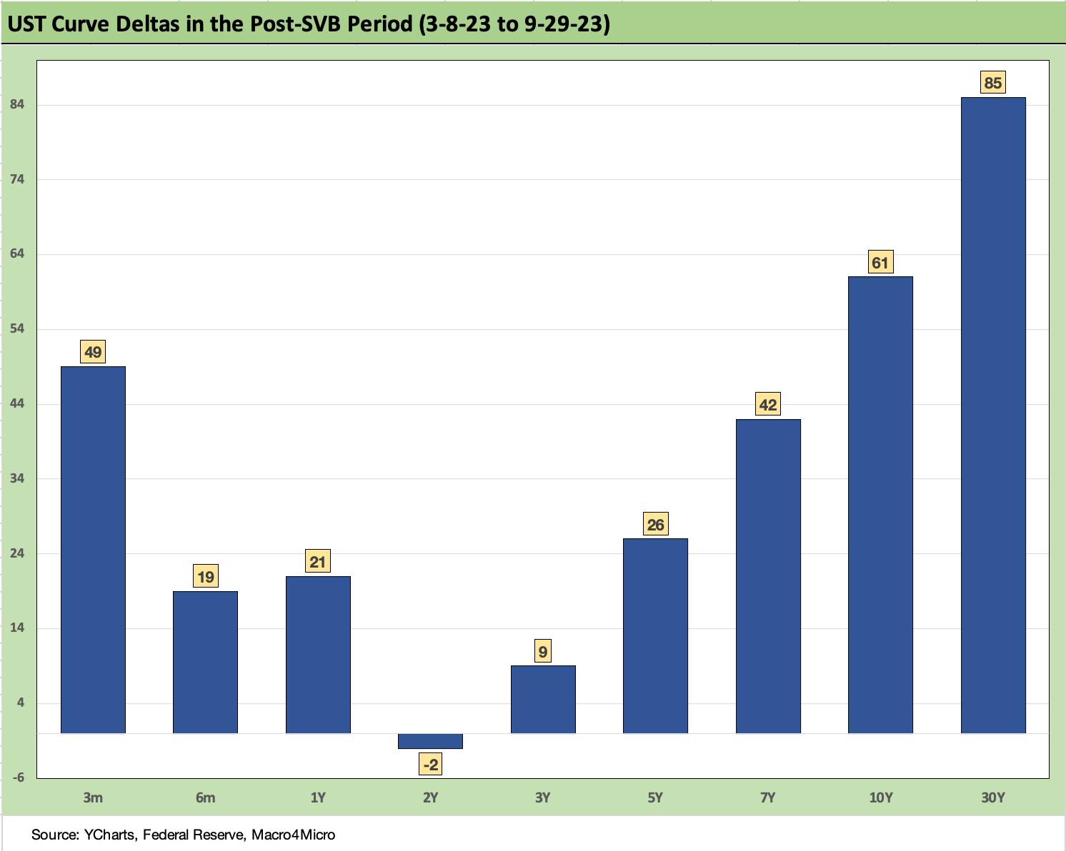
The above chart updates the UST deltas from the post-SVB period. The steepener has been slow and steady and working against the extension trade.
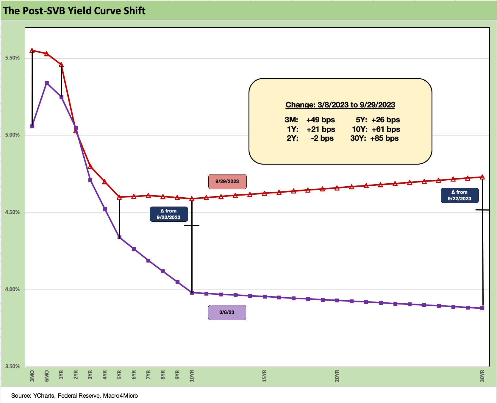
The above chart tends to be more effective visually just putting the deltas in curve format. We see a pronounced upward shift steepener from 5Y to 30Y and from 2Y to 10Y/30Y.
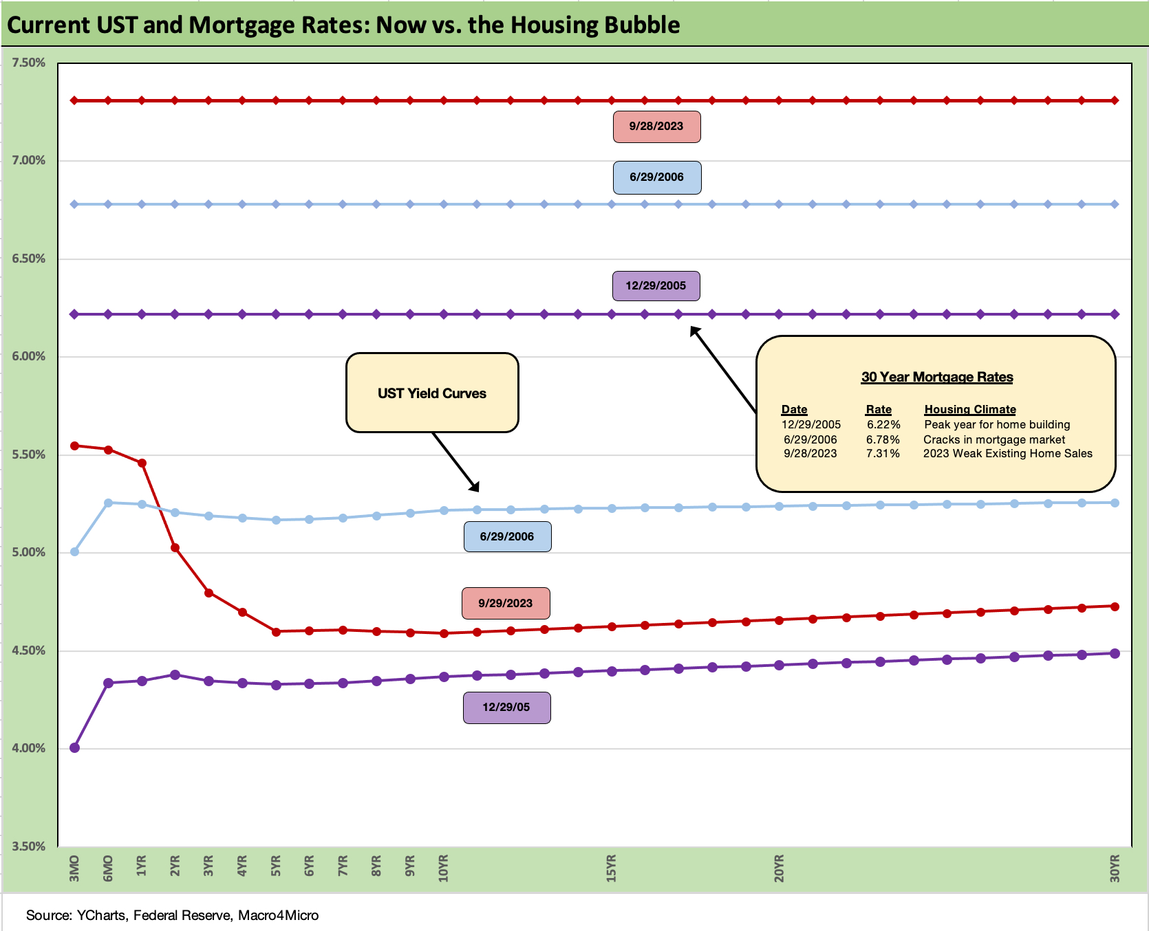
The above chart updates where the Freddie Mac benchmark mortgage rates are now with the upward migration of the UST. We also plot the UST curve and mortgage rates from the housing bubble periods. We include the end of 2005 (peak homebuilding year) and mid-2006 (when the housing cracks were showing). As a reminder of the strange history of mortgage rates, I had the Big Short on TV again today. Always an entertaining (and disturbing) rerun.
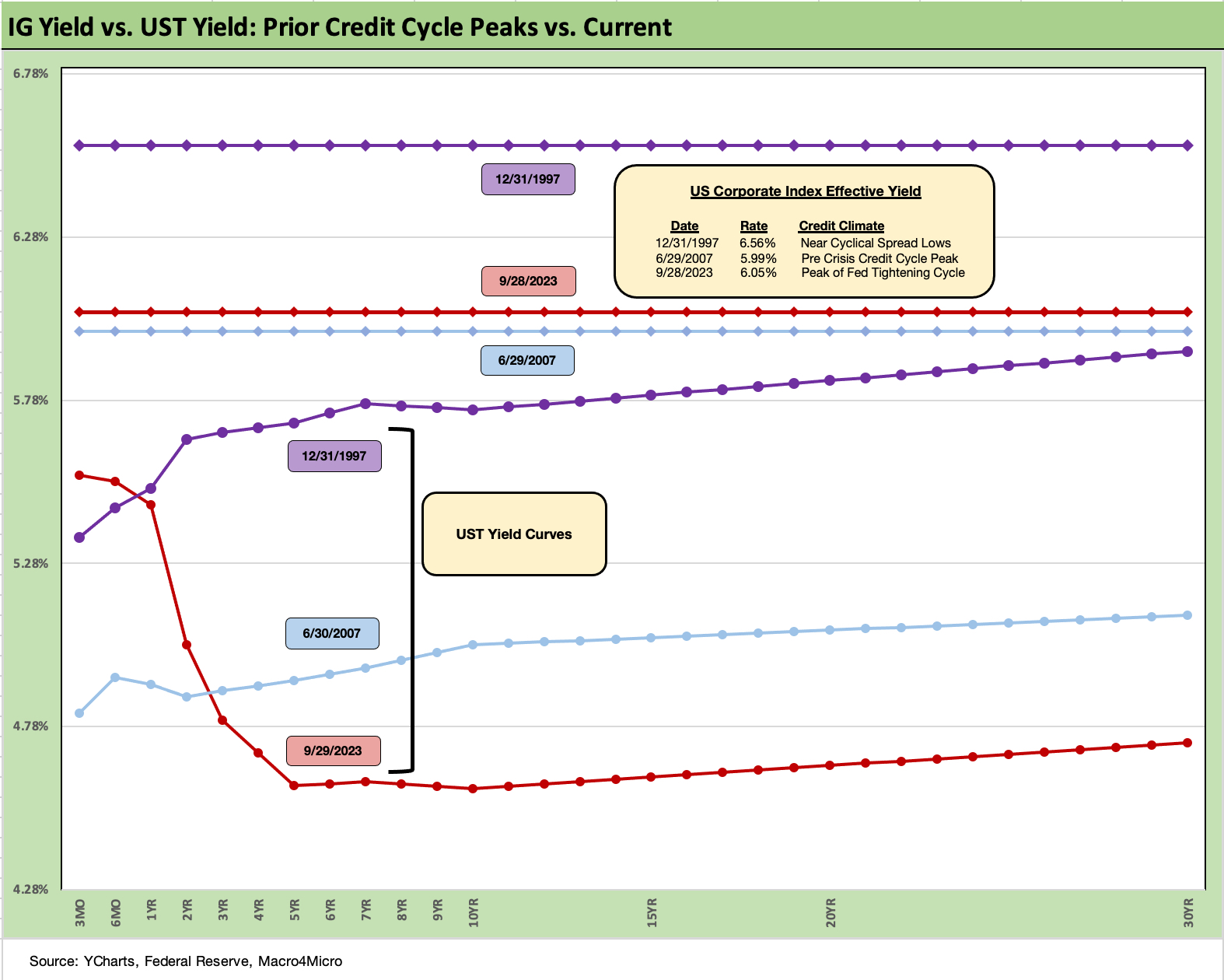
The above chart updates some historical context for the US IG benchmarks and UST curve now vs. the all-in yield at two prior credit cycle peaks (or near lows in spreads). One is in June 2007 at the credit bubble peak and the other at the end of 1997 (Oct 1997 was the actual spread low). After 1997, the credit cycle had some years to run (erratic as they were in 1998-1999) but 1997 marked the spread lows before the TMT bubble went off the rails. Asia was melting down on the way to the summer 1998 EM contagion and the LTCM counterparty crisis.
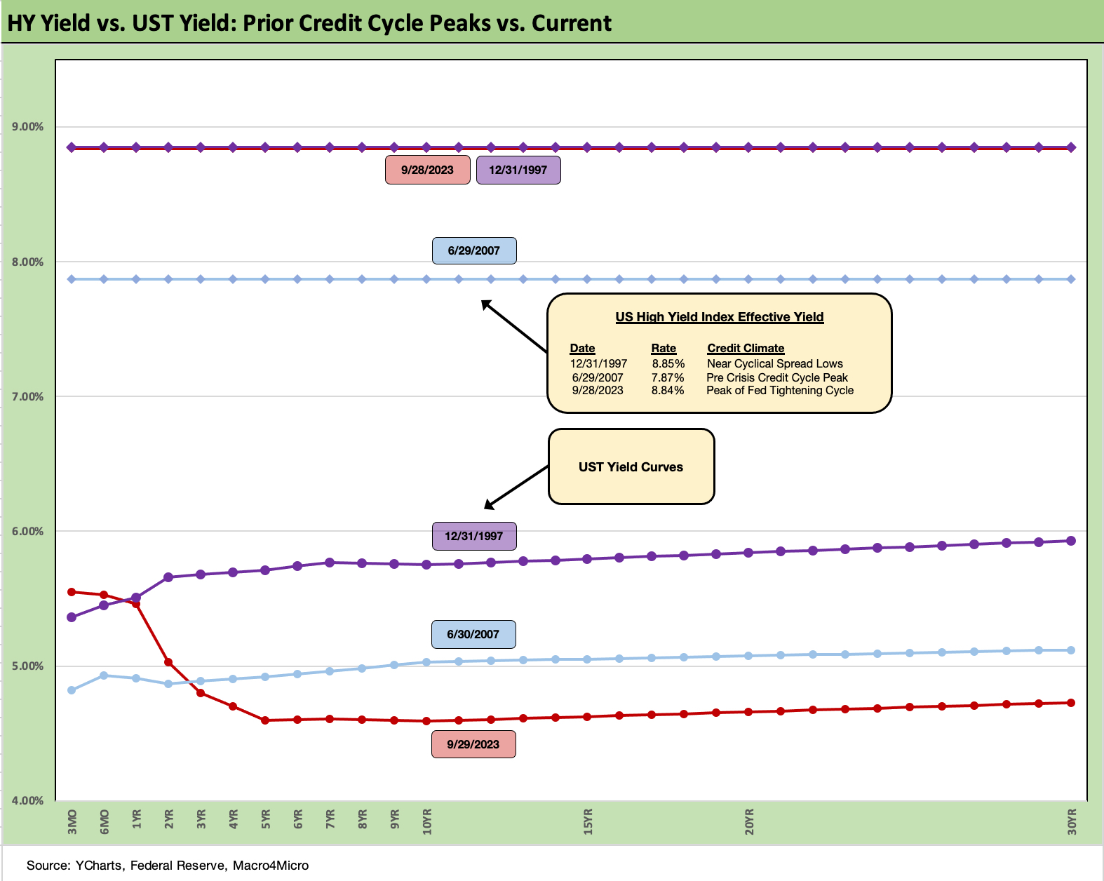
The above chart does the same exercise as the prior chart but for HY benchmark yields. The current HY index yields are right on top of 1997 now but from a lower UST starting point.
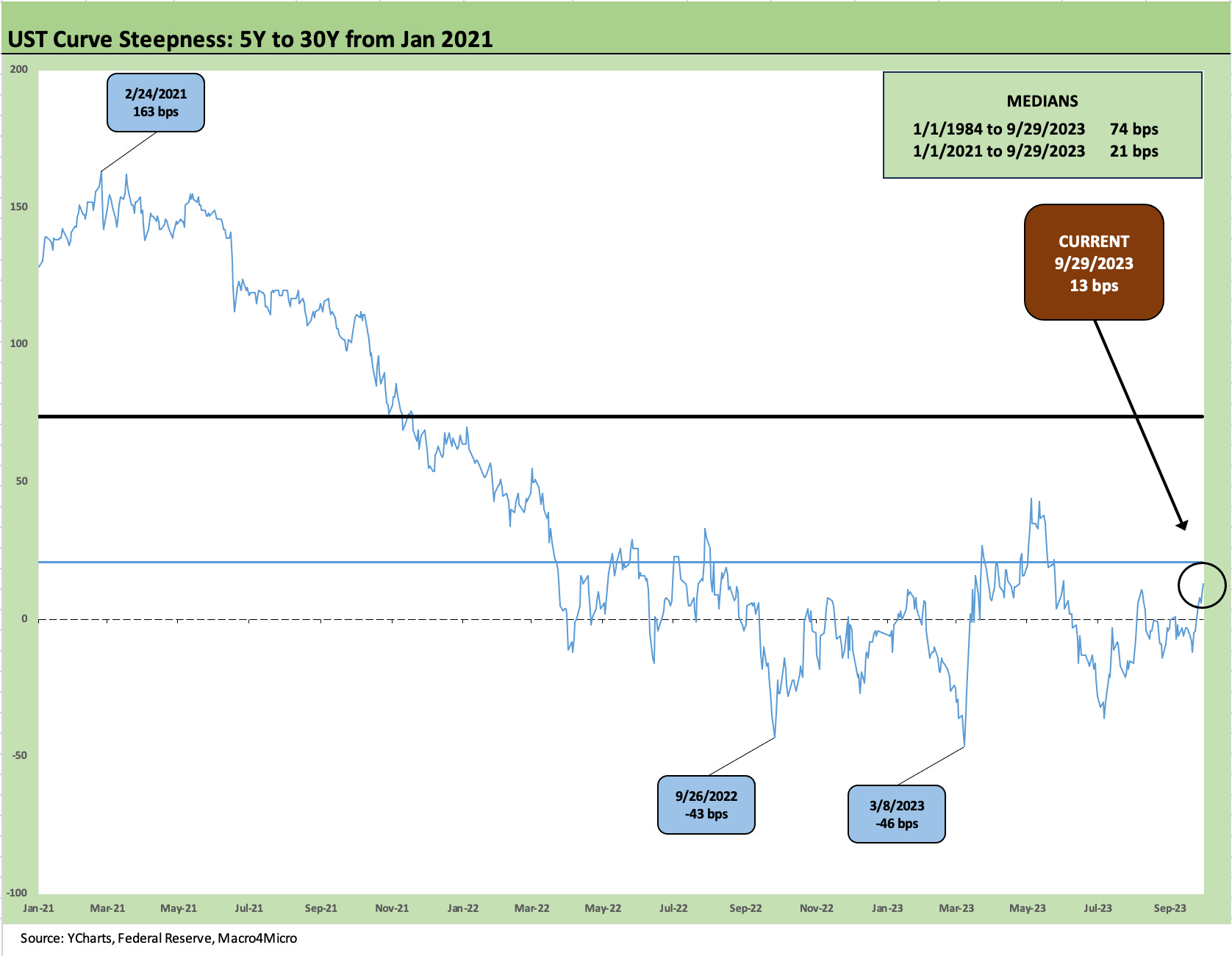
Each week we update one or two UST curve slopes. This week we plot the 5Y UST to 30Y UST slope. We see that the 5Y to 30Y UST curve slope is back in positive territory at +13 bps. That is below the short term median from the start of 2021 but further below the long-term (post-1984) median of +74 bps. That is well off the -46 bps inversion from just before the regional bank meltdown.
The steepener that unfolded has come out of bond benchmark returns. Higher and steeper was not in the game plan for those executing the extension trade as it has hit total returns and underperformed cash.
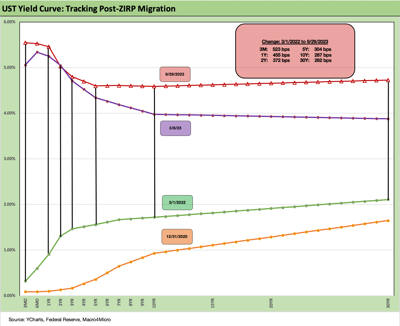
We wrap this week’s State of Yields with the usual running migration chart where we break out the deltas from March 1, 2022 just prior to the end of ZIRP at mid-month March. We also post the year end 2020 UST curve for a frame of reference.
The chart shows the steady bear inversion from the end of 2020 and since March 2022. The problem for bond returns is the intermediate and long end of the curve are now slowly steepening towards the 2Y level with the 30Y now above the 5Y UST. The gut check is whether the market starts to expect 5% handles on 5Y UST and beyond. We were there in mid-2006 as investors look back for parallels before the credit crisis.