

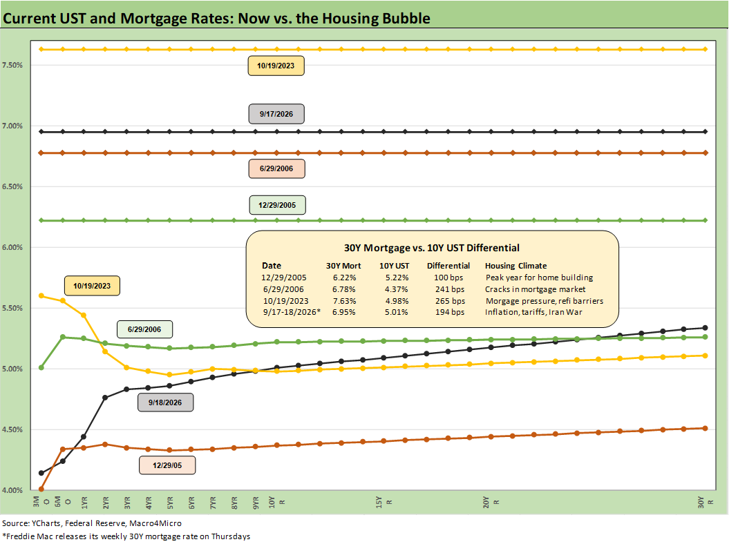
The chart revisits some notable moments from the current post-COVID housing cycle and looks back at the mortgage peak of Oct 2023 along with the housing bubble in 2005-2006. With Trump screaming for 1% fed funds rates lately, a look back at the housing bubble should include how the 1% fed funds of 2004 influenced the markets and asset risk. That might be sobering and especially now with a material inflation problem that we did not have back in that 2004 to 2006 housing boom.
The chart breaks out the weekly Freddie Mac 30Y mortgage rate at the dates cited (Freddie is set weekly). For the current market, the 6.95% for the Freddie benchmark is lower than the more diverse Mortgage News Daily survey (7.2% as of Friday close). The chart posts the Freddie rate at the end of 2005, which was the peak homebuilding year of that cycle. We also post the mid-2006 rates when the problems in subprime were starting to surface before the later problems in 2007 and de facto collapse in 2008 that set off a mountain of counterparty risk exposure.
At the risk of burying the lede, the relationship of UST and mortgage differentials should be worrisome from what these numbers say. The 10-29-23 date saw a 4.98% UST 10Y, and that came with a 7.63% 30Y mortgage rate. The differential between the Freddie 30Y at the time and 10Y UST in Oct 2023 was +265 bps. To end last week (Thursday Freddie, Friday UST) that differential was +194 bps. The mid-2006 differential was +241 bps. The extremely tight differential of +100 bps in 2005 was a very different number at a time when one could argue the market was brain dead in risk pricing.
The question from here is what will drive the current Freddie-UST differential higher? The easy answer is that if the UST curve rises in 10Y, then the 30Y mortgage rates go higher also. The pricing of mortgages is another risk variable on the table. With a 5.01% 10Y UST as of Friday vs. 4.98% at the 10-19-23 date (when it hit 5.0% intraday), that Oct 2023 mortgage rate is +68 bps (7.63% - 6.95%) from where the market closed this past week.
After years of working in the neighborhood of the mortgage rocket scientists at Lehman in my various roles in the mid-1990s (including a stint as head of credit risk to help clean up the counterparty mess…I was “volunteered”), I know better than to hop the fence into the mortgage pricing yard. Either way, the above chart tells a worrisome story around the data relationships and what could unfold for the housing sector.